Kitchen in pastel colors

There are several reasons to decorate a kitchen in pastel colors, light and airy. If there is a lack of natural light, it will become larger, more spacious and lighter. But this is not all - neutral shades hide room flaws, incorrect location and other mistakes that apartment owners make when they renovate and decorate a room on their own.

Features of pastel colors
Any chromatic color has its own pastel version - they are created by mixing a basic tone with white paint. It is about these - more muted, soft, powdered shades that will be discussed. The pastel palette is extensive, due to the many intermediate undertone and the degree of their intensity. Visually, they look calm, unobtrusive and velvety, just by contemplating the color, you can feel this delicate texture.
Features and at the same time the advantages of pastels lie in several nuances.
- The aura of light shades soothes, having a relaxing effect on a person - it is relaxation for the soul and body.
- Light tones in combination with bright colors of the same range can smooth out their scalding, cold or too dark effect.
- A positive property of such colors is their perfect combination with each other, in contrast to saturated shades. Because of this, they can be used in large quantities and on all walls of the room.
- Another great quality is the ability to revitalize and refresh the space.
When the kitchen in the apartment is made in such soft and unpleasant undertones, it looks especially neat. Delicate, eye-pleasing paints are never harsh, flashy, exciting or annoying, and in small and small rooms, pastels are simply irreplaceable as decoration.
If we take the shortcomings, then there are very few of them - if the design is incorrect, the room may look faded and dull, the second minus is the soiled surfaces.
Types and placement of kitchen units
A bright room can be equipped with different types of kitchen units. You need to choose the one that best suits the shape of the room.
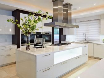
- For large rooms, models are used that can be set with the letter "P". The furniture occupies three walls, the fourth has a dining sector. The island arrangement is also popular, and the "island" is formed from several pedestals, including a sink and a stove.
- With a small area, the corner installation is most practical, which saves free space. This usually involves a corner arrangement of a sink with a spacious drawer inside. But you can also choose a linear shape if the kitchen is small and narrow. Then the headset will be placed along one wall in a straight line.

Interior furniture facades in pastel colors can be brilliant when choosing styles such as hi-tech or minimalism. In other cases, you can stop at matte. Since in a small space it is wiser to use tall fronts to make the headset more spacious, it makes sense to select glossy models that are easier to clean.
With regard to the finishing of furniture, it can be made of materials such as PVC film, pressed wood, acrylic plastic, natural veneer or enamel. The strongest and most durable countertops are made of metal, stemalite or stone, artificial or natural.
Color palette
Warm neutral shades are usually suitable for kitchens located on the north side - they "warm" the room, making it more comfortable. With unwanted shading, it is a great tool for positive thoughts and a good mood. These tones include:
- cream;
- light beige;
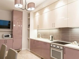
- pink beige;
- Creme brulee;
- creamy;
- milkshake;
- delicate cashmere;
- sand;
- cream (cream);
- vanilla;
- caramel.
Cool pastels are relevant for rooms facing south, and include the following calm shades:
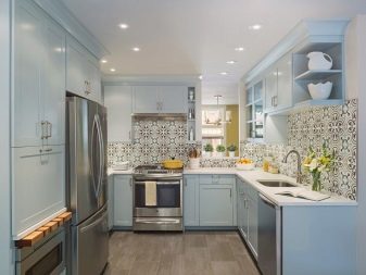
- pale blue;
- turquoise;
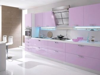
- lavender;
- lilac;
- light purple;
- pale blue;
- mint;
- cold pink.
However, in any room, the listed colors can be skillfully combined and diluted with a pattern of contrasting pastel colors, and this technique is often used in design, in addition to bright accents that are also necessary in the interior.
Styles
Designers recommend decorating rooms with a basic neutral tone in several styles.
Classic
In this case, light colors are the basis for filling the room with elegant furniture, moreover, preferably from noble wood species or with facades painted in the colors of white chocolate, ivory or pearls. Antique mosaics, tetrahedral columns recessed into the wall, and gilded accessories are added as decor. Working panels can be made of artificial marble - black or light.

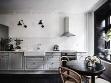
Scandinavian direction
White color in such an interior prevails over other shades, including gray, metallic (steel), cold blue. Warm colors serve as additions - these can be woven runners and rugs, wooden tabletops and side tables. Bright touches - distinctive red dishes, a laconic pattern on a kitchen apron, a houseplant near a window, on a windowsill or a hinged shelf.
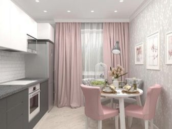
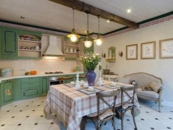
Provence
It is the ideal solution for kitchens of all sizes, offering a romantic and comfortable environment.The set can be chosen in a vintage style, the most popular are mint, pale blue and olive colors. Curtains and decorative attributes should be selected in soft lilac and pink colors, beige patterns are allowed. Accessories that can emphasize the style are souvenirs, ceramic dishes, painted pots with spices.
Loft
You can decorate the space in the loft style, but this requires a spacious room with voluminous windows and high ceilings. If the kitchen is located in a private house, and wooden floors are visible, they are not masked, but left in their original form, like bare walls. The preferred lighting is industrial style lamps.


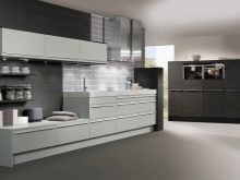
Design features in monochrome colors
Based on the advantages of design in light shades, many decide to choose a pastel design, but they often get lost when it is necessary to choose a specific color for the kitchen. Some settle for white or other solid colors.
In this case, you should heed the recommendations of qualified designers.
- When choosing a classic decor, you need to remember that monochrome colors, no matter how attractive they are, will look monotonous and boring without dilution. Therefore, it is worth considering adding rich color spots in the form of decorations, lighting fixtures, curtains, and individual functional kitchen accessories.
- When the walls of the room are covered with monochromatic paint or wallpaper, then you cannot choose a headset in this color or any other pastel. You will need furniture in a contrasting or partially contrasting, deeper tone.
- The dark bottom and light top of functional furniture are a traditional solution for the kitchen space, relevant not only for a classic design, but also because of practicality, because the light panels of the lower cabinets will have to be cleaned almost every day.
- The main rule is not to overload the room with unnecessary details and decorative elements.
Kitchen appliances should be correctly matched to warm and cool pastel shades in the headset itself or in the overall finish - ideally, it is a similar color, metallic or black, but not solid, but used to detail the object.
Add bright accents
When using a pastel palette, color accents that bring a touch of life are extremely important, and these are not necessarily some expensive details. Moreover, such inclusions fit perfectly into the interior in any stylistic direction.
Expression in a limited amount is necessary in any room, including the kitchen. Any accents must be placed correctly. The successful placement of bright elements solves several problems at once:
- makes the image of the room complete;
- adds a share of creativity;
- makes the room unique and inimitable in its image.


In monochrome, not saturated with color spaces, accentuation is especially important. At the same time, you can make the boundaries of the zones more pronounced and fill the room with fresh colors.
The accent color depends on the tone of the finishing pastels used:
- objects, utensils and textiles of pink color can be used as strokes for a beige palette, you can also add deep shades of brown;
- with pale blue walls - orange blotches;
- against the background of lilac tones in combination with beige, it is better to use green.
And also, according to the rules of decoration, various cool shades can be complemented with red, amber, yellow and orange tones. A delicate peach colors can be refreshed with red details... However, these are just a few remarks - in fact, touches of virtually any bright color can be applied for a neutral interior, and this is another plus of the pastel design.
It is possible to arrange these juicy notes within the kitchen with the help of stained-glass windows, which are dark in comparison with the general tone of window grilles and frames, and small sculptures on open shelves. You can hang bright curtains, pictures. In addition, furniture or its individual parts can be contrasting.
Bright colors, in addition to decorating the kitchen, cheer up and increase appetite, however, there should not be too many of them, so as not to create a feeling of chaos and disorder.


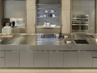
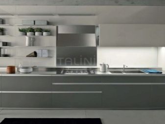
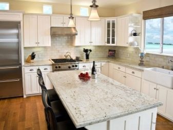
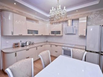
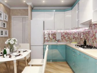
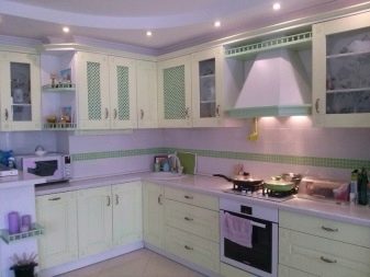
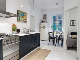
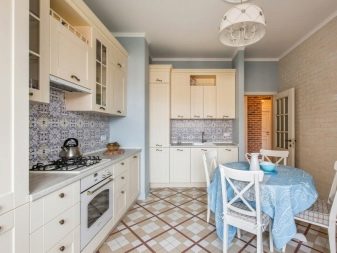
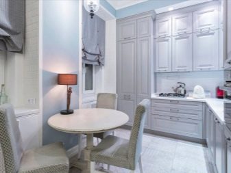
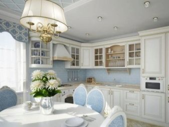
Beautiful examples of the interior
There are quite a few options for the original, light and sophisticated design of kitchens in a light palette.
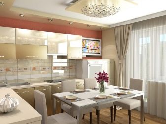
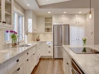
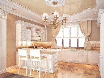
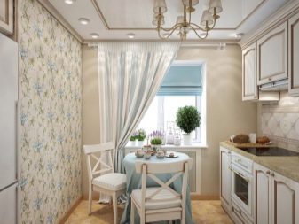
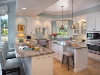
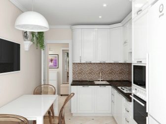
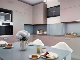
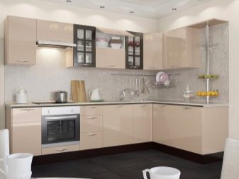
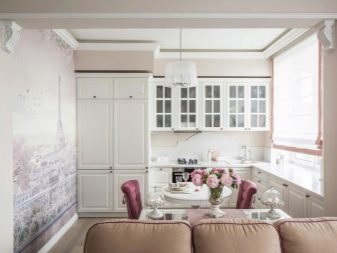
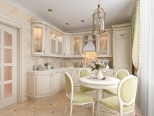
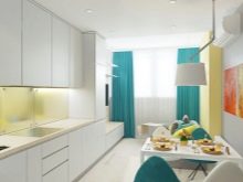
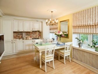
The delicate caramel-beige color of the headset with an apron and tabletops made of greenish-golden artificial stone looks beautiful. The dining area is made of contrasting materials - white and brown.
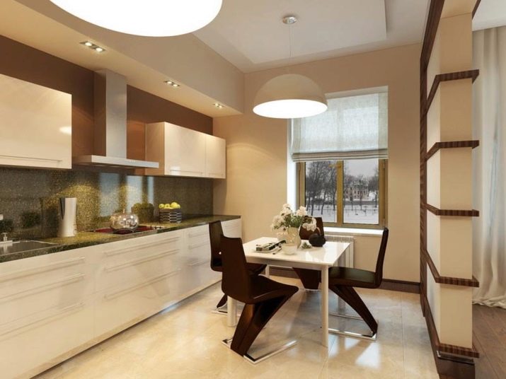
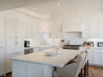
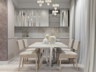
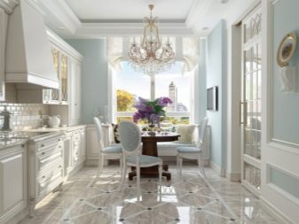
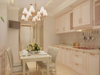
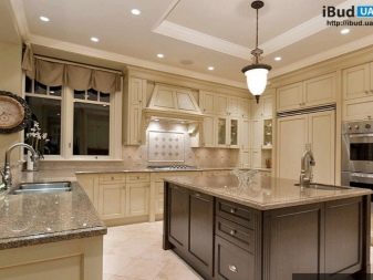
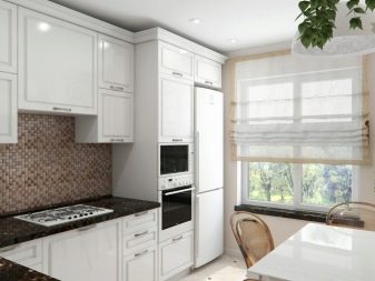
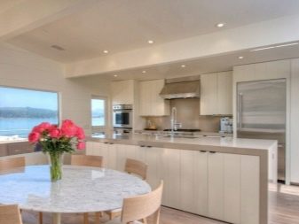
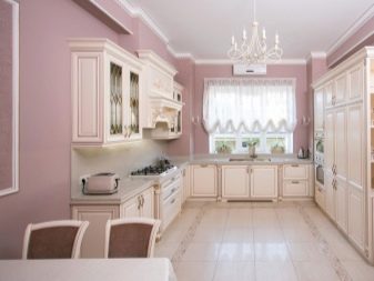
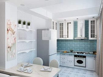
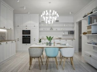
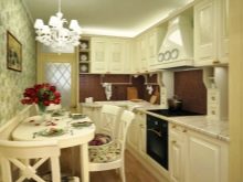
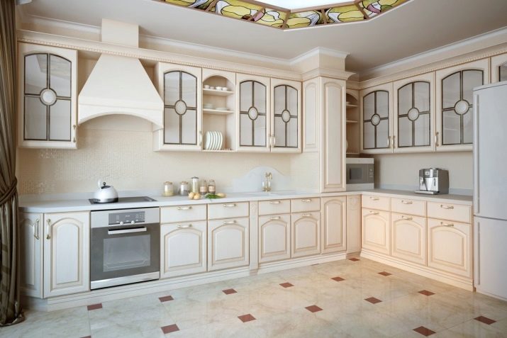
Cream furniture with frosted glass facades, pedestals decorated with a relief image, allows for a stretch ceiling with an ornament combining coffee color and a shade of champagne. At the same time, the color of the countertops, refrigerator and hood is white.
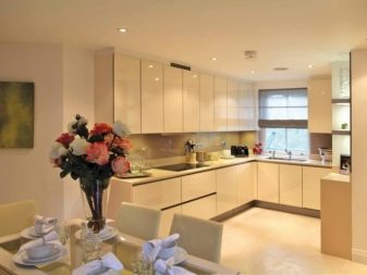
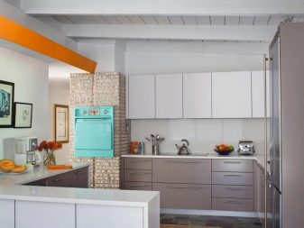
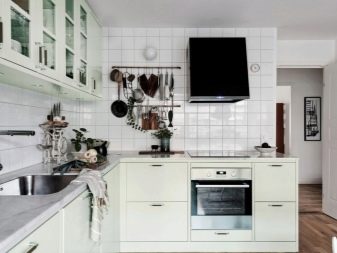
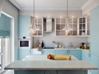
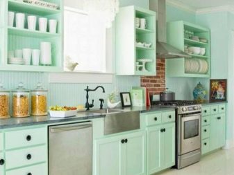
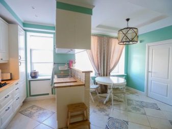
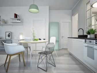
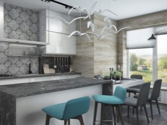
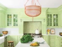
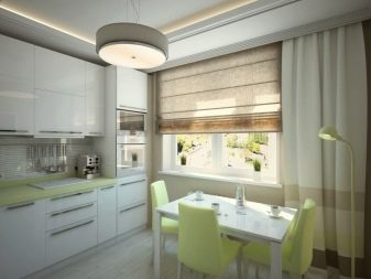
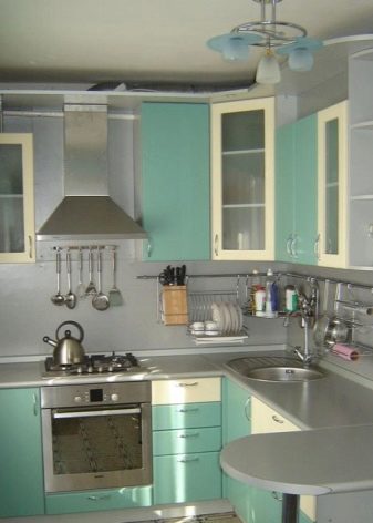
The mint color of the headset can be perfectly combined with white and black countertop panels. But also this color is combined with gray tones and metallic. Cold lighting is suitable for such a kitchen using a chandelier with metal outlines and lamps of white and bluish glass.
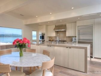
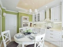
The Provence style kitchen in light olive shades allows for yellow curbstone fronts and light wood countertops. The dining table and chairs are also made of wood.

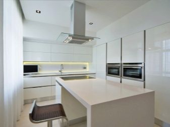
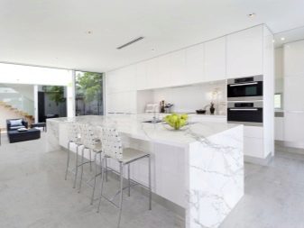
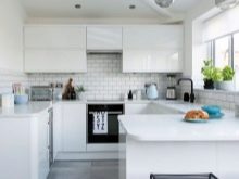
An important recommendation for those who decide to choose white for their kitchen - this tone is only suitable for a minimalist style, in all other cases the kitchen will look more like a hospital.