Trendy Pantone Colors
Colors play a big role in life. In nature, some colors of animals or plants can warn of danger or increase the chances of survival and reproduction. Human life also depends a lot on the surrounding flowers.
Each color has its own meaning. Each of them affects the emotional background of a person, can evoke both good and bad associations. There are many shades and tones in color schemes. There are specialists and entire companies who analyze them and experiment with combinations of certain shades.
What?
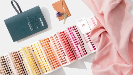
Recently, in the fashion industry, in publishing houses, designers have developed the concept of "color of the year" or "trend colors". But who dictates the best shades and combinations to the whole world? The Pantone Institute is a company that has been successfully operating in the market for over half a century. We are all familiar with Pantone from computer programs, photo editing applications: this name sounds everywhere, where you can come across a palette of shades and tones.
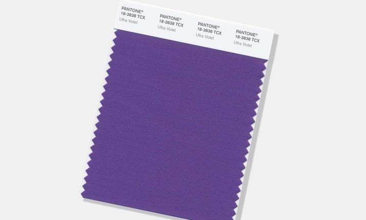
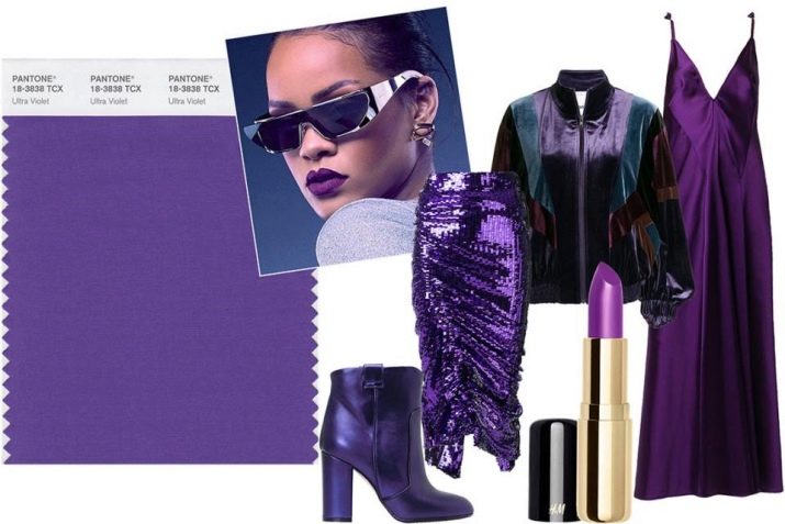
The Pantone Color Institute is a company of color-savvy experts who conduct extensive annual analyzes of the political and economic state of the world. They study the behavior of people, their habits, new trends in art, music and creativity. After careful and in-depth analysis, the institute announces its choice of color, for example, last 2018, a bright shade of violet - ultraviolet was named the trend color.
The reason why the major fashion design industries and well-known publishers are so respectful of Pantone is simple - the company not only created a color palette, but also gave each shade its own number and name. When using professional software or creating a design, this solution makes it easier to find the right color. Also, this institute periodically publishes options for various color combinations and forms the right taste among designers and people who work directly in these areas.
Basic colors
In the color world, there are 3 primary colors: blue, red and yellow. They are considered to be the main ones for one reason: no color combinations, mixing in various proportions can form the above paints. The Pantone Institute's color table system comes in two flavors.
- RGB... It translates as red - red, green - green, blue - blue. This is the color rendering of the displays. Obtaining a variety of shades is based on mixing three colors: when mixing all at once, white is obtained, the absence of color is black.
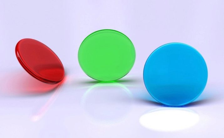
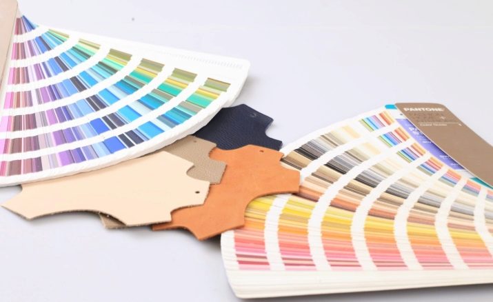
- CMYK... This program is more varied and has more opportunities for obtaining new shades, it is most often used by designers. The Pantone Paint Chart includes many different color combinations and far surpasses its range of mixing applications.
Their color catalogs are huge, so certain colors are allocated seasonally and annually, for easier understanding and use of the original shades.
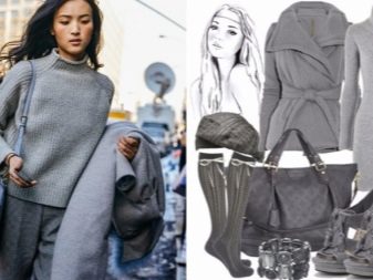
Such a concept as basic colors in a wardrobe, design or interior is a certain color foundation that, despite fashion trends, we keep in mind. These are mainly black and white colors: the first is more often used to emphasize solidity, severity and seriousness, and the second color is considered festive. Also, gray, blue, brown and beige can be considered basic: such paints are much more successful in creating a tandem with other shades.
Popular palette
Every year, for the seasons spring-summer, winter-autumn, the Institute of Colors issues top ten current color solutions, for example, for the winter season of this year were chosen the following colors.
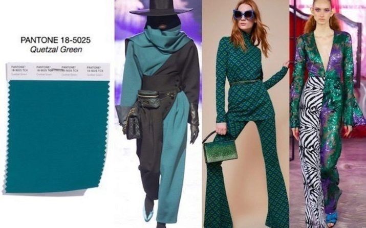
- Green quetzal. This is a very deep shade of green, quite dark, mixed with blue (where blue, in proportion, takes the lion's share of the combination). Kwezal is the name of the Panamanian bird, the color of the plumage of which corresponds to the palette. The color combines the depth of the ocean and green leaves.
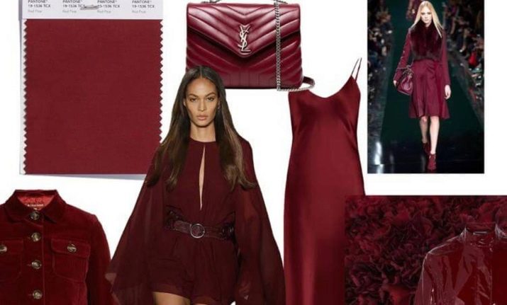
- Red pear... A color associated with luxury, a deep burgundy shade of the red palette. Matches wonderfully with green quetzal when used with accessories.
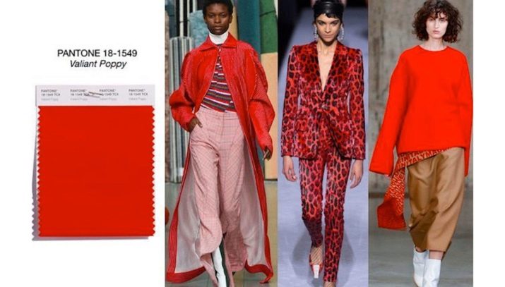
- Heroic poppy. The bright shade of the red palette can add warmth to the cold winter cold. At the same time, it looks a little defiant and emphasizes sensuality. Perfect for bright personalities who lack a riot of colors in cold weather.
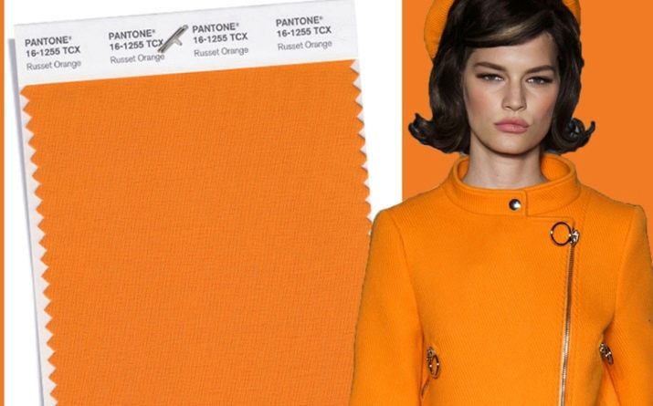
- Red orange. It's about warm sunlight and orange blossom.
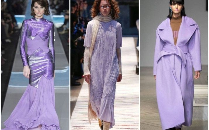
- Crocus petal... This is a very interesting shade of the purple palette: it is both warm and pale. By the way, using this delicate sensual color will look great in accessories. In addition to warm outerwear, bags, boots and scarves of this shade can be considered.
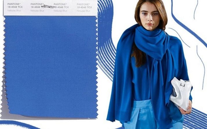
- Foggy blue. An alluring color, associated with determination, can give a feminine look a touch of masculinity and strength.
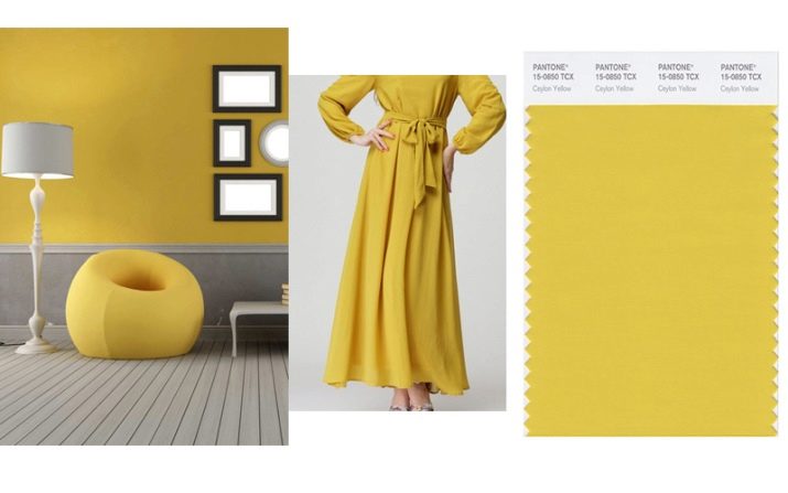
- Ceylon yellow. As promised by the Pantone Institute, this winter was full of bright colors, Ceylon yellow is one of those bright colors.
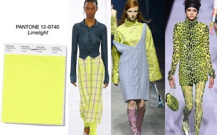
- Limelight... The acid-yellow hue is able to bring sophistication and zest to the mono-bow. Combines very well with other color trends.
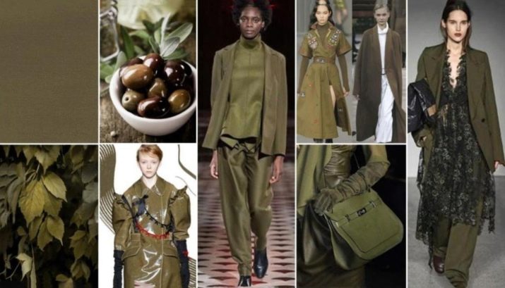
- Olive... This color is considered noble and is perfect for classic looks.
- Ultraviolet... Deep color, mesmerizing with its softness, continues to be popular this year as well - many eminent design houses continue to use it in their fashion shows.
Armed with all the trending colors on the Pantone list, you can create gorgeous, trendy and trendy looks that will be appreciated by those around you.
Shades of the year
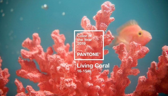
At the end of autumn last year, the Pantone Color Institute presented the main color of 2019. It was named "Living coral". According to the institute, this color gives cheerfulness, amazes with its softness and calmness. Let's take a closer look at the title.
Corals are inhabitants of the seas and oceans, invertebrates that grow in certain "colonies". They are home to many reef habitats. The institute made such a choice based on the slightly unstable political and economic state of the world and society. And he gave the public a color that can warm and calm.
Living coral is a symbol of human striving for the best, positive thinking.
What results will the use of this shade give in various fields.
- On the Internet many find the use of this color to be inspiring.
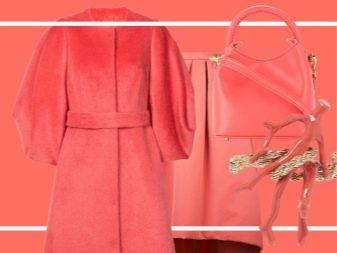
- Fashion industry. This shade creates a striking contrast when combined with other colors - there have been many examples of daring experiments on the catwalks and in street fashion shows. This shade was also used as the main color of clothing, but more emphasis was placed on the images: accessories, lace patterns.
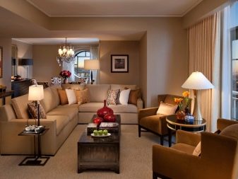
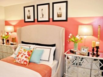
- In the interior. Interior designers' hands are "untied" - this color is perfect for a variety of trends, but the main accent can be put in pop art. And it does not matter at all whether it is a pillow or a soft blanket, curtains on the windows, a table, a vase or the color of the wall - it will decorate the interior, give everything an extraordinary look, will soothe and delight at the same time.
- Living coral as packaging. Choosing this shade for packaging a particular product, you can be sure of demand. This is an alluring color, thanks to which the buyer begins to associatively trust the seller.
Many people consider colors close to pink to be girly colors, perhaps this is due to gender color perception, but now many clothing and interior designers add these shades to men's wardrobe or men's rooms, erasing the boundaries of stereotypical thinking.
Application options
Fashion
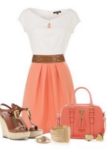
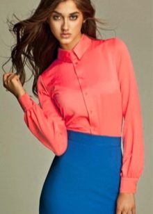
Shades like this were popular in the forties and fifties, and now they are back again. Many fashion houses put on vivid images at the shows: coral skirts, sweaters, mono-bows, outerwear and much more. Consider the options for combining this color with things already present in the wardrobe.
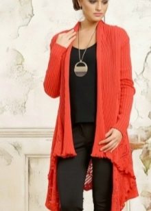
- Black... If you have black skirts, dresses or pants, then a coral accent, which can be a sweater, sweater, scarf, cape, outerwear or bag, will transform a boring look and add zest, warmth and bright accent to it.
- House Versace also showed the practical use of coral accessories when using combinations of white and black, blue and white.
- White... Combining these two shades, you will give the image a festive look, brightness and freshness.
- Native shades are also perfectly combined with coral, such as red or orange. This combination surprises with its brightness, freshness and looks very stylish.
- For the cold season, combinations of coral and brown, as well as blue and gray shades.
- Do not ignore bright patterns and prints on dresses or combinations.
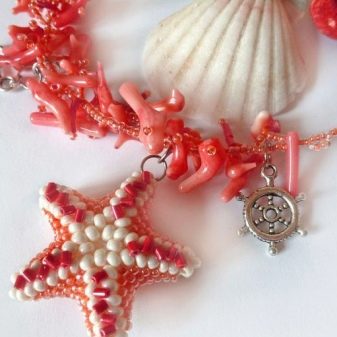
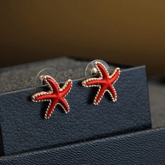
Do not forget that coral is a sea animal, therefore necklaces or earrings in the form of marine jewelry (small coral branches or starfish) will be welcomed in warm seasons.
Interior
During the reign of such directions as Baroque and Rococo, coral could often be found, and it was also widely used during periods of historicism. This year, live coral can be used in any interior design.
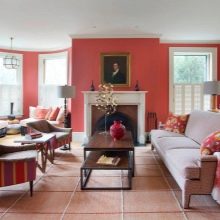
- As the main color. Choosing this shade as the basis for the interior, you can create an unusually bright stylized room, delighting with a riot of warm marine colors. Such an interior solution is perfect for bright personalities who do not get tired of eternal optimism.
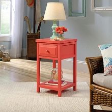
- For calmer people, an accent solution is suitable. Living coral is known to look great against white and black backgrounds. And if you do not dare to repaint your room, then you can simply purchase a bedside table or coffee table.
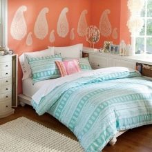
- It is worth mentioning that coral goes well with all marine colors, such as turquoise, ocean blue and shades of blue.
- For bedrooms, coral duvet covers, bedspreads, pillows, curtains are suitable. You can also use a soft carpet in the color of living coral.
You can learn more about the popular Pantone colors by watching the following video.


