How to compose and design a designer's portfolio?

Every designer looking for a job knows the value of a good portfolio. It not only shows the author's achievements, but also favorably distinguishes him from the background of other performers. Few of the novice masters know how to properly design their portfolio, how to fill it, so that the employer is interested in you.
You can start your journey in the design world in different ways. For example, you can go to work as an intern in some design studio, or you can put together such a studio yourself. However, perhaps the easiest and fastest way to make money is freelancing. It allows you to search for and carry out a variety of projects and teaches you how to behave in a highly competitive environment.
However, in order for the customer to choose you as the performer among dozens of competitors, it is necessary to demonstrate your abilities to him. This is where the question of portfolio arises.


Basic compilation rules
The portfolio of any self-respecting designer should follow a number of simple rules.
When adding a work to your portfolio, attach to it the text of the assignment that the customer gave you, or briefly retell his problem that you solved in this work. Beauty is good, but practicality is more important..
Don't list every project in your portfoliothat you were working on. The employer will rate you on the worst job you do. However, make sure your portfolio starts and ends with your best work. This will leave the customer with a good impression of you.
Imagine yourself at the customer's site and carefully review your work... Would you like to work with such a person? Does it look neat enough, does the eye cling to some unnecessary detail?
Be sure to number the pages... Even if you don't plan on printing your portfolio. Firstly, this makes it visually more aesthetically pleasing, and secondly, after viewing all the works, it will be easier for the customer to return to those that he remembered.
If you work in several styles and want to show them to the employer, make sure there is a smooth transition between them. Group works by style... If they are made in a clear stylistic framework, then you can use subheadings such as "work in style 1", where "1" is the name of the style.
As a designer, you must be creative in everything, including your portfolio.... Something new is expected of you, your own flavor, not a template set of works. Hundreds of thousands of sample portfolios are viewed every day by HR managers and customers around the world. Make yours stand out from the gray mass.
Do not keep your study papers in a portfolio if you have already completed your studies... These works were created by you only to tell the customer "This is what I have already learned." Completion of the training implies that you are already a fairly competent specialist to create your own unique projects.


Structure
A well-structured portfolio looks noticeably better and is rated higher than one in which the designer neglected the appearance. It should consist of four important parts:
title page;
page "about the author";
main part;
conclusion.
The title page is your business card. It should not be too bright, flashy or out of the general style. You can place one of your works on the title page, or arrange it in a minimalist style.
The main thing that should be on it is your name, surname and specialty. You can also specify the year (s) when the portfolio was compiled.


Next is the author's page... Here you can insert your photo, duplicate your full name, date of birth and a few words about yourself. If you are under 25 years old, then it is better not to indicate your date of birth. Many employers are in no hurry to hire young specialists. Here you can also specify contact information: email, phone number, links to social networks.
Main part... Its creation and design takes most of the time. It includes all the works that you have contributed to your portfolio. It can be categorized by style, design, or even color. The main thing here is not to mix up all the works and give them enough space. You can put several small sketches on one page, or devote an entire spread to one large project.
In the final part it is customary to insert reviews of satisfied customers, thanks, and also duplicate your contacts. Don't forget about the back cover design. It must be an addition or continuation of the front side. Such a structure will suit anyone, even a novice illustrator, advertising and printing designer, motion designer and even a layout designer.
Printing design skills will be very useful for you in the design of your portfolio, even if it is not related to printing at all.


Format options
There are several options for portfolio formats. Don't dwell on just one of them. In different cases, you may need different options.
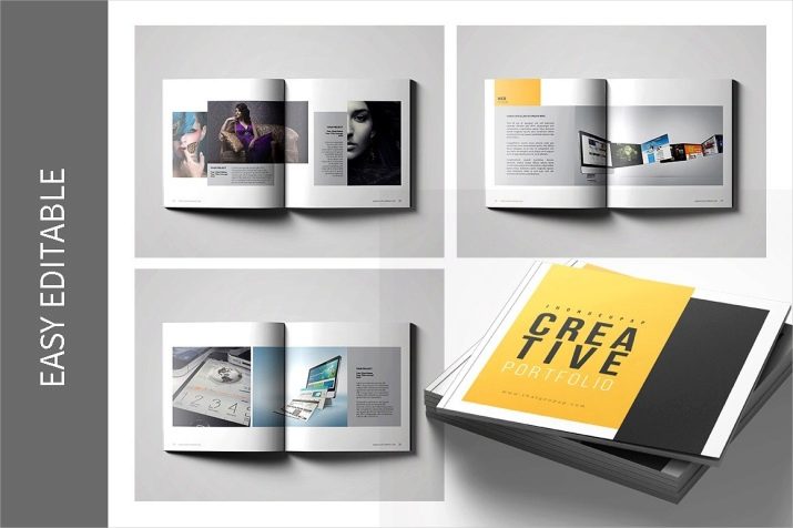
This format is versatile for almost any need. Initially, it is better to lay out the pages in Photoshop, and only then convert to PDF. Subsequently, such a portfolio can be easily printed in any printing house, sent by mail, or even brought with you on a flash drive. As a sample, you can take any art book or portfolio of another designer. Try to fit everything into a file of 10-15 pages... It can be difficult for an employer to absorb a lot of information.
Presentation
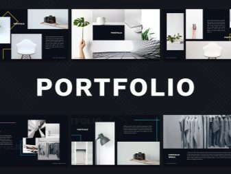
Nowadays, presentation-format portfolios are rarely made out, but it also has its advantages. For example, the ability to add soundtrack to your work.
However, this feature should be used very carefully, because employers do not always perceive it positively.
Personal site
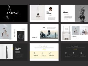
Perhaps the best option for working with online customers. You can create a website even without contacting an experienced layout designer using ready-made layouts or use them as a PDF portfolio. The same rule applies here as in presentations - do not overload the employer with information. Examples of good sites can often be found from professional performers on freelance exchanges.

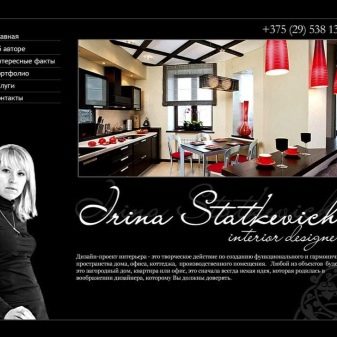
How beautiful to arrange?
Experienced designers are happy to provide beginners with lots of design tips. But everyone also reminds that there is no magic button "make beautiful", and the choice of design still falls to your artistic taste. Before you start putting together your portfolio, take a look at how the professionals do it. Mark or even write down for yourself, point by point, what exactly attracts you.
Do not forget about the rule "one good job is better than several bad ones."
Quality should come first, and only then quantity... You don't have to publish all of your work, as you only overload your portfolio and dilute the value of truly worthwhile projects. Works done with a soul look best. Be sure to include them in your presentation.
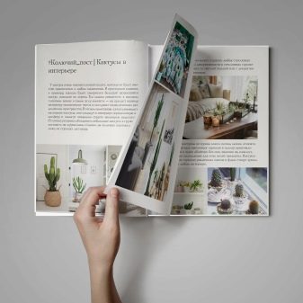
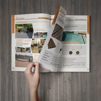
It is better to remove from it a few boring and dull projects that you were not interested in working on, but add one that you would gladly continue.
Tell a story in your portfolio. Let it be in the form of small captions for the work with a story about how you helped and how you changed the design for your client. And at the end of the presentation, you can collect customer reviews and logos of companies with which you have already worked. This will link all the work into a single system.
Keep your portfolio design simple. If you are creating it from scratch, then you should think in advance how everything will look like, what will be the background, cover, font. While your portfolio should look unusual, you should avoid clumsy details and overly bright backgrounds.


Recommendations
Before starting work on a portfolio, determine what purpose it will pursue. Whether it will be attracting customers, demonstrating skills or self-presentation for finding a job in a large studio. Customize it to fit these goals perfectly. Exclude and add elements from it. There is no one-size-fits-all portfolio.
Feel free to show even unfinished tasksthat you have worked with. Can you briefly describe what you would have improved in them. But don't go into self-criticism. An author who doesn't value his or her work is unlikely to be appreciated by an employer. Show yourself as a professional.
If you haven’t had any clients yet, update the design of existing items or just invent a client for yourself.... No one in an interview will look for this company or customer and check if you really did the job for him. You shouldn't do this with reviews. It will also be useful for a novice designer to take part in a variety of contests.
You may not win any prizes, but you will have a great experience and, possibly, create work that can be placed in a portfolio.

Do charity work within reasonable limits... For example, create a logo for a local literary club and they will give you positive feedback in return. Or ask your clients to order work from you not directly, but through a freelance exchange. In the portfolio, you can indicate that you took the order on a specific exchange.Of course, you will have to pay a small commission, but this will help to raise your rating faster and other customers will treat you with great respect.
Don't use free website builders for hosting... There are a lot of ads on them, which are unlikely to have a good effect on the perception of your portfolio by the client. Better to pay a little to use a domain name and place anything there, even banners with advertisements, if it fits the style.

Instead of a simple demonstration of work, add to it a few sketches that you made while working on the project. This will liven up his presentation and give the customer a more complete understanding of how you structure your workflow. But don't turn it all into a journal with notes. Don't write too much. Excessive text will take away the attention from really important details and take up too much space on the pages. Don't add more than one small paragraph, about 4-6 lines.
Pay enough attention to the little things. For example, if you want to work with logo design, show them more often on your portfolio pages, make a logo for yourself, and post it as well. Or, you can style your presentation in the style of the company you want to partner with. The main thing is not to copy her ideas and style, but bring something of your own into it. Only you can control the customer's attention, make him look where and when needed. Use this opportunity wisely, and all roads will be open for you.
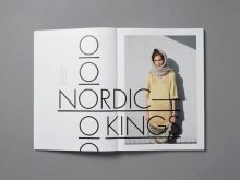


See below for instructions on how to build a designer portfolio.


