Registration of the design of the living room 15 sq. m
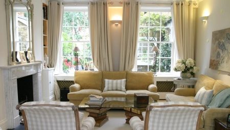
The main value of a modern interior is space, light, naturalness. But the realities are such that it is a little strange to expect space from the layout of the Khrushchev buildings. You can sigh, admiring the huge living rooms in the pictures of interior magazines, for an infinitely long time. But it is wiser to start a plan to transform your own home. And let one have to reckon with a modest footage - it is not a sentence to apartment comfort and style. Even on 15 squares, you can create something convincing, bright, with an expressive individual handwriting.
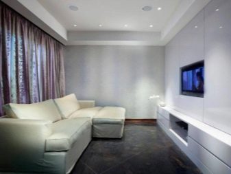
General rules
A small living room is a cramped space. Some styles, monumental and majestic, do not fit into this footage in any way. But there are many other directions that will make the design of a 15 sq. m. Selected styles are quite compatible with budget renovation options.
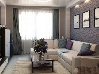
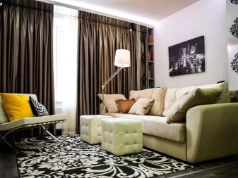
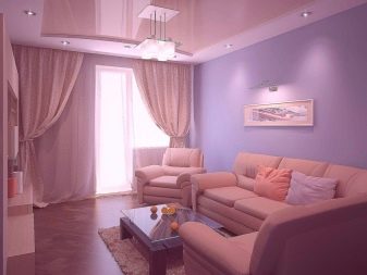
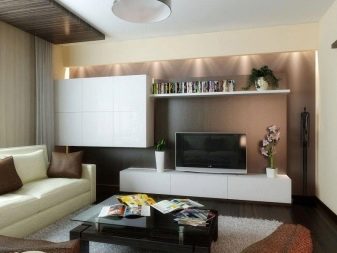
For a small space, certain rules work.
- Don't make the room multifunctional. It is difficult to combine a 15-meter living room with a media zone, a recreation area, a dining room, a library and a study. Therefore, you have to sacrifice something. Bookshelves are sometimes moved into the hallway, which adds the latest originality. A large sofa in a small living room is not particularly practical. Therefore, boldly overcome stereotypes and make repairs not “like everyone else”, but “as you want”.
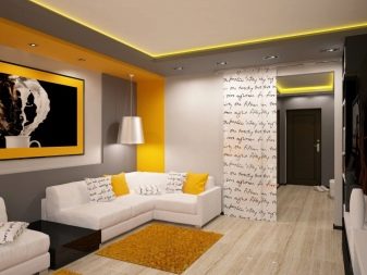
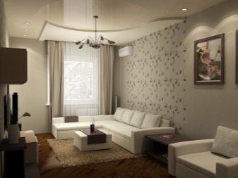
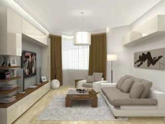
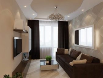
- A light finish is preferred but not required. Of course, a small footage requires a light design.But if you do not like this interior sterility, if you do not like monotony and smoothness, if you feel more comfortable in darker colors, break the rule. Yes, the living room will not visually increase from dark wallpaper, but it will be your comfort zone.
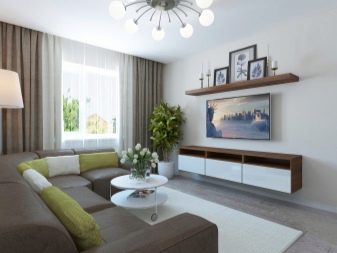
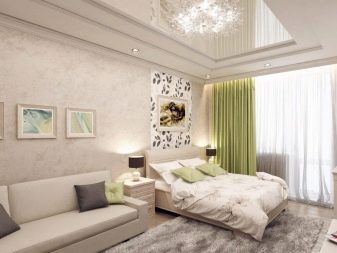
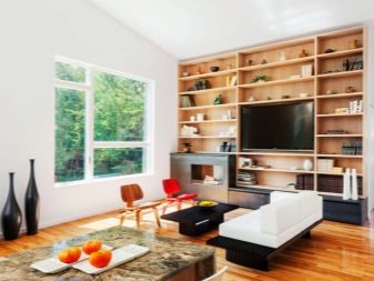
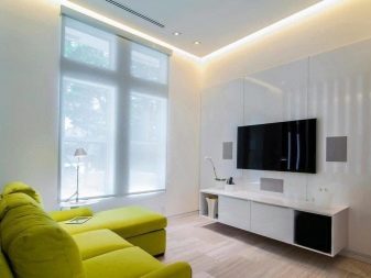
- Mix modern and vintage. Depersonalized interiors, reminiscent of the showrooms of furniture stores, are what experts are asking all apartment owners to get away from. Life should be felt in your home. Today, the demand for headsets and furniture sets is disappearing, more and more people prefer to compose images of rooms themselves, without buying a ready-made collection. An old desk and a modern cabinet in the same room - why not?
The main thing is to stick to moderation.
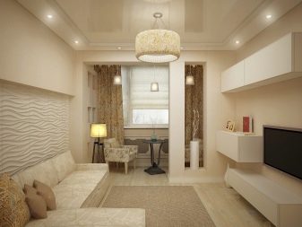
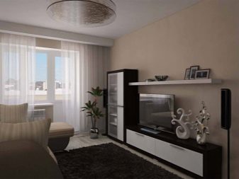
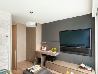
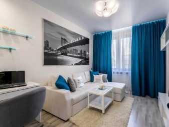
A small room is not something to be ashamed of. A huge number of examples from the Internet, social networks confirm that even on a modest area, you can create a pretty interior. Not boring, not cramped, not cluttered, but fresh, filled with light and air. Just first decide on a style that will help you not to be distracted, streamline ideas and the choice of interior elements.
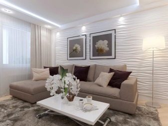
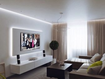
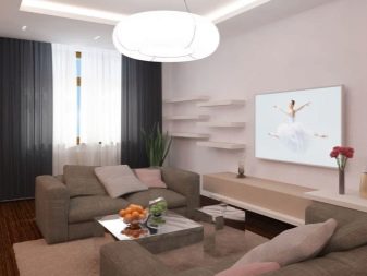
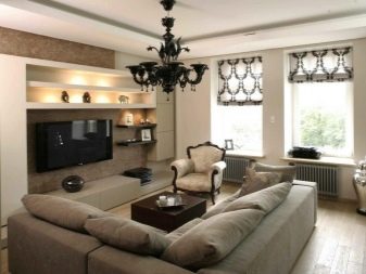
Small hall in a modern style
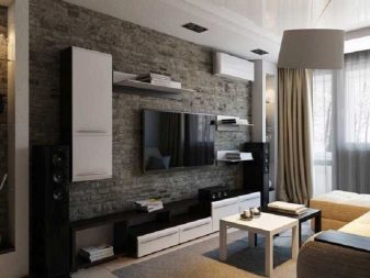
Modern style is too general a concept that is interpreted in different ways. And often it is understood as modern classics. If you simply refer to the classics, you will run into contradictions. Classics are characterized by rich decorativeness, some pomp in design. In a small living room, this is extremely inappropriate. That's why refer to a modern interpretation of the classics, which is more complementary to small apartments.
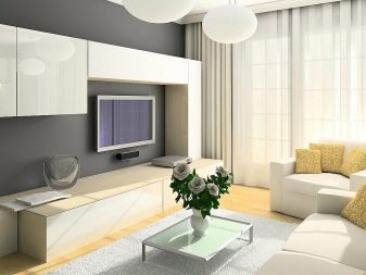
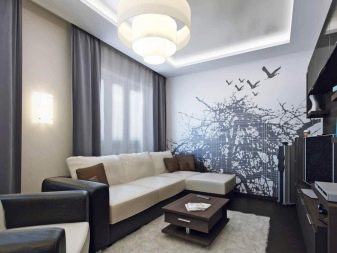
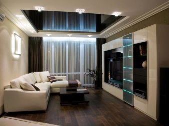
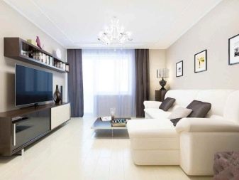
Living room design in modern classics involves:
- natural shades and natural materials;
- wooden furniture;
- cotton upholstery;
- decorative stone covering;
- strict subject composition in the room, built around the central object (usually a sofa).
But such a repair cannot be called budgetary, even on 15 square meters you will have to work a lot. Solid expensive furniture, expensive finishes are also typical for the decoration of the living room in the neoclassical style.

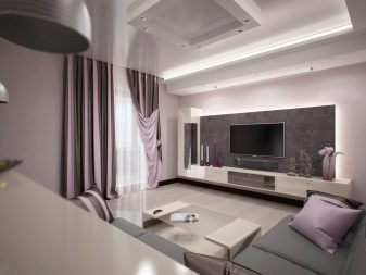
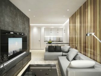
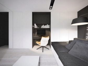
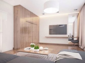
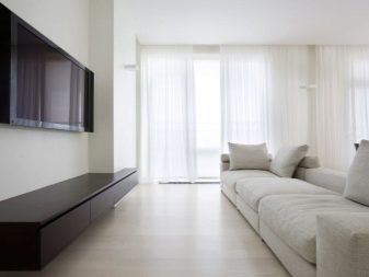
Minimalism in the living room
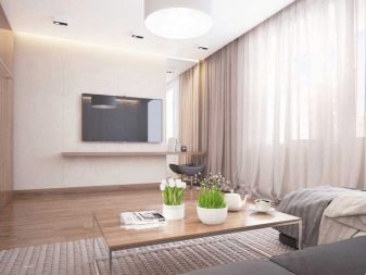
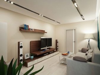
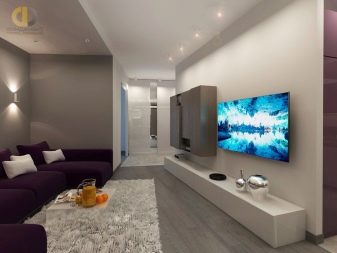
This style, if we denote its philosophy, presupposes restraint, laconicism and even some understatement as a popular, silent aesthetics. One gets the feeling that the interior in the apartment is just a background against which life can "paint" anything. Such interiors are preferred by active and active people who do not so much rest at home as work, create, communicate. They do not look for pleasure in things and trinkets, therefore they are strict about the decoration of the apartment - nothing superfluous, nothing distracting, nothing overwhelming.
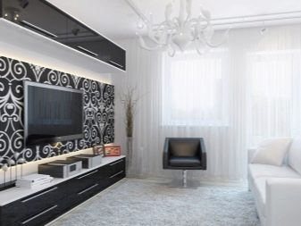
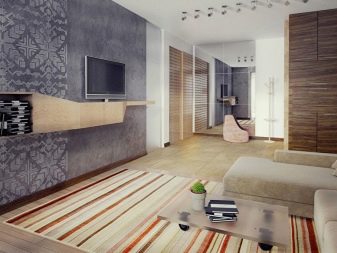
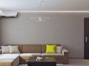
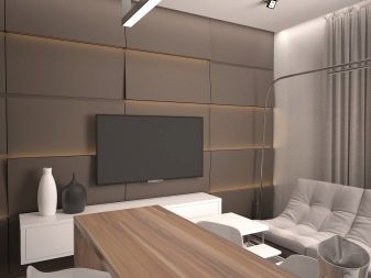
And for 15 squares, minimalism is really a good solution. Very often, transformer models with high functionality appear in such rooms. For example, a sofa, which is not very large when folded, unfolds and becomes roomy. Or the coffee table turns into a large dining table.
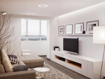
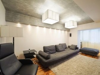
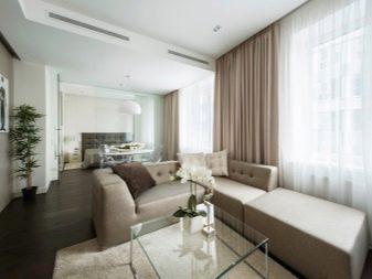
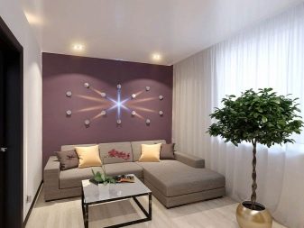
There is very little decor. The decorative function is performed by the texture of coatings, lines and shapes of objects, as well as compositional harmony.
Everything is very laconic, restrained, you will not see an abundance of colors in such a living room either. If this is a room with a balcony, then it will be functional. For example, there may be a table and an armchair for single morning breakfasts.
Scandinavian style on 15 squares
This style is philosophically, and not only, very close to minimalism. He took its best sides, but embellished it a little, embellished it, complemented it with colored delicate strokes.
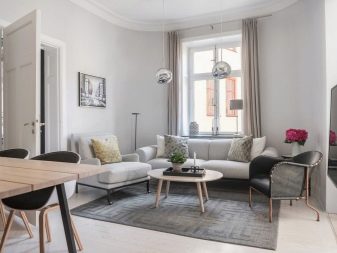
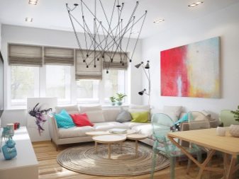
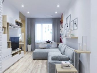
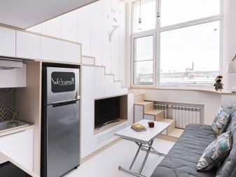
8 reasons to fall in love with Scandi style.
- These are light and laconic spaces, where freedom of action, natural lighting and a feeling of light pleasant coolness and freshness are a priority.
- It is an inexpensive style to implement. The costs can be minimal, all the furniture is quite affordable, the decoration is also simple (unless you overpay for brands).And there are thousands of successful examples that can be studied, spied on, and put into practice.
- This is a functional style that does not like frivolity and unnecessary furniture, unnecessary decor, empty decoration.
- Natural materials are preferred for decoration. Therefore, instead of stretch ceilings, a flat, white-painted ceiling is often used. Everything should be as environmentally friendly as possible.
- The atmosphere of a room can be easily transformed with details. Textiles and decor change, as well as accent colors - and the whole space changes.
- Repair in the Scandinavian style can be done on your own, without the help of specialists.
- This style does not actually become outdated, does not lose its relevance, does not go out of fashion. He is so convincing that he simply cannot get bored. And if it gets boring, then accessories are replaced, and the impression is completely different.
- This is a compromise style that many people like. Therefore, it often happens like this: the wife wants Provence, the husband wants minimalism, and they agree on the Scandinavian style.
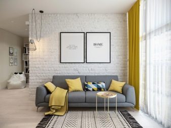
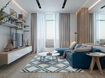
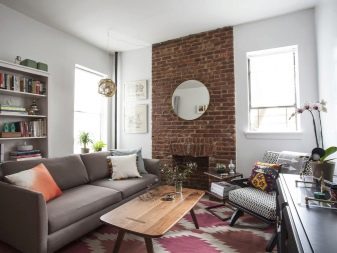
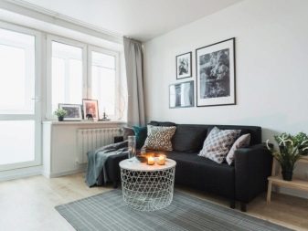
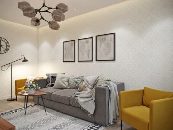
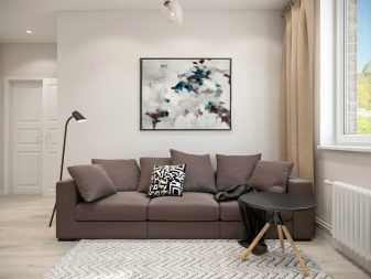
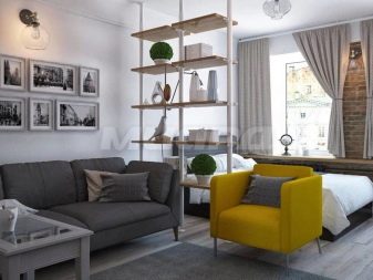
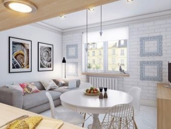
The main difference between scandi is its light background. In the Nordic countries, where the style came to us, cold winters, little light. Therefore, it, the light, is delayed in this way: it is introduced into the space of the apartment due to the light finish and the delicate choice of additional colors.
Provence style
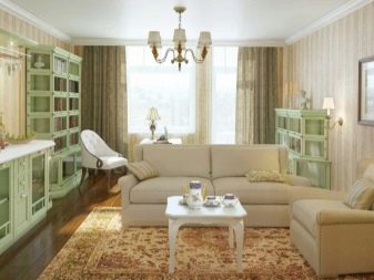
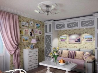
It is more suitable for spacious living rooms, but it can be successfully recreated in the conditions of 15 squares. This is done through light shades and abundant natural light. You will also need wooden furniture, often painted white. And the recognizable style will make textiles with floral motives.
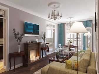
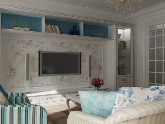
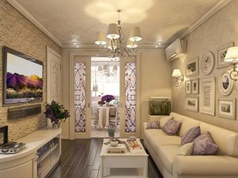
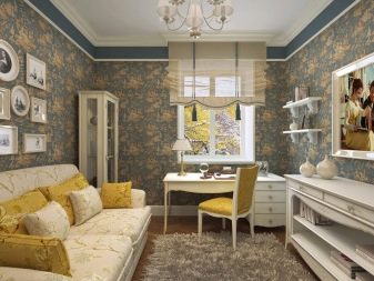
Provence is a kind of country style. Therefore, a natural, simple, devoid of snobbery and claims to solidity, village aesthetics should be clearly visible in this room.
The design of both rectangular and square living rooms can be successful. It is more difficult with a very narrow room. It is desirable that the room faces the sunny side.
Successful examples
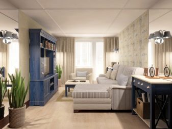
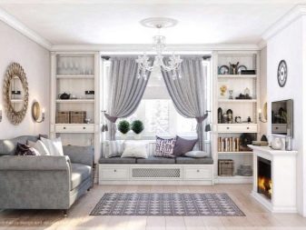
To show exactly how a beautiful and cozy 15-meter living room can look like, good photo examples can. In the next selection, there are several options for very cute little living rooms that are immaculately decorated.
9 inspiring little living rooms.
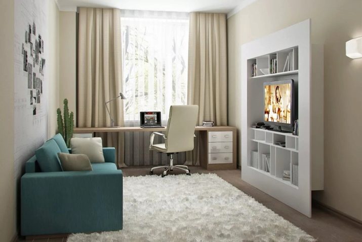
- A laconic design option for the hall, in which you can feel the coolness. The media zone looks very interesting, it is successfully combined with the library. The desktop by the window is very comfortable, and this is the right decision - if it were moved to a corner, the spaciousness and light in the room would feel completely different.
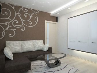
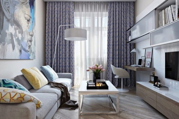
- Another interesting modern option for a narrow rectangular living room. A spacious TV stand, comfortable bookshelves, a laconic coffee table, at which, if necessary, you can dine. The diagonal laying of the laminate visually expands the room, as does the light wallpaper. A countertop shelf instead of a full-fledged desk is a sensible solution for a small space.
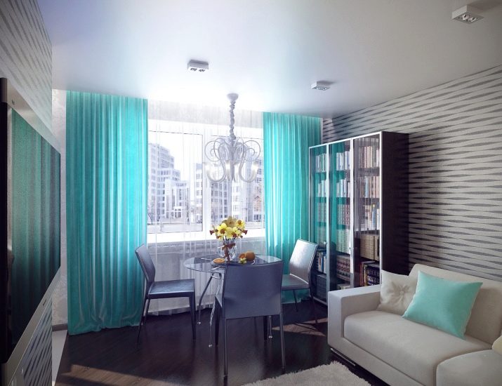
- Turquoise is not the main color in this interior, but it has become an accent. The library area, a table with chairs, a sofa, and a media area fit in on a small footage. In order not to overload the space, the owners chose an “airy” glass table. Again, there is a diagonal layout of the flooring.
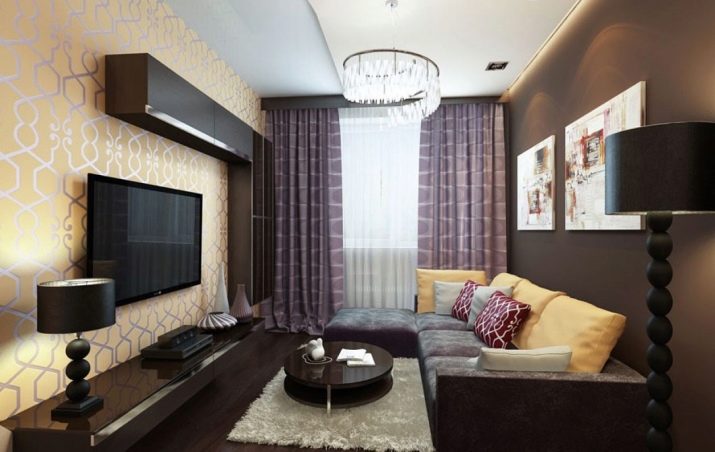
- Dedicated to lovers of dark shades. This is a good decision, because the dark color in this interior does not press, does not create oppression. The roll call of the yellow wall and yellow cushions is an excellent and easy move to implement.
- A noble interior that looks solid and in which every meter is rationally used. An artificial fireplace is in place, but a side table-bench can be more practical.
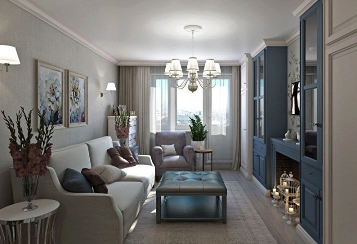
- This is how a small living room looks like in the style of modern classics. The colors are very interesting, the decorative mirror on the stele looks great, which works as a good visualizer for expanding the space.
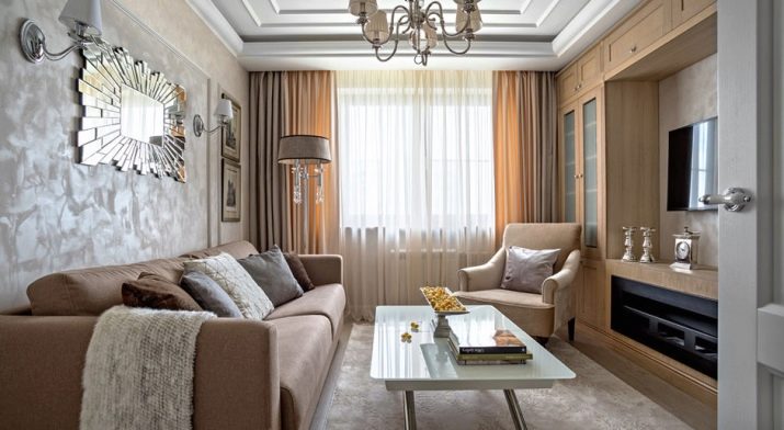
- This is the living room, which is partly combined with the kitchen. Everything looks simple but elegant. An original partition separates the seating area from the mini-office. A retro curbstone decorates the interior, depriving it of the resemblance to numerous modern living rooms. The dining area is located at the intersection of rooms.
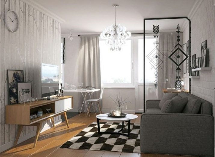
- Cool, invigorating, democratic Scandinavian interior. The simplest decoration of the walls, the classic solution with the design of the floor, a spacious (and therefore practical) TV stand, a comfortable sofa, an "airy" table - all the items are simple, but at the same time it is a very elegant solution.
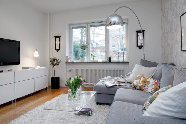
- Bold and proactive fusion is at its peak today. He does not really stand on ceremony with space, but this style preaches healthy hedonism and the desire to combine everything that is loved on one territory. Fashionable and daring!
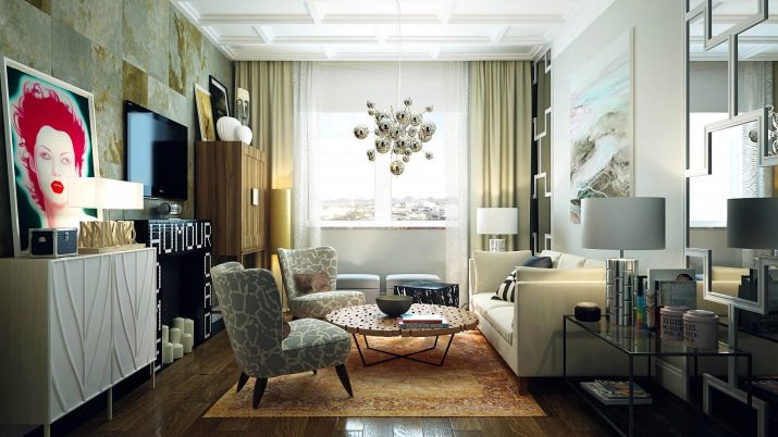
The first and main step towards change is the rejection of stereotypes, false modesty, fear of bold decisions. This is how you can transform not only a room, but also life, its pace and its colors.


