Design of the hall in the apartment
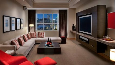
The decoration of the hall in the apartment is extremely important. It is in this room that both family members and visiting guests first judge her. It's time to deal with this topic properly and eliminate all sorts of mistakes that the owners usually make.
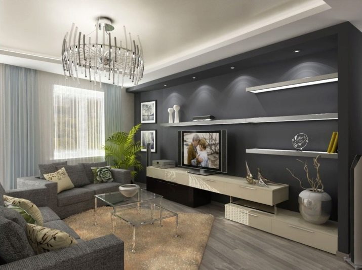
Peculiarities
It is appropriate to start a conversation about the design features of a hall in an apartment by studying its overall varieties. In a large space, you can take a variety of design actions without risking facing negative consequences. But in a small area, you have to act much more prudently.
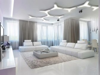
But in both cases, whether in an ordinary city apartment or in a private house, the ultimate goals of design work will always be the same. Only practical techniques and basic approaches differ.
In the living room of even the most modest sizes, you can not limit yourself when choosing color compositions and decorative elements. It is quite possible to provide optimal conditions for everyone living in the house, but overloading the interior is unacceptable. A maximum of luminaires can be used to visually correct insufficient area. If there is little visual correction, the layout of the living room with a balcony is applied, that is, these two rooms are combined.
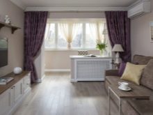
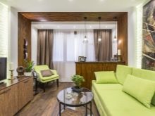
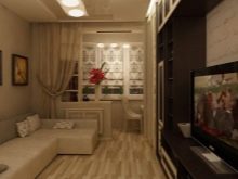
Important: such work should be undertaken only after consulting with professionals and carefully studying the documentation for the house. In modern halls, a functional, laconic-looking atmosphere must be created.
In addition, you need to strive for:
- comfort for all family members;
- no problems with cleaning and cosmetic repairs;
- exclusion of flashy and too aggressive design decisions.
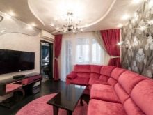
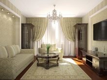
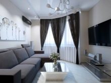
The choice of a specific design option can be made only when there is a clear answer to the question: who exactly will use the home. Single people over the age of 50 and young families with children and pets have completely different requirements for him. An adequate design solution always looks light and unobtrusive. It is recommended to divide the space as clearly as possible into zones with a certain range of functions. Now let's see how these general principles are affected by the specific area of the room.
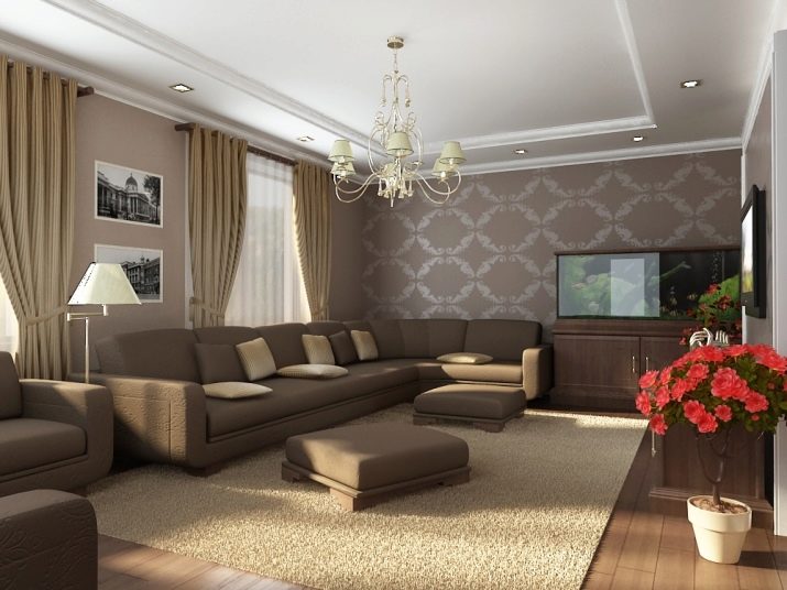
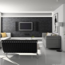
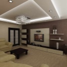
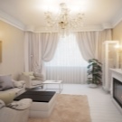
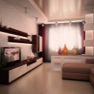
We take into account the size
The living room is 14 sq. m will not be able to use panoramic windows and put a fireplace. However, this does not mean that the tenants of old-built apartments cannot take advantage of the achievements of modern design. They just have to find a compromise between their aspirations and objective limitations.
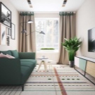
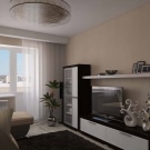
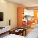
In a similar way, by the way, you can solve the problem of a living room of 12 sq. m in an old one-room or two-room apartment.
The lack of natural light is corrected by the addition of electric lamps. There should not be too many of them, it is important to clearly think over the location of each light source. You can apply:
- chandeliers;
- modern ceiling lights;
- perimeter lighting;
- table lamps or lamps placed on the floor.
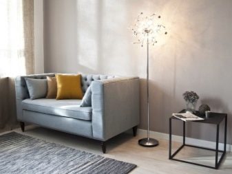
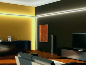
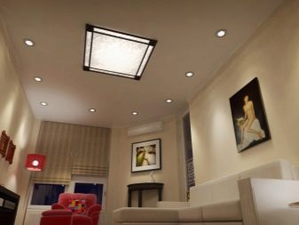
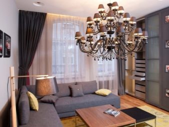
Mirrors are another effective technique for expanding space. They are mounted near doors or occupy a certain part of the walls. Of course, light cold tones in the decoration of the walls and ceiling will also contribute to the visual expansion. The floors in the room are 12 or 14 sq. m most often have comfortable natural colors. As for furniture, compactness and practicality are very important for it.
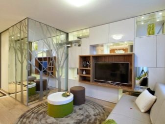
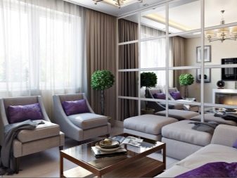
It is unacceptable to use furniture that is not directly necessary. Cabinets are almost always abandoned. If they are still used, then they choose the most compact options with mirrored doors. They act differently when the living room area is 22 square meters. m. On such an area, you can organize 2 or 3 sleeping areas and even use the remaining space for a multifunctional guest area with thoughtful storage of things.
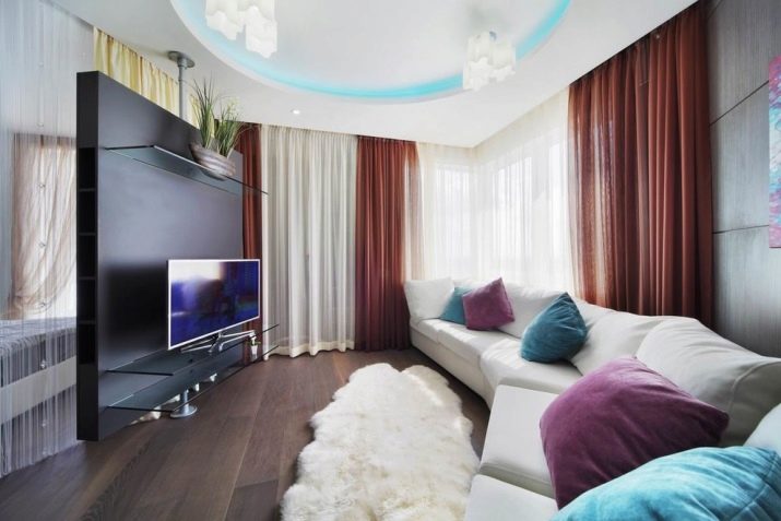
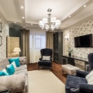
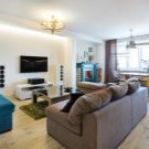
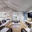
This result can be achieved even without dismantling the load-bearing walls, simply by zoning the space according to a clear pattern.
For the most complete use of the area, it is advised to use built-in furniture. Lighting is clearly divided into zones so that those in each of them do not interfere with other people. But now we need to return to living rooms with an area of 12 sq. m (or 13 sq. m - the difference is small).
On such an area, it is quite possible to realize your intentions and embody almost any design direction. Visual expansion is achieved with:
- light finishing materials;
- stretch ceilings with a glossy sheen;
- the correct selection of patterns on the wallpaper;
- rejection of walls and large cabinets.
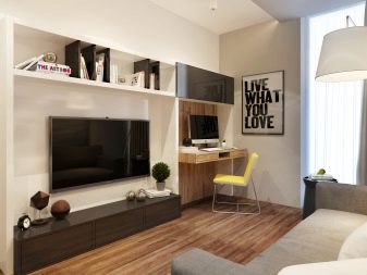

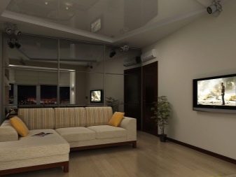
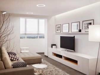
Work and leisure areas are mostly performed in the same style. Abrupt transitions are unacceptable. Although it is not necessary to use only one color, it is required to choose a uniform color scheme.
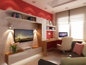
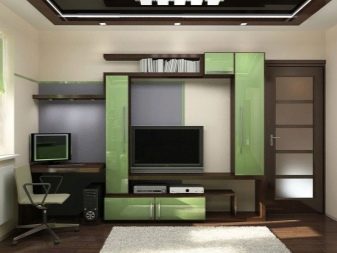
When adding color accents, the aspect ratio cannot be ignored. It is worth considering how to gracefully beat the partitions.
This can be done using:
- bar counters;
- dining tables surrounded by chairs;
- decorative columns;
- sliding panels;
- flower stands and other similar solutions.
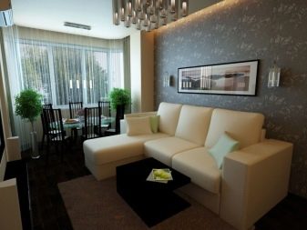
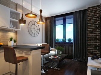
For information on how to properly equip a small-sized apartment, see the next video.
Now let's look at how to decorate a room with an area of 18 to 20 square meters. m. A living room of this size must have a well-thought-out ceiling. A properly implemented ceiling system will immediately change the visual perception of space. It will seem more spacious and luxurious than it actually is.It is very important to think about the ratio of light and shadow, about normal lighting. Its illiterate use in such an area very often provokes the appearance of dull interiors.
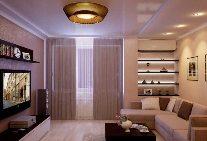
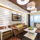
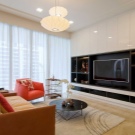
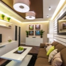
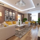
Many designers believe that in a living room of 18-20 m² you can forget about clear plans and programs. They recommend to arrange furniture "on a whim", starting from comfort and personal opinion. It is advisable to use beige tones. The use of paintings, interior lamps and a variety of decor is encouraged.
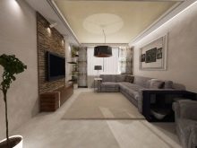
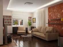
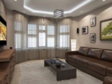
But there should not be too many such elements, otherwise the impression will be hopelessly ruined.
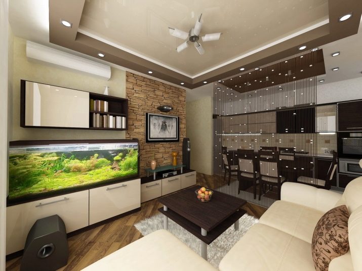
Experienced decorators recommend in living rooms with an area of 17-20 sq. m each surface to arrange in stages, starting from the ceiling. In finishing, the unconditional emphasis is placed on the lightest colors. Wall covering should be oriented towards the visual expansion of the room. The floor is also covered with a light coating, ideally they reproduce natural wood (if the budget does not allow using it in its pure form). When it is not possible to make major repairs, the following requirements are imposed on the living room:
- equipping with open shelves and medium-sized coffee tables;
- preference for transforming furniture;
- choice of modernist or ultra-modern styles;
- change of swinging doors to sliding ones;
- the presence of an open window opening (with its simultaneous filling with light).
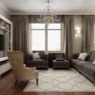
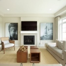
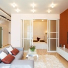
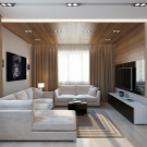
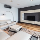
Now let's see what the lucky ones can do who got a living room of 25 sq. m. A variety of zones can stand out in this room:
- canteen;
- study;
- rest corner;
- personal library and a number of other options.
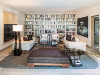
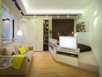
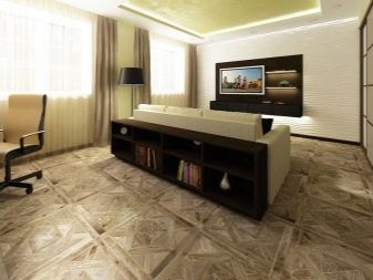
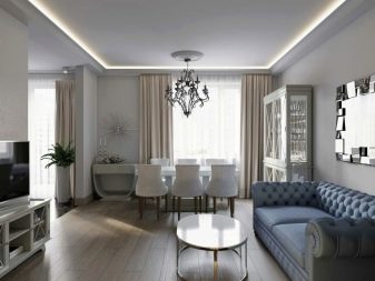
The guidelines are the lifestyle, needs and tastes of the people themselves. It is worth noting that it is more difficult to choose a suitable design option for a narrow room of 25 m² than for a square living room. Natural lighting must be taken into account, according to which the dominant color gamut and the need for lamps are determined. Living room style 25 sq. m can be anything, they select it strictly individually.
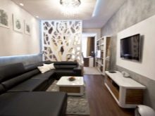
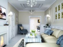
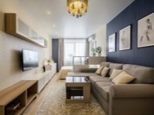
The stylistic features are the same as in rooms of a different size.
Finally, it is worth considering the arrangement of a living room of 30 sq. m. In such a room, you can implement a variety of ideas, including making everything original. However, you will have to act very clearly and thoughtfully, achieving a harmonious combination of comfort, functionality and stylish appearance. It is categorically unacceptable to allow the appearance of voids and deviations from the main style.
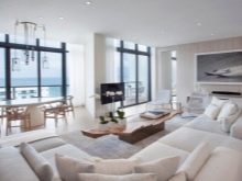
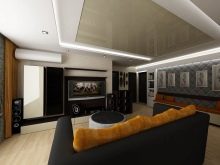
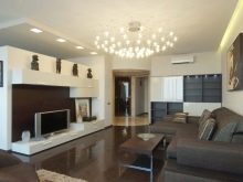
An alcove or deep niche can be used to accommodate built-in furniture. Since the spacious guest room excludes the appearance of corridors, closets, you will have to provide special areas for storing things. In a one-room apartment, you will definitely have to add a kitchen, sleeping and dining area to the hall. Therefore, you cannot do without a powerful hood. Household appliances should be as quiet as possible, and easy cleaning will be an important requirement for the materials of all surfaces.
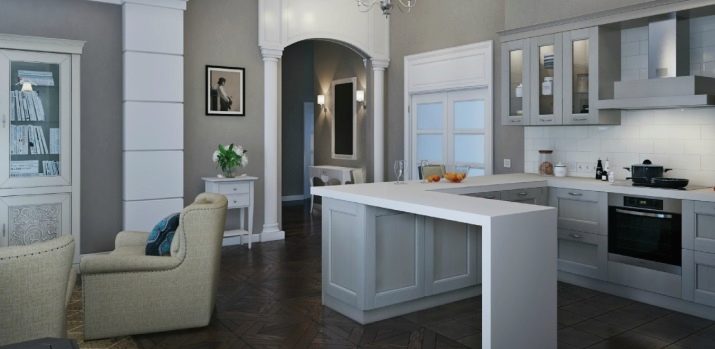
Otherwise, dirt and grease spreading from the kitchen corner will be a serious problem.
How to zone?
The zoning of the hall in the apartment is mandatory, only its role is different. In a small room, zones are allocated for the most functional use of limited space. If the area is very large, division into sections avoids an overly monotonous impression. In most cases, 2 zones are distinguished. Division into 3 sections occurs much less often, and the selection of 4 or more fragments is practiced in isolated cases.
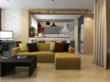
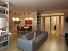
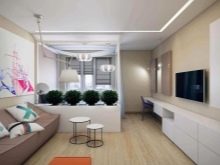
For distribution into zones, you can use corner sets. A similar solution is recommended for separating the kitchen and guest areas. The back of the headset is painted in the same tone as the walls, or wallpaper is pasted. But much more often they use a bar counter to separate the kitchen from the living room.Most often, the breakfast table is used for both design and practical purposes.
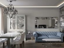
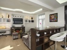
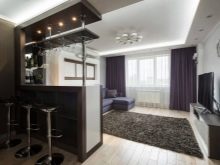
If you do not want to mount something, you can resort to separation of color contrasts. They try to make the kitchen segment lighter, and the guest segment is painted brighter. This step will help to visually enlarge the space and cope with the cramped space, even on an area of 18 m². When the living room and dining room merge in an apartment with a small kitchen, a composition of a dining table and chairs is used for zoning.
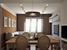
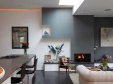
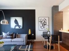
At the same time, the creation of opportunities for comfortable leisure will be a plus.
Other items suitable for separation in this case include:
- light shelving made of transparent materials;
- aquariums;
- dressers.
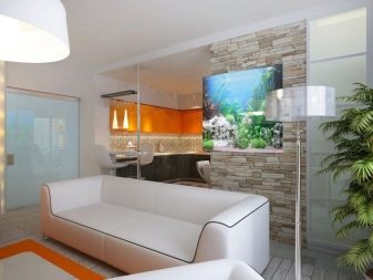
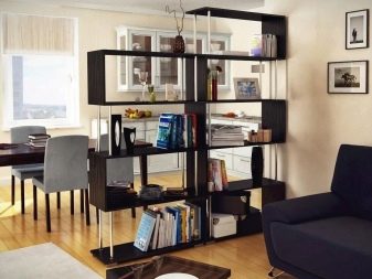
When the living room is 20 sq. m and more are combined with the sleeping area, there will be a lot of opportunities for zoning. Physical separation is achieved by using curtains of various fabrics. Along with regular fabrics, lightweight tulle can also be used. The choice largely depends on the surrounding interior. But it is worth mentioning another way of dividing the sleeping and living areas: installing a double-sided shelving unit.
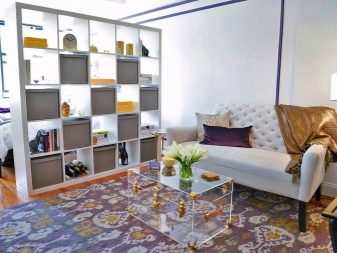
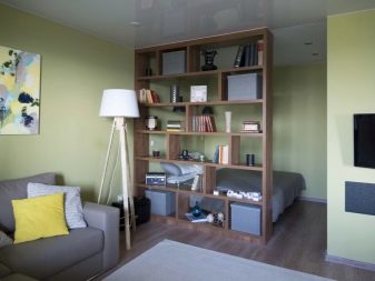
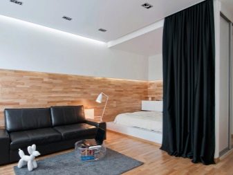
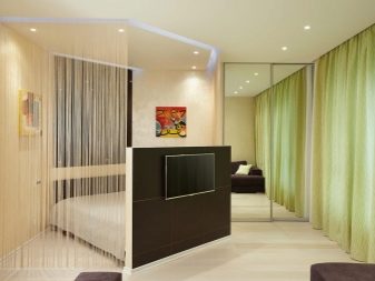
In one part of the room, it will become a bookshelf, and in the other - a simplified wardrobe. Partitioning with glass partitions is considered a modern and stylish option. However, a cozy atmosphere can be guaranteed only by combining them with:
- curtains;
- folding screens;
- racks.
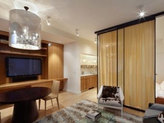

The hall can be combined with a nursery. But in this case, you will have to think about where the toys will be placed, and where the play area itself will be located. Both of these areas should be clearly separated from the guest space. In relatively large (from 20 sq. M.) Rooms, the separation of zones is achieved by partitions. In this capacity, curtains or sliding doors are used.
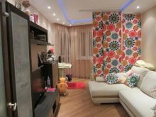
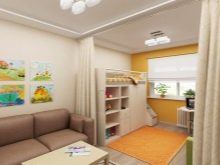
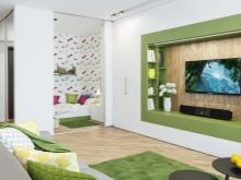
The simplest option is considered to be the isolation of the cabinet corner. But it should also be approached thoughtfully. The very design of the working area takes place most often in the corner by the window, where the desk and chair are placed. You can increase the isolation of this place by installing light shelving or partitions, high stands with flowers.
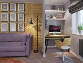
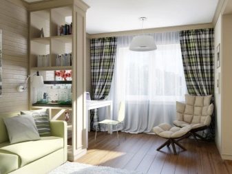
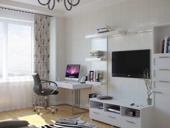
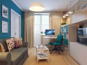
A sliding door can also be installed in the partition.
Style solutions
It is very important to decide on the style of interior decoration in the hall. You will have to go there at least once a day. In most cases, the living room is visited even more often. That's why preference should be given to solutions with a calm atmosphere and comfortable furniture... Too pretentious old and overly avant-garde compositions are equally unacceptable.
- Recently, design in the spirit of fusion... It implies a harmonious union of dissimilar styles. Fusion is also characterized by the elegance of its design. It is possible to combine animal skins, masks from different ethnic traditions and sophisticated elements. But we must not forget that expressive details should not violate the overall harmony or create a contradictory feeling.
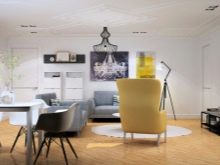
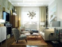
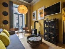
We'll have to put up with the fact that the atmosphere in the spirit of fusion is quite difficult to create. Only trained people with a delicate aesthetic taste can implement this program. It is enough to make a single mistake, and as a result, another absolutely tasteless room will appear. A very complex and sophisticated system is hidden behind the seeming chaos.
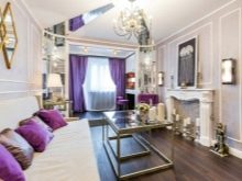
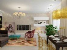
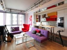
It is sometimes impossible to catch the connection between individual elements.
- Another attractive modern style of the apartment hall is the loft. Everyone knows that it is characterized by the use of rough, unfinished walls, but there are other features. The areas in the living room are decorated in different colors. Usually the sleeping area is made darker. Bright colors are used for the dining area.

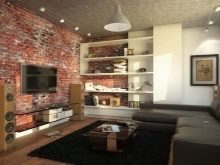
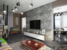
The floor is allowed to be decorated with wood materials or covered with a carpet.The ceiling in a loft-style room should be painted the same way as the walls. This solution will ensure the completeness of the interior. It is recommended to use beds with wrought iron details for the sleeping area. They usually try to delimit the functional parts of the room with book shelves, often complemented by antique decor.
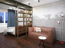
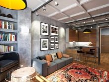
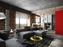
A living room with an office in the spirit of a loft can be filled with:
- books on the shelves;
- statuettes;
- collections of souvenirs.
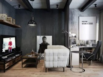
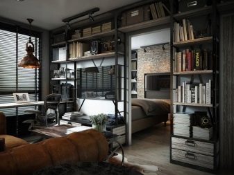
To decorate the premises in the spirit of a loft, carpets and other elements that meet personal taste are used. Another indispensable feature of this style is the use of as much advanced technique as possible.
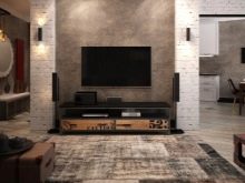
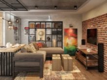
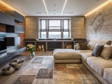
Plasma TV with a large screen diagonal is quite appropriate.
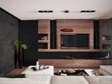
- As for the popular minimalist environment, it is recommended to focus on the following features:
- products and decorative elements with the purest tones;
- using simple looking accessories;
- geometric correctness of individual elements;
- furniture design in purely natural colors.
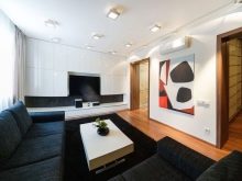
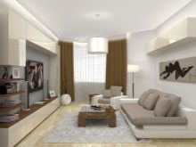
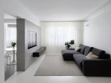
Curtains in a minimalistic living room are selected only by those that do not contain any patterns or visual decorations. Only a strict, laconic canvas will fully comply with the design canon. Linen, cotton, light muslin will be almost the best choice.
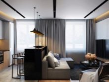
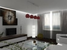

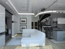
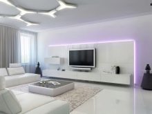
- Similar to minimalism and high-tech style. However, this option uses more shiny metal surfaces and other catchy elements, if only they emphasize technological excellence.
Materials and colors
An almost flawless way to decorate a room is to use wallpaper. They are not inferior to even the most modern materials. Design options using wallpaper combinations are widespread. It is not necessary to combine just their different types: sometimes the difference is expressed in color or used ornament. If wallpaper is used, it is worth highlighting one wall for them, which should not be overlapped by furniture or other decorative details.
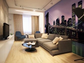
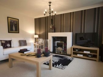
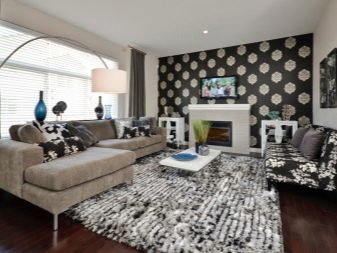
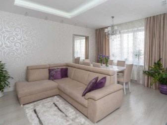
But you can also decorate the hall with paint. It is applied no more difficult than wallpaper, while it is even more profitable in terms of saving useful space. The paint can have the shade that will be given to it when kneading, while the color of the wallpaper is immediately set in production. The high durability of the paintwork is very valuable for home owners with small children.
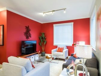
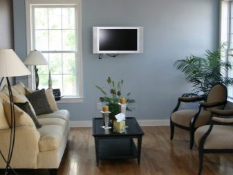
And if the coating does get damaged, it won't be too expensive to renew.
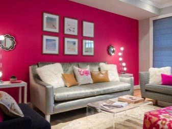
An attractive solution is the use of an accent painted wall that can increase the overall space. When choosing a paint, one should be guided not only by the dimensions and stylistic orientation of the room, but also by its position in relation to the cardinal points. Light, the brighter light colors are recommended for expanding the space. It is also necessary to take into account, however, that an extremely flat work surface must be prepared for the paint. This is especially important when creating glossy coatings.

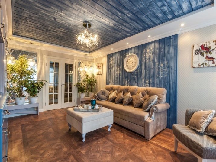
Clapboard and drywall are very popular. Walls covered with clapboard look very attractive and create a favorable impression. For the greatest savings, it is recommended to use pine-based lining. But this solution will not work if the kitchen area is highlighted in the living room. Pine fibers do not tolerate moisture and strong heat well.
As for the colors, then dark tones should be approached as carefully and thoughtfully as possible. What looks attractive in a photograph will not always be perceived in real life as well. Designers also warn against the enthusiasm for red when decorating halls. If the windows face west or northeast, it is advisable to use tones from beige, cream or honey palettes.
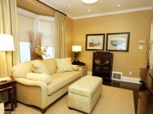
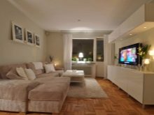
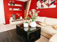
These colors will make the room look more optimistic.
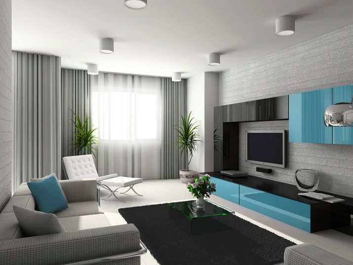
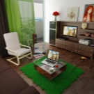
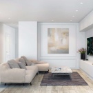
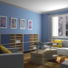
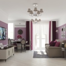
The beige color is considered universal and suitable for almost any style.It adds coziness. Gray colors are better suited for living rooms in the spirit of loft, modern. But even in a classic environment, it is quite appropriate. You can take a closer look at other tones:
- lilac;
- blue;
- white;
- green;
- yellow.
Selection of furniture and curtains
The decor in the living room depends not only on the style and color, but also on the furniture used. Its optimal composition includes:
- sofa;
- pouf;
- armchairs;
- chairs;
- TV stand;
- coffee table;
- modular set of racks, walls, shelves and drawers.
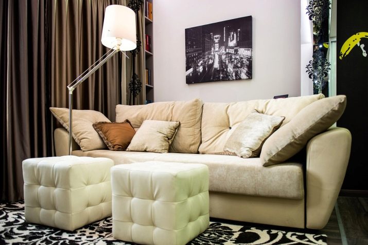
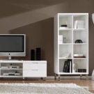
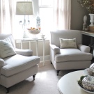
To properly equip the hall, you need to think about the dimensions of the upholstered furniture. In a small space, only two seater sofas can be used. Only with a large area can ottomans and armchairs be installed. Modular sofa designs are recommended for medium sized rooms. They can be placed in different corners of the room.
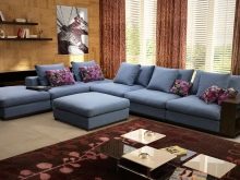
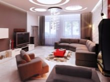
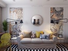
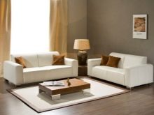
Combining a pair of medium-sized double sofas is also considered a good choice. The smallest rooms have 1 sofa and a couple of bean bag chairs. The back side of upholstered furniture in the living room should not have rough seams and plywood parts. As for the walls, it is quite pleasant to use modern models.
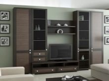
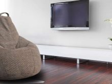
They are significantly improved compared to previous models, which were produced before 1985.
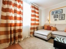
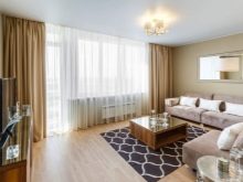
You need to know not only about the furniture, but also about the curtains that should be used in the hall. For northern windows, it is advised to use organza canvases. To visually increase the height of the ceiling, it is recommended to use a fabric with vertical patterns. A horizontal pattern is better for expanding the room.

Lighting
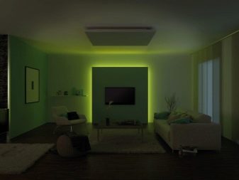
In the living room, as in other rooms, general and local lighting is highlighted. Those parts of the room that should be made higher are illuminated as efficiently as possible. It is also necessary to take into account the color of the lamps. Blues and blues are calming, but objects may not look very pleasant in this light. It is much more correct to use green lamps.
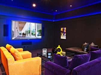
The red color of the lighting is controversial. Its light shades contribute to a positive attitude and focus attention. Dark options, on the other hand, will only create a sense of alarming uncertainty. Of course, the more naturally the room is lit, the better. "Natural" is expressed in the fact that the illumination should decrease as the transition from higher to lower tiers.
The ceiling, like the sky, is illuminated as much as possible. The walls are weaker, and the floor does not need any special lighting at all. The use of very bright, "blinding" lamps is categorically unacceptable.
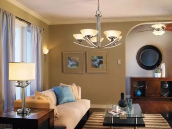
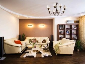
It is recommended to give preference to models with manual or automatic regulation. And one more tip - the most organic structure of lighting is created when it matches the distribution of tones in the room in terms of light temperature.
Decorative elements
Decor is the last (but not most important) design element on the list. A classic is the use of pictures and posters. You can get rid of the routine of their perception if you carefully choose the style and color of the images. An equally attractive option is the use of photographs.
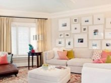
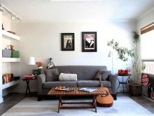
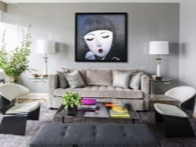
The choice of a frame by its appearance is no less important than the selection of a suitable image.
In recent years, the renaissance has experienced such decoration of the walls of the hall as embroidery. It will be especially appropriate in the interior, where there are other things made with your own hands. In a country setting, porcelain plates are recommended. To make them look individual, they buy blanks, and then paint them at home. Hanging plates with flowers are recommended for shabby chic style.
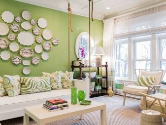
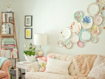
Beautiful ideas
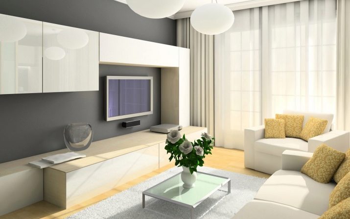
- If you need to decorate a hall in an apartment simply and without frills, you should take a closer look at this photo. The light yellow floor, diluted only with a light carpet, looks very attractive. The white sofa and slightly darker pillows on it do not create any design complaints.The noble color of the walls, interrupted only by dark yellow curtains, adds charm. A plant in a tub and objects grouped along one wall perfectly complete the composition.
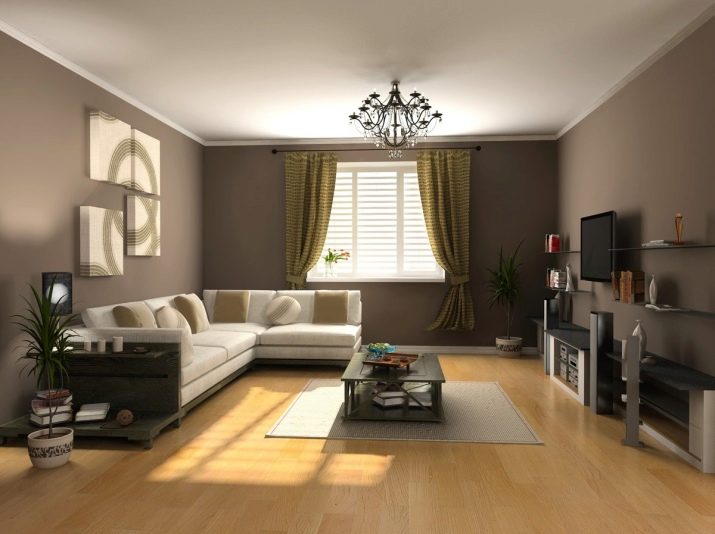
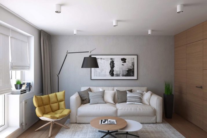
- An alternative option is presented here. Thanks to the use of a relatively low table, the space is not cluttered, the perspective is completely open. The gray walls and wood flooring form a very attractive contrast. The original furniture composition, placed close to the wall, makes the room even more interesting. It should be noted, of course, the abundance of sunlight.
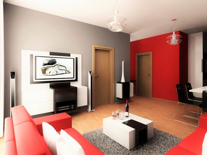
- And this hall clearly refutes the opinion that the red and black space will look too defiant. Due to the competent introduction of accessories and painting one of the walls in dark gray, it is possible to exclude all negative effects. The decorative objects and chairs of the original shape may not immediately catch the eye, but they definitely attract attention. A pair of equally spaced pendant chandeliers looks quite appropriate in this composition. And even the light wood door tearing apart the gray monolith of the wall does not make an alien impression.
For budget repairs and design of the hall in the apartment, see the video below.


