The choice of design for the kitchen 12 sq. m
A 12-meter kitchen is already good. If desired and skillful in such a space, you can place all the necessary equipment and furniture, and if guests come, then they can be seated so that everyone is comfortable.
The abundance of free space does not drive the owners into the framework of strict practicality, therefore you can try to beat this or that style so that the room is the pride of the household not only in terms of functionality, but also from a purely aesthetic point of view.
Fundamental rules
Modern full-fledged renovation has long no longer presupposes the banal re-pasting of wallpaper or simple painting of the walls anew - now it is customary to update the interior once and for many years to come. Since the procedure is done efficiently and once, it makes sense to do it thoroughly, starting with drafting - this is the only way to design a kitchen with an area of 12 sq. m will turn out to be complete and without distortions.
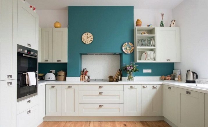
Not wanting to attract a professional who requires significant money for their services, you can try to draw up a project yourself, but then you will need to give yourself answers to a number of questions.
- How many people will your kitchen be designed for? You need to understand how many people can be accommodated there if necessary, so you should take into account both possible guests and potential addition to the family. It is clear that free space should not be obtained by cutting back on functionality, but functionality will also be meaningless if you are uncomfortable in such a kitchen.
- Will there be a dining area in the kitchen? For some, the kitchen and dining room in their own apartment are one and the same, and the hostess prohibits household members from eating anywhere other than this place. Others, on the contrary, do not see a way to place the dining table in the kitchen if the family is large, and in general they prefer to have a snack somewhere in the living room.
Still others were lucky: their dwelling is so large that there was a place for a separate dining room. In any case, placing a dining table in the kitchen or abandoning it is a few square meters of space.
- If household members do eat in the kitchen, do they all do it at the same time? The fact is that many families have a tradition - it is imperative that everyone get together for a meal at least on a weekend, if the schedule allows. Others follow a fundamentally opposite path - there everyone eats by himself. In the first case, you need a full-fledged dining area that takes up a huge space, in the second situation there is no need, because you can often limit yourself to even a modest bar counter.
- Do guests have a place in the kitchen? Each apartment has a special place where guests are most often brought - there is all the infrastructure in the form of comfortable seating areas and so on. When creating a kitchen project, you need to clearly understand whether the kitchen will be your residence for receiving visitors, because if so, the local dining area should be impressive from all sides.
- Is the kitchen just a place for cooking and eating, or something more? If you have as many as 12 squares there, then you can quite come up with additional functional responsibilities for the kitchen space. Housewives, who, in general, do not mind spending a lot of time at the stove, do not want to break away from watching TV - we need to give them that opportunity.
Someone in the kitchen is so comfortable that he would work here with a laptop - for this you need to allocate a separate small area. Young mothers cannot leave babies unattended, which means that it is necessary to provide a play area even in such a non-designated room. Finally, an aquarium with fish or green spaces will be an excellent decoration for a room, but they will also take up space that should be allocated in advance.
- What equipment do you need and where will it be located? One of the most common mistakes of the owners is that they forget to calculate the footage of the room, they get too carried away with the purchase of furnishings, and then everything that is necessary simply does not fit into the existing dimensions. In order to avoid such situations, think ahead.
- How many cabinets do you need? A comfortable kitchen assumes that a huge amount of food, utensils, and so on is stored here. There will be no place to store food - the hostess will have to spend too much time shopping, and trips to the store will become an overly frequent routine. If all the dishes cannot be hidden, the kitchen will always look cluttered. Accordingly, the boxes should be able to hide everything at once, and even with a small margin.
- Do you have (or are planning to) any pets? If yes, then the feeder is usually located here, since the kitchen is most susceptible to various contaminants, and additional dirt from careless eating by a cat or dog will not be able to greatly aggravate the situation.
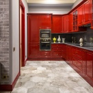
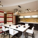
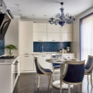
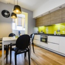
Finally, remember that no aesthetic delights should prevent the kitchen from fully coping with its main responsibilities - to be convenient for cooking.
All its other functions are secondary, so do not get carried away with the creation of a multifunctional zone, so as not to get a second living room with missing kitchen functionality.
Finishing features
The success or failure of the interior is largely determined by the finish, especially since it is its wear that most often becomes the reason for subsequent repairs. To make your design the most durable and practical, choose wisely.
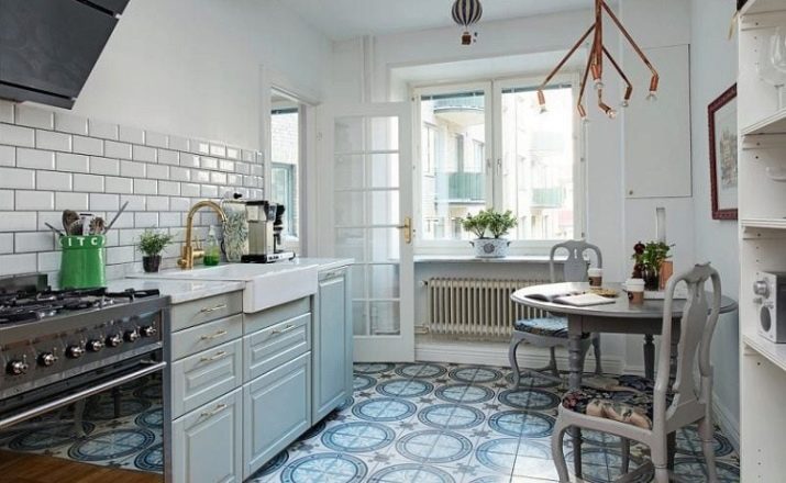
Perhaps the most serious stress in the entire kitchen, be it a private villa or an apartment in a panel house, is the floor. First of all, there is always a lot of water here - it gets here in the form of drops from sinks or boiling pans, in the form of settling steam, as well as as a result of cleaning in desperate attempts to wipe off other popular contaminants.
For this reason, the kitchen floor must be moisture resistant, so original ideas with parquet or laminate should be discarded immediately.
Among other things, the floor can also withstand serious physical exertion, and the problem is not even that you are constantly stomping in a confined space, but in the high probability of falling heavy objects such as a frying pan or a saucepan. In this plan the only really reliable option should be considered porcelain stoneware: even if you manage to split it, if you have a spare fragment, you can always do without a major overhaul of the premises.
As an alternative, by the way, any other ceramic tile is suitable - it is not so durable, but it also allows for a relatively simple replacement.
Decorating kitchen walls usually involves the use of several finishing materials at once. The reason for this is simple - different fragments of the wall experience completely different degrees of threat, for example, the space hidden by the headset is generally hidden from prying eyes, so a primitive painting with water-dispersion paint for this surface will be sufficient.
The same cannot be said about the apron, which is located closest to the sink and stove, and therefore is constantly exposed to splashes and hot steam - it is always made from the most resistant materials, such as the same ceramic tile, tempered plexiglass or metal plate.
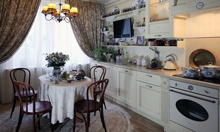
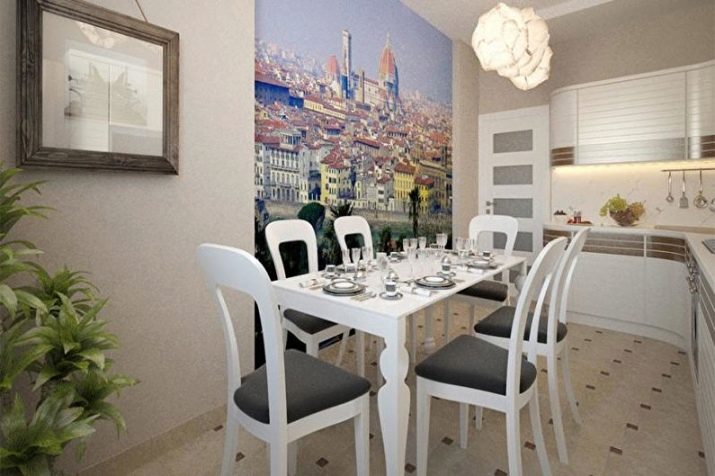
Finally, the wall farthest from the headset, which often has a dining area, is relatively safe, and attracts a lot of attention, therefore it is often decorated as an exception photomurals, for example, but if possible choose washable option.
In terms of finishing, the simplest choice of materials for the ceiling - there is simply not so great a choice, so the task seems simple. One of the most common modern solutions are stretch ceiling, prized for the uniformity of the surface to be created - it blends perfectly with most styles.
A slightly more interesting and modern solution is preliminary pasting of the surface. glass cloth, which is then painted - such a ceiling is not at all susceptible to the appearance of microcracks, which means that repairs will not have to be done in the near future.
In the pursuit of simulating believable ethnic and rustic designs, the ceiling can be decorated with decorative beams.
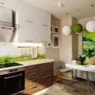
Arrangement of furniture and appliances
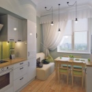
The 12-meter kitchen is also good in that it does not limit you in the process of drawing up projects - you can choose any layout option, abandoning overly banal ideas on how to furnish a room. Much also depends on the shape of the space, but in general, the kitchen set can be positioned in 6 different ways.
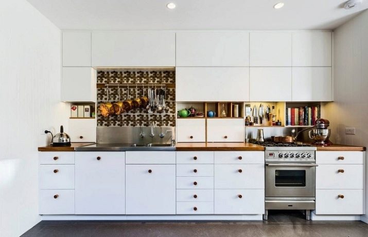
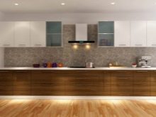
- Single or linear kitchen represents a classic layout option, when the entire working area is one straight line, entirely located along one of the walls. Accordingly, the table is installed most often against the opposite wall, and the space between them serves as a passage. Often, such a project is preferred in elongated rooms, as well as in the case of combining a kitchen with a living room.
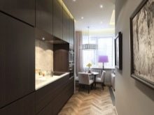
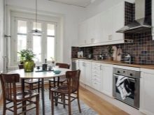
- Double row option the arrangement of the headset is appropriate in a rectangular or even square kitchen, when it is advisable to equip cabinets and appliances along two opposite walls.Experts say that in no case should the passage be narrower than 1.2 meters (this is required by fire safety), but for adequate placement of the dining area, its width should be even greater - from 2 meters. If you do not have so many free squares, you will have to equip the snack area on the bar counter.
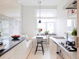

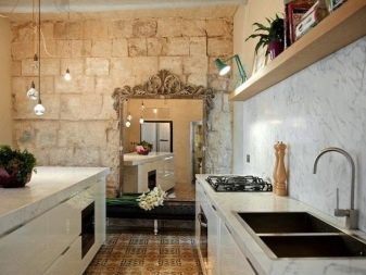
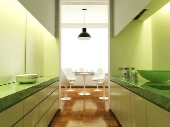
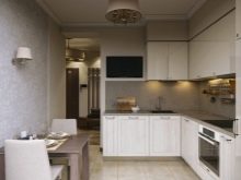
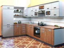
- L-shaped or corner kitchen lately it is considered both the most convenient and the most demanded. Its convenience is based on the idea that the working area should have the shape of a triangle - then everything you need will be at hand and you will not have to stretch, or walk back and forth, or spin in place. Another advantage of this layout is that you can arrange furniture and appliances in the shape of the letter "L" in a room of any shape. A refrigerator that does not fit into the main row is often used as a short stick.
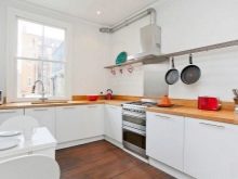
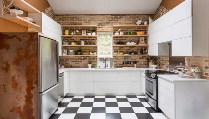
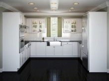
- U-shaped layout also uses the concept of a working triangle, only here there are already two of them at once. This arrangement is appropriate if the window is located opposite a door or a wide arch - then the tabletop is located directly under the window, while being connected to the "wings". It is necessary to plan a two-winged structure so that it is convenient to reach everything, therefore experts advise the following parameters: the length of each of the wings is 1.5-2.5 m, the length of the "crossbar" is no more than 2 m.
Keep in mind that furniture will even take up too much space, therefore, most often such solutions are appropriate in studios.
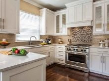
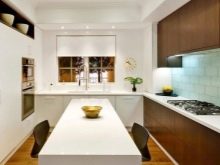
- C-shaped kitchen resembles the above-described U-shaped, but in this case one of the wings is shortened and bent towards the center of the room, forming the so-called peninsula. This bend usually turns out to be either an extension of the countertop, or a bar counter adjacent to the headset, but giving access from three sides. If you do not have a clear idea of why you need a peninsula so much, then in a 12-meter kitchen it is better to refuse it - it has too many disadvantages, including blocking the space, especially in narrow rooms.
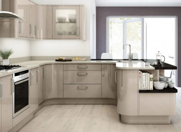
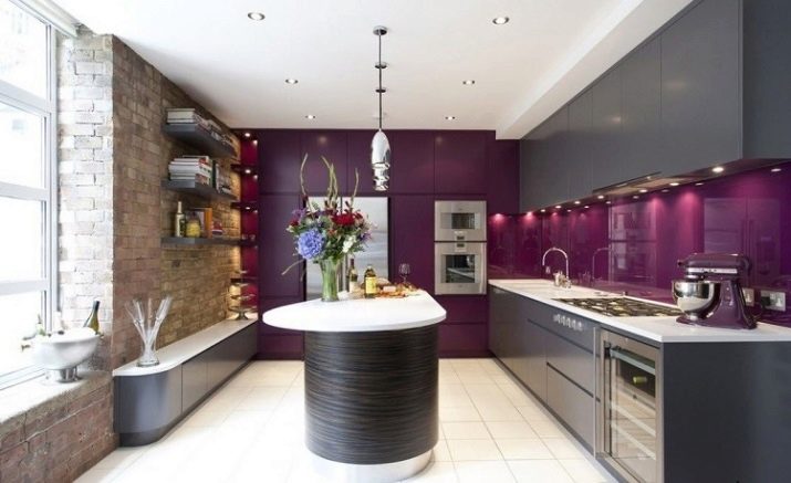
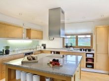
- Kitchen layout with an island can be considered the most atypical, since part of the workspace is located completely separate from the main headset and does not adjoin any of the walls or, in extreme cases, only touches the wall with its narrow edge. The easiest way to equip an island is to use it as a dining table or worktop, including with hidden drawers inside for storing food and utensils.
Much more unusual performance should be considered organization of a sink or stove on the island, but in the first case, you should provide for a way to connect the water supply and sewerage system, and in the second, think over the installation of an extractor hood in the middle of the room.
Choice of shades
Choosing a color scheme for the kitchen, you should not focus only on your own preferences. So, experts usually do not advise making a choice in favor of colors of a cold palette - it is believed that they have an overwhelming effect on the psyche, and with it on the appetite. In the kitchen, either light colors or neutral warm are much more appropriate, and yet each of them has its own specifics.
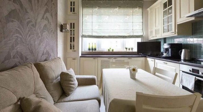
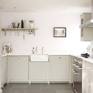
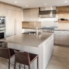
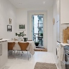
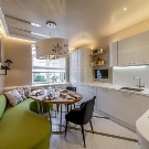
White is traditionally used to visually expand the space and add non-existent squares to it. With an area of 12 square meters, this is not necessary, but whiteness is the perfect backdrop for any brighter accents. The only drawback of this color is its associativity with a hospital or laboratory interior, but you can get rid of this impression with the help of natural wood inserts.
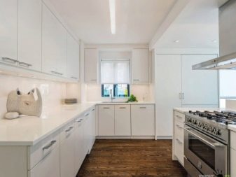
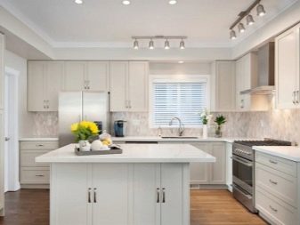
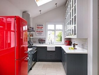
Gray tone is also quite popular., but it is often due not so much to color preferences as to the active use of steel surfaces. Those in the kitchen show themselves from the best side, because they differ in strength, durability, and even hygiene.Glossy surfaces look stylish, and even give the interior extra breadth if you suddenly need it.
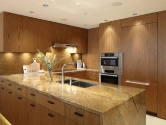
Brown kitchens are popular for the same reason as gray ones - in this case, we are talking about imitation of wood., which is still one of the most popular materials and is subtly associated with home comfort for many people. Natural wood is hardly practical to use in the kitchen, since it will not last long, but modern manufacturers can offer any other material that plausibly looks like an array.
Designers point out that it is better not to delve into the depth of color, otherwise a too dark design will negatively affect appetite and will produce an overall depressing impression.
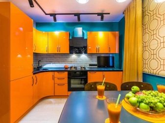
Yellow or orange decoration - this is an emphasis on the fact that in the kitchen you should always feel cheerful and cheerful. In humans, these colors are associated with sunlight, delicious southern fruits and beautiful flowers, therefore, in their environment, the tone inevitably increases. So that the interior does not dazzle in the eyes, it can be "cooled" with the help of black and white colors and blotches of other colors listed here.
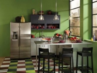
Green has a similar and dissimilar effect at the same time. - it does not invigorate, but soothes, but at the same time it is still directly related to an increase in appetite. It is also recommended not to go into too gloomy shades here - light light tones look much better, it is possible with an admixture of yellow.
Style solutions
Since repairs in the kitchen are being done thoroughly and for many years to come, it makes sense not to slip into trivialities, but to thoroughly think about the style so that your kitchen will forever remain in the memory of those who have attended it at least once. For this reason, it is worth considering the main stylistic ideas that are relevant today in the design of the kitchen.
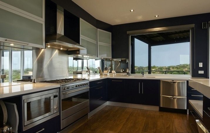
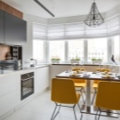
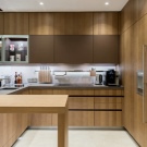
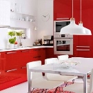
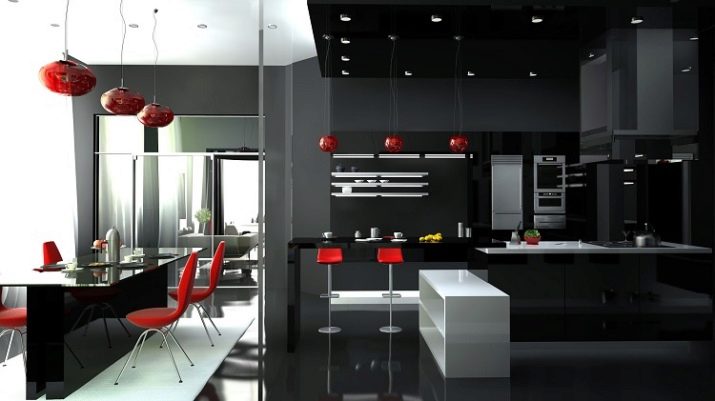
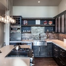
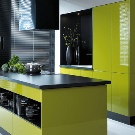
Many owners today prefer modern styles such as minimalism, hi-tech or even futurism. There is no place for beautiful trinkets that only distract attention - the kitchen was created for performing work operations, therefore the emphasis in design is on practicality, and beauty lies in simplicity.
There is no room for either textiles or flowers (be it living plants or patterns on the wallpaper), and neutral and monochromatic options prevail in the colors.
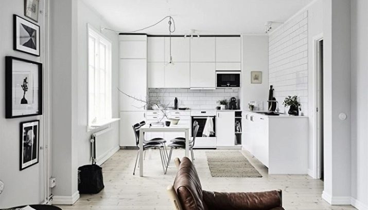
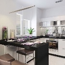
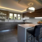
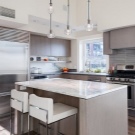
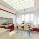
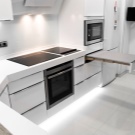
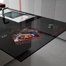
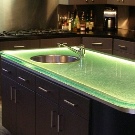
Materials that are as durable and easy to maintain as possible are metal, plastic, glass and stone. Of course, with such requirements you will in no way do without good technology, and if for minimalism it is simply needed, then to fully display the high-tech style you simply have to spend money on the most fashionable and functional novelties like some kind of touch-sensitive tabletop.
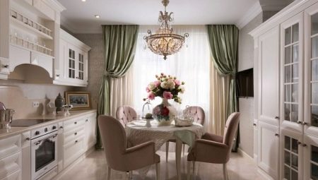
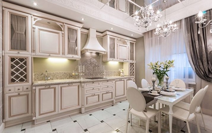
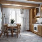
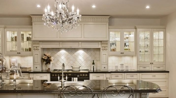
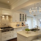
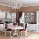
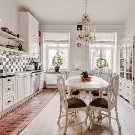
The classics, of course, have not gone anywhere either. In the classic style, the emphasis is on the chic interiors of the rich houses of the past, so the owner who wants the old aesthetics will have to spend a lot on exclusive materials and numerous decorations in the form of the same stucco and wood carvings.
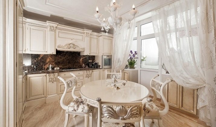
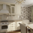
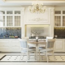
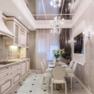
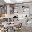
An expensive chandelier is an indispensable element of a classic kitchen, in addition, your interior must look expensive. It will be especially difficult to fit modern technology into the old design, but some manufacturers still meet the needs of lovers of everything elite and produce limited edition retro models.
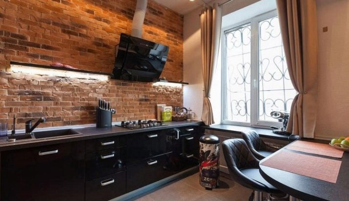
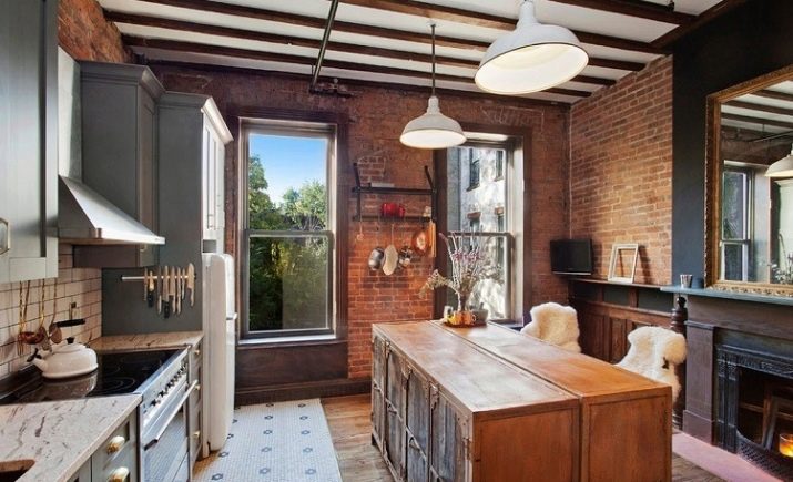
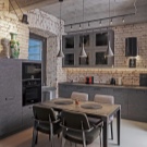
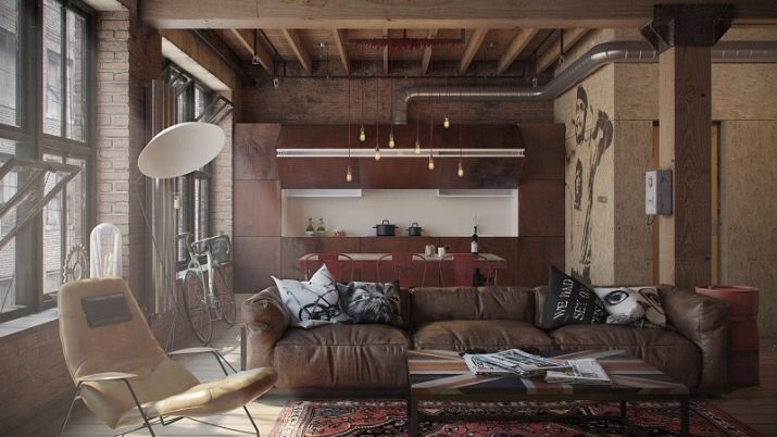
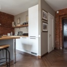
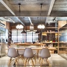
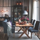
Separately, it is worth highlighting the loft style, which is not even roughly similar to most other styles. The direction began as a decision taken out of despair, because its very name in translation means "attic", and this style was used when converting abandoned industrial enterprises into inexpensive housing.
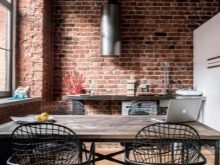
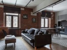
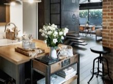
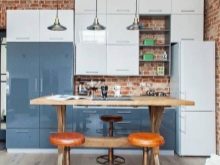
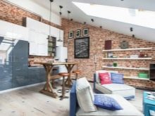
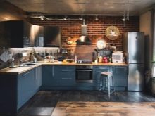
Over time, austere aesthetics, combined with a clearly visible desire to embellish the ugliness, became so in demand that even ordinary apartments began to be adjusted to the loft standards, especially since in the kitchen all these brutal brick walls without finishing and not hidden pipes turn out to be very practical.
Beautiful examples
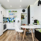
Among all the design options, it is most popular today. modern style, not spoiled by decorations, but not forcing the creators to worry about how tricky to decorate the room.
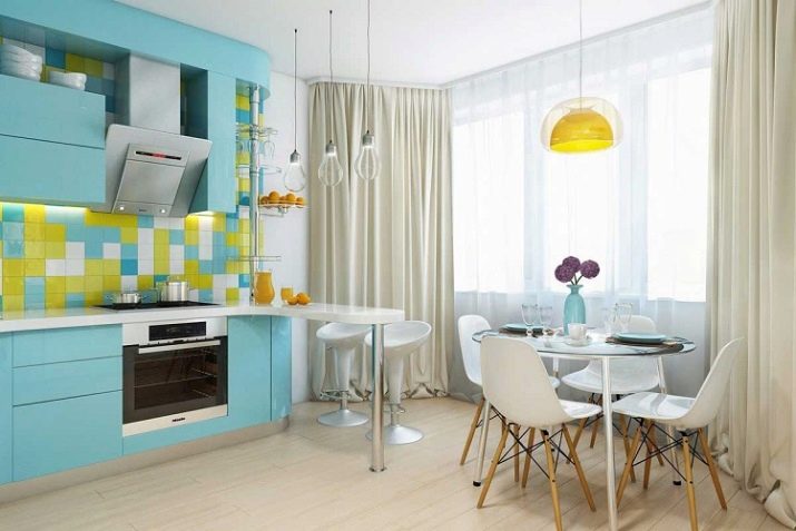
Restrained correctness is good in itself, but if you still need to dilute it a little, you can solve the issue with the help of an abstract colorful apron.
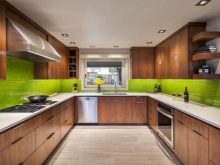
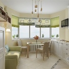
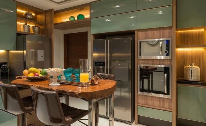
To ensure real coziness, it is often not so many decorations and trinkets that help correctly selected colors... Just take a look at this kitchen - there are no specialties in it, but its natural design, starting from the combination of green and woody brown with a little splash of cheerful yellow, leaves only a positive impression.
The harsh loft is to a greater extent designed to please men - it finds a response in the soul, which requires not to chase after polish, but to allow itself to be a real brutal. If you do not go too far with brutality, having finished all the other walls “normally”, the kitchen will be well received even by those who do not consider themselves to be fans of the industrial direction.
