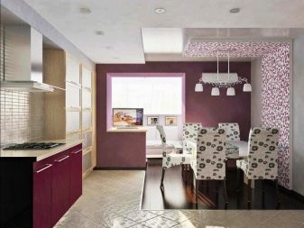
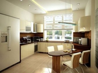
Kitchen design 16 sq. m: layout and examples of interiors
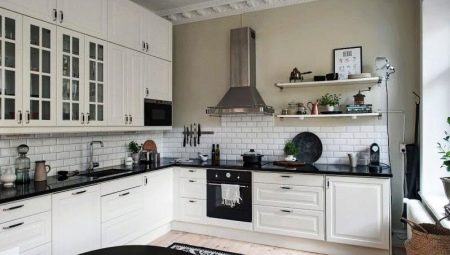
Kitchen design 16 sq. m is a very interesting task. This is a fairly large space that allows you to realize the most daring interior ideas, unusual layouts. This space allows you to work with almost any style - from modern to retro and baroque. In an apartment with such a kitchen, you don't have to worry about not having enough space for some equipment.
Without compromising on comfort, you can put a large refrigerator, place an area with a sofa and TV, a bar counter. It all depends only on your taste, needs and the chosen style. 16 squares is a great area to equip a kitchen-living room.
The biggest problem of such a room is the illiterate choice of furniture arrangement, when the overall picture looks uncomfortable, empty, incomplete. To avoid this, you must follow certain rules and take into account the recommendations of designers.
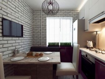
Layout
Depending on the shape of the room, style, your preferences, you can choose the option for arranging furniture.
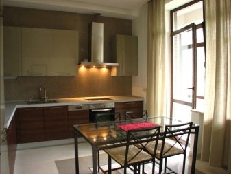
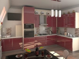
Corner kitchen. The most common option, especially good for a square kitchen. The area for work, according to such a project, is located along two adjacent walls. It is possible not to use both walls completely, ending one side with a bar counter, a peninsula. There is enough space left to beautifully furnish the dining group, the recreation area.
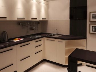
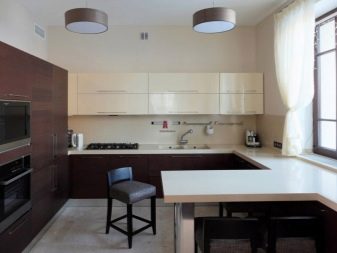
U-shaped kitchen. 16 square meters allows you to use the U-layout, which is only appropriate in large rooms. A huge plus of this arrangement is its spaciousness, a large number of storage sections, the most convenient, overall working area. In order not to clutter up the space, you should not arrange the headset from wall to wall.
It is enough to use completely one central wall, and make the side walls symmetrically.
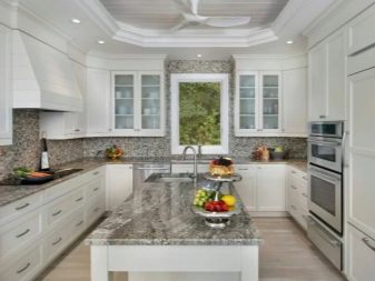
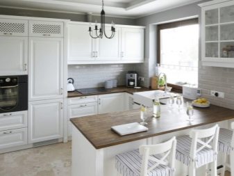
Ostrovnaya. Only allowed in large kitchens. In this case, in the center of the room there is a section separate from the wall section in the form of a pedestal table. It can accommodate storage compartments, equipment and even a sink. The main thing is to bring communications out. An island kitchen can optimize the functional triangle and make working in the kitchen more comfortable.
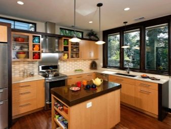
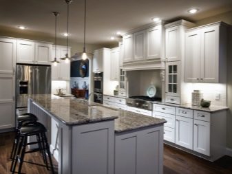
Linear. Not the most suitable layout for such an area, since it involves only one wall. In this case, the interior looks disproportionate, there is little storage space, and the working area is also small. But if you are focusing on a seating area and want to free up more space for it, this option is worth considering.
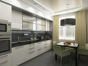
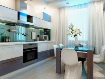
- Parallel. Suitable for elongated rooms, can occupy them in whole or in part. The disadvantage of this layout is that you will need to walk a lot from one wall to another. You can consider this option if you delimit the area for cooking and storage sections on different walls.
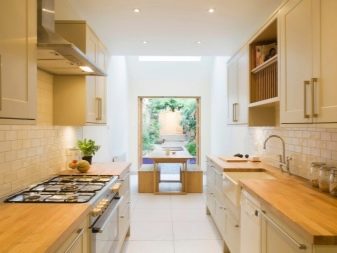
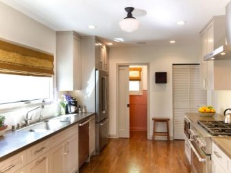
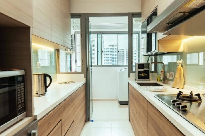
If the kitchen has a balcony, then regardless of the chosen layout, you need to arrange the furniture in such a way that it does not interfere with the exit.
Dining group and bar
In addition to the kitchen unit, it is important to choose and arrange the furniture in the dining area correctly. Sometimes it is replaced by a bar counter, however, such a square allows you to place both. Anyway one of the latest design trends - the allocation of the dining area, visual zoning... In a large kitchen, this can be a real mini-dining room, comfortable not only for family dinners, but also for receiving guests.
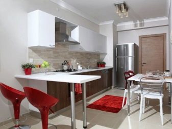
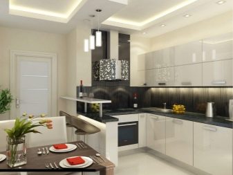
It will be correct to delimit the space with the help of colors, materials, finishes, lighting. The main thing is that the style is uniform, and the composition is harmonious. The bar counter can delimit the space. This design hit continues to be relevant. Since in the presence of a dining area, the functionality of the bar is not important, you can focus on decorativeness.
It can be connected to the work area and only serve as a zoning reception.
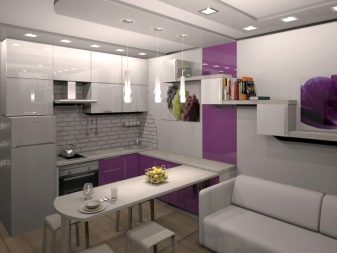
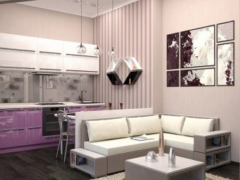
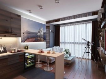
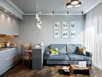
A sitting area with a TV is a very popular solution, in this case the kitchen also becomes a living room... This group can replace the dining room if there is a full-fledged bar counter, or connect to it. In any case, this area should be visually clearly highlighted, while not contradicting the general style.
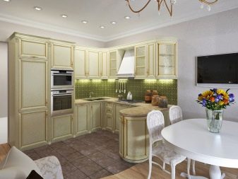
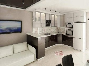
Style and color
Style is the basis of harmonious design; in a large kitchen, almost all styles can be used. A room of this size looks great both in modern variations and in retro styles. There are many popular and current styles, it is important to choose the one that will be close to you.
Provence. The style of the French province, which is dominated by pastel shades, white, floral motives and a cozy atmosphere. There is a lot of air and freshness in such a room.
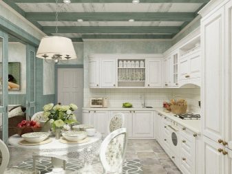
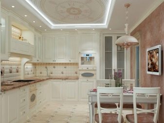
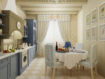
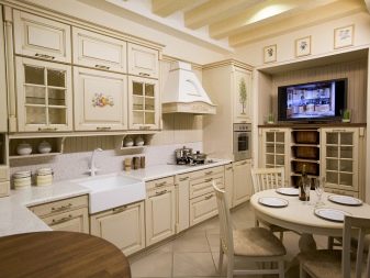
Country. Rustic style, as close as possible to naturalness. Natural materials are used, natural shades: brown, green, all tones of wood, stone.
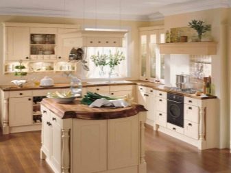
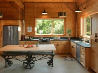
Scandinavian. Laconic and restrained, but very expressive style, which is loved for its simplicity and functionality. There are no pretentious elements in it, a lot of light colors. Accent colors are bright.
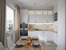
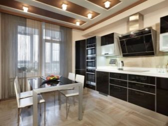
High tech. Contemporary style for those who prioritize functionality. Technique comes to the fore here, metal, glass and gloss prevail in the decoration. The color scheme is as restrained as possible, the decor is minimal.
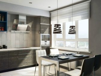
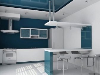
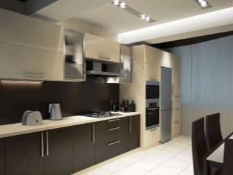
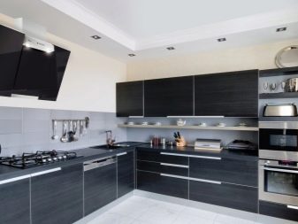
Classic. It never goes out of style. The lines in this style are smooth, the silhouettes are soft. Only natural materials are used in the decoration, and plastic and metal are prohibited. The color scheme is natural, combining light and dark shades.
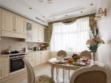
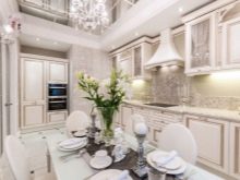
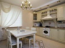
Minimalism. A very relevant trend, it uses only laconic colors: white, black, black, soft brown.Decorative details are practically excluded from the interior. The lines are clear, the silhouettes are geometrically correct.
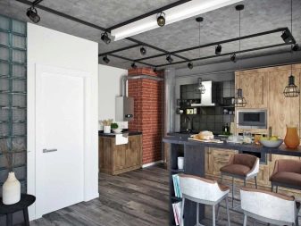
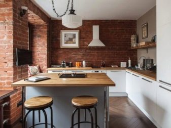
- Loft. This style can only be used in large kitchens as it requires space. This industrial direction combines rough finishes: brick, concrete, beams, plaster with metal, plastic, wood products. The color scheme combines neutral, versatile tones with sharp contrasting, vibrant details.
Designers advise to be careful with bright colors, acidic shades, as well as overly dark palettes. This kind of finish is psychologically uncomfortable, tiring and annoying. Observe the rule of three colors: primary, secondary and accent. The brightest and darkest tones should be presented in an accent version.
Be sure to consider the level of natural light. If the room has only one north-facing window, artificial light may not be enough. In this case, take care of additional light sources.
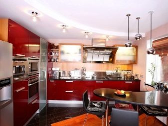
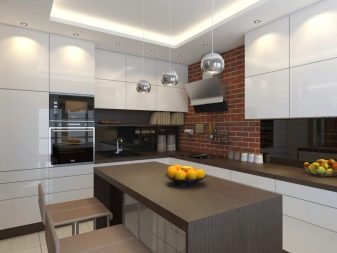
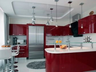
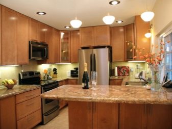
Finishing
In accordance with the general style and the intended color scheme of the decoration, choose materials for renovation. They should be not only beautiful, but also of high quality. Important qualities for finishing materials in the kitchen:
- moisture resistance;
- non-staining;
- ease of care;
- non-susceptibility to temperature extremes.
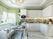
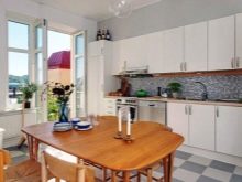
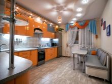
Ceiling
Choose the finishing material that is easiest to clean up when needed. Most often, a stretch fabric is used, it can be:
- glossy;
- semi-glossy;
- matte.
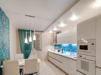
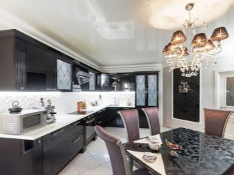
Mostly the ceiling is decorated in snow-white colors. You can consider zoning options using a multi-level ceiling. Remember that gloss increases space. Matte ceilings are more status, solid, suitable for retro styles, classics.
Walls
There are many variations, it is better to choose light shades for wall decoration, so as not to reduce the space visually. First of all, these are wallpapers that must be washable. In addition to wallpaper, consider tiles, wood paneling, and decorative plaster. You can safely combine materials, the main thing is that the look and color match the overall style.
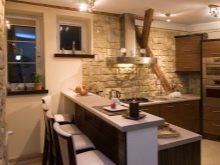
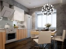
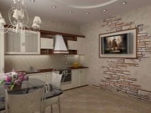
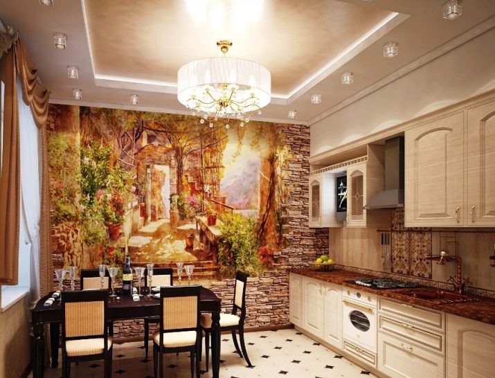
The stone finish and its imitation, photowall-paper looks very interesting.
Floor
The flooring must be durable, great for these purposes tile... However, it does not fit into every style, in addition, if it is not possible to install a floor heating system, it is not very comfortable. Also used with success laminate, linoleum. Floor covering can be safely used for zoning by combining different colors or materials.
