Two-tone kitchens in interior design
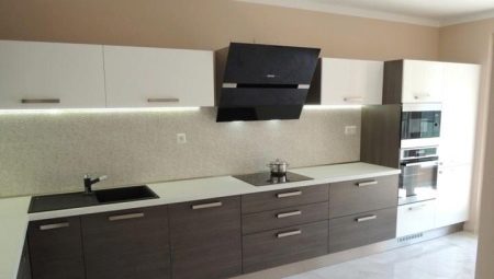
Two-tone kitchens are a non-standard solution for kitchen furnishing. Reserving the right to accentuate the space, they add a special color and temperature to it. In this article, we will look at how to choose the right color scheme and style for the kitchen furniture to look not only stylish, but also status.
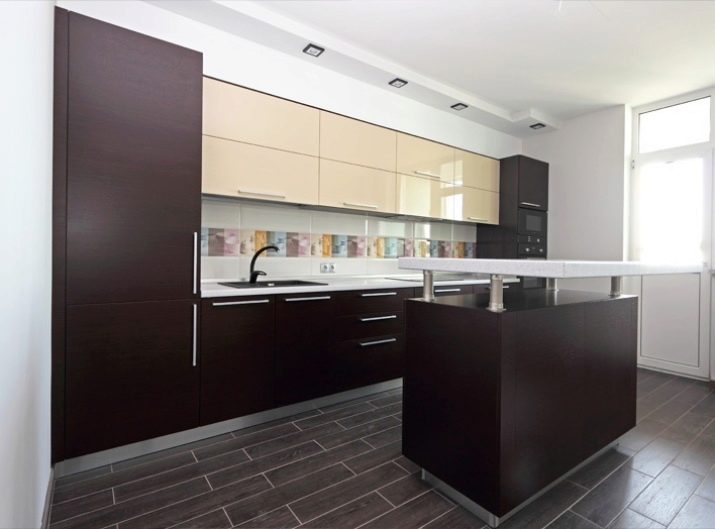
Color combinations
It's no secret that color has the ability to visually change space. By choosing the right contrasts, interior design professionals create a certain mood in the kitchen and emphasize the architecture of the room. This allows you to play up the drawbacks of the room, giving them the appearance of advantages. Each duet should carry a certain message.
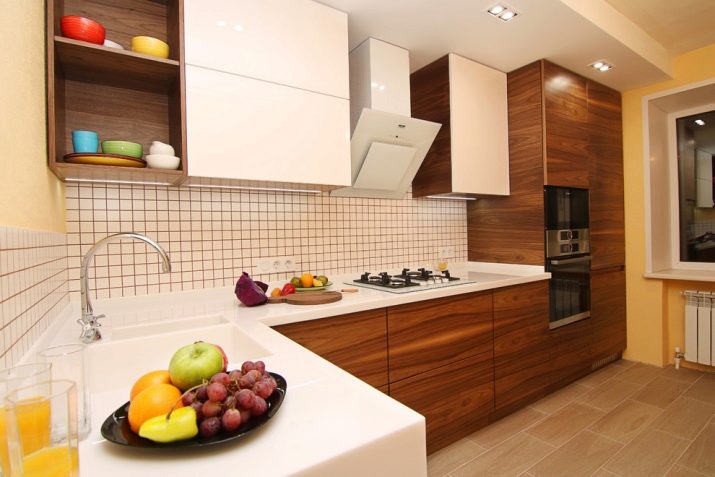
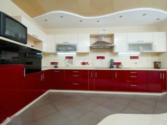
Dark bottom + light top
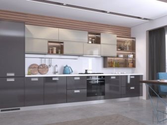
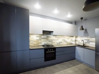
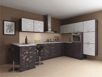
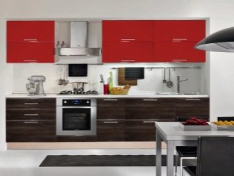
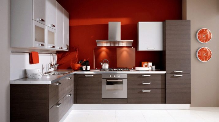
Today it is fashionable to choose models with a dark bottom and a light top. This allows you to visually erase the rigid boundaries of the walls, expand the space and raise the ceiling. An example of a perfect combination is the contrast between white and graphite. The set looks no less successful in the interior of the kitchen, the floor cabinets of which are made in brown, and the hanging drawers are in beige. The visual effect is similar, but the use of color tones creates a different atmosphere in the kitchen.
It is also fashionable to combine white with wine or dark pistachio, vanilla and turquoise.
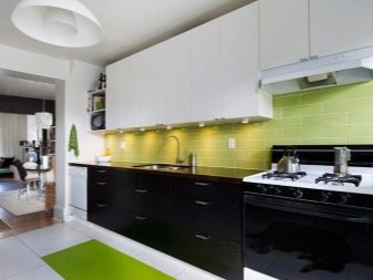
Light bottom + dark top
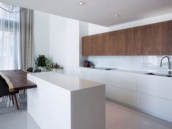
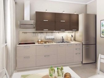
This solution is used less often, but with the right approach, it has every chance of becoming a highlight of the design. As a rule, they use a combination of chocolate, coffee with milk and beige. Black is undesirable here, since in the upper position it will put pressure on the atmosphere of the room. In general, duets of white with woody shades, aqua with light sand can be used here. These contrasts are carefully chosen, the colors used should be soft and muted.
Two-color facades
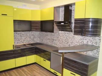
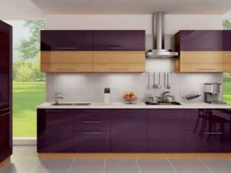
Two-tone furniture of this type looks unusual: both the upper and lower cabinets in it can be painted in two contrasting colors. Often, so that they do not merge into a single color spot, they are positioned with a certain pattern. For example, top cabinets can be created with two low drawers that contrast in color. Sometimes, when composing a furniture ensemble, the upper cabinets create a certain composition.
At the same time, the contrast is maintained at the bottom: these cabinets can also imply a certain arrangement with the condition that, together with the top, create the desired visual effect.
Accents on the main background
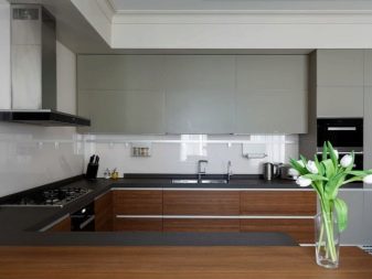
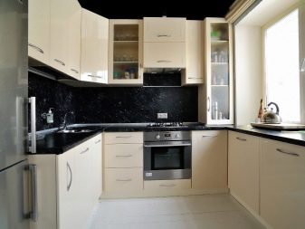
In addition to the models described above, its own group includes modifications, the color contrast of which is based on the play of the color of the facades with the color of the fittings (for example, cabinet handles) or elements of the ensemble itself (sinks, countertops, built-in appliances). The contrasting tabletop against the background of the line of light boxes looks expressive, emphasizing the geometricity of the headset and the linearity of the forms. The dark contrast against the background of light furniture also looks very nice.
Combinations of light colors
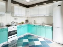
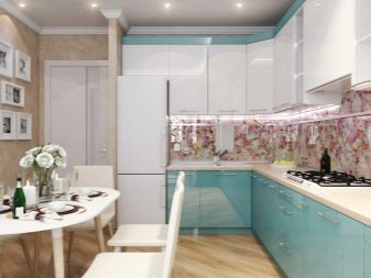
It is not at all necessary to buy a headset with a pronounced contrast to equip a kitchen. For example, you can bet on a duet of white with any shade of the color palette. It is neutral, and especially successfully combined with light tones (for example, pistachio, gray-pink, lilac, mint, whitish-turquoise, caramel, lime, lemon).
At the same time, contrasts can be very different: white top and colored bottom, neutral bottom and colored top, mixing colors in a certain headset composition, accentuating the islands, countertops, sinks, finishes with the color.
The best contrasts and texture
This season, interior design stylists suggest paying attention to the following color combinations of two-tone kitchens:
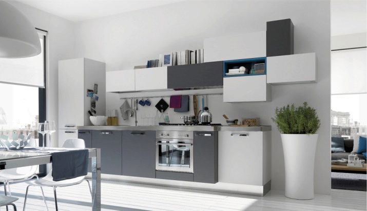
- white and steel (graphite, gray);
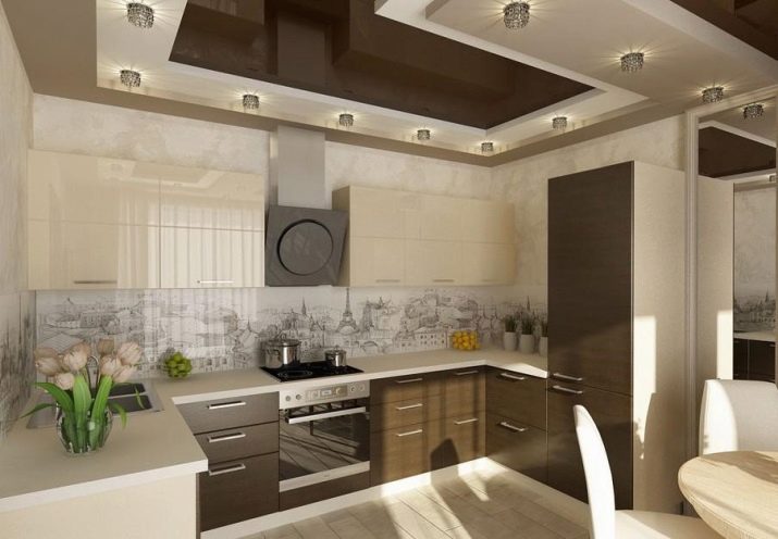
- vanilla and gray-brown wenge;
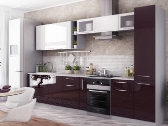
- white and brownish purple;
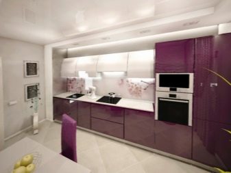
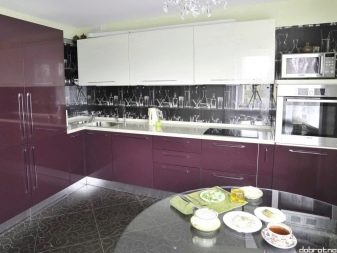
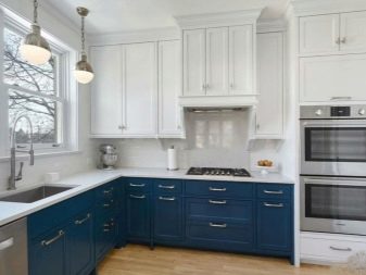
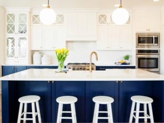
- white and blue (gray-blue);
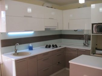
- white and cappuccino (coffee with milk);
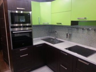
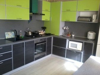
- black and pistachio (lime);
- sea wave and white;
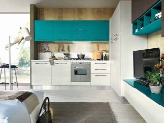
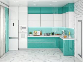
- lilac and creamy;
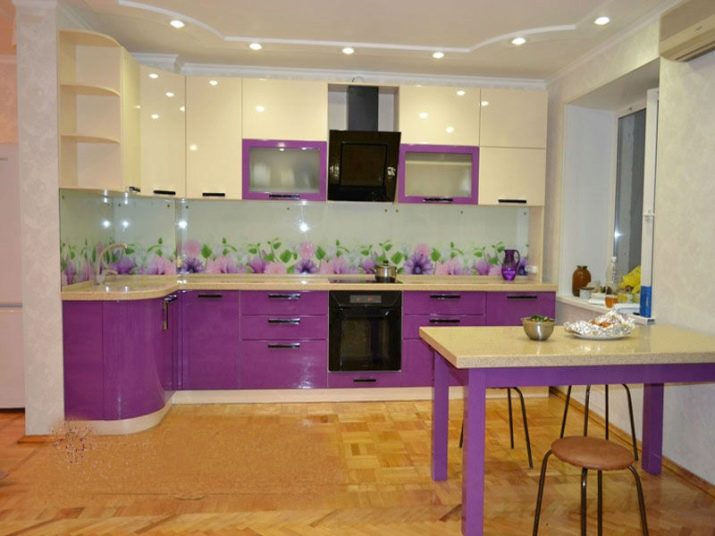
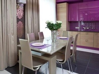
- purple and beige;
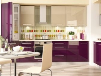
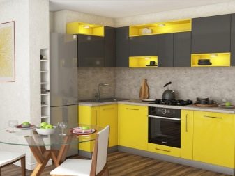
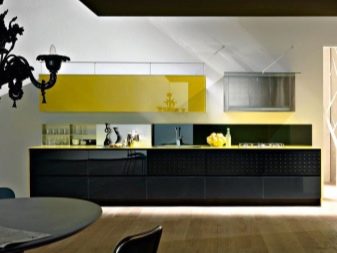
- yellow and graphite (black-brown);
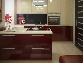
- burgundy and milk;

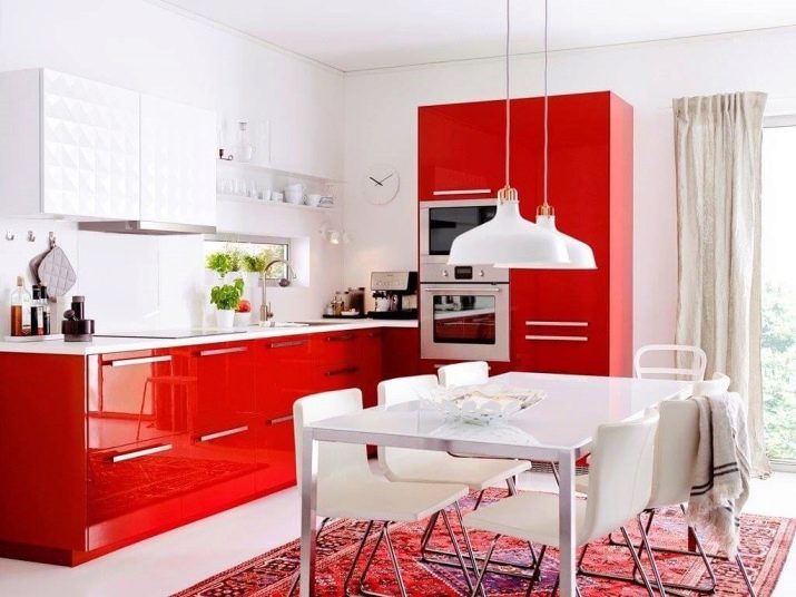
- red and white;
- turquoise and black;
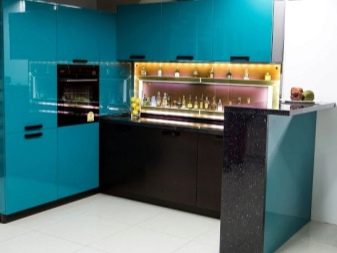
- turquoise and mocha;
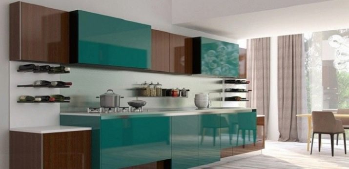
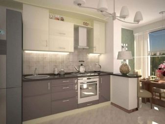
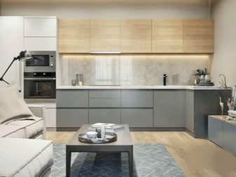
- beige and gray;
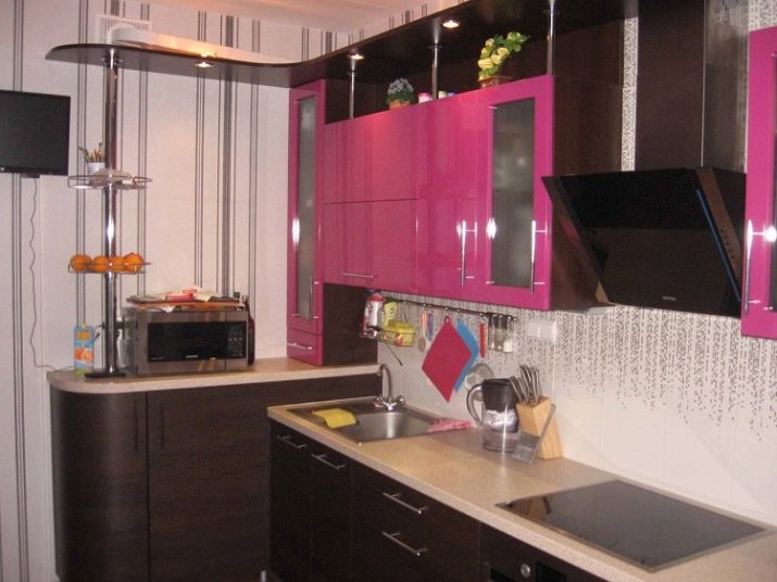
- fuchsia and black-brown;
- burgundy purple and black.
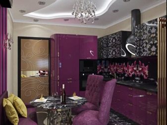
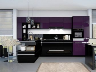
As for the texture of the furniture, one should be maintained in the same way. Otherwise, when looking at the headset, you may get the impression that its elements were bought in a hurry and are not a complete ensemble. The texture is usually selected based on the type of specific style. For example, the resources of modern trends in interior design are the demonstration of gloss, while retro styles need a matte texture of furniture facades.
Style solutions
The influence of style on the choice of furniture color is enormous. Each interior style has its own favorites among the shades of the color palette, through which you can better indicate belonging to the style. For example, for rural retro destinations of Provence and country these are light colors, dark contrasts must be dosed here. This means that in general, the color of the headset should be light; when choosing a contrast, you should rely on a bright accent in the form of accessories.
This will create expressiveness without prejudice to the color rules of the styles.
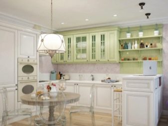
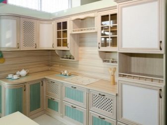
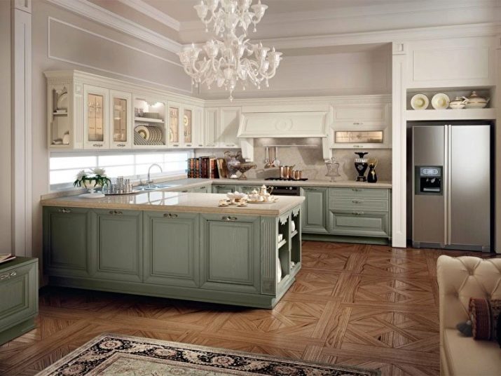
Two different color headset style classic there is nothing else but selection according to the principle of palace solemnity. For example, it is a white background and gilding, a milky top and a gray-turquoise bottom.An interesting solution would be to create an accent zone in the center of the kitchen unit by means of color. For example, it can be highlighted in one color, and all the rest of the furniture can be selected in another. Looks like this design in the interior of a classic kitchen will be more than appropriate and harmonious.
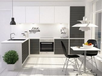
When it comes to choosing a color for a modern style, you can look at the contrasts of neutral colors (white with steel, gray, graphite, and less often black). It is very important to add to interior of modern styles (for example, high-tech, modern, art deco, brutalism, launch) textures for metal or select tones that combine with it better than others. For example, these are the majority of shades of noble wood species.
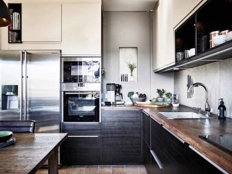
For ethnic styles there is nothing better than using woody tones. However, as one would like to fill the space with them to the maximum, one will have to limit oneself. Wood can turn the interior into a wooden box or a chopped bathhouse when there is too much of it. It looks expressive only when it can stand out due to a different color and material.
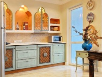
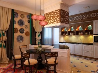
When buying furniture of this contrast, it is necessary to take into account: there should be no wood texture on the walls or on the ceiling. In this case, the texture may not be too glossy and matte. Woody design looks very stylish in interiors, bringing high status to the atmosphere. The wooden color can be embodied not only in the facades, but also in the colors of the countertops.
Choosing a kitchen set
Despite the fact that two-tone headsets are not as versatile as their monochromatic counterparts, you can still choose your option from a wide range of offers. To do this, it is worth considering a number of basic recommendations that we usually keep in mind, but forget at the right time.

Tint temperature
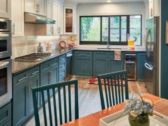
Pay attention to the exit side of the windows. If they face north, you can't buy a headset in cold colors. When they face south, the room is already warm, don't create a stifling atmosphere by purchasing the option in warm colors. Think about what contrasts will look great in your kitchen. Pick a few duos just in case the store doesn't have a better one, pay attention to the temperature of the shades.
Furniture type
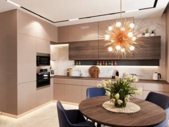
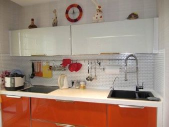
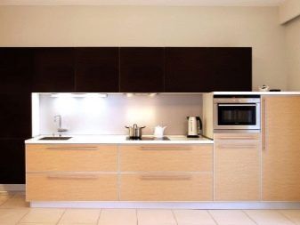
The headset can be angular, linear (straight) and U-shaped. If your kitchen is elongated, take a straight line, if a typical rectangular one, you should take a corner one. If it is square and spacious, you can buy a U-shaped one. Before you go to a furniture store, measure the place for the headset, draw a diagram of its location in order to understand whether the placement will be successful and convenient. Decide what suits you best: an option with a counter, a bar, an island, a peninsula, floor cabinets alone without top drawers or with them, shelves, open storage systems.
Dimensions and shape
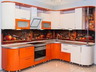
The kitchen set can have strict geometric or curved shapes. Some models have modules that protrude beyond the common line. If your style tends to be curved (like modern style), this is your typeface. If the design is based on a minimalist style, take the option with straight lines. The size of the entire ensemble should be commensurate with the area of the kitchen. The smaller it is, the simpler the design and the more compact the headset is.
Harmony of contrast
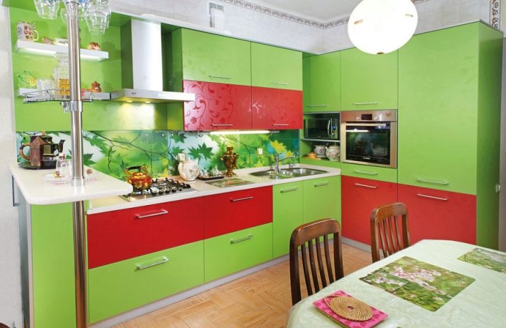
Pay attention to the amount of contrasts used. Stick to the rule: there should be at least 60% light in the ensemble. You cannot choose colors that compete with each other. A dark set must be softened with a light color, otherwise such a kitchen will not look beautiful in the interior. Do not use products with sharp contrasts. (for example, red with green or blue) - the tones have different emotional coloring, they look difficult in the interior.
Snap to furnishings
Before paying for a purchase, think carefully: do the colors of the headset match the furniture that is already in the kitchen.At the same time, you can not be guided by wallpaper, since it is easy to replace them, but furniture is bought less often. You can only buy items in the desired shades if you update all the kitchen furniture. If you plan to buy only a headset, you need to choose it in tones that may not be identical, but at least related to one of the tones of the existing furniture elements.
Combination nuances
Consider the fact that any interior is built on the use of 3-4 contrasts. There is no need to take an option that will not leave a chance to use other accents in the interior of the kitchen. For example, take into account the color of the apron, which can both successfully connect wall and floor cabinets through color, and destroy the interior to smithereens.
If you choose an option in light colors, choose it so that in the future it can be decorated with a bright apron. Light colors look soft in the interior, but without bright metered strokes they lose their expressiveness. Take those furniture options, the color combinations of which will be more universal. So you can complement 2 colors with any accessory up to live greenery.
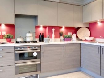
For example, it can be a contrast of white and gray, beige, sand.
Duets of gray and beige
Such furniture looks especially expensive in the kitchen today. However, to achieve the desired effect, you will have to pay attention to the purity of the tones and their temperature. You can choose a model with a gray bottom and a beige top, which will help increase the space. If you want to demonstrate the uniqueness of the headset in a different way, you can take a closer look at the options where contrasting cabinets and hanging drawers can be combined into one group, placing them, for example, in the center of the model headset.

Successful design examples
We offer 10 examples of a harmonious choice of a two-tone kitchen for furnishing the interior.
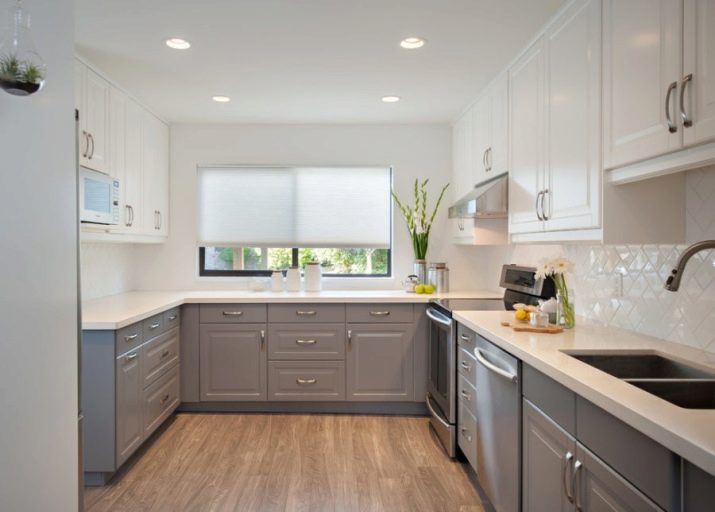
- U-shaped set in a modern style for arranging a small kitchen.
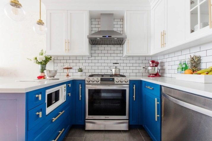
- An example of a visual enhancement of a kitchen due to the contrast of blue and white.
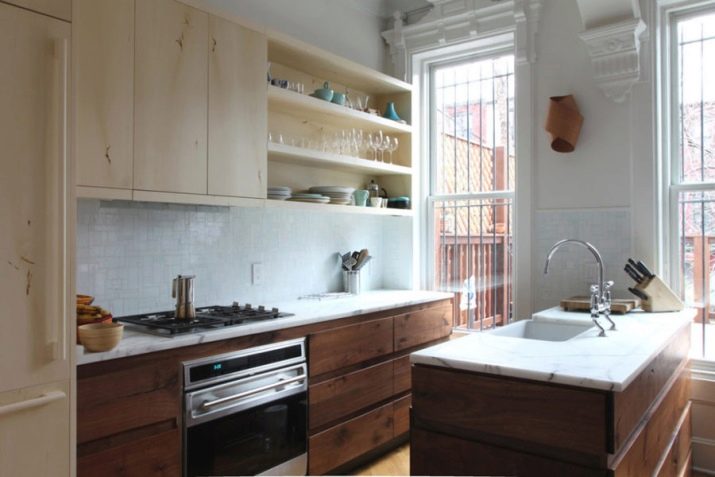
- Arrangement of a spacious kitchen with furniture of a two-color type with an accentuation of the island zone.
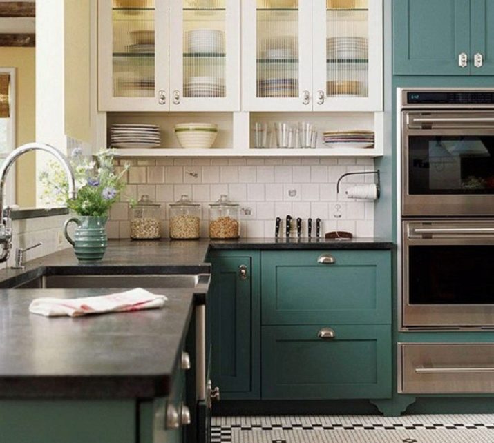
- The use of a dark color to accentuate not only the lower, but also the upper facades.
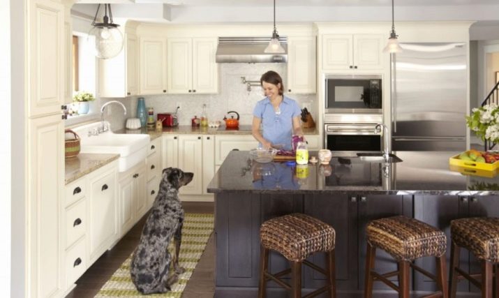
- Accentuating the island against the light base of the headset.
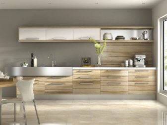
- An example of playing around with a design through the contrast of white with woody color and its multifaceted texture.
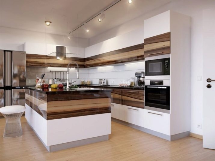
- A laconic solution for a small kitchen, through which the effect of increasing the space is created.
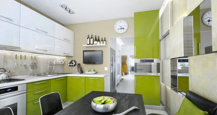
- An example of zoning a kitchen by means of a headset color, a stylish interior option.
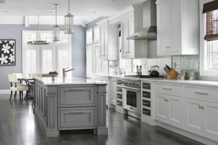
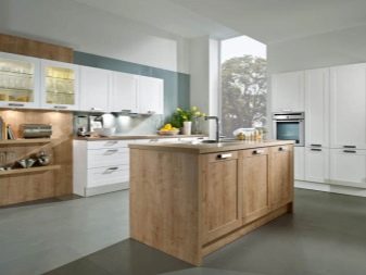
- Kitchen in neutral colors with linear furniture and an island.
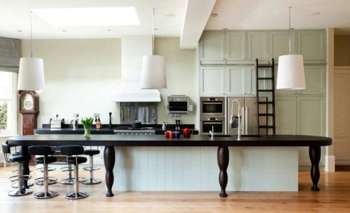
How to choose a kitchen facade - watch the video.


