Brown kitchens: color combinations and interesting design ideas
Very often you can hear that white kitchens are out of competition. However, dark tones, including browns, can also be used. The main thing is that everything is done correctly and skillfully.
Palette of shades
Brown cuisine can be served in the most comfortable way. Contrary to popular belief, this color scheme is by no means boring in a well-thought-out interior. But the background in tones of brown is usually extremely interesting. Among these tones, special attention is drawn to:
- woody color;
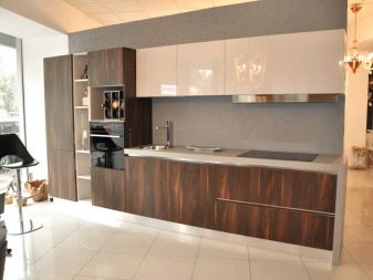
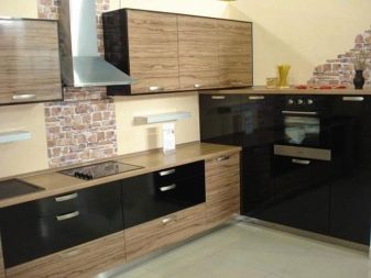
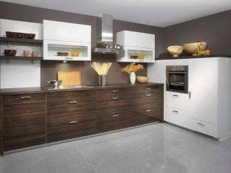
- a shade of dark chocolate;
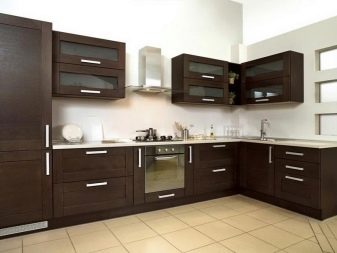
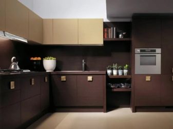
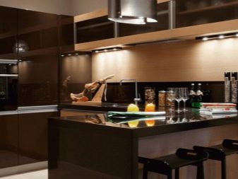
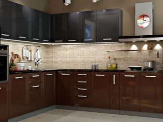
- dark beige;
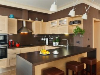
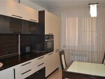
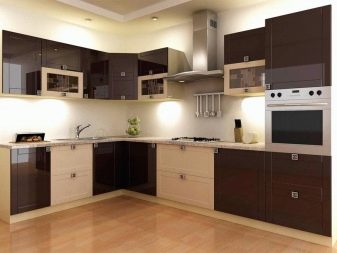
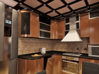
- iced coffee.
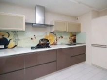
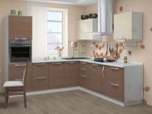
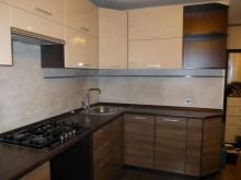
By using these colors, you can create a luxurious environment. Brown shades are considered ideal for a classic room. They allow you to reveal the benefits of natural materials. But this does not mean that such colors are obviously unsuitable for ultra-fashionable interiors. On the contrary, they show other positive aspects of the colors - a universal look and practical perfection.

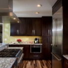
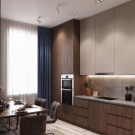
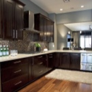
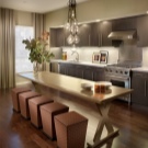
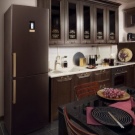
Experts advise choosing light brown paint in small kitchens. The proportion of saturated inclusions should be minimized. Such elements can be:
- decorative items;
- facades on one of the tiers;
- floor covering.
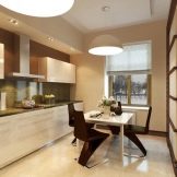
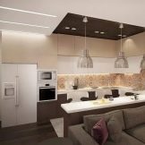
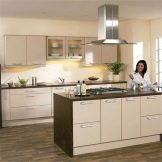
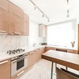
When the room is quite large and the lighting is very good, use a dark brown color. In this version of the interior, it is logical to use natural wood and emphasized expensive textiles.But the dilution of the beige-brown kitchen with other shades is unjustified. This can compromise the inherent elegance of such a solution.
A color such as a truffle looks nice and very good. But the more traditional solution is a creamy kitchen. Its advantages are:
- external nobility;
- cleanliness of the environment;
- cosiness;
- multifaceted appearance;
- admissibility of minor inclusions of other tones.
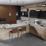
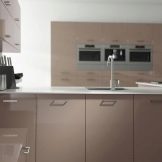
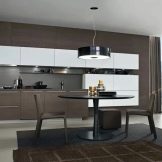
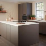
The cream color looks no less interesting than the white one, but at the same time it somewhat simplifies the cleaning process. The effect of maximum "hospital" sterility, characteristic of the white interior, disappears. The brown palette helps:
- calm down and relieve nervous tension;
- increase concentration on important matters;
- get rid of stress and anxiety;
- eliminate the annoying effect typical for brighter tones.
Types and placement of kitchen units
In a small space, a single-row, or linear, scheme turns out to be quite an appropriate idea. It is also recommended for relatively large but narrow rooms. The design is very simple: the set is placed so that there is a refrigerator on one side of the sink, and a stove on the other. The optimal length of the working area is 2-3.5 m. If the value is higher, the ergonomics of the room will be impaired.
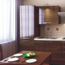
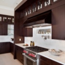
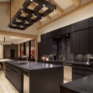
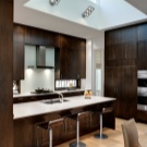
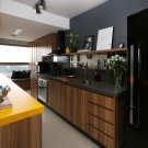
The linear design is suitable even for very small areas. However, there is also a drawback - the installation of auxiliary household equipment is difficult.
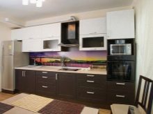
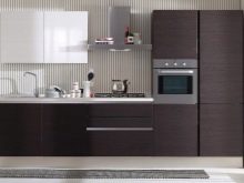
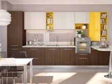
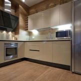
The L-shaped type of headset is usually considered universal, but it will be optimal in moderately large rooms. The ergonomics of the corner layout is expressed in the fact that it will allow you to create a full-fledged working triangle without any problems. Installation of all the required household equipment will not be difficult. However, in very large, as well as in very narrow rooms, such solutions are hardly advisable.
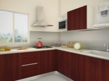
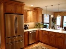
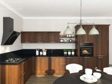
A brown kitchen can also be U-shaped. In this case, the entire volume of furniture and appliances is distributed along three walls. But the "P" configuration is of little use for modest or very large rooms.
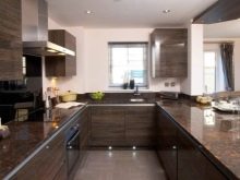
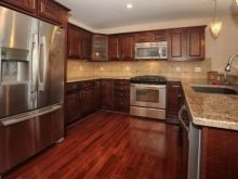
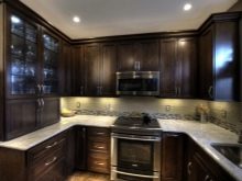
If the area is very large, you can choose island options.
In addition to the geometry of the headset, you need to immediately make a choice between glossy and matte designs. Gloss is considered the best way to achieve a spectacular look and competently beat a medium-sized space. Thanks to him, furniture can acquire a characteristic "airy" look. As for the notorious fingerprints, they remain on any surface - it's just easier to notice them on a glossy layer. Much also depends on the color: white gloss is practically not subject to this defect. If the room faces north or is very dark, the reflection of the light will compensate for the lack of light. But at the same time, the gloss quickly begins to glare and gives a reflection of the surrounding objects. A specular effect is rarely appropriate.
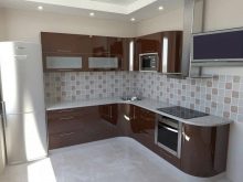
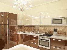
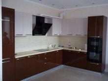
The matte surface also deserves attention. It is less prone to clogging with dust and other types of contaminants.
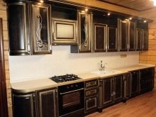
In addition to choosing a general design concept, it is necessary to decide at the very beginning whether the room will have a modern or antique image. In the second case, it is recommended to use patina. This type of cover has become fashionable and has a stylish look. The emphasized old look will surely charm the owners and owners of the house, set them in a romantic mood. To form an artificial patina, varnishes and paints of a special formulation, as well as acids, are used.
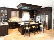
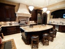
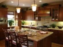
The technologies of patination of both metal and wood have been developed. You can even do the necessary work with your own hands. Patinated surfaces:
- last longer than usual;
- less sensitive to liquid moisture and vapors;
- require only very simple maintenance;
- they look as original as possible and go far from the template;
- allow significant savings in comparison with genuine antique furniture.
In more modern interiors, it is appropriate to use stripes of various types to decorate a brown kitchen. In the early 2010s, the striped interior was thought to be outdated. However, this stylistic decision is now experiencing a renaissance. Stripes work especially well in a monotonous setting, where they allow for a sleeker look. Stripes can decorate not only walls, but also furniture and decorative items. On the walls, they are appropriate in styles such as:
- vintage;
- country (traditions of any country);
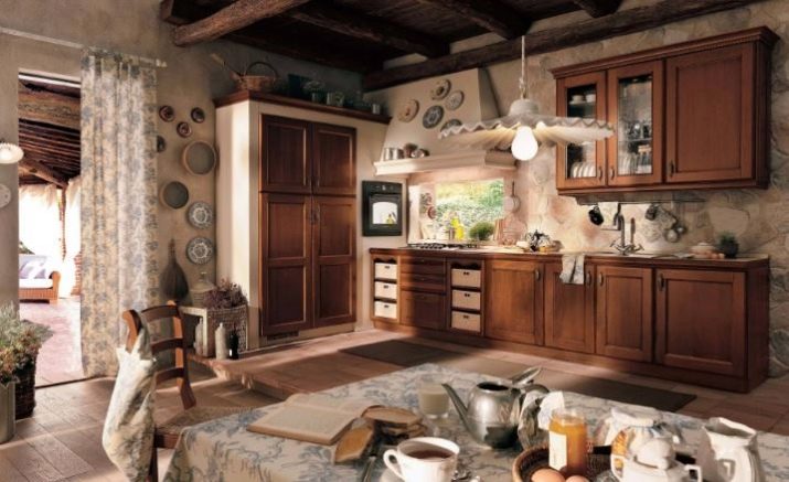
- retro;
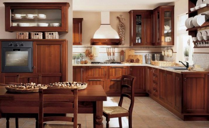
- classic style.
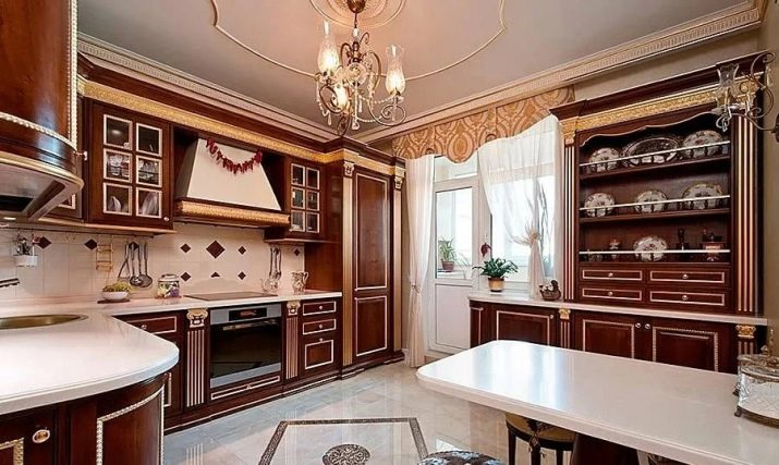
An original step can be to dilute an overly boring interior with stripes on the wall or ceiling. In the latter case, it is advised to use wooden planks. A striped carpet can become a harmonious reflection of such a top. You just need to take into account the aesthetic value of vertical and horizontal lines. They have a mutually opposite effect.
Successful color combinations
The blue-brown variety of cuisine is in demand. This combination of tones can be presented in a variety of ways. Both the blue and brown portions can be easily saturated or thinned. This solution will look lighter, more sophisticated and more elegant. When one of the colors is chosen as the dominant, it is necessary to take into account the nature of the visual complement and the relationship. And when blue and brown are equal, it is required to provide a harmonious transition between them. Otherwise, the space may seem overwhelmed. The advantages of the blue-brown range are:
- rarity and unusual combination;
- external calm;
- visual richness.
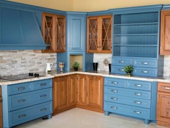
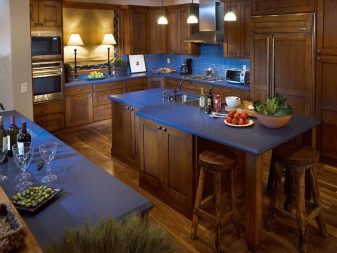
But you can also look at kitchens with other colors, including white paint. The fusion of white and brown tones opens up a lot of possibilities and allows you to make the atmosphere more harmonious. White loses its excessive aggressiveness, while brown loses unjustified dry practicality. In addition, a visual reduction in space is excluded. The white-brown room is most in demand in modern styles.
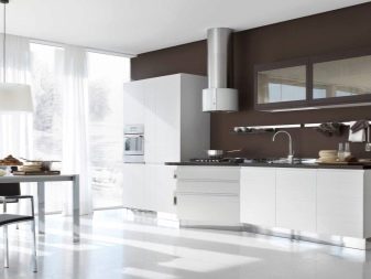
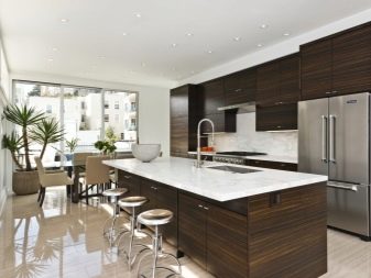
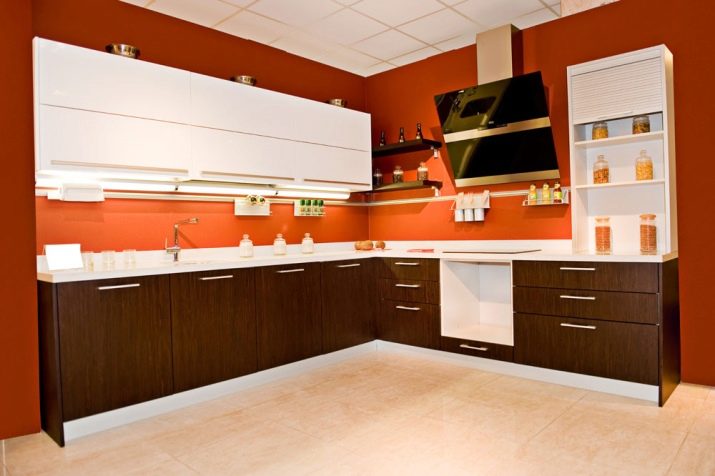
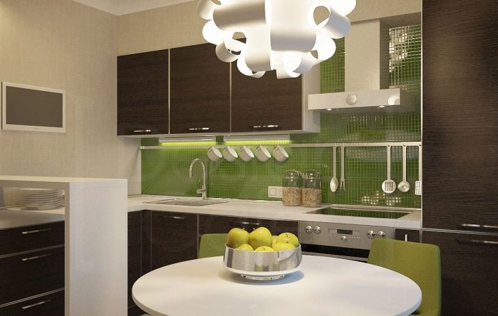
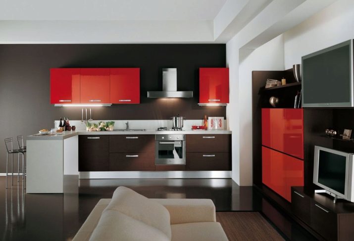
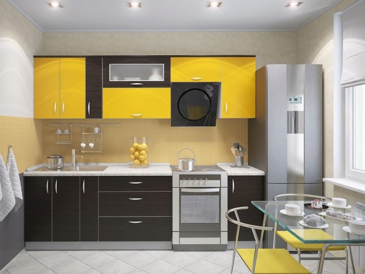
White trim can be used both in wall decoration and in headset facades. This makes the room more spacious. The white and brown range goes well with bright expressive accents. You can even apply several different shades. Good combinations come with:
- blue;
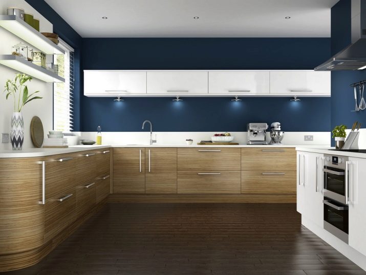
- terracotta;
- green;
- red;
- yellow flowers.
But the black and brown combination is also quite good. The main thing is to work on it professionally and thoughtfully. Only then will it be possible to fully realize the idea, since the combination of two dark tones can look gloomy. It is difficult to meet the black-brown coloring of the kitchen even in special catalogs. Psychologists note that the brown component in this (as in any other) combination should dominate.
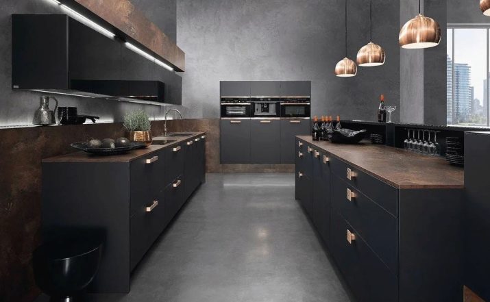
Otherwise, an uncomfortable environment may be created. A clean black and brown room looks bad in any case, it must be complemented with other colors. For better perception, it is recommended to apply:
- creamy tone;
- beige;
- pistachio and oil colors.
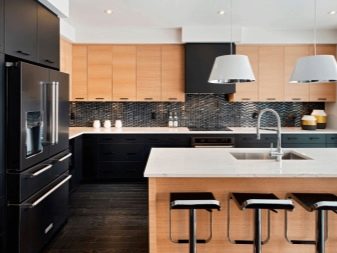

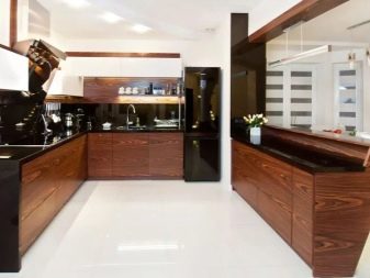
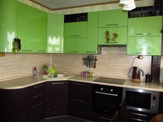
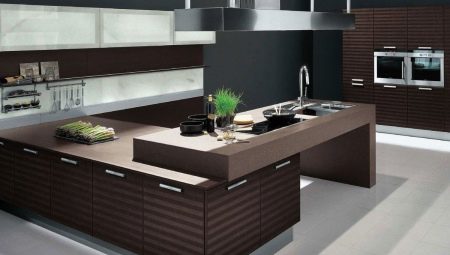
Brown fronts can be easily combined with black countertops. In this case, light colors are required to decorate the walls, backsplash and floor. An alternative solution involves black bottom, brown top stripes, diluted with a light background. Sometimes they use black glossy furniture, which is favorably set off by a light brown background.
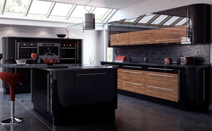
As for the options for brown furniture color, the most respectable solution is wenge. This color can be achieved not only when using natural wood. The veneers, varnishes and paints, and the laminating film are also pretty good.
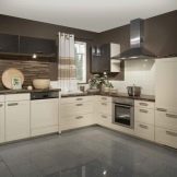
A gray-brown kitchen turns out to be a very good choice for both classic and modern interiors.You just have to thoroughly choose textures and decorative elements so that the result will please people. The advantages of this solution are:
- neat look;
- emotional relaxation;
- improved tone;
- appropriateness in rooms of different sizes;
- warm and at the same time restrained atmosphere;
- compatibility with a variety of colors.
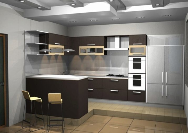
But it must be borne in mind that the combination of gray and brown tones will please only with a competent approach. Excessively dark brown will make the room heavier, and the fusion of some warm shades looks dirty. Non-professionals rarely succeed in choosing a composition well.
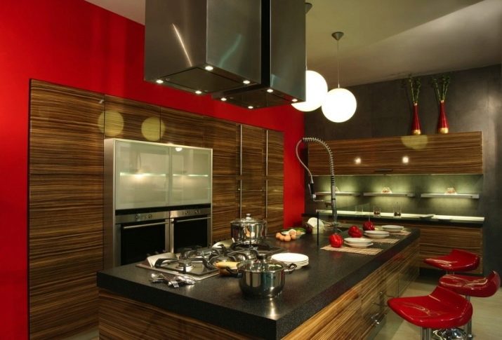
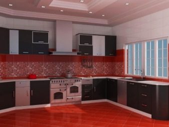
Completing the review of options is appropriate in the reddish-brown variety of cuisines. This is a relatively mild solution, not particularly flashy. This arrangement is perfect for Provence and loft styles. The use of metal surfaces is recommended. Matte sheen is preferred over gloss. It is advised to include in the interior:
- brickwork;
- untreated wood;
- clean, uncoated plaster.
Style selection
Modern brown kitchens are often decorated in a farmhouse style. It reproduces a simple and functional effect, making rooms more comfortable. The characteristic features of this style are:
- open shelves without facades;
- deep roomy sinks;
- traditional floor coverings;
- large kitchen tables.
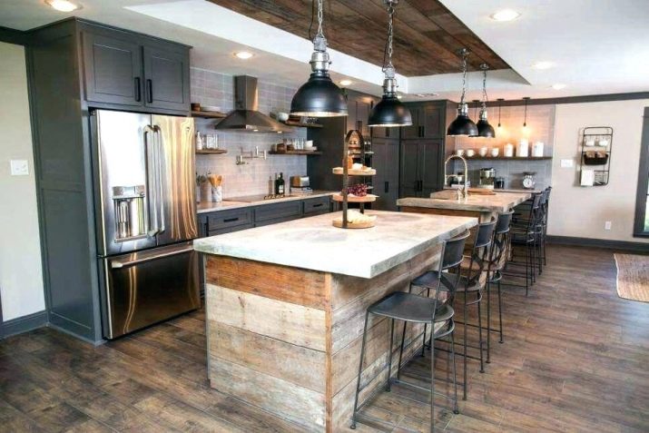
Rustic design is an attractive alternative. It may look worn out and rough, but it competes successfully with the most glamorous classics. If the priorities are comfort and warmth, you need to give preference to the Provencal style.
But the classics will be appreciated by those who strive for:
- restrained atmosphere;
- practical look;
- optimal kitchen functionality.
Features of kitchen design in monochrome
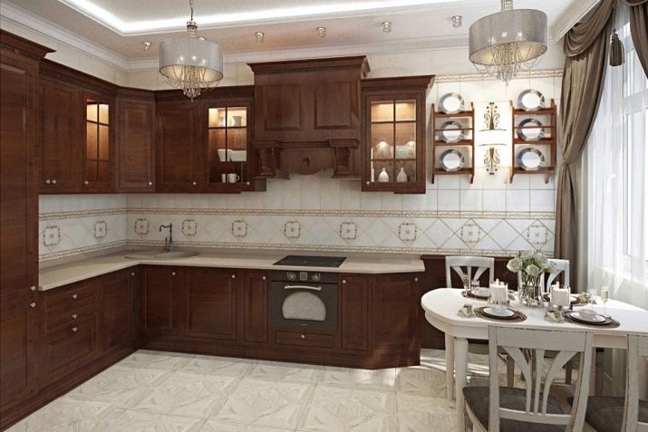
A pure brown room goes well with a white floor. In this case, the walls add a certain monumentality, and the lower part of the room adds lightness for balance. To improve the composition, use bright inclusions. The combination of mint and brown, for example, adds naturalness while avoiding over-sensuality at the same time. In a spacious, completely brown room with good lighting, it is advised to choose furniture:
- chocolate color;
- black coffee colors;
- wenge colors.
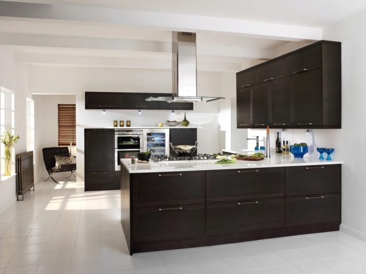
If the space is relatively small, it is recommended to use cappuccino, light beige and milk chocolate tones. And since it is decided to use a completely pure brown color, refrigerators of the same color are good enough. True, the cost of such solutions is very high - exactly higher than when choosing a classic white color. The main part of such models falls on brands:
- Atlant;
- Bosch;
- Samsung;
- Indesit.
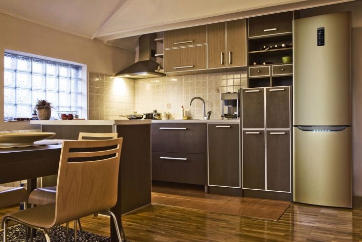
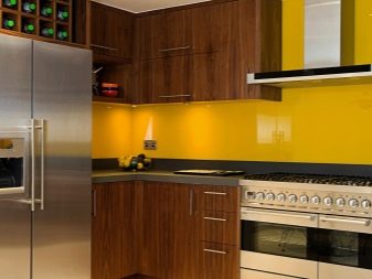
The best brown refrigerators mimic natural wood. Sometimes they use solutions with brown furniture. The apron should be in contrast to her; in this case white. Dark brown headsets are played up with yellow, beige, sometimes red aprons. You also need to consider what wallpaper to stick on the walls in a room with brown furniture.
It is recommended to use wallpaper:
- yellow;
- red;
- chocolate;
- cream colors.
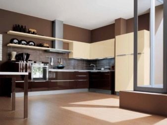
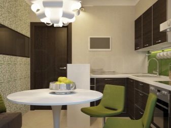
Cream and beige canvases are especially good - they add brightness, visually increase the space and best suit the purpose of the kitchen. But you also need to think about what to do with the stove. The functional area is usually designed as light as possible. This rule is especially important in a small room. They try to place the plates in the corner, preferably away from the sink or closer to the wall.
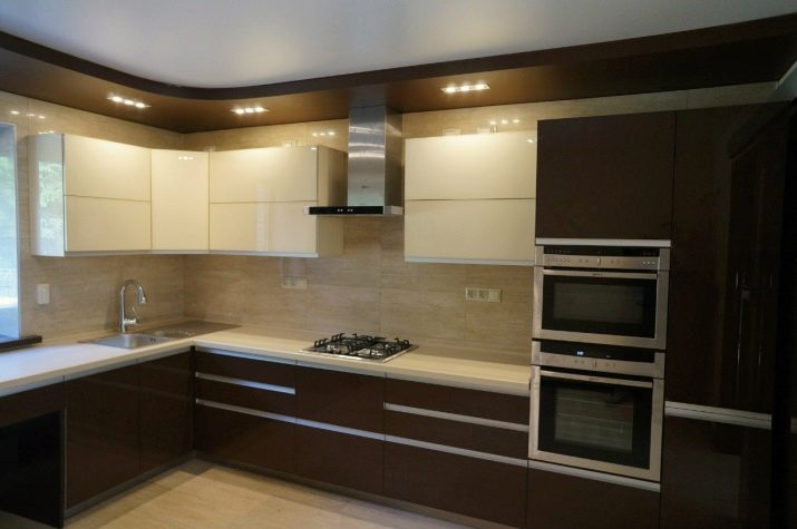
Beautiful examples of the interior
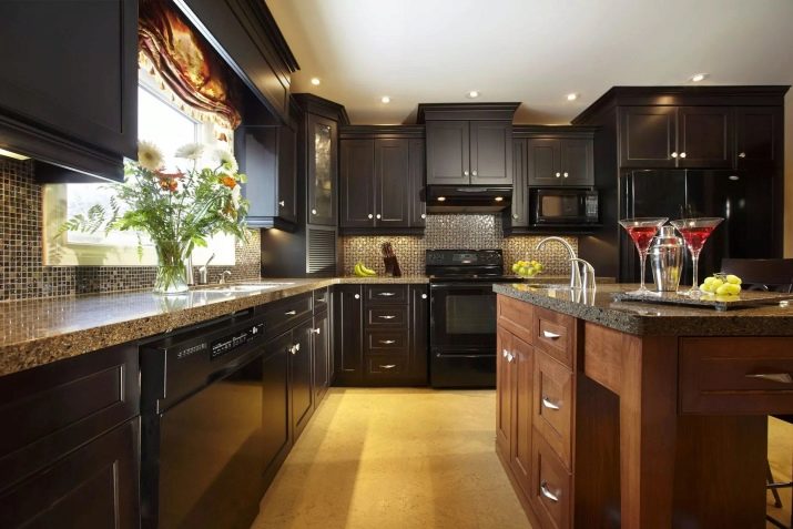
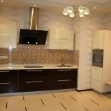
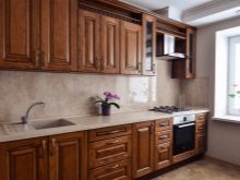
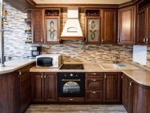
The photo shows a brilliant pure brown kitchen interior. The very dark furniture fronts contrast nicely with the mosaic finish of the apron. Mirror surfaces are also used rationally.
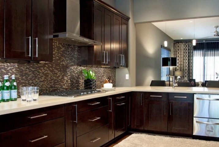
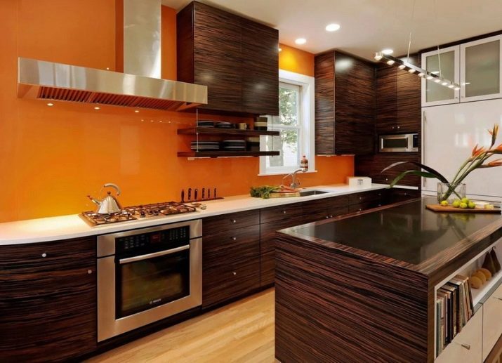
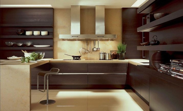
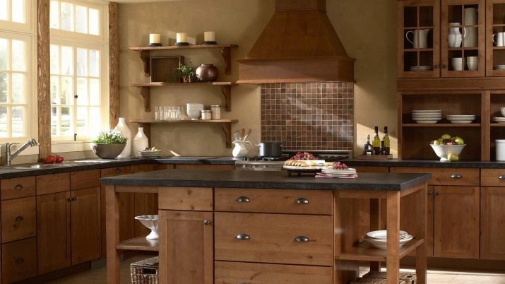
And here the imitation of dark brown wood is used in combination with a pleasant yellow wall. The white countertop helps to dilute the interior and eliminate oversaturation with bright colors.
