Red and white kitchen: features and design options
A beautiful, stylish kitchen can charge its owner with a positive mood for the whole day, because it is in the kitchen that morning coffee is brewed and a fresh, delicious breakfast is prepared. It is pleasant to receive guests, have a friendly conversation or prepare a romantic dinner in a comfortable and beautiful kitchen room. In the design of the kitchen, it is necessary to think over all the details so that it is as functional as possible and at the same time beautiful.
The first thing to consider is the color of the room. Color is of great importance, it can fill with energy or relax, invigorate or concentrate the person in the room. White and red is a common and effective color choice for kitchens.

Advantages and disadvantages
Red and white cuisine is very popular for a reason. This design looks very modern, fresh and bold, it fits perfectly with some styles, creates an exclusive and striking look. Besides, the advantage of this color scheme is that there are a huge number of room design options in such colors, which means that it is quite simple to choose a design for a particular kitchen yourself.

If we talk about how the red color affects the human psyche, then here, undoubtedly, there are a lot of advantages.
Red color is able to charge a person with energy, cheer up and increase self-confidence.
Some sources claim that a room with red elements has a positive effect on hypotensive patients, slightly increasing pressure.
If you correctly plan the location of all the furniture parts of the kitchen and harmoniously distribute the white and red colors in the design, then you can achieve the visual effect of expanding the space, this is very important for compact rooms.
Despite the large number of positive aspects, a kitchen made in a similar range has its drawbacks. The fact is that such a combination in itself is very catchy and bright, therefore it is extremely important to observe the correct proportions when choosing such shades.
If there is an unreasonable amount of red in the design, then the kitchen will turn out to be more oppressive than invigorating.
Also, there is a risk of getting a vulgar and cheap kind of premises.
If the kitchen mainly consists of white, then this design will require additional maintenance. You will have to clean the room many times more often, because all the shortcomings will appear here.
It should be compared whether such a color is able to harmoniously fit into the style of the interior. There are styles in which such a color combination would look inappropriate and even ridiculous.


Types and placement of kitchen sets
The set is an indispensable piece of furniture in the kitchen, so it is extremely important to correctly place and choose its color. The placement of the headset depends on the area of the kitchen and its layout. It is best to place it above the work surface, in the most harmonious area for this, so that the furniture does not interfere with movement and does not spoil, but improves the aesthetic qualities of the room.
Choosing a design in white and red tones, you should determine how exactly the tones will be combined in the kitchen.
Depending on this, the kitchen set can be one-color (red, white) or colored (with a combined color or contrasting pattern).
Usually, headsets in light colors look fresher and easier, especially if the bottom of the room is red... This combination creates a more airy, wider space, and therefore looks stylish and fresh. Nevertheless, some styles involve a monochromatic set, which, when properly combined with decoration, textiles and decor, looks very beautiful.
Thus, the main rule for choosing the color and placement of the headset is the characteristics of the kitchen room and the design style.
Color combinations
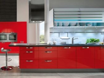
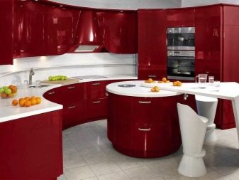
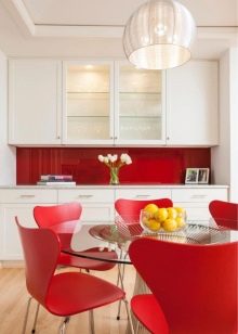
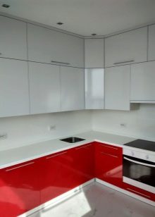
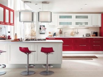
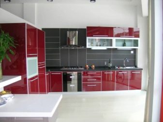
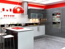
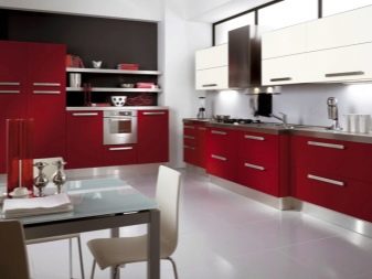
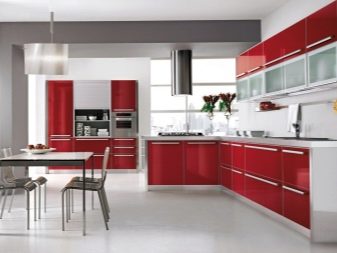
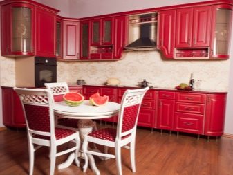
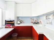
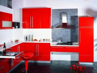
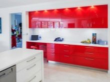
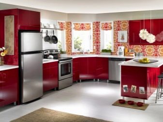
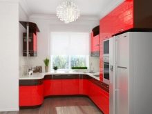
One of the most successful color combinations is the combination of a red bottom with a white top. At the same time, gloss will be preferable in red tones, and in this case it is better to make white details matte. Red shades can be different, they are chosen depending on taste preferences. In the kitchen, pomegranate, scarlet, cherry, dark red or any other juicy shades are appropriate. In this case, silvery facades in the upper part of the room will look organically - this will dilute the overall color picture, but will not overload it. For walls and ceilings, it is better to choose white, and make the floor as light, neutral as possible.
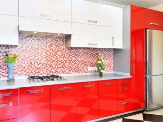

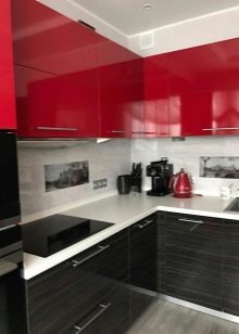
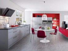
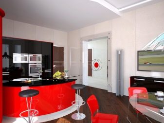
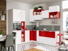
The reverse color scheme, that is, white bottom, red top, is suitable for bold, creative individuals who are not afraid of non-standard solutions.
This design creates a certain feeling of weightlessness and visually expands the space of the room.
In this case, light floors, such as ivory, are suitable. The ceiling can be either two-tone or classic white, as there are very few styles where a red ceiling will look appropriate and stylish.
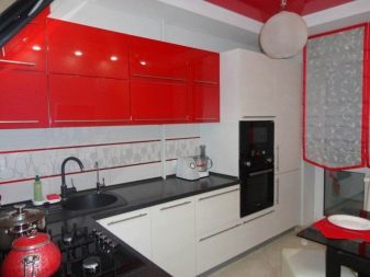
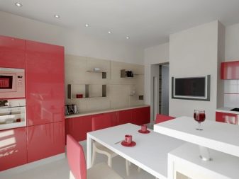
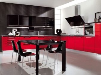
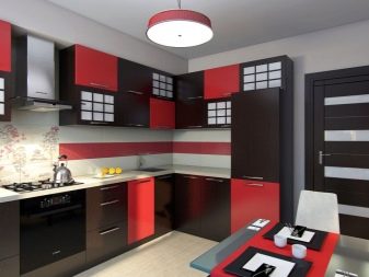
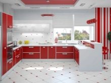
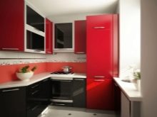
White and red tones go well with black. It should be noted that the main tone should be white. Red in this case is made in smaller quantities, and the black tint should be minimal. This proportion is suitable for small to medium sized kitchens, but in cases where the area of the room is large, the colors can be applied equally.
Kitchen sets and other furniture should be red or black, and a white shade will serve as the perfect backdrop.
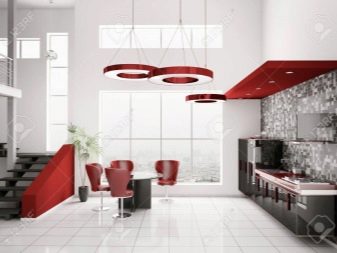
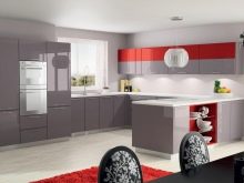
A beautiful combination gives gray in a composition with white and red. A design in this style will look elegant and sophisticated. Gray can visually muffle the brightness of reds and whites, and usually doesn't look overwhelming or cheap.
Styles
The suggested colors for the kitchen suit different styles.
- Provence creates an atmosphere of comfort and tenderness, which means that the main color in the kitchen should be white. A red tint can be present in the decor - ornament or pattern. This style accepts ruffles and cute prints in flower or polka dots.
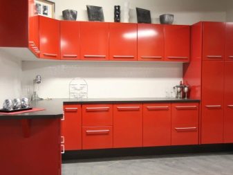
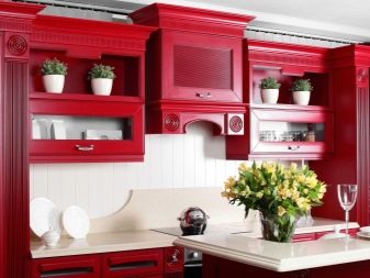
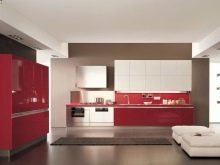
- For modern style a lot of red tone can be used. Here it is permissible to use red tones for the walls, and white can be used to highlight the headset, ceiling and work surface. When choosing this style, it is recommended to use only expensive, high-quality materials, and make the surfaces glossy.
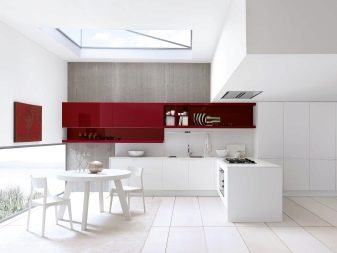
- Hi-tech style or minimalism will also look good in the proposed colors. In this case, you should adhere to the rule that all furniture and equipment should be ultramodern, made of expensive materials. It is best to make the main color white, and add accents with red.
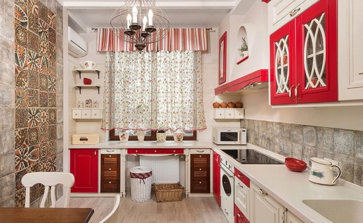
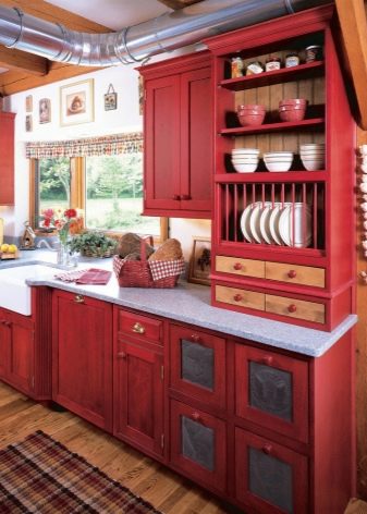
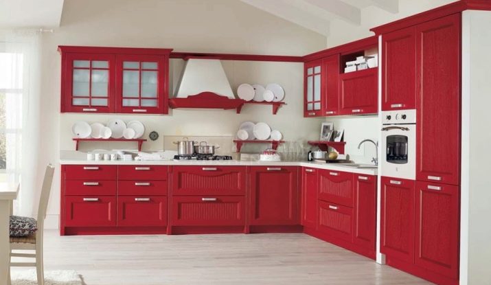
- A style like country, looks very impressive in white and red colors. The headset should be made of wood. Wooden chairs and a table, furniture made from natural materials will look good. Red is best for curtains and decorative details, while work surfaces, walls and ceilings are recommended to be white.
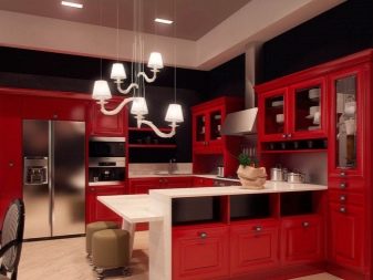
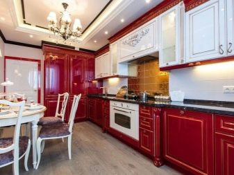
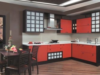
- Classic and Japanese styles great for this range. In these styles, the presence of deep red can be greater than white. In this case, the upholstery, apron, facades and decorative elements should be made red. White, in turn, should be the decoration of walls, ceilings, work surfaces. An ornament suitable in style will also be appropriate here.
Features of interior design in white and red colors
When organizing repairs in such colors, you should carefully consider the choice of materials for decoration. If paint is used for the walls, then it must be of high quality, capable of withstanding temperature changes, which are not uncommon in the kitchen.
Wallpaper should also be of high quality, matte, solid colors are the best choice. In some cases, if the design dictates, the wallpaper may have a texture or pattern that matches the style.
Some design styles strongly reject any kind of painting on the walls. This should be treated with special attention, since it is easy to spoil the whole appearance with unsuccessful wallpaper.
Ceilings, as a rule, are made classic, white, suspended. If the area of the room allows you to make a multi-tiered ceiling, then you can add red to its design.
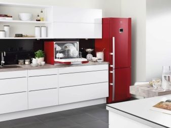
Technique can also complement a design. The refrigerator, in the Art Nouveau style, may well be red and not only fit into the design, but also decorate it. The same goes for the rest of the technique, which must be chosen exactly for a specific style.
Successful examples
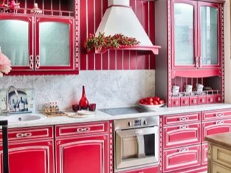
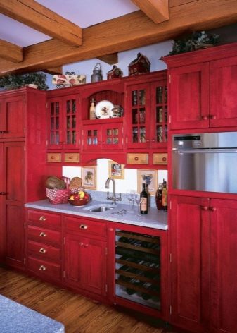
These tones are great for country style. To maintain this style, it is best to paint the ceiling and walls white. For floors, it is advisable to use natural wood, parquet or laminate.
It is recommended to make the headset red.
It is especially welcome if the furniture is made of wood, since this style provides for the presence of natural materials.
Textiles and cookware that are visible can also be red. Textiles and decor in a red and white cage look very harmonious.
In a style such as minimalism, a minimum of decorative elements should be used. Style assumes the presence of only functionally necessary pieces of furniture in the room.
The finish should be white, the floors are light. Kitchen sets and other furniture should be harmoniously done in red and white.
Best of all, if the white color predominates - this will enhance the feeling of spaciousness and functionality of the minimalism style.
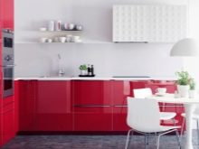
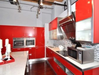
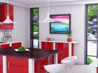
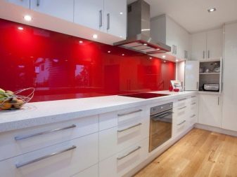
- Modern kitchen in white and red colors.
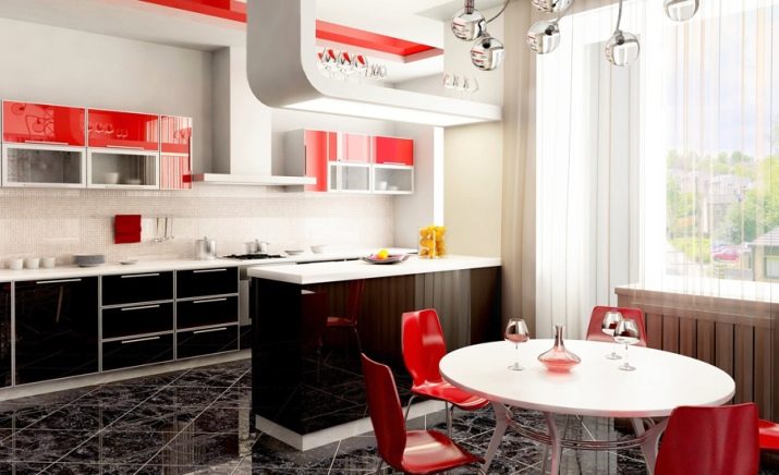
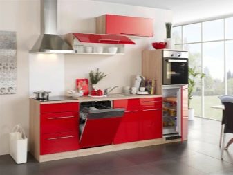
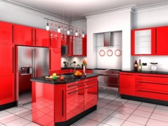
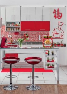
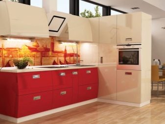
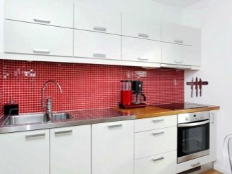
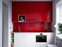
- Expressive interior of a small kitchenette.
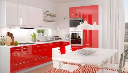
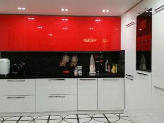
- White kitchen and red apron. This combination looks bold and fresh.
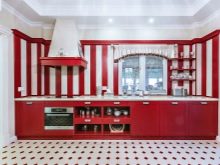
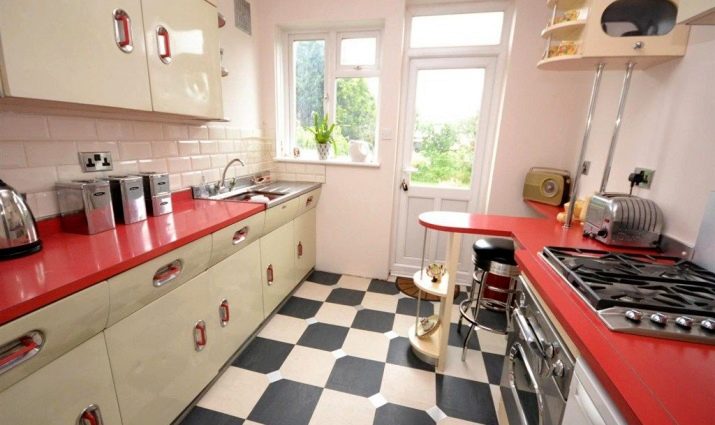
- Retro style in the interior.
- It is very important to choose the right wallpaper.
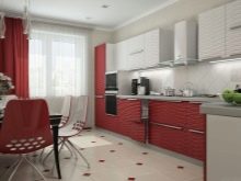
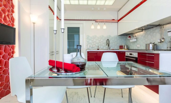
- A good option for a small room.
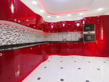
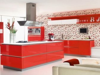
- Stylish, fashionable, functional and beautiful.