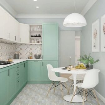
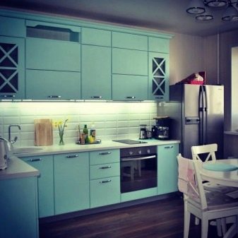
Mint kitchen interior design
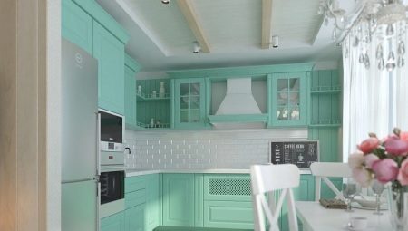
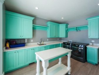
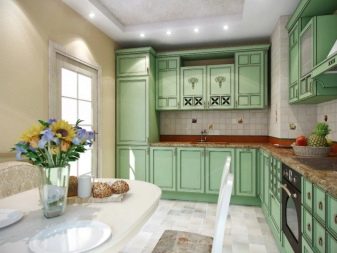
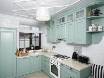
Effective and original design largely depends on the choice of color. It is important not only from the point of view of aesthetics, but also from the point of view of the psychological impact on a person. Mint cuisine is a very unusual and beautiful solution. Mint colors are pastel colors, they are very delicate, soft, non-irritating. The combination with other tones of the menthol shade turns out to be elegant and refined. This color can be considered for walls, floors and even ceilings. Mint kitchen sets, textiles, decor are a very effective way of decorating a composition.
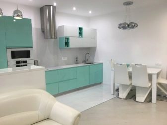
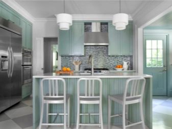
Characteristic
The pastel range itself is unobtrusive, light and gives a feeling of spring freshness. Mint associatively transfers a person to the coolness of a summer evening. It has several different shades: menthol, mojito, faded mint. All of them bring some weightlessness, calmness, and pacification into the interior. This color is bright, but unobtrusive. The positive energy emanating from the mint composition has a beneficial effect on the psyche. In this palette, you can safely decorate the kitchen-living room, in it you can get a feeling of serenity, and have a good rest.
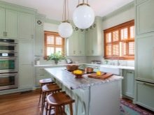
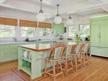
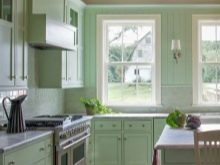
In addition to the pastel scale, mint can be present in the interior in a rich variation. These are more catchy shades, they are more aggressive and require a neat combination with other tones. Bright mint looks better when used on glossy surfaces, but wallpaper of this kind can be tiring.
Advantages and disadvantages
Among the pluses can be distinguished:
- elegance, originality;
- naturalness, freshness;
- invigorates, gives strength, but does not disturb;
- pacifies;
- well suited for rooms of any size and light level;
- does not tire the eyes;
- non-marking.
There are also disadvantages that most often appear with an excess of mint:
- light colors in large quantities are unnecessarily relaxing (to an apathetic state);
- the wrong choice of shade will make the kitchen "lifeless";
- not suitable for all styles.

Possibilities of use
You can equip a kitchen in mint shades in different ways.
Mint walls. Ideally, decorate not all, but one or two walls in this shade. An apron, furniture and decor of a different color will help to beautifully dilute the mint background.
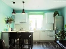
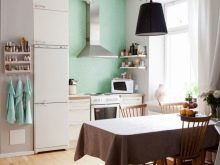
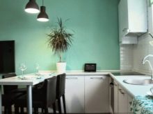
- Mint furniture. A very sophisticated solution, unusual and effective. As an additional shade, mint is ideal.
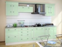
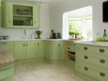
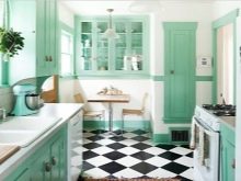
- Furniture, walls in mint color. This solution is rarely chosen; it is best to decorate the kitchen in different shades of the menthol scale. Choose faded tones as the main color, and saturated ones for furniture.
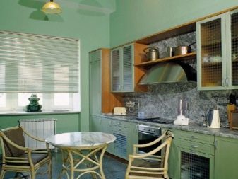
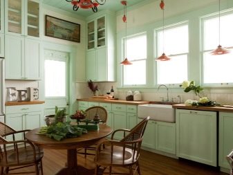
Best combinations
Any beautiful color can be "killed" or exposed in an unattractive light, if you choose an unfavorable combination for it. It is very important to combine tones into a single composition. This must be done even at the planning stage, so as not to get an unpleasant picture as a result, which will be annoying and look unaesthetic. Designers recommend adhering to certain rules for combining mint.
Choose hues within the same saturation spectrum. If you have chosen a pastel mint tone, all other colors must be selected in the same palette. Calm colors are suitable: beige, milk, soft gray, delicate blue, light pink, faded yellow, lavender, lilac.
In the event that the choice fell on a bright mint, it is necessary that the colors in the union are not lost next to it. Rich brown, blue, pink shades, fuchsia, coral, violet, orange, olive will do.
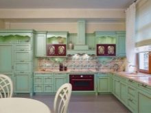
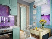
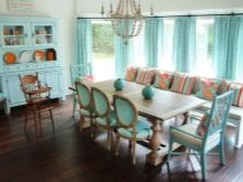
In design, five popular combinations are most often used.
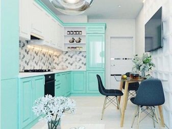
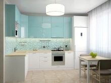
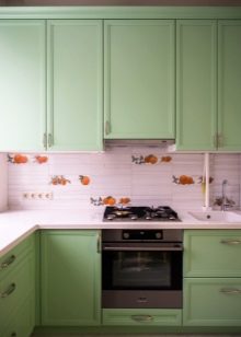
Mint and white. Mint white cuisine is a very effective and common way of decorating. The result is a very fresh, lightweight design. You can use not only boiling white, but also beige, ivory. This will soften the contrast. The perfect solution for modern interior styles.
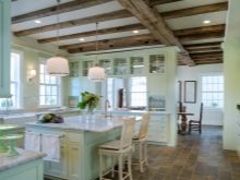
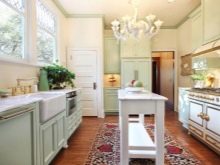
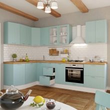
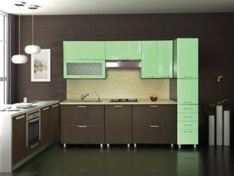
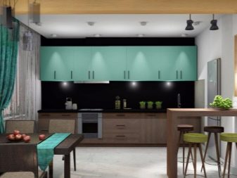
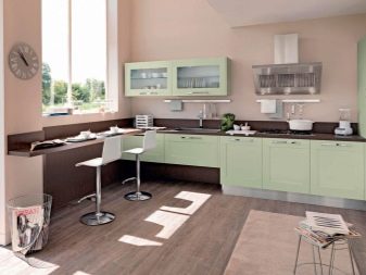
- Mint and chocolate. This is the classic version of the combination, they can be distributed and combined in different ways. Even kitchen sets can combine both colors: base and countertop - chocolate, fronts - mint. Or a dark floor, light furniture. Great for classic styles.
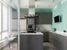
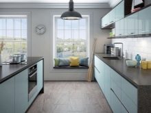
- Mint and gray. The mint gray kitchen is perfect for noble, discreet interiors. This is one of the most discreet and elegant solutions. Gray will be able to give conciseness to any shade of mint, even the brightest.
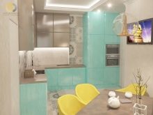
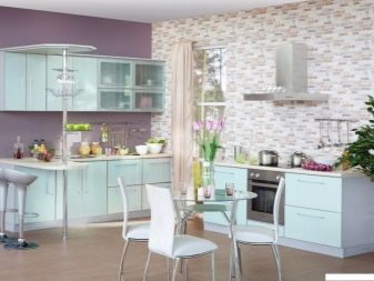
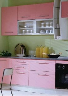
- Mint and pink. A very glamorous combination, romantic and gentle. It will be pleasant to be in such a kitchen. The perfect solution is pink furniture and walls in a light shade of menthol.
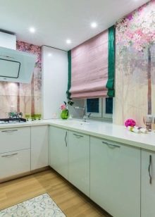
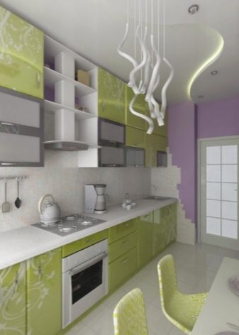
- Mint and violet. A very effective way of decoration, which suits lovers of strict and energetic interiors. It is best to combine bright menthol with rich violet or pale lavender with subtle mojito.
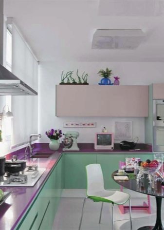
If you do not want to rely on contrast, choose shades that are close in gamut. So, in a company with blue and green, mint will look organic and elegant, and the design itself will turn out to be harmonious.
What style do you prefer?
Since mint is a natural shade, it looks best when combined with natural materials. All wood tones look great with menthol. Glossy decor will add the right mood to a modern interior. Much depends on the style in which the kitchen is set up.
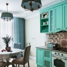
Country. A rustic, close to eco style involves the use of natural shades, landscape motives. The green palette plays a special role here, especially when combined with wood finishes. Better to opt for mild menthol.
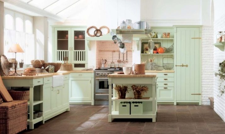
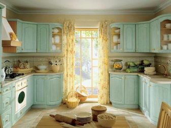
- Provence. The style of the French province is shaped somewhat differently.Whitewashed furniture, pastel colors, floral motives prevail. Menthol in this case is chosen light, soft, faded, as gentle as possible.
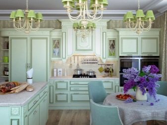
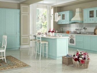
- Classic. Mint and brown are the leaders in classic interiors. Natural materials, quality textiles, no pretentiousness. The focus is on status and comfort.
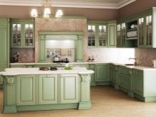
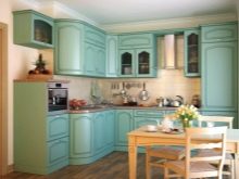
- Contemporary styles. These include minimalism and hi-tech. Their distinguishing features are contrast and manufacturability. Decor is kept to a minimum, functionality comes first. You can choose intense shades, but neglect small details, decorations, unnecessary elements. They are replaced by chrome-plated fittings, gloss in the design of surfaces.
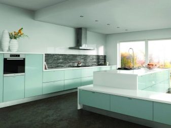
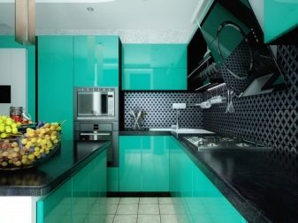
- Vintage styles. Retro is a very fashionable trend, in which mint is present in a mild embodiment. This composition is complemented by geometric silhouettes without sharp corners, contrasting combinations.
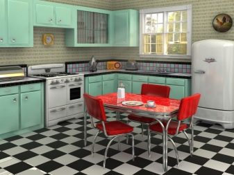
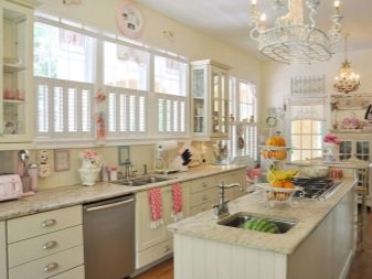
We place the right accents
Oversaturation with shades of menthol affects the overall composition in a negative way. If you are not sure about your knowledge of color or do not want to rely on mint, try using this color as an accent. It is enough if the shade is present in the ornament of textiles, the pattern on the wallpaper. A glossy apron in mint looks luxurious, especially in combination with brown.
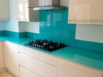
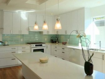
Mint details look great on a snow-white background. The ornament can be floristic, curly, abstract - depending on the chosen style. It is worth adding a bright blue touch to this picture - and you get an incredibly beautiful design. Popular solutions for accentuation in the menthol scale:
- towels, tablecloth, curtains;
- a wall in this color, decorated with monochrome photos in white mat;
- mosaic of mint tone and metallic sheen of technique.
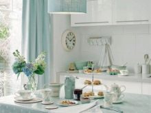
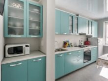
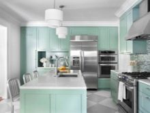
In addition to the detailed design, the accent can be made on the floor, walls, ceiling. You should not choose a bright gloss for their design - it is better if they are matte. Against such a background, a kitchen set in a different color will look best: red, catchy blue, white, wood colors. It depends on the style.
Choosing ceramic tiles as a material, you can safely experiment with mint, but it is better if it is of a pale, unexpressed tone.
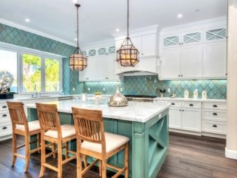
The flooring can be non-monochrome. Look original: a cage, gray-white stripes. An effective accent is the dishes in this range, it is better if it is slightly richer than other menthol shades in the room.
Be sure to take into account the degree of illumination: in dark rooms, use lighter colors, in well-lit rooms - bright, saturated ones.
