Peach kitchens: design features, color combinations and examples
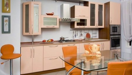
Among the many shades, peach stands out for its special tenderness and warmth. The judicious use of this color in the interior can make a space charming and cozy. This is especially important for the kitchen, because people spend most of their time here. We will talk about how to harmoniously fit a peach kitchen set into the interior in our article.
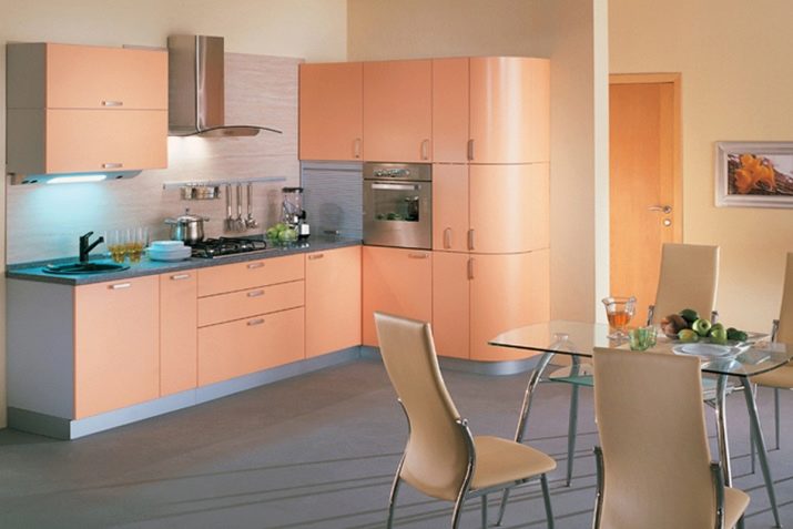
Peculiarities
"Delicious" peach shade is formed from a combination of 3 colors. Orange, yellow and red are bright, even flashy themselves. But oddly enough, the tone, named after the famous fruit, turns out to be calmer. The light shade of peach evokes a feeling of peace and harmony. A brighter tone invigorates, creates a festive mood. In any case, the color enhances the appetite, causing an association with a velvet fruit. It comes in handy in the kitchen.
A room decorated in peach tones will always look as if it is bathed in the sun. That's why this color should be paid attention to those whose windows face the north side. If you combine peach with other warm tones, the room will always be cozy. The inclusion of cool colors in the setting is also allowed. Peach goes well with many shades, so there are many variations in kitchen design with such a set.
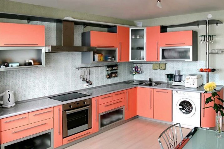
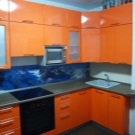
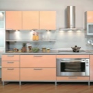
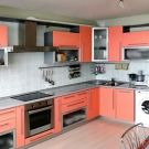
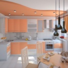
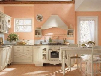
As for the style of the interior, modern furniture is mainly produced in this color. The point is that the shade looks better on a smooth matte or glossy surface. This can be achieved by laminating chipboard or MDF, and such headsets are suitable only for modern, minimalism and hi-tech.As for the classic and "rustic" styles, they imply the use of wood for the production of cabinets or wood imitation. Of course, if you wish, you can paint the tree in a peach tone, but it will not look very good.
Modern models are very diverse. These are headsets with straight lines and rounded options. Both monochromatic and combined designs are acceptable. Most often, the top row of cabinets is highlighted in one color, and the bottom row with the other. However, manufacturers also offer more original versions.

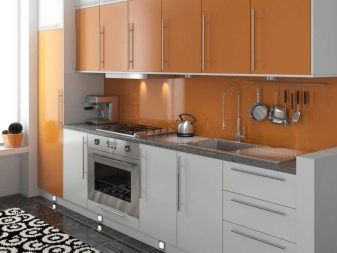
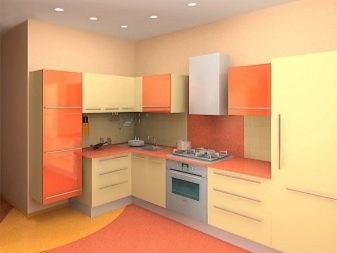

Combination with other shades
Despite the fact that this color is very pleasing to the eye, its abundance in a room can be annoying, especially if a bright option is chosen. Therefore, the best solution is to take 1-2 additional shades that will be in harmony with the color of the kitchen set and emphasize its dignity.
White
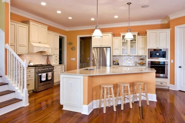
White peach cuisine is one of the best options. Whiteness refreshes, creates an atmosphere of cleanliness and coolness on a hot day. Against her background, the peach becomes even more juicy and expressive. Often this color combination is used when making a two-color headset. Also, whiteness can be present as an addition to plain furniture. A tabletop, an apron, other pieces of furniture (table, chairs) or decor can be snow-white.
If the headset is large, you can use white for the walls. If a monochromatic design seems boring to you, choosing a light wallpaper with a peach pattern would be a good solution.
Gray
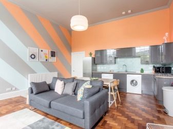
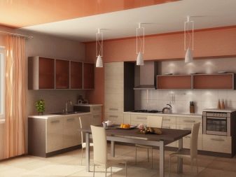
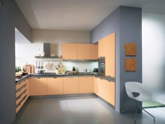
Ash shades are very practical. In addition, in combination with a peach shade, they look quite impressive. A dark gray asphalt tone can be incorporated into a spacious room. If the kitchen is small, it is better to choose a light gray shade, complementing it with chrome details. In any case, the use of ash allows you to completely eliminate the effect of the "doll" setting. Such an interior turns out to be restrained, but not boring. Gray can be a countertop, part of a headset, walls, or even the floor.
You can take white as a third color for decorating the space. Depending on its amount, the interior can be made more or less light.

Brown
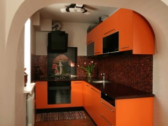
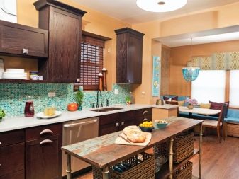
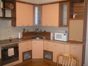
The peach brown combination can be called natural. It creates an association with a ripe fruit hanging from a bare branch. You can make the floor brown if the size of the room allows it. In a small kitchen, you can limit yourself to a dark headset countertop and a wenge-colored dining table. The furnishings will be harmonious and very cozy.

Green
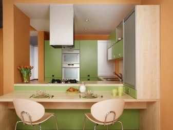
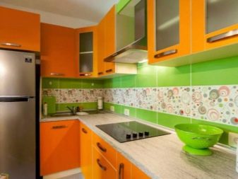
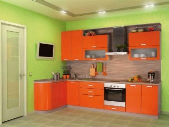
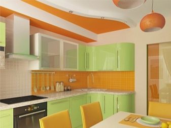
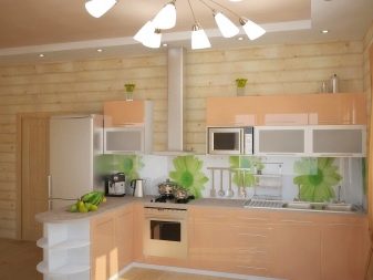
Another idea given by nature is the combination of a peach with rich greens. You should not be zealous with adding green to the decor, otherwise the interior will turn out to be too bright. A few spectacular touches in the form of a pattern on an apron or plastic green chairs are enough. Fresh flowers in pots will also come in handy.
Blue, mint
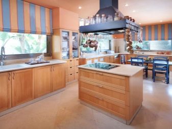
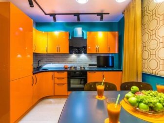
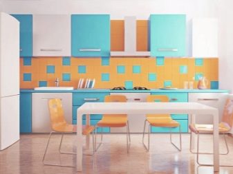
These shades can add a touch of sea freshness to the design of the kitchen. It is also worth knowing when to stop, including cold accents in a metered dose (in decor, small elements of the interior). In addition, it is better to choose light, not too bright colors.

Burgundy
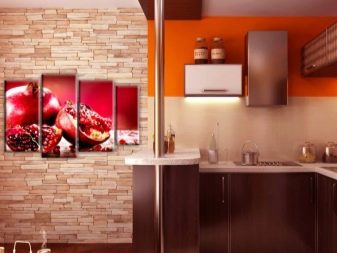
If the peach tone has a pinkish tint, it can be successfully combined with a noble burgundy color. It can be present in an apron pattern or wallpaper print. If you wish, you can even make the bottom row of cabinets in burgundy shade.



Beige
Combination with beige tones (creamy, caramel, sandy) the interior turns out to be very soft. However, given the similarity of colors, you should not be limited to two of them. A beige and peach kitchen without additions will look inexpressive and boring.
The interior should have a third color that stands out from the warm range, for example, white, gray or brown.

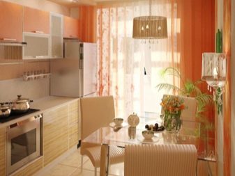
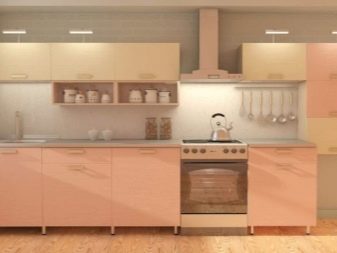

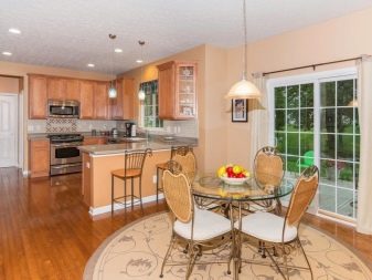
If you want to limit yourself to warm colors, combine tones of different saturation. You can choose a light beige shade of walls and floors, as well as a bright set. This will prevent the colors from blending into each other, and you will be able to create a pleasant, delicate background. Also, an alternative to boiling white can be a milky color. It will refresh the space, but it will not make it cold.
We should also mention the stylish shade of beige "coffee with milk". Not only is the color itself fashionable and beautiful, it perfectly sets off the peach, making it even more “delicious”. In this case, you can take white or gray as the third component of the palette.

What colors should you not use?
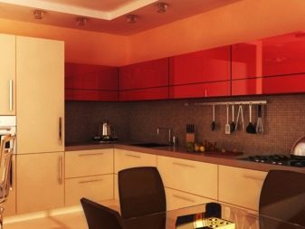
It is undesirable to combine red, crimson and bright yellow colors with such a set. Despite the fact that the combination will resemble a fruit platter, the interior can turn out to be overloaded with bright colors. The peach color does not look together with purple. Also, do not mix the color of peach with reddish-brown tones. Better to choose dark chocolate shades.
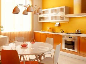
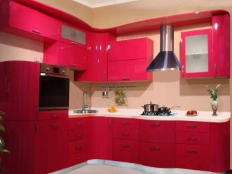
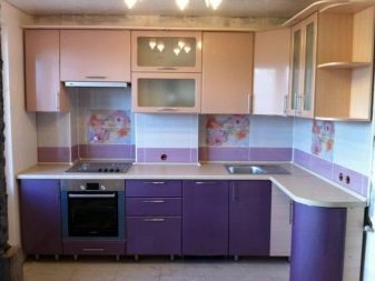
Also remember that you should not combine more than 3 colors in one interior at once. Despite the large number of listed options, it is impossible to include all of them in the design of the kitchen, otherwise the atmosphere will turn out to be motley and tasteless. The exception is halftones, which do not contrast with each other, but, as it were, merge into one soft gradient.
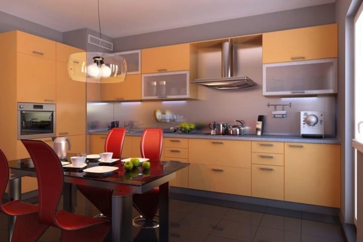
For example, white, cream, and beige are very similar. If they are all present in the design of the room along with peach, variegation will not work. Moreover, such a neutral color palette allows for another eye-catching accent. For example, it can be dark brown or green.

Beautiful examples
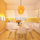
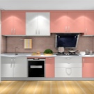
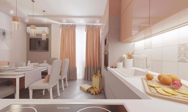
White, peach and cappuccino are the perfect combination. The interior is both cozy and very stylish. The set is combined, which allows you to duplicate the "tasty" color on curtains, furniture and lamps. The light background makes the room spacious and the design romantic. A good solution is to choose a cold shade of parquet in harmony with the lower part of the curtains.
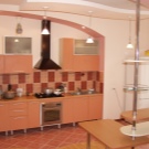
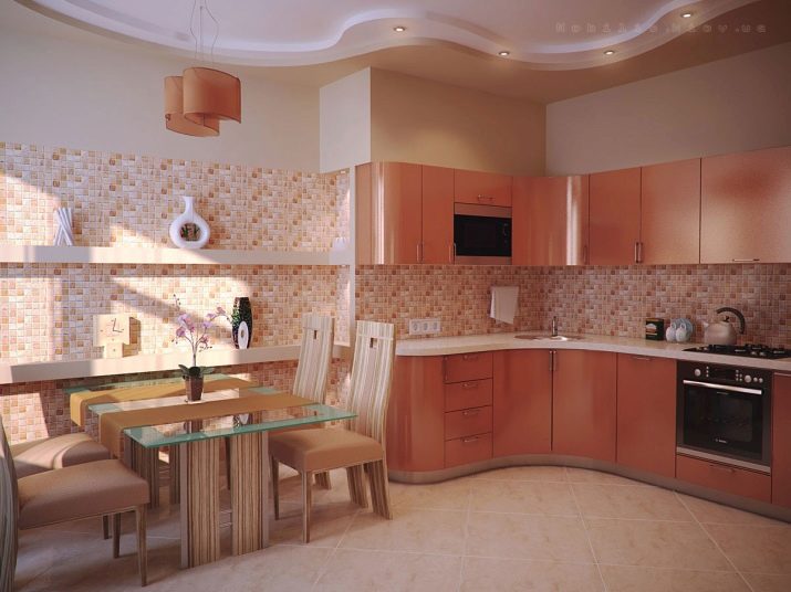
The bright interior in warm colors will appeal to active and cheerful people. The print on the walls matches the color of the cabinets. Beige chairs are invisible against the general background, which visually lightens the situation. The floor tiles are much lighter than the set, due to which it looks impressive and expressive.
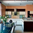
Delicate tones are not typical for a brutal loft, however, with a mix of styles, this option is also possible. The traditions of shapes and textures are perfectly kept - cabinets in this style can only be rectangular and matte. Roundness and glossy shine are inappropriate here. The design of the headset is as simple as possible, but due to the juicy shade it looks interesting. Milk and chocolate colors have been successfully chosen for floor zoning. The brick wall also has a matching greyish brown tone. The composition is completed with a white apron and gray touches of decor.
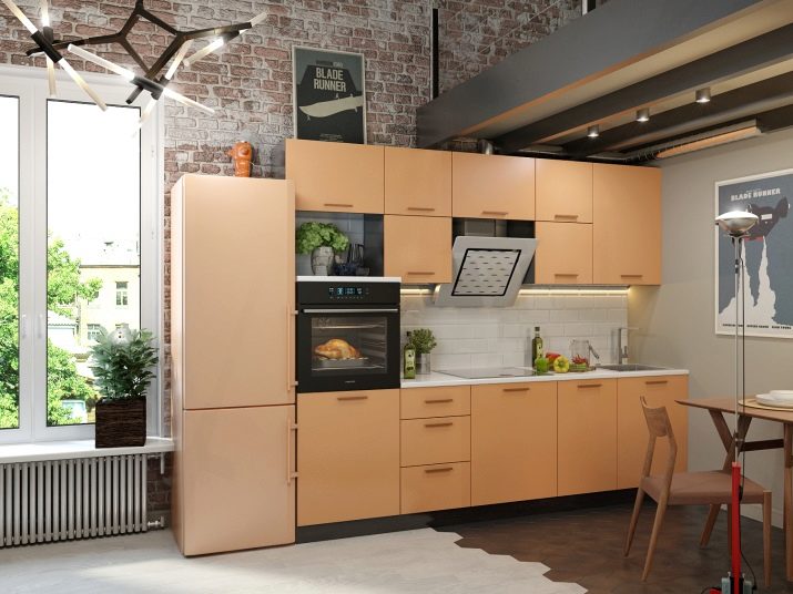
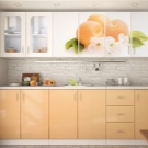
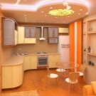
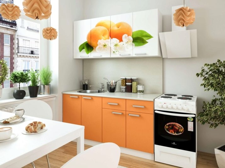
Photo printing on a headset is a great idea. Moreover, there is a reason to remember which fruit the color is named after, and to depict it in all its glory. The whiteness of the walls and furniture allows a small kitchen to appear larger. The set matches perfectly with the lamps, and the green color on the façade is supported by the potted plants.
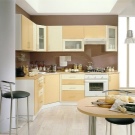
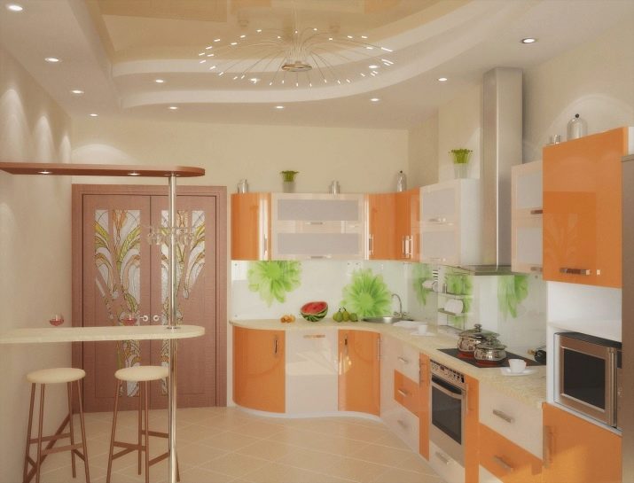
Another option with the inclusion of a green shade in the interior, only in this case it is not on the facade of the furniture, but on the apron. The set has two-tone bright colors and a complex design, but due to the neutral beige background of the kitchen, the interior does not look overloaded. A light bar counter and tall elegant stools add sophistication to the atmosphere.
For information on which color scheme to choose for the kitchen, see the next video.


