Kitchen colors with wood countertops
Wood is one of the materials with indisputable authority. It is appropriate to use it even for a kitchen countertop. But you need to carefully approach the choice of the color of the composition, then you get the best combination in the kitchen interior.
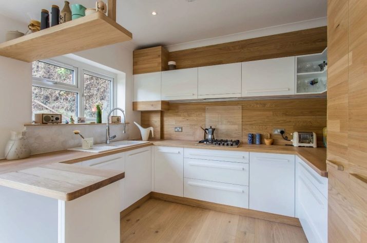
Popular light colors
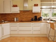
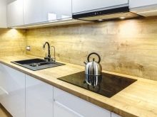
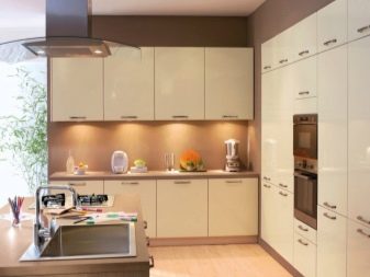
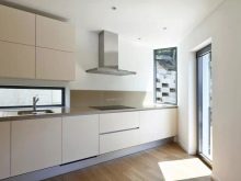
Light-colored kitchens are always popular. This is a classic solution that will definitely remain out of competition for a very long time. Such tones will look very attractive and emphasized expensive. But before talking about specific shades, you need to talk about such a popular way of decorating a kitchen set with an apron, as creating a glossy surface. This is often said to cause permanent clogging with fingerprints.
However, in modern versions of interiors (as opposed to classic ones) gloss will work as well as possible.
The intensity of the pollution is determined by the specific color used. So, on a white glossy material, it is almost impossible to find those very fingerprints.
Not only white, but also beige cuisine deserves attention. Such design:
- proven for decades;
- not subject to fluctuations in fashion;
- looks stylish and elegant.
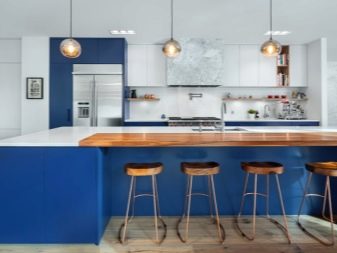
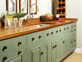
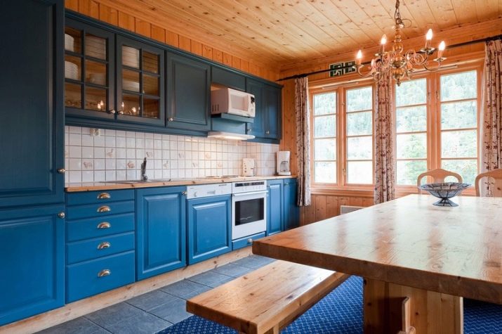
Desaturated beige color goes well with wood, it adds coziness and warmth... A blue kitchen can also be combined with a wooden countertop. Some time ago, this coloration was condemned by designers as an appetite suppressant. But for those who are overweight and simply prefer the nautical style of people, this is the best solution. Poor compatibility with other colors can be a problem.
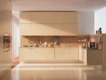
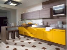
Vanilla-colored cuisine is considered appetite-stimulating. The advantage of this color is that it can be used regardless of style. Vanilla space looks harmonious and interesting, while completely calm.
To avoid boredom, you can use rich accents.
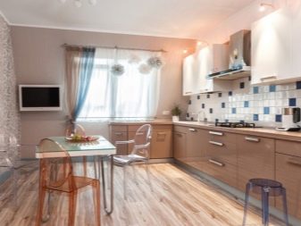
Creamy cuisine is just as good as vanilla.... This color also calms and harmonizes the space. In addition, it boosts your mood on rainy days. Here you need to consider another option - a matte surface. Recently, such options are gaining popularity again.
A matte effect can be created using a variety of materials. It blends appropriately into any modern interior.
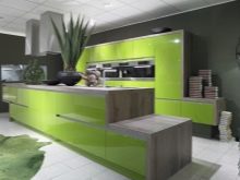
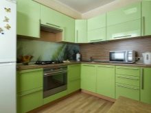
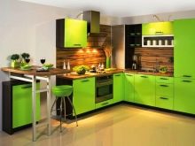
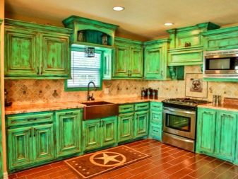
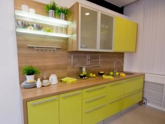
Completing the review of light kitchens with wood worktops is appropriate for compositions with light green color... It perfectly expresses the freshness of spring and the revitalization of nature after winter is over. A fair amount of vivacity and other positive effects on the psyche make this color quite popular. But it must be borne in mind that excessively bright colors can quickly get bored.
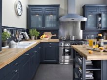
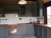
Dark facades
Light colors do not always suit people. Darker dominant colors are perfectly combined with wood countertops. It is appropriate to start the analysis of options with a blue kitchen. Heavenly color improves mood, but at the same time reduces appetite. Therefore, you can not get too carried away with the blue color in any case.
Alternatively, you can give preference not too pronounced shades of blue - the same pale blue expresses peace, promotes contemplation.
A cool blue facade is better suited for shaping modern interiors, especially high-tech ones.
When operating with green paint, you need to take into account the orientation of the room. In rooms facing south, it is impractical to use overly saturated colors. Green palette can be combined with yellow and red shades to increase appetite; combination with brown has the opposite effect.
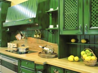
In addition to pure green, it is recommended to use pistachio (for pacification) and lime color (for more motivation).
It is strictly forbidden to use olive tone in a kitchen with a wooden countertop. This can lead to constant anxiety and even depression.
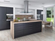
Quite often, design is also practiced dark gray kitchen. This solution is recommended for various modern styles.
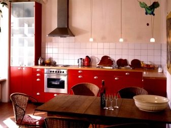
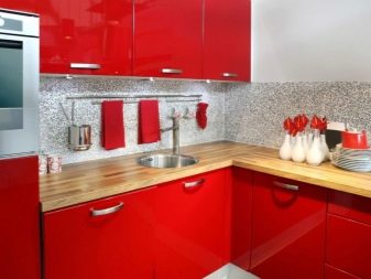
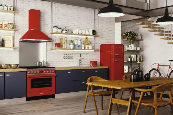
If you have impeccable taste, you can make a dark red kitchen. For example, the color of dark cherry gives good results. Such a composition will allow you to wake up faster in the morning and create a more pleasant atmosphere in the evening. The red color fits perfectly into various styles, from classic to fusion. It is also easy to combine with other colors and with a variety of geometric ornaments.
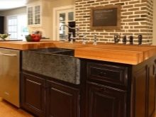
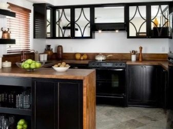
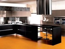
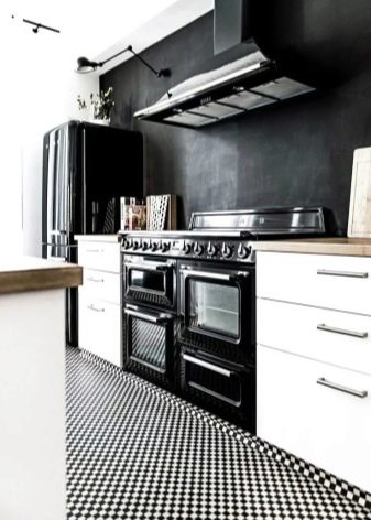
Sometimes in kitchens with wooden countertops, even black furnishings. This option should be used with extreme caution. After all, the darker the space, the less it looks. However, with a skillful approach, you can create a sense of elegance and grace. Black is appropriate in styles:
- high tech;
- minimalism;
- Gothic;
- art deco;
- retro.
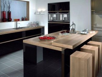
But it doesn't really matter whether you use the colors already listed or do emerald, graphite kitchen... There are universal rules and principles that must be followed. The best ratio, according to the designers, will be two colors in a 50/50 ratio. It is advisable to paint tricolor kitchens according to the scheme:
- 60% top paint;
- 30% background color;
- 10% expressive accent.
It is not necessary to use direct and unambiguous combinations. A good choice is often contrast kitchen (in which colors opposite in aesthetic perception are used). But sometimes they just choose shades that harmoniously complement the main color. You need to be aware of invalid pairs:
- Red Green;
- blue - white;
- blue - black.
Color selection
When choosing a color for a kitchen with a wooden countertop, you shouldn't be limited by general design guidelines and personal tastes. It should also be remembered that in a small kitchen room, dark surfaces will be poorly perceived. They will have to be used as carefully as possible and in a limited area.
Sometimes, for example, black facades of household appliances look good. But if this is the solution, it is not recommended to use black, brown or dark gray elsewhere.
It should be noted that the perception of colors is influenced by:
- the size of the room;
- the height of the walls;
- illumination;
- the main goal of the design project.
Even professional designers don't try to use more than 2 colors in one typeface. This is an almost impossible task. At the same time, it is recommended to make the lower row of furniture darker than the one located on top. In a monotonous space, you can vary the shades of the main color, sometimes forming a complete range. As in any other case, when decorating a kitchen with a wooden countertop bright furniture is combined with discreet walls, and vice versa.
They help to add coziness to a large kitchen additional bright dilutions. But to make the headset too dark is impractical. If possible, you should give preference to natural colors. Lines running diagonally along the walls can add dynamics to the setting.
And one more nuance - when everything is selected and the decision is made, it is worth asking yourself if such a composition looks pleasant.
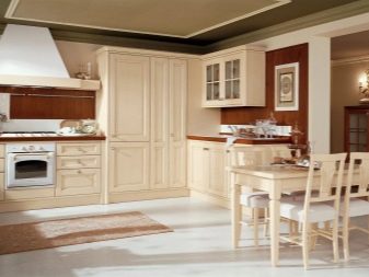
Beautiful examples
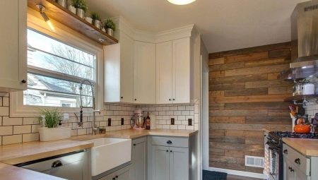
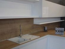
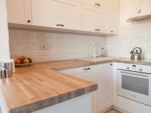
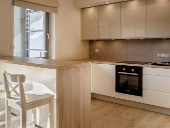
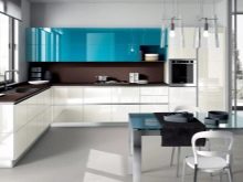
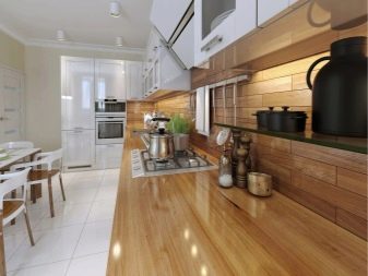
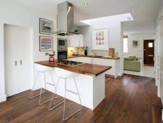
This is what one of the beautiful design options looks like. The light color of the table top is in harmony with the similar color of the rest of the wooden surfaces. White also looks appropriate and attractive.
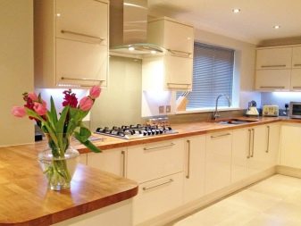
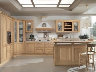
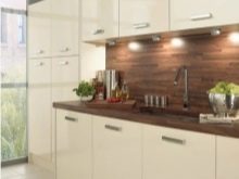
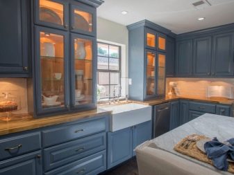
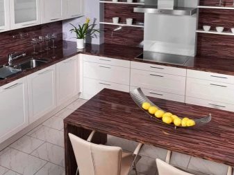
And here a clearly more intense and noble type of wood was chosen. It is optimally intertwined with the classic furnishings in the room and with the white and blue wall.
An overview of a glossy white kitchen with a wood worktop is waiting for you in the video below.


