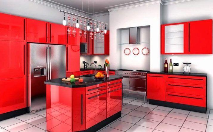
Kitchen interior in red and black
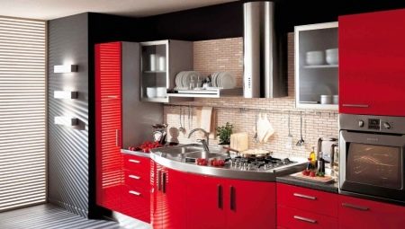
Red and black kitchen is a daring challenge to the traditional design of the headset and an interesting design solution that can become a real interior decoration. To achieve the desired effect, it is important to place the accents correctly. There are certain recommendations of specialists that allow you to harmoniously include bright and dark shades in the room setting.

Advantages and disadvantages
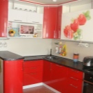
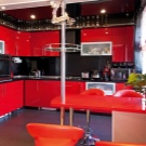
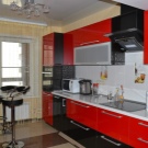
Stylish glossy kitchens - red top and black bottom, trendy totally anthracite options with a scarlet countertop, designer delights in the form of raspberry, strawberry headsets with graphite inserts can radically change the entire atmosphere of a room. With the help of such a color scheme, it is easy to hide some of the layout flaws. Red and black tones belong to the classic range and allow you to abandon additional accents.
In addition, it is possible to balance an overly bright design solution due to the interior decor or the correctly chosen style.
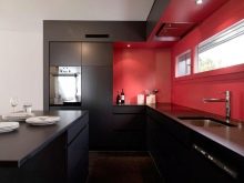
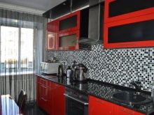

The red and black kitchen has other advantages as well.
- Contrast. Clear color separation allows you to bring to life projects where strict line geometry is important.
- Brightness. In such a kitchen you will definitely not have to look for something to "catch" with your gaze.
- Variety of shades. Red and black colors, even in matte and glossy versions, look radically different, not to mention the options when scarlet changes to coral, and charcoal acquires graphite gray tones.
- The ability to achieve an original visual effect with minimal means. You don't even need to add various details - the room will already look luxurious.
- Versatility. The set can fit into the smallest kitchen. It is also suitable for a kitchen-dining room or studio.
- Clear zoning. The work surfaces are already color-coded; there is no need to further emphasize them in other ways.
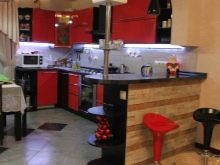
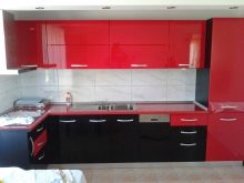
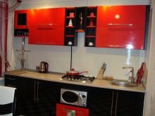
There are also some disadvantages. A red and black headset requires the right choice of lighting, many design styles will not work with it, you will have to abandon pretentious accessories. A rich color can over-excite the nervous system, and an abundance of dark will lead to its depression. An incorrectly planned color scheme will look ridiculous. But if everything is done correctly, the red and black kitchen will become a real decoration of the interior.
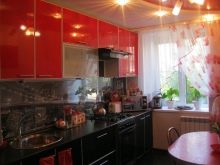

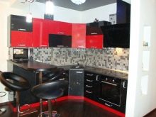
Types and placement of kitchen units
The first thing you have to pay attention to is the area of the space and its layout.
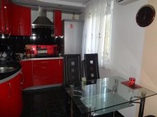

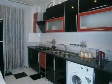
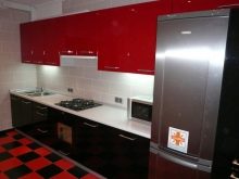
The placement of the kitchen unit and the type of its design largely depends on how large the area is available for use. If a small kitchen is being made out, only straight and angular configuration options can be used here. Linear set is located along one wall and usually does not take up much space - it contains 3-4 floor sections and a hinged unit of shelves or closed cabinets.
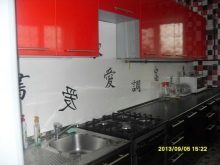
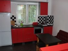
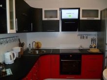
L-shaped or corner option occupies 2 walls, allows for a more rational arrangement of the storage system and equipment, increases the area of work surfaces.

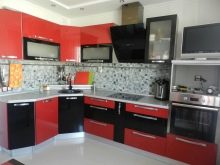
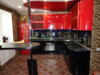
In a spacious kitchen placement of a red-black headset can be U-shaped along three walls... This is a convenient solution that includes a bar counter.
This configuration of cabinets allows you to abandon the dining area in its classic form, makes the kitchen more modern.
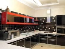
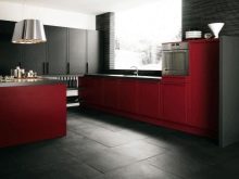
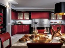
In addition, you can use a set with a parallel arrangement of cabinets in 2 rows - on opposite walls, and move the dining area to the window.
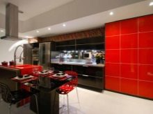

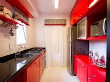
The kitchen with the "island" also looks interesting. - a free-standing module of a square or rectangular shape, where the work surface and equipment are usually located.
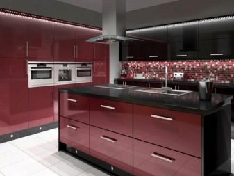
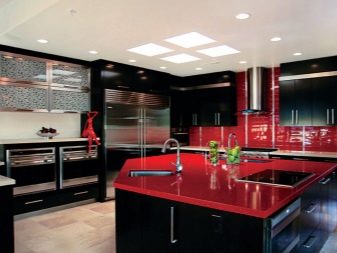
Color combination options
What to choose, a corner and straight kitchen set in black-white-red in interior design or a laconic two-color design of a set of furniture - there are many options.
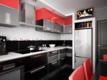
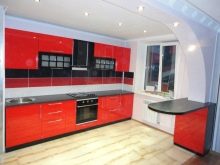

Combining colors in a red and black kitchen takes a lot of art and experience. As a rule, contrasting combinations are used here, clearly delineating the functional areas. For example, a red tone can be used in countertop finishes. The bottom and top of the cabinets can be black. Glossy scarlet storage systems look spectacular in combination with a carbon countertop.
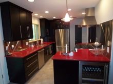

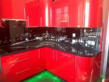
In this combination, the dominant color is the color of the vertical surfaces - the facades of the kitchen. An apron in such an interior can maintain the tone of the countertop or add new colors to the decoration of the space. To avoid overly merging colors, you can include a third tone, with which accents will be indicated. Most often, this role is played by white - rather neutral and at the same time solemn.
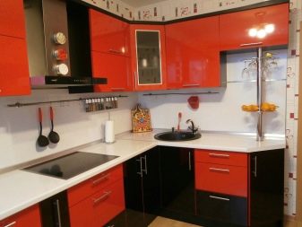
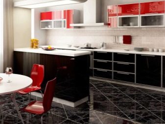
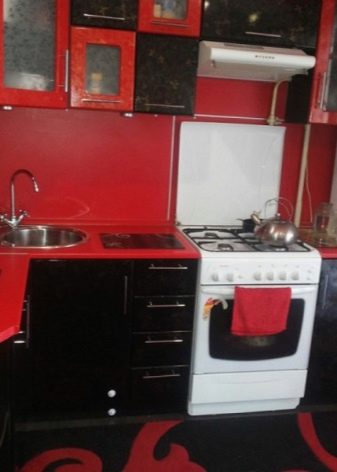
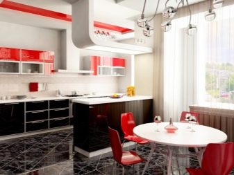
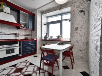
A popular solution is a red top and a black headset bottom. In this case, you can include in its decoration a white tabletop and edging of glazed wall cabinets. This will dilute the unnecessary rigor and help make the contrast kit more versatile. Combine with a glossy floor with black marbled tiles and white walls to create a very light kitchen without a hint of gloom. In the dining area, a white round table with red chairs will help support the chosen design solution.
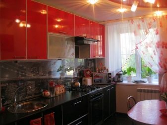
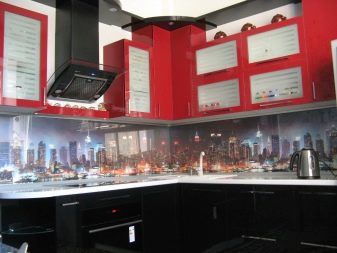
The apron and the countertop are two elements that play a significant role in the combination of colors in the kitchen space. If the facades are two-tone, the decoration of these zones can also be built on contrasts.For example, lay out the apron area with mosaic tiles in two colors or place here a glass panel with a red and black pattern, floral print, 3D photography.
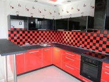
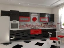
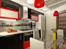
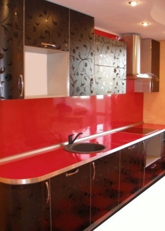
If the table top is painted in red, you can use other visual tricks. For example, combine it with a matching apron, giving volume and depth to the work area.
Against such a background, silver household appliances look especially impressive.
Suitable styles
Among the design styles that can be used as a basis for creating a red and black kitchen, options that are close to minimalism, but not only to it, stand out especially. It is important that the decor of the working and dining areas coincides with the overall design of the house, apartment, and does not create too bright contrasts in the interior. Besides, when choosing a style, it is worth considering the personal preferences of the owners and the available budget from the very beginning.
Modern
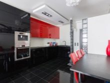
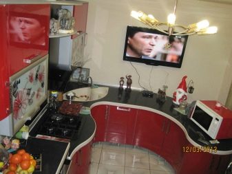
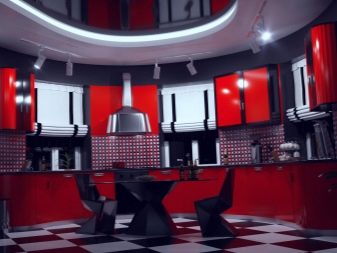
This amazing style of the early 20th century is back in fashion. The interior allows the use of a combination of red and black colors. For this option, a contrasting light floor, glossy facade design, the use of podiums and ceilings with complex geometry are suitable. Angular lines are completely absent in Art Nouveau. Natural and smooth curves throughout, in decor, furniture, window and doorways. The walls can be black or dark gray, cabinet designs are complemented by carvings, stained glass windows.
Provence
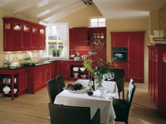
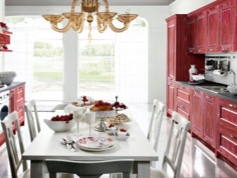
The sophisticated and light style of the French province can also be embodied in a contrasting red and black tones. Only the basic tone will be an exquisite wine color, close to burgundy, and only the table top will remain black. Muted shades are well suited for interior decoration in a country house. The apron here can be left natural, wooden, walls made of light wood will also harmoniously emphasize the sophistication of the decor. Copper or bronze cabinet fittings will become a bright detail.
High tech
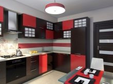
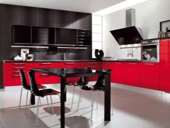
The ultra-modern kitchen in this style looks like a spaceship bay. The abundance of chrome and metal details, characteristic of this style, dilutes the black and red colors. There is a complex geometry of cabinets, "portholes" instead of traditional glazing, an abundance of built-in appliances.
Minimalism
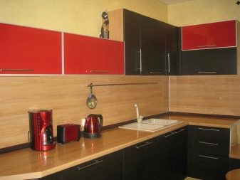
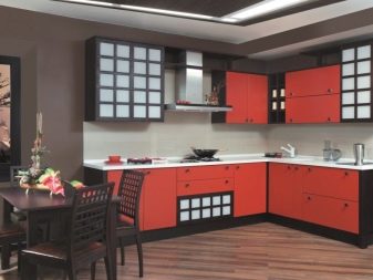
Most of the inexpensive headsets in black and red are made in the style of minimalism. Here, in contrast to the high-tech style, the facades can be matte, the technique - hidden behind the facade structures. The geometry of the cabinets is as strict as possible.
Loft
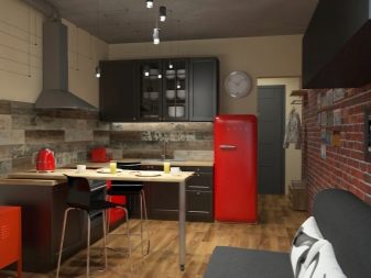
A good way to integrate a red and black kitchen into an interior is to choose a loft style for it. In this case, the decor of the facades will be red, with contrasting edging, the walls are brick, the wall part of the headset is made like a classic shelving or sideboard without hanging structures, in black. A spacious loft is characterized by the use of a U-shaped or island-shaped headset.
It is better to make the floor neutral - gray, with concrete tiles.
Interior design features
When using a red and black color scheme in the design of a kitchen set, it is important to ensure that the rest of the finishing details harmoniously set off it. So, you can complement the headset with a white apron with a bright print or graphic ornament. On walls outside the work area, matte textured wallpaper looks good. You can use in decoration decorative panels with various ornaments or in a single color - white, gray.

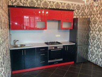
If you want to preserve the unity of the color scheme in the interior, you can decorate the walls in black or red tones. Mosaic coatings with a glossy shine look exquisite - they are not so monotonous and can be saturated-carbon. If the main color in the headset is black, and only the work surface is finished with red, you can add colors in the decoration of the walls, the choice of textiles for windows, towels, tablecloths for the dining table.
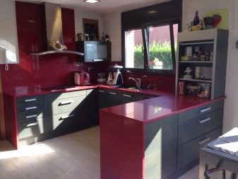
Household appliances for the interior in red and black tones can be silver-gray or steel, black and even white, if the same elements are present in the very design of the room. Window openings can be decorated with matching blinds or roller shutters.
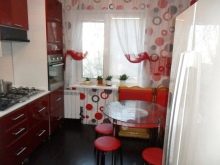

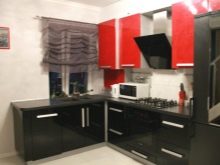
In finishing the floor in a kitchen with a black and red set, both monochromatic and two-color checkerboard styling, "dominoes" with a diamond-shaped arrangement of elements, are allowed. In the monochrome version, only a charcoal tone without transitions is welcomed. The best choice would be glossy tiles or parquet boards in a shade of dark wenge, mocha.


Lighting
Creating effective lighting in the interior of a red and black kitchen is simply a must. The advantage should be given to LED lamps of a modern look and shape, overhead or cut-in, original spots. In the dining area, the chandelier can be replaced with multidirectional mini spotlights - they go well with the loft or minimalist style. In a glossy Art Nouveau kitchen, you can use a crystal chandelier as the main lighting element and wall sconces.
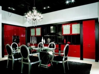
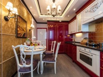
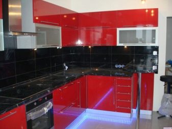
Pendant lights also fit well with the red and black kitchen range. They can be chosen in a two-tone design or alternated in the interior. If a dark floor is used, it is possible to integrate the lighting into the lower part of the floor-standing cabinets.
The glossy red stretch ceiling in combination with LED strip lighting around the perimeter looks good.
Successful examples
- The red and black kitchen is diluted with a gray background and light countertop. An active base color looks harmonious, creates an atmosphere of warmth, despite the absence of unnecessary details.
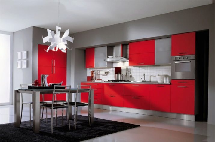
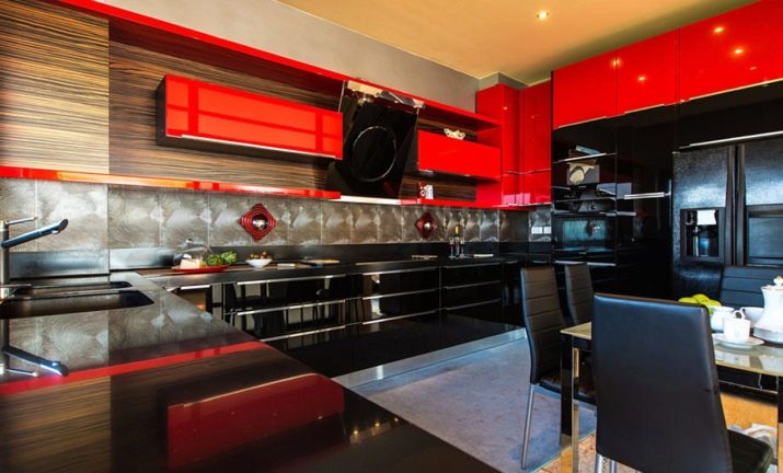
- The stylish design of the kitchen in red and black, combined with the spacious room and high ceilings, does not create an oppressive atmosphere. A bold combination of graphite-colored open modules and laconic scarlet facades energizes and looks life-affirming.
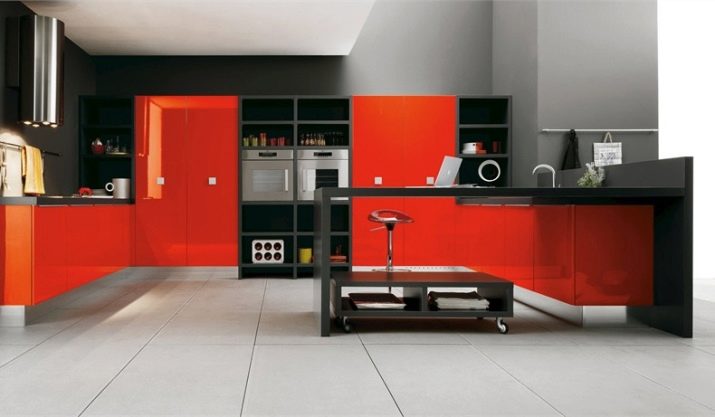
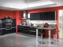
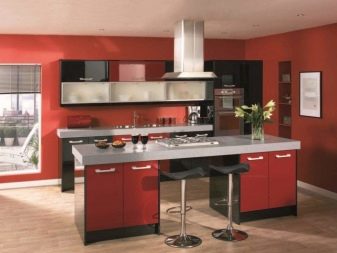
- A red and black kitchen with a complex "island" and an impressive storage system. The fittings and design of the facades are in harmony with the technology. Black countertops and cabinet bases add sophistication and graphic appeal.
