Kitchen interior in light colors
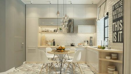
When choosing a color scheme for decorating a kitchen, many prefer light shades. This is not accidental at all. Delicate tones make the room cozy and light, visually expanding its boundaries. Such a kitchen always looks clean, it is pleasant to be in it. So that the room does not seem boring, it is worth considering some of the nuances of style and correctly placing accents.
Color spectrum
There are many pleasant light colors available, allowing you to create stylish kitchen interiors.
- White color - a universal option. It fits perfectly into any interior, has a lot of variations (boiling white, milky, pearl). In modern and classic interiors, such furniture looks luxurious and expensive, and in "rustic" interiors - original and charming.
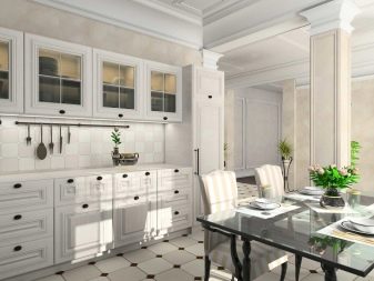
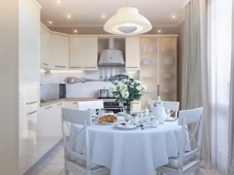
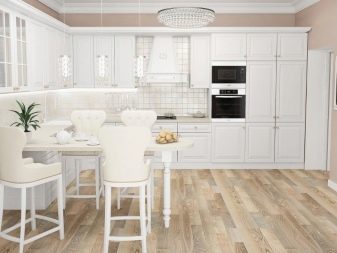
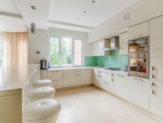
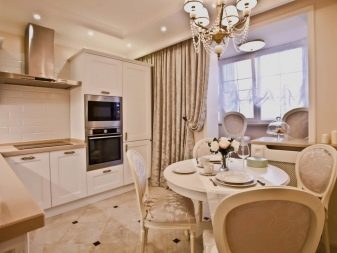
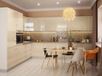
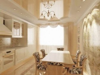
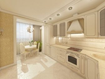
- Beige tones (vanilla, caramel) create a warm, cozy atmosphere. This choice is ideal for those who find white furniture too austere and "cold". These shades look best in classic, modern, eco style.
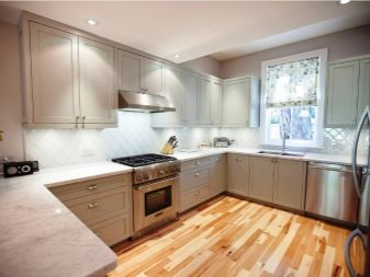
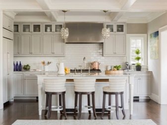
- Light gray tint suitable for spacious, well-lit rooms. Despite the seeming nondescript ashy tone, it can look very impressive surrounded by snow-white objects. Such a cold scale is characteristic of minimalism and hi-tech, sometimes found in Provence and Scandinavian direction.
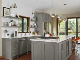
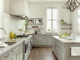
- Pastel shades (delicate light variations of pink, peach, blue, lavender, olive and other colors) can be harmoniously combined with white or beige, as well as with contrasting accents. Some of these shades fit well with Provence. In modern style, all options are good.
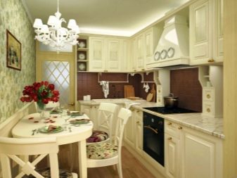
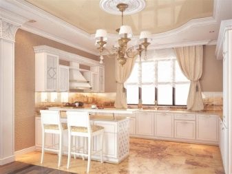
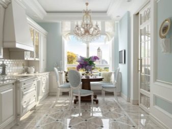
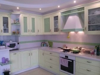
Thus, the palette of light colors is very wide. And if we take into account the variety of textures, then the number of design options increases. Luxurious gloss, shimmering shine, velvety matte, woody texture - all this looks completely different. And if you add beautiful fittings and a spectacular apron, a bright kitchen can become your pride.
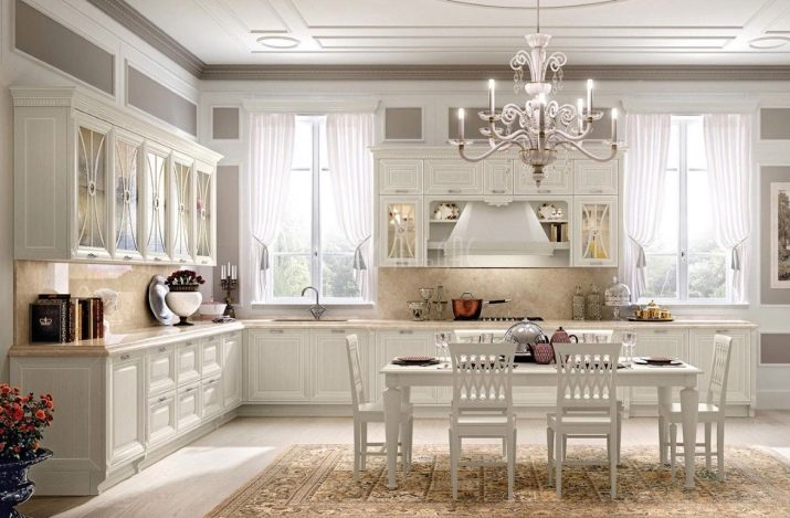
Types and placement of the headset
The shape of the headset, which determines its location in the room, is selected based on the area of \ u200b \ u200bthe kitchen.
- Straight models are arranged linearly (against one wall). This is the most common option.
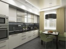
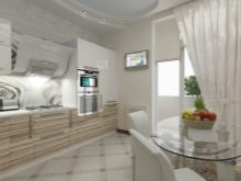
- Corner headsets are usually chosen in cases where there is a lack of space. Such models use an angle, which allows you to use every meter of a small room as efficiently as possible.
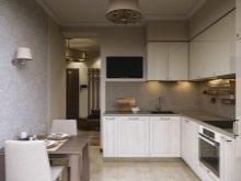
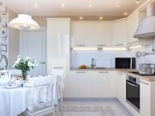
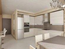
- U-shaped arrangement is rare. Given the light tone of the furniture, even in this version, it will not "weigh down" the interior.
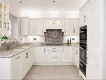
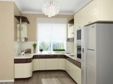
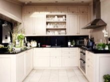
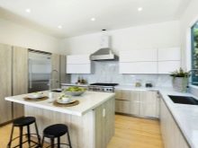
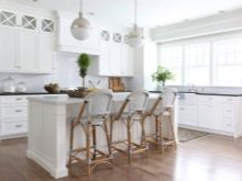
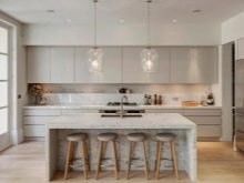
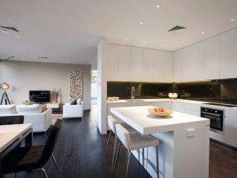
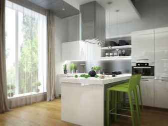
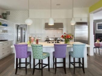
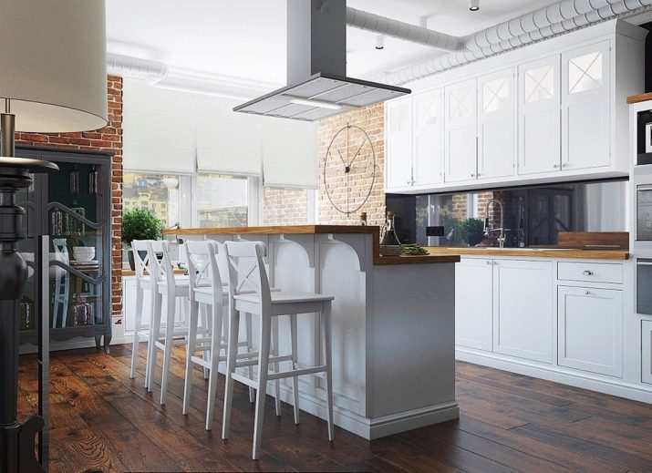
- Headsets with an island or a bar counter are original and very effective. However, such a solution can only be implemented in a spacious room. In studio apartments, the bar counter often serves as a space divider into a kitchen area and a resting place.
As for materials, wood products are considered to be of the highest quality. However, they are also the most expensive.
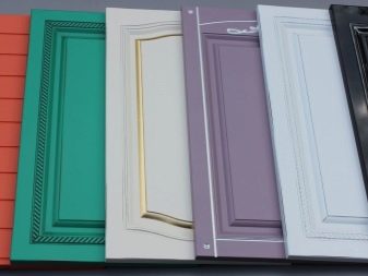
MDF belongs to the middle price category. The material can be covered with veneer or foil. Due to this, it takes on any shade, becomes glossy (enamel) or matte.
Chipboard - a budget option. The decorative coating gives the material any tone and texture. However, many people avoid buying such furniture due to the use of formaldehyde in its manufacture.
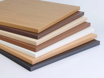
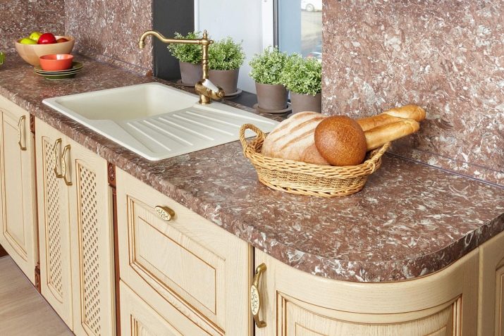
The table top can also be any. For the manufacture of this important part of the kitchen set, natural and artificial stone, solid wood, chipboard, MDF are used. The most practical are options with a variegated pattern (speckled). Surfaces made of granite or its imitation perfectly hide minor damages and stains.
If you are used to treating furniture with care, any of the options will be an excellent choice for you.
Suitable styles
Light colors fit perfectly into almost any design direction. For the decoration of country houses, they often choose "rustic" styles (country, Provence, shabby chic). Laconic minimalism, elegant classics, brutal loft, and airy Scandinavian motives can be found in city apartments. Each style has its own characteristics in terms of decoration, furniture design and the general color scheme of the room. Let's consider each of them in more detail.

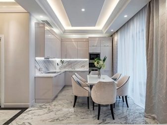
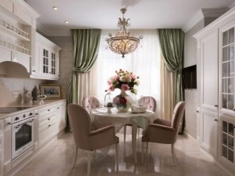
Classic
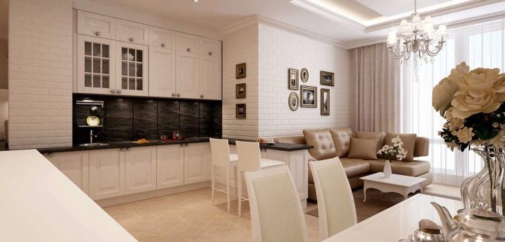
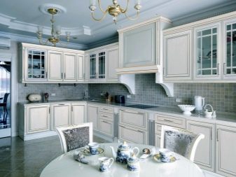
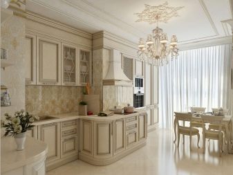
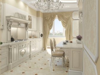
The classic kitchen set is the epitome of elegance. He can be austere and discreet, or royally luxurious. Furniture is made of wood or its imitation, it can have a snow-white, milky or beige shade. Doors are usually hinged.
Patina, carving, sophisticated vintage-style fittings can be used as decorations. For the countertop, choose natural or artificial stone. The apron is decorated with ceramic tiles.
In such a kitchen, the light tone of the headset can be combined with darker noble shades. More often these are the nuances of coffee with milk and dark chocolate. Less common are combinations with gray, black, dark blue.
If a neoclassical direction is chosen, a light shade can be diluted with bright accents of turquoise, blue, purple. In a modern interpretation of the classics, it is also possible to use glass with photo printing for the apron.
The main thing is to take into account the style of the decor when choosing a picture. In this case, images of medieval castles, imitation of paintings and old photos are suitable.
Hi-tech, minimalism, modern
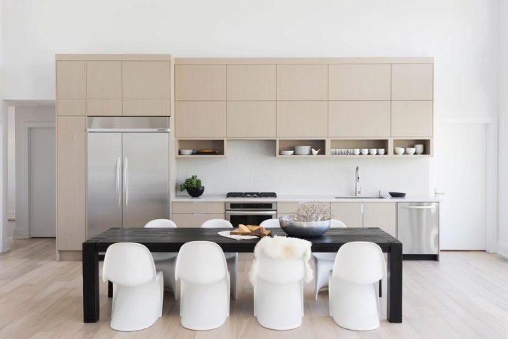
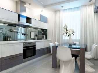
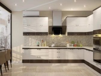
Modern styles suggest different lines and shapes. Typefaces can be straight or rounded.A variety of door opening options can be used, including lifting up and folding in an accordion manner. Minimalism and hi-tech imply cool shades of steel, spectacular contrasts.
Boiled white or light gray set can be complemented by black and asphalt touches in the decoration of the countertop, backsplash or floor. Sometimes brown shades are also used. Accents can be set with bright spots of red, mint, yellow, orange. The fittings are laconic, they can often be absent.
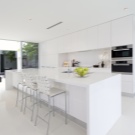
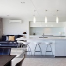
The color scheme of Art Nouveau is more extensive. In addition to dazzling whiteness and delicate creamy tones, it is allowed to choose pale tones of blue, pink, gray, purple, olive and other colors for the headset. Here the design is more "lively" and original.
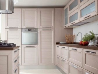
Facades can be glossy or matte. The photo printing on the cabinet doors looks interesting. You can leave the headset monochromatic, and highlight the apron with a beautiful pattern. Colored tiles, glass, plastic - there are many options. You can also give preference to furniture with a woody texture in a natural beige shade. Such a kitchen will always be warm and cozy.
Scandinavian direction
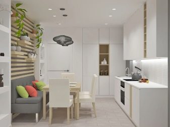
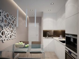
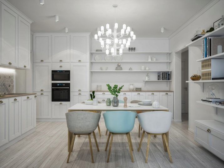
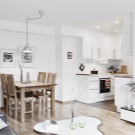
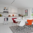
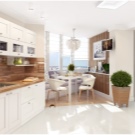
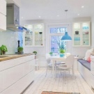
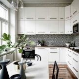
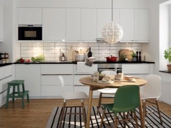
This style is chosen by those who love identity, space and abundance of white. Here, not only the headset itself, but also the walls can be snow-white. Prints are extremely rare here (mainly on woven rugs). As for the decoration, apron and furniture, they are monochromatic. The working area is decorated with square tiles or ceramic imitating brick.
Nordic headsets are distinguished by restrained simplicity. However, the style cannot be called cold and boring. The table top and other natural wood items add to the coziness of the atmosphere. Top cabinets are often replaced by open shelves.
The general color scheme of such rooms includes white, gray, beige and brown tones. Also, the interior is decorated with live greenery. Small bright accents of red, yellow or orange in decor items are acceptable.
Provence
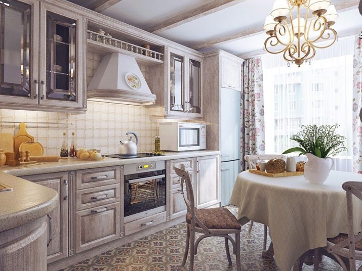
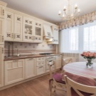
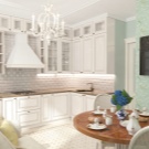
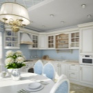
This style is similar to the previous one in its simplicity and lightness. However, the vintage mood is more pronounced here. Rectangular cabinets made of wood or its imitation are painted in one of the light, sun-bleached tones: olive, blue, gray or mint.
Of course, white colors are also allowed. The fittings are made in the old style "under bronze". The table top can either have a natural wood color or be painted (usually white or dark brown).
The space is "enlivened" with flower or striped wallpaper, textile accessories. For the apron, you can choose a hog tile or patchwork. Decorating the walls and work area with decorative plates, boards, open shelves is welcome.
Unlike minimalism, where all kitchen utensils are hidden inside cabinets and drawers, cooks and spices placed on rails are even welcome here.
Loft
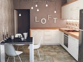
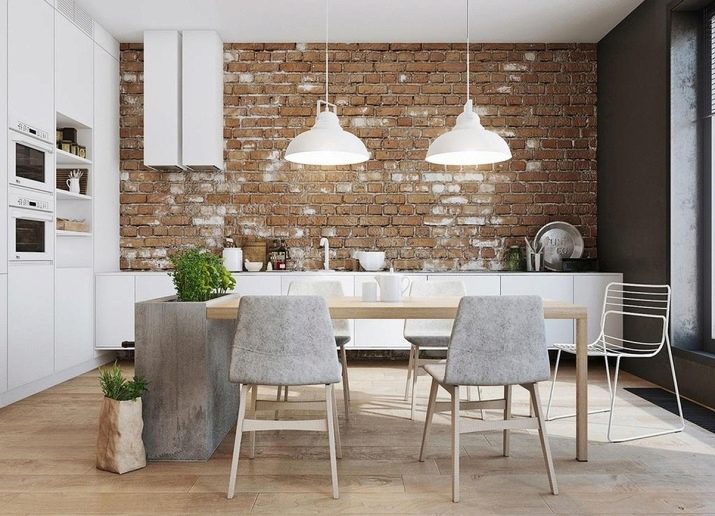
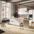
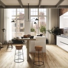
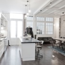
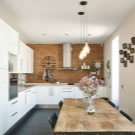
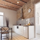
This extraordinary style creates a not very homely atmosphere in the room. Untreated concrete or brick walls, communications left in plain sight, metal lamps or light bulbs hanging from wires - all this looks very specific. However, a white set can transform a setting and make it look less gloomy.
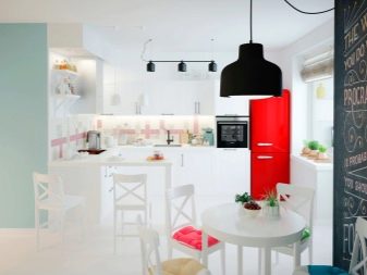
The design is welcome to be simple. There should be no decorations in the form of a printed apron or beautiful accessories. The color scheme of the room can include white, black, gray, brown. However, even within the framework of this design concept, the interior can be made more interesting. For example, you can use a slate board as an apron, and a red refrigerator or yellow chairs can become a bright accent.
Design features in monochrome
If the kitchen is made in one color, it is worth highlighting either the countertop or the apron with a different shade. Otherwise, everything will merge into an incomprehensible bright spot. The accent can be either soft (for example, a combination of white and beige), or more contrasting.
Before making repairs, decide what color your future headset will be. It is desirable that the floor covering be at least a couple of tones different from the tone of the lower cabinets. This is especially true for kitchens with light wood furnishings and beige parquet floors.
If in a kitchen with a snow-white set you want to make a floor from tiles of the same color, you can choose products with a pattern. The black and white "checkerboard" design of the floor also looks interesting, however, such a bold design move should be well thought out, because sharp contrasts are often tiresome.
Wallpaper can be printed. The plaster or paint on the walls should also be slightly different in color from the furniture. The exception is minimalism, where glossy facades seem to dissolve in space, as well as the Scandinavian style. In the latter case, not only the apron can be decorated with white tiles. This allows you to highlight the walls due to the texture of the material.
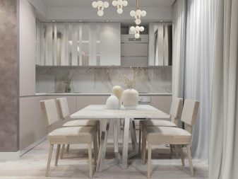
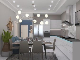
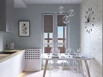
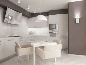
The contrasting dark floor looks impressive. However, this solution is only suitable for spacious rooms. If the kitchen is small, it is better to focus on the light design of all surfaces. But the dark countertop does not give the effect of a visual reduction in space at all, although in this case it is better to make an apron in a delicate shade.
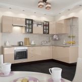
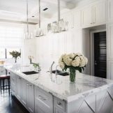
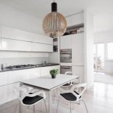
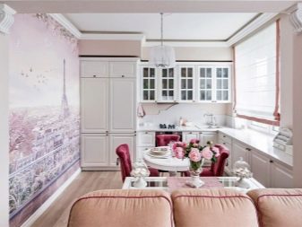
The interior, completely executed in pastel colors, will look good both in classics, and in provence, and in modern style. In the first case, the atmosphere will not be allowed to become boring by the play of half-tones of decoration, the luxury of decorative elements of furniture, graceful lamps and curtains. In the second, floral motifs and an atmosphere of rustic comfort will play a role. In the third version, you can use discreet wallpaper or an interesting glass apron.
If the abundance of cold whiteness does not evoke hospital associations in you, you can arrange a minimalistic kitchen in this color.

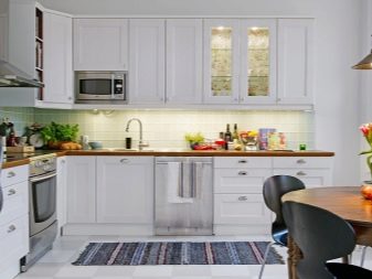
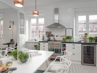
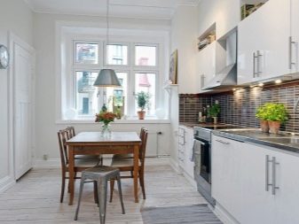
In such a room it will be easy to breathe, the atmosphere will create an atmosphere of calm and tranquility. Snow-white Scandinavian cuisine can be generously decorated with greens in pots. The warmth of a wooden countertop and a colorful rug will make the room cozy.
Add bright accents
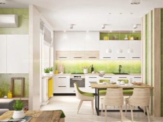
If the interior in light colors seems boring to you, you can add interesting details and bright colors to the atmosphere. First of all, the headset may not be monochromatic. For example, the top can be done in white and the bottom in light gray or beige. This option will already look more original than monochrome cabinets.
You can choose an unexpectedly bright apron for a plain kitchen. A yellow or orange color will create the illusion of sunlight in the room. Green will remind you of summer. Blue, blue, turquoise tones will add a touch of sea freshness to the interior.
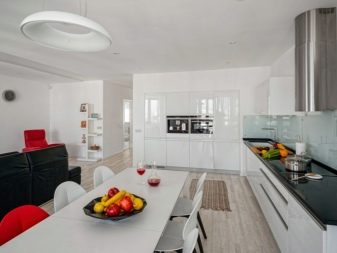
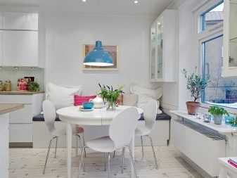
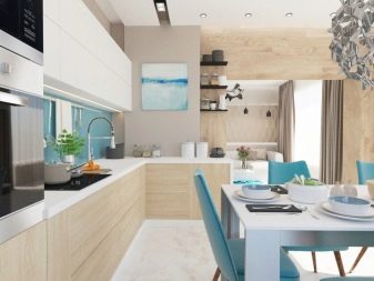
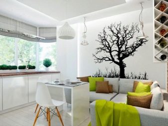
Besides, you can add brightness to the kitchen using other furniture (for example, chairs), curtains, decor items. A romantic setting will help create pink or purple shades. Sensually looks in light colors cherry Colour.
Red - a bold choice. This color energizes, increases appetite, however, it is better to use it in very limited quantities. Saturated shades give the interior a bright personality.
But if you want the room to remain light, you should not get carried away with accents. 2-3 elements are enough. For example, chairs with an apron or curtains can overlap in color.
Successful examples of interior design
In conclusion, we offer you some ideas for decorating a bright kitchen in different styles.
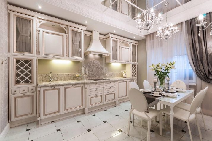
The delicate range of the classic interior is effectively set off by coffee curtains. Luxurious crystal lamps and mirrors enhance the effect of spaciousness and weightlessness of the environment.
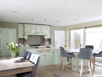
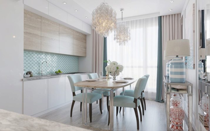
A fresh and at the same time cozy combination comes from the combination of white, beige and blue colors. The textured fronts of the upper cabinets make the set even more interesting.
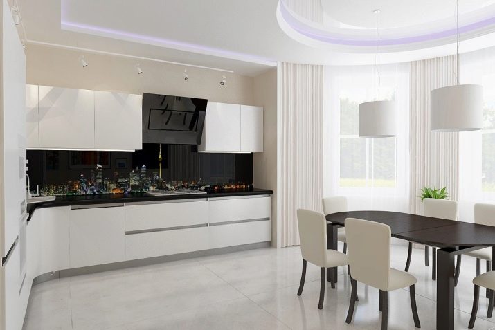
Black and white contrast always looks impressive and expensive. The table top and the printed apron seem to form a single surface. Light-colored floors and walls keep the design lightweight. The wenge-colored table harmoniously fits into the minimalistic interior.
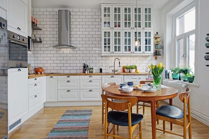
The absence of curtains on the window allows the sun to freely enter the room. The dining table, chairs and wood worktop soften the abundance of whiteness typical of the Scandinavian style. A rug, flowers - that's all you need for a cozy home environment.
The ennobled loft combines features of brutality and neat aesthetics. The white facades blend beautifully with the brick walls and brown floors. Roller blinds and bar stools support the overall mood.
The following video will tell you about 13 mistakes that should not be made in planning a kitchen.


