How to choose the color of the apron for the kitchen?
It's not a secret for anyone that the perception of space can be changed by means of shades of color. This is successfully used by interior design professionals, creating their best projects for customers. In the material of this article, we will consider how to choose the color of an apron for the kitchen, indicating on what criteria the choice of a particular shade is based.
Basic rules for the selection of shades
The colors of the kitchen apron cannot be called random. Their choice is based on taking into account various factors. For example, the location of the windows is key. If they face the north side, it is absolutely unacceptable to use cold paints. This will make the room dark and cold.
At the same time, for the kitchen, the windows of which face the south, it is impossible to pick up hot colors. From this it will become visually stuffy and uncomfortable. The way out is this: for cold rooms they take warm tones, for warm ones - cold ones. This allows you to achieve visual balance, which is extremely important for the interior of any room in the home.
The color of the apron for the kitchen can be selected based on the following rules:
- it can be related to the main color of the design or its contrasting companion;
- it should contrast with the facades of the wall and floor cabinets;
- it can be related to the table top, accessories, dishes, curtains, the color of the furniture of the dining group;
- it cannot stand out against the general background, in which it is allowed to use no more than 4 basic tones;
- its approximate color should be repeated at least in a minor interior accessory;
- it should be clean, clearly visible, free from acidity that hurts the eyes;
- he should not visually reduce the space and introduce negative perception into it;
- it should look beautiful and advantageous on the material selected for the apron with a certain texture.
How to choose the right one?
When the question of choice turns into a problem, you want to resort to ready-made templates by which you can choose a color without thinking about the compatibility of shades. And there really is such an opportunity: to select harmonious contrasts, you can turn to the color wheel. Harmoniously arranged shades in it are opposite each other. Moreover, those that are located on both sides of the shade opposite to the desired color are also considered successful for combination.
Whatever color was chosen for the design of the kitchen, the tone of the apron should not interrupt it. The accent, the role of which is assigned to the apron, should stand out against the general background. But this is only possible if there is not much of it. At the same time, we must not forget the rule of color contrast: in the interior, 1 color is considered the dominant, the 2 nd - its contrast, the 3 rd and 4 th connect the first two shades.
In this case, the colors of the second pair can be related to the first two. As for the color of the apron itself, it can be related to each of the 4 tones. However, if chaos occurs in its colors with the use of many shades of the color palette, this will introduce an imbalance in the aesthetic and color perception of the kitchen interior. You do not need anything superfluous - the choice of this or that color is based on this.
To understand what is suitable in a particular case, it is enough to look at the colors of the furnishings. For example, it can even be the upholstery of chairs, the color of their covers, sometimes even some insignificant detail. If wallpaper has already been pasted in the kitchen, the floor has been laid, the furniture has been selected, the curtains are hung, you will have to make a start from this. An exception to the rule can only be allowed if the kitchen is made in neutral colors.
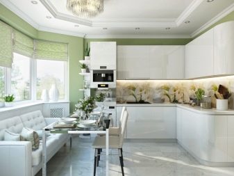
These colors do not initially carry any emotional connotation. For this reason, they can be combined with color contrasts. White, gray, silver, metallic and even black can be combined with all colors of the color palette. Against their background, each color contrast will bring its own notes to the interior. For example, green or pistachio will add life, cornflower blue will hint at freshness.
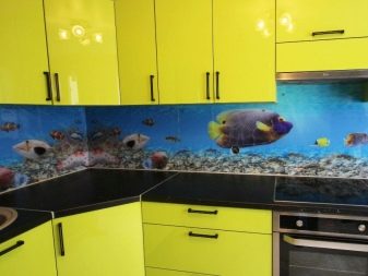
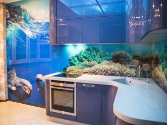
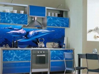
When choosing a color, you will have to take into account the theme of the apron, namely its drawing. Often it is chosen incorrectly, without considering the degree of relevance in the kitchen. Agree, dolphins and other marine life have no place in the kitchen, as well as three-dimensional images, from which the eyes get tired. Even if the background color is super beautiful, this does not mean that the apron will look appropriate and expensive.
For a bright kitchen
The choice of the color of the apron for the kitchen in light colors is based on the aesthetic perception of the tones of this group. Unlike other colors of the palette, they are able to endow the space with a high status. Therefore, the contrast will have to be chosen thoroughly, because otherwise the interior may look quite simple. We offer contrasts used by interior design professionals.
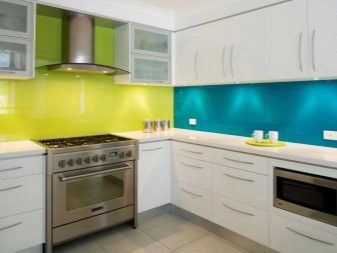
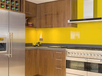
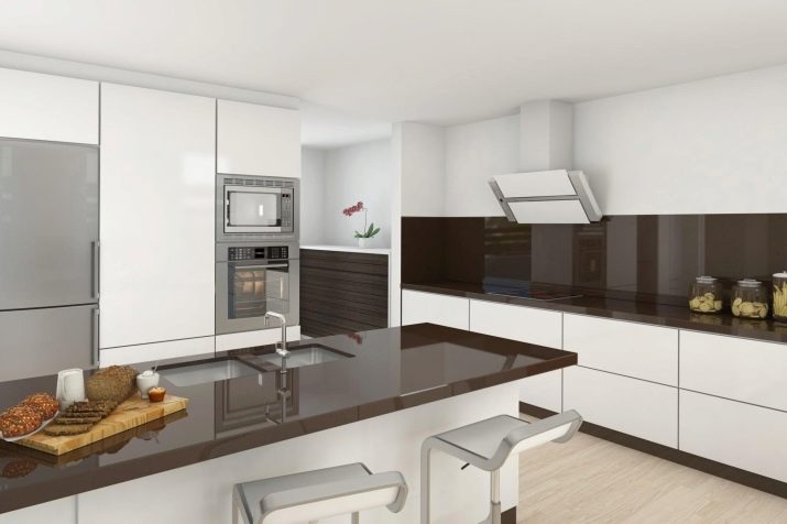
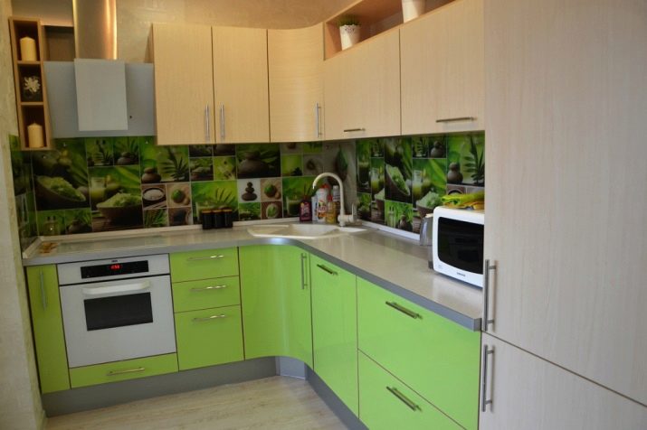
- In a white kitchen the color of the kitchen apron can be blue, turquoise, black, woody, steel, gray-brown, lavender, purple, pistachio, lemon pink, coffee, mint, peach, chocolate, sand.
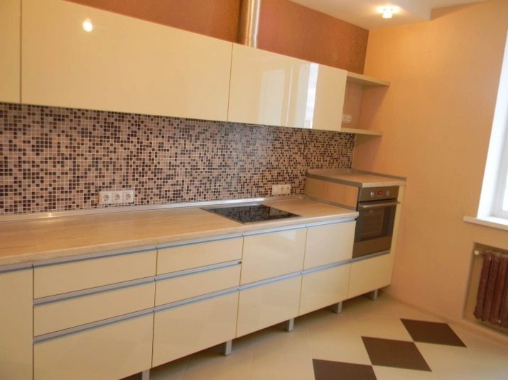
- For beige and gold aprons of vanilla, white, coffee, peach, green, gray tones, as well as gray-blue, orange-brown, white-chocolate, white-cherry, white-lilac palettes will go.
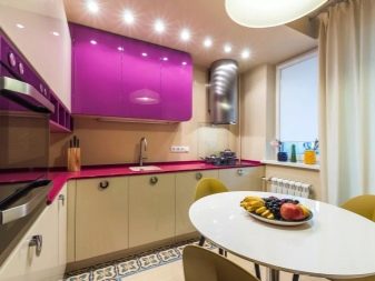
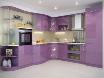
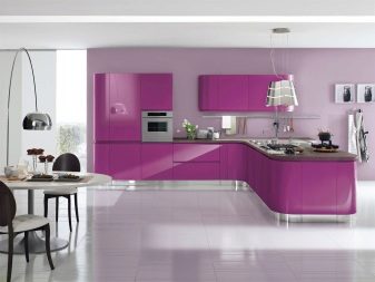
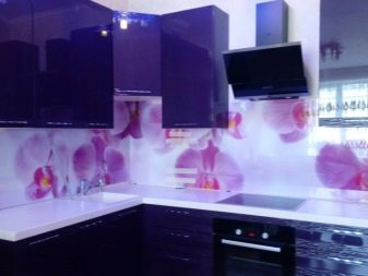
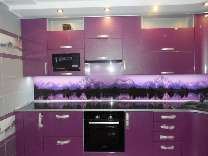
- For lilac kitchen you can bet on the contrast of white with fuchsia, burgundy purple, and pink. In addition, for this interior, you can purchase or order an apron made in the contrast of white and beige, gray and pink, white and silver, white and cold purple.
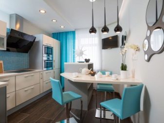
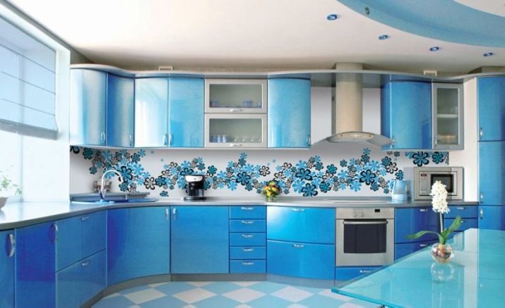
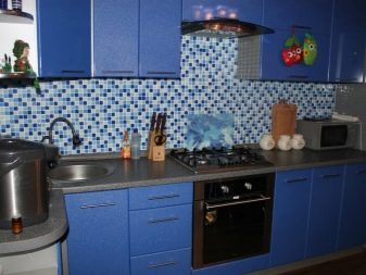
- In the blue kitchen, diluted in white, the background of the apron can be gray-blue, white-blue, turquoise, sand, beige, creamy, gray-beige.
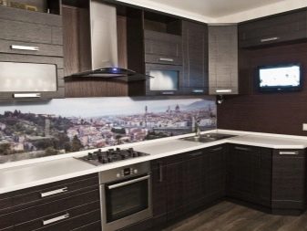
For kitchens in dark colors
If a dark color is chosen as the basis for the color scheme, the apron usually plays the role of softening the perception of contrast. In this case, it is especially important that it looks good against the general background and is in place.
- The most successful contrasts for a gray kitchen will be duets with white. Firstly, white color always softens the perception of other colors, and secondly, it makes it possible to decorate an apron with any pattern. Often, a simple print in the interior of the kitchen makes the apron not only stylish, but also an effective accent. White here can be combined with fuchsia, lemon, green, orange.
- For a brown kitchen, everything will depend on how the dark color is used. If the wall or kitchen set is light, an apron can become a dark accent of the room. If it is light, preference should be given to white, milky, woody, gray-beige, golden, orange, transparent blue paints.
- For a blue kitchen, you can choose an apron in white, sand, milk, coffee colors. In addition, contrasts of white with sand, gray, silver, blue and sand orange are welcome here.
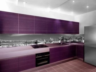
A purple kitchen can be decorated with a product made in white with a lilac or silver pattern. Also, tones that are suitable for lilac kitchens are appropriate here.
For bright
When the owners want a dynamic color to be the main background of the kitchen, you have to choose an apron in lighter and muted colors.
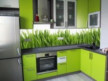
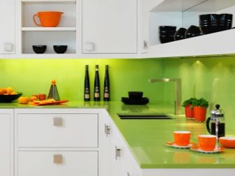
- For example, for a kitchen in green tones, you can pick up aprons in wood, white, beige, as well as products in contrasts of white with lemon, deep green, watermelon, orange and black.
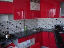
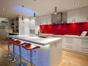
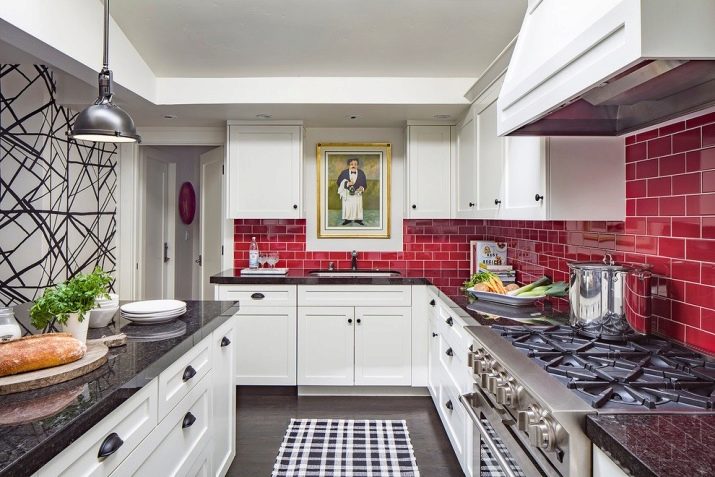
- For a red or burgundy kitchen, aprons made in white, white-gray, white-black contrasts are suitable. The trio of white with wine and light gray is also appropriate here.
- It is better to complement a kitchen in orange tones with an apron, the color combinations of which are represented by duets of white with orange and light green, sand, green, orange with black, white, terracotta. In addition, brown aprons look beautiful in such kitchens.
Yellow in the kitchen can be combined with gray; sand and white are well suited for light green.
As for the aprons themselves, here you can also refer to the opinions of experts. For example, option:
- white can be combined with any color contrast, including dosed black;
- green looks best in a neutral interior;
- red tones are ideally combined with white and light gray;
- a gray shade looks advantageous in a pink and white kitchen;
- beige is appropriate in a duet with brown, gold, silver;
- lilac goes well with white and silver gray.
Recommendations
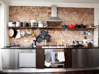
When choosing a color scheme for a kitchen apron, you cannot underestimate the resources of a specific style. It is no secret that each design direction has its own priorities, the knowledge of which will allow you to choose the shade of the apron most correctly. For example, for loft style, the use of brick and concrete shades is ideal... Modern is associated with warm sunny colors: beige, sandy orange, peach.
To choose the best color for a particular headset, you can focus both on the color of the fronts of the top or bottom, and on the color of the countertops. In addition, the pattern can overlap with the color of the fittings and the texture of the material (for example, it can be combined with stone, marble, wood). It is necessary to select an option for a classic straight or corner kitchen set, taking into account the degree of illumination of the room. Sometimes a beautiful color in the space of a particular room does not look the way we would like.
You can also choose the type of headset color combination on the basis of ready-made projects, which are generously shared by Internet portals. Designers note that the neutral shade of the upper and lower kitchen cabinets needs shades that will be darker or lighter by several tones. If they are identical, they will merge into a single color spot, which will deprive the interior of its versatility. At the same time, juicy tones need support.
If you decide to decorate the kitchen with an apron of a bright color, you need to support it with fittings of a similar tone. It can be doorknobs, towels, a tea set. It must also be remembered that the more dynamic the color of the apron, the more laconic the shape of the headset and the less decor. Ornaments and intricate patterns are also appropriate in the decoration of the apron, if the headset in the kitchen is kept in strict lines and restrained design.
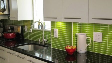
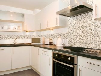
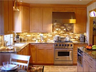
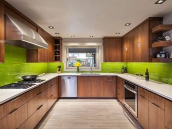
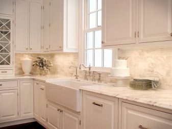
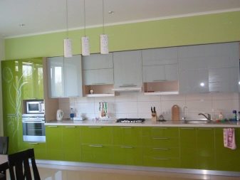
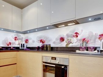
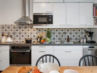
Beautiful examples
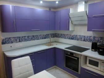
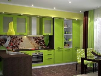
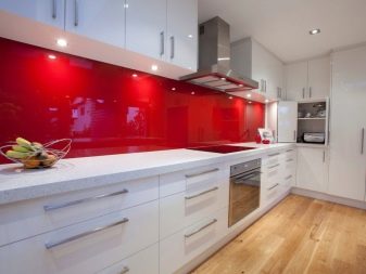
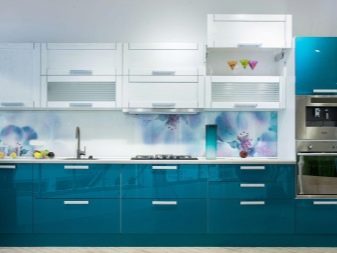
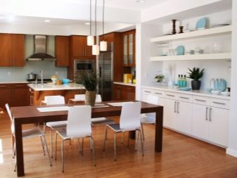
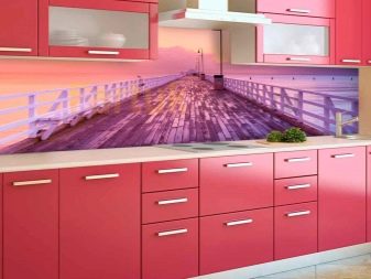
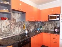
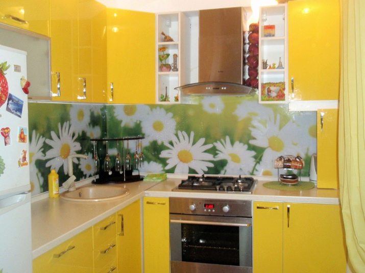
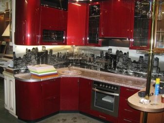
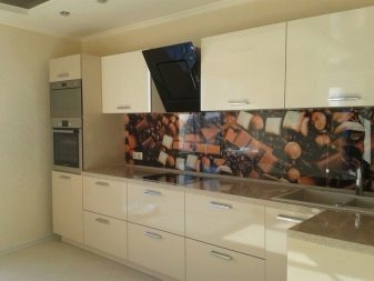
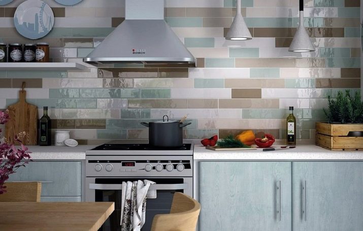
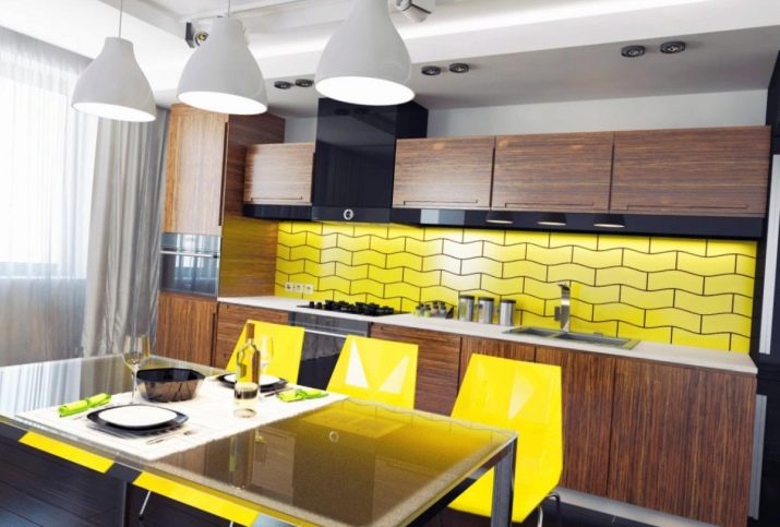
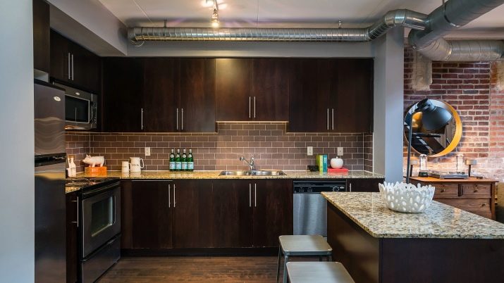
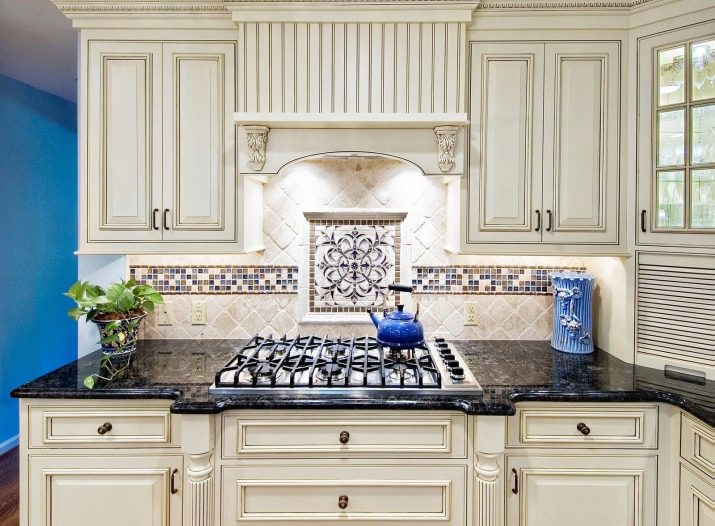
We offer 10 examples of a successful selection of apron shades, taking into account the background of the interior.
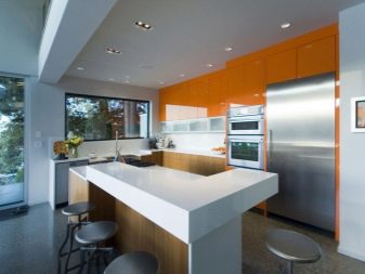
- A harmonious choice of an apron for a bright kitchen.
- Interior solution in bright colors.
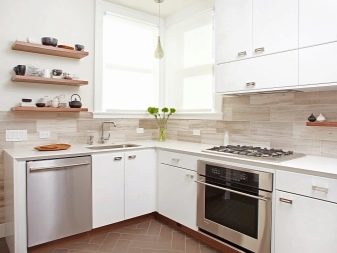
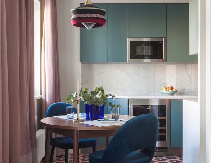
- Accentuating space in a neutral design.
- Using bright colors to decorate your kitchen.
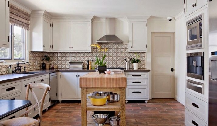
- The choice of an apron for the loft style.
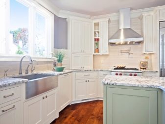
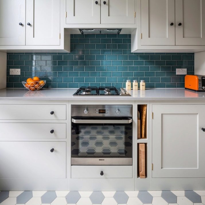
- A variant of the design of the working area in a classic style.
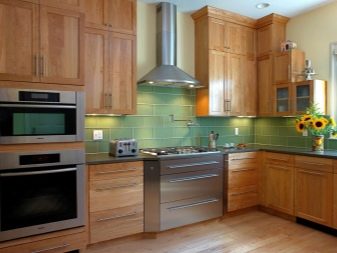
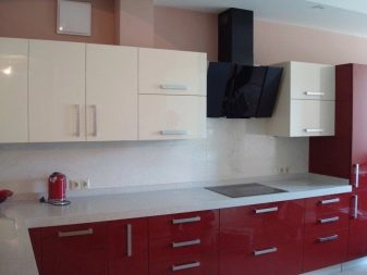
- A harmonious combination of the color of the apron with the facades of the headset.
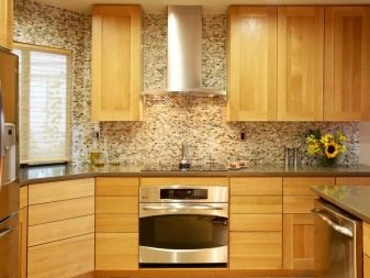
- Selection of shades for interior accessories.
- A successful color duet of an apron with a kitchen set.
- An example of a stylish apron coloring against a neutral interior.
How to choose a kitchen apron, see the video below.


