Tiles for the kitchen on the apron: types and finishes
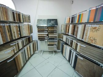
No one can argue with the fact that the kitchen becomes smart when it is decorated with a kitchen apron. In this case, the choice of facing material can be very diverse. In the article, we will talk about tiles as one of the most relevant options for wall cladding in the working area of the kitchen today.
Pros and cons of using
The tiled apron adds a special touch to the interior design. Moreover, the material itself has many advantages.
- The tile for the kitchen backsplash is aesthetically attractive and, with the right choice, increases the status of the interior by an order of magnitude.
- It is distinguished by a wide range of color solutions, due to which it is convenient to match it to a specific background of the interior composition.
- Based on the design and print features, the material can be matched to any stylistic solution of the interior.
- The material has a different shape and, depending on this, provides for a different type of styling, which makes the apron special.
- The material is characterized by a wide range of price solutions, so everyone can buy it.
- The tile differs in composition and appearance, due to which the method of cladding differs. It is variable in size, so it can be laid out in special compositions.
- Most of the range of tiles for laying an apron is resistant to mechanical damage, inert to fungus and mold, and in addition, durable.
- In stores, it can be serial and paired, which allows you to choose the material with finishing without worrying about the mismatch of shades.
- Elements can have a wide variety of textures, up to imitation of the required material.
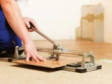
- The owner of the house can also be engaged in laying tiles, it is not difficult, although it requires accuracy and perseverance.
However, along with the advantages, tiled aprons also have disadvantages.
- Working with tiles, you will not be able to avoid dirt and construction dust.
- Any departure from the ideal markings will make the apron look untidy.
- Facing most of the materials will require dismantling part of the wall, and for better adhesion, you will have to drill holes in the wall.
- For cladding, you will need profiles, as well as a tile cutter, because it will have to be trimmed as needed.
- Before laying, you will have to spend a lot of time to calculate the material consumption and the design of the apron.
- The main part of the assortment is afraid of mechanical damage before laying, and therefore the elements often split during transportation.
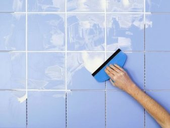
- Seams are the weak point of tile aprons. Often it is because of them that the apron loses its aesthetic appeal.
Materials (edit)
In the production of kitchen tiles, manufacturers use different raw materials. In this case, the choice of the priority option will be based on the resources of a specific style that is embodied in the kitchen. For example, someone likes majolica, resistant to aggressive environments. Others like terralia, which is made from the best grades of clay, sand and flux.
Someone uses gres or ceramic granite for cladding the working area of the kitchen. Others like it better clinker (clinker tiles), characterized by high aesthetic appeal. There is also a cotto or so-called tuscan stone, which is produced from the clay of the Mediterranean and Central American regions.
Conventionally, all types of material can be divided into several main groups. Tiles for a kitchen apron are:
- ceramic;
- glass;
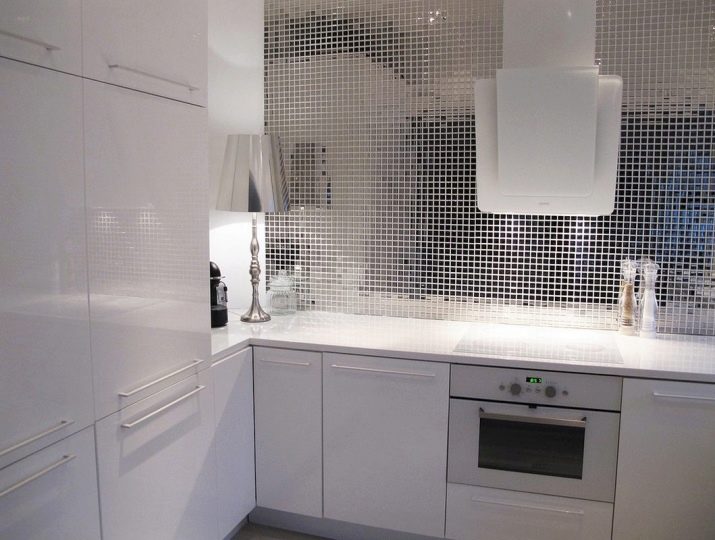
- mosaic;
- mirror;
- stone;
- self-adhesive.
Each type of material has its own characteristics, and therefore differs in performance characteristics. Ceramic is a common type of material that is most often used when facing wall ceilings. It is made from a charge mass, which includes kaolin, sand, quartz, mica and mineral oxides. It is often decorated with a beautiful pattern or ornament, it can imitate the texture of the required material, it can be smooth and embossed.
The tiles can be pressed and extruded. It is either pressed with subsequent firing, or pushed through special equipment with further cutting and firing of the resulting layer. It is thinner than floor cladding.
The disadvantage of this material is the need for calibration.
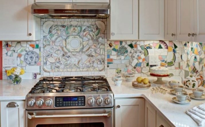
Mosaic tiles are nothing more than small squares of the same size. It is necessary to glue them on the wall especially scrupulously, because even 1 mm deviation can hopelessly ruin the overall appearance of the finished apron. This material is often used to accentuate an apron, laying out certain panels and sketches from the mosaic. Knowing this, the brands have developed a kind of mesh mosaic.
This type of raw material is unique in that it already contains a specific picture of different tiles and is divided into separate blocks. There is no need to suffer and create a drawing, like assembling jigsaw puzzles. It is glued in composite blocks, like a typical tile.
However, the calculation of the location must be done very carefully, otherwise the picture may be skewed visually.
Glass tiles differ from ceramics in composition. Despite its fragility, it is quite practical in everyday life, does not absorb foreign odors, does not burn, and is easy to clean. In addition, it is aesthetically pleasing and has the ability to visually enlarge space, which is characteristic of glass. Unlike it, the mirror one cannot boast of aesthetic appeal during long-term use.Over time, darkish spots appear on its surface.
Self-adhesive tiles are an alternative to the well-known types of kitchen tile cladding. In fact, these are PVC tiles with a different type of texture, which are glued to a prepared base. This facing can reproduce the texture of ceramics, stone and even marble. However, if this material is easy to install, it cannot be called practical.
He is afraid of high temperatures, not at all environmentally friendly, short-lived.
Shapes and sizes
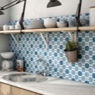
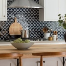
The shape of the facing material can be different. Depending on the variety, the tile on the kitchen apron can be square, rectangular, diamond, hex... This allows you to diversify the methods of styling, saving the kitchen workspace from routine and boredom. If desired, you can find unusual solutions in stores: such a tile has not only smooth and straight lines, but wavy edges.
Other details during installation form a pattern of scales, which, even with a simple solid color, looks very stylish and effective.
By the way, even from rhombuses, you can make a unique pattern by creating an apron with a three-dimensional effect using elements of different shades.
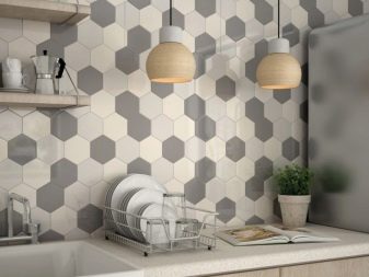
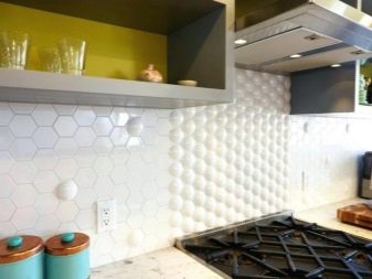
Even square tiles with wavy edges look very beautiful in the interior. Hexagonal tiles can be both symmetrical and elongated, which also looks extraordinary and expressive in the interior.
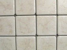
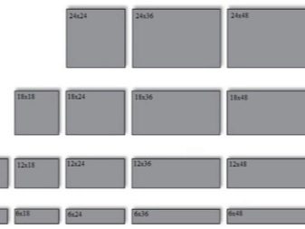
As for the size of the facing material, they depend on the type of raw material and its shape, and therefore they are small and large. For example, ceramics in the standard size is 10x10 cm. This size is convenient for stacking as it reduces the amount of trimming required. In addition, on sale you can find tiles with easy-to-install dimensions of 15x15 cm.
Also, the typical dimensions of a square tile are 20x20, 20x25 and 30x30 cm.In the lines of points of sale, you can buy items with dimensions of 20x30, 30x40 cm. If we talk about the size of the mosaic for the background or panel, the edge of its square varies within 2-5 cm. The hog tile can have different sizes. Small details of this material are 6.5x12, 7.5x15, analogs are larger - 10x20, 10x25, 15x45 cm.
We take into account the style
In order for a tile apron to match a certain interior style, the material must be selected correctly.
It is important to consider that cladding of any style has its own priorities in the choice of texture, size, color and shape.
In one case, symmetry and strict geometry are important, in the other, the stake is placed precisely on the originality and curvature of the lines. In addition, you will have to look closely at the texture at the same time.
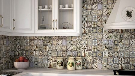
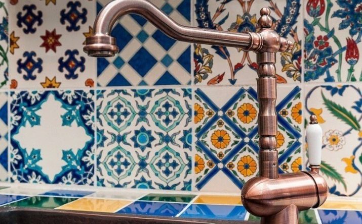
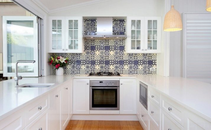
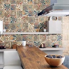
A striking example of the accentuation of the oriental style is Moroccan tiles or elements with a pattern characteristic of the stylistics. Regardless of its color, it immediately creates a special flavor in the room. These are characteristic patterns, specific tones, and variegated patterns. This tile in the interior of the Moroccan style looks bright and appropriate. However, for other styles, it is not suitable, because they need to create a different atmosphere.
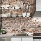
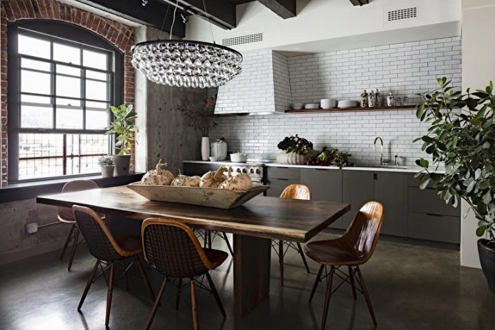
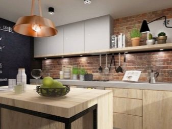
When tiles are selected for a loft-style kitchen, the situation is different. It is undesirable to take something complicated here, since it is important to create the atmosphere of an industrial facility... In view of this, the tile should be as simple as possible. For example, it can be an option in the form of ordinary square parts of white color with a glossy type of front surface.
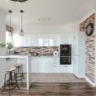
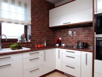
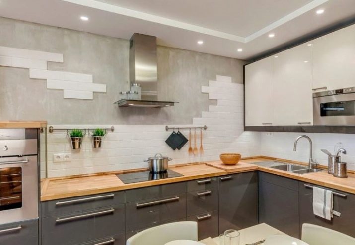
If you want something different, it makes sense to use the basic stylistic resources by choosing a design for concrete or brickwork.
In this case, the color of the tiled cladding can be either white or the usual brick or gray. The texture should be as close as possible to natural materials (rough surface type, dullness, slight relief). Nothing bright is needed here, as this will move away from the typical atmosphere of stylistics.
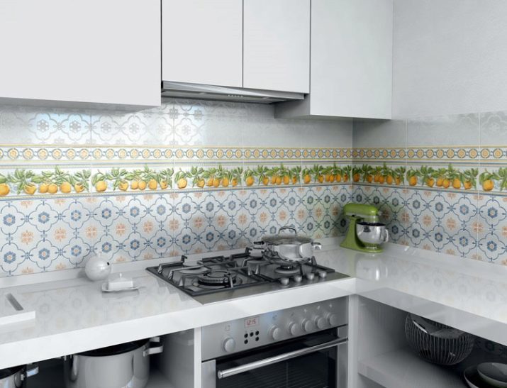
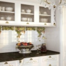
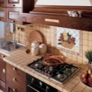
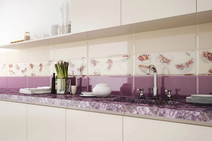
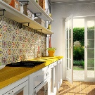
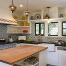
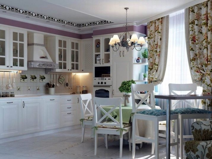
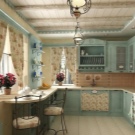
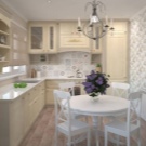
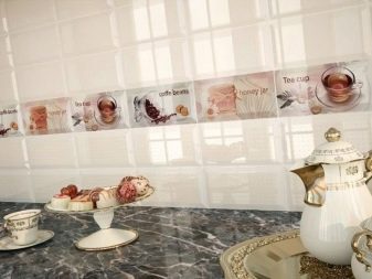
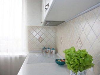
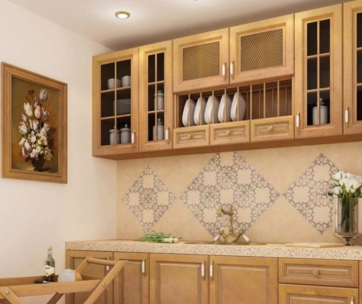
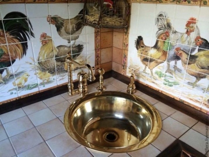
The Provence style kitchen or the so-called French country style is distinguished by a gravitation towards cool pastel shades. In this case, the priority is white. If there are few textiles in the design, you can decorate the apron not just with a symbolic pattern, but with a decorative panel. It is more expedient to position the facing composition above the slab.
The motives of prints should correspond to the style: these are meadow flowers, cockerels, chickens, pheasants, vintage still lifes, possibly sunflowers, cornflowers. The panel can be framed with a thin border, decorated with a simple floral pattern. In this case, a pair of serial tiles is selected, in which colors and specific compositions are selected. Its size should be small, their shape is often square.
With the right approach, you can decorate the apron with mosaic tiles. However, it should be borne in mind that it will have to be dosed: here it is only appropriate as a panel. The main background must be made in a plain light color, with a matte, possibly convex texture. At the same time, you need to select tones in such a way that they are combined with the color scheme of the kitchen interior. Color solutions for traditional country are warmer, the rest of the rules for choosing tiles are the same.
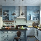
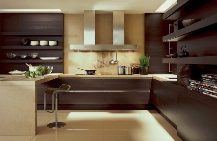
If you need to choose a tile for an apron of a modern style, you need to build on the textures used in the interior. In this case, the type of specific design and kitchen area is of great importance. For example, if this is minimalism, which is embodied in a small room, tiles are selected without a pattern with a glossy surface. In order to visually enlarge the room and give it air, when choosing a color, preference is given to light elements.
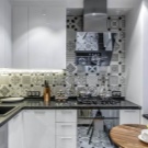
Reflectivity and gloss are the priorities for choosing a modern kitchen apron material... It is important here to show the uniqueness and modernity of the cladding. The focus is not on the print, but on the texture of the material. These are tiles or glass, as well as mirror mosaics. It is necessary to select this or that option taking into account the lines towards which the style is striving.
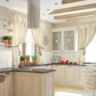
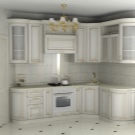
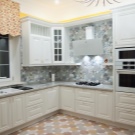
For example, for a classic kitchen, symmetry, purity of color, uniformity of the cladding, the presence of gilding and stucco decoration are important. The accent of the classic style apron can be located in the central part of the cladding. Depending on the preferences of the customer, you can choose tiles with a print. It can be ornate monograms, an originally played out geometric pattern, as well as an accent in the form of a small panel, complemented by mosaic tiles. Masonry can be either traditional or diagonal.
As for the mosaic, this material requires a particularly careful approach to the selection. If you approach the design of such an apron casually, instead of a stylish accent in the kitchen, you will get an attempt to create bathroom panels.
Ideally, it is better to take a modular-type option with a ready-made pattern, which you need to glue to the base in blocks according to the principle of ordinary masonry.
You should not mix mosaic with mosaic, because it looks, to put it mildly, not very nice.
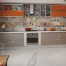
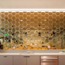
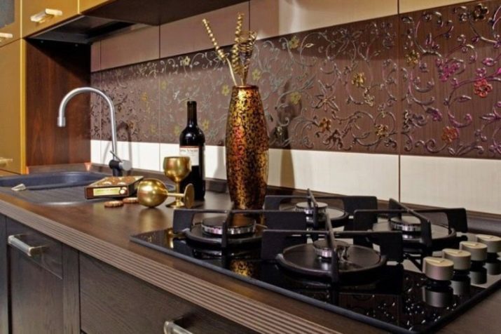
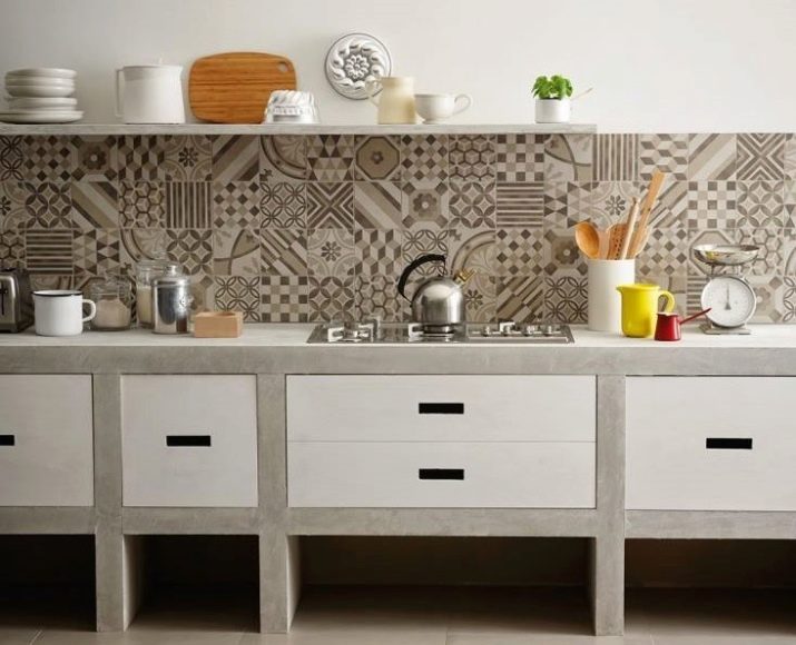
Apron finishing options can be very diverse. Tiles imitating wood, stone, brick, concrete, plaster, mirror, metal look beautiful in the interior of the kitchen. Someone prefers details with ornaments, flowers, vegetation, geometric patterns. If you want to take just a mosaic, you should rely not on colors and cheerful contrast, but on texture. For example, it can be a material like metal or a mirror. Such a mosaic will decorate a kitchen apron in the interior of any modern style.
Color spectrum
The choice of color solutions for modern tile material is endless. Modern brands offer customers the widest selection of shades for every taste. However, before giving preference to one or another option, it is necessary to take into account the side that the windows face. For example, if you go north, you should not take cold tones: visually, they will add an unpleasant atmosphere to the room.
However, cool tones are needed in a kitchen that faces south.
Ornamented tiles usually have no more than 3-4 shades. At the same time, they are usually muted, soft, which allows the colors to successfully fit into the tone of the general concept of stylistics. For example, depending on the style, it can be a color:
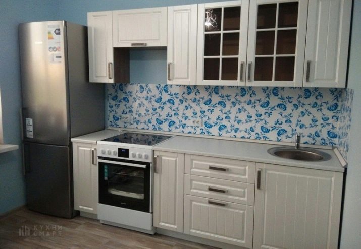
- gzhel with a combination of white, blue and bright blue;
- white and gray for Scandinavian style;
- patchwork, made in a combination of yellow with blue and orange;
- Moroccan tiles in the contrast of beige, turquoise and brown;
- country music in the form of a trio of white, beige and brick;
- Morocco, combining gray, marsh and mustard tones;
- classic in a duet of white and dark wine.
Looks good contrast of beige with gray, white with silver, white with yellow and gray, mustard and gray, blue, terracotta and turquoise. If a tile with a pattern is not suitable for the interior of a particular kitchen, the bet is made on the color of the grout. It is she who can play the role of contrast, bringing a special flavor to the interior. For example, the same yellow apron can be made special by adding gray grout.
In this case, the lines will be underlined, due to which a certain pattern will be created. In this case, the tiles can be selected, for example, in the form of honeycombs, rhombuses, as well as component parts of hexagons. Brickwork can also be made unique by marking it with trowel in a contrasting color and choosing related shades of the same color for laying the apron (for example, gray with different temperatures and degrees of saturation).
Multicolored tiles are usually used in contrast to plain color fronts for wall units and base cabinets. Otherwise, it loses its expressiveness. If you decide to create a dynamic atmosphere in the kitchen, you can pay attention to the bright colors of the elements. For example, orange, lemon, green, yellow looks beautiful in the kitchen. If you want bolder solutions, choose a wine tone in combination with a gray contrast.
Too dark and cold colors for kitchens are rarely chosen, as is the duet of white and black. So that they do not carry a negative color, they are dosed and diluted with a light companion (for example, white). Dark gray also needs a softening contrast, which is why it is usually diluted with white or light beige. If it is a mirror mosaic, it will look great against a pistachio-colored headset.
Popular brands
Today, many companies are engaged in the production of tile cladding. Among them, several manufacturers can be noted, whose products are in special demand among buyers.
- Porcelanosa - a manufacturer that produces collectible tiles in restrained colors, suitable for the stylistics of classic branches of interior design, hi-tech, modern and minimalism. The products are characterized by discreet beauty, have a matte and polished surface type, imitate smalt mosaics, marble, and the structure of porous materials.
- APE Ceramica - a brand that produces tiles for different interior styles: urban (with urban theme inserts), gastronomic print (for country style), patterns typical of the English style (stripes, lilies, geometry). The line includes a plaid in the look of Impressionist reproductions, cladding with Spanish ornaments, suitable for ethnic stylistics.
- Aparici Is a brand that currently produces 50 different collections for every taste. Among them there are elements of a corrugated type with non-standard decor, embossed ornaments, gilding, prints in the form of photographs. The assortment is designed for such areas of interior design as minimalism, ethno, modern, baroque, classic, retro.
- Pamesa - a company that produces its collections in different variations of colors and patterns.It stands out against the background of manufacturers in its segment by the technology of brief firing of ceramics. The best collections include products with pink buds, floral prints, decor in the form of hearts, crescents, stars. The manufacturer's products are of the highest quality and color purity.
- "Keramin" - a manufacturer of high quality glazed ceramic tiles, featuring the widest choice of textures and formats. The tiles of the trade mark are completed with floor cladding and various decorative elements. It can have a matte, glossy type of surface, it can be smooth or structured. It successfully imitates the texture of stone, metal, textiles, concrete, wood.
Masonry methods
You can lay out the tiles on the apron in different ways.
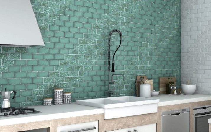
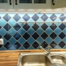
- Classic there is nothing more than stacking square elements of the same size and geometry with the formation of crosshairs. The design can be played up by inserting panel tiles, using decorative details with a pattern, a chess print.
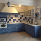
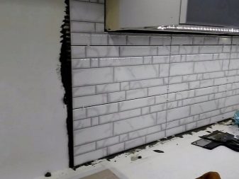
- Brick differs from the standard classics only in shape: the details are rectangular. This tile looks very appropriate in the interior of the loft style; for its implementation, both smooth and even elements and embossed porous ones are used.
- Classic with a shift or "hog" is a laying of square slabs, each subsequent row of which is shifted approximately to the middle of the width of the fragments of the previous one. According to this scheme, rectangular cladding fragments are also laid.
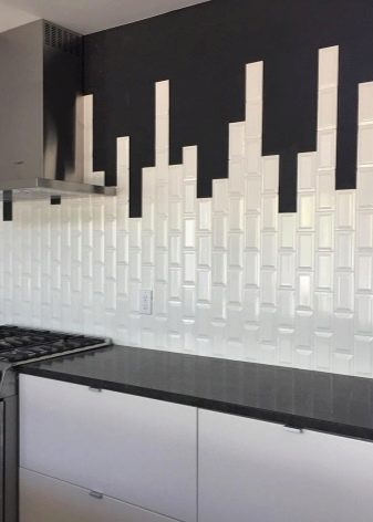
- Vertical masonry can be performed according to the principle of the classics with a shift. In this case, the shape of the elements can be used both square and rectangular. The appearance of such an apron turns out to be non-standard; for the desired effect, a plain tile is used.
- Diagonal allows you to bring a fresh look into the kitchen interior, it looks interesting, it is a stacking of square plates at an angle of 45 degrees. Lining with bricks with a shift is performed according to the same scheme. The method is considered time-consuming, in addition, with such a facing, more material is consumed and more pruning is required.
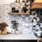
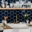
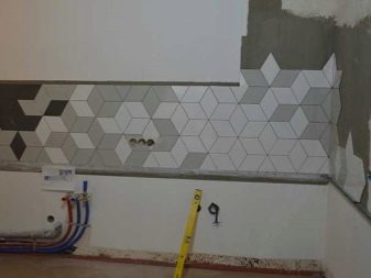
- Honeycomb obtained by laying hexagonal tiles. In this case, it is extremely important to observe the ideal geometry, since even 1 mm of seam mismatch will ruin the appearance of the finished cladding. Today, this styling is considered one of the best, suitable for cladding aprons in modern kitchens.
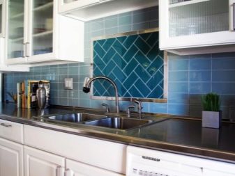
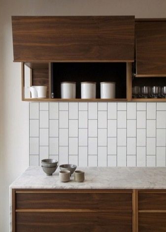
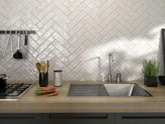
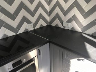
- "Herringbone" differs from previous schemes in that it is laid out at an angle of 45 degrees with alternating direction of tiles from right to left. At the same time, you need to put them one on top of the other in such a way that together they form the so-called herringbone. This type of laying looks original, the elements can be laid not only diagonally, but also according to the vertical-horizontal principle.
When choosing one or another type of cladding, one has to rely on the shape of the tile, its size and the experience of the master.
Therefore, it is impossible to say unequivocally which is better: even a laconic classic has every chance to look super-spectacular if it is chosen and arranged according to all the rules of style.
Selection recommendations
Having decided on the color, shape and type of facing material, you can go to the store to buy the desired tile. To choose really what you want, you should pay attention to several criteria for a good purchase.
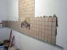
- First, draw a schematic sketch of the future apron. This will allow you to understand how it will look in the interior of a particular kitchen.
- According to the diagram, mark the number of parts that will be needed for styling. Add 10-15% to the total number of fragments in case the material breaks on the road or gets damaged during installation.
- If in the kitchen small objects are in sight, when choosing, preference should be given to monochromatic elements. Patchwork is appropriate in combination with monochromatic headset facades.
- You need to buy tiles from the same batch, since different series may have a different shade.Against the general background, this can be noticeable.
- If the cladding is matched to the color of any accessory, at home it is worth picking up the thing in the desired color. The color of the material on the display is usually different, so you can choose exactly what you need.
- Inspect each tile for geometry when purchasing. If the material is curved or of different thickness, it will not work to glue it exactly.
- If possible, it is better to select elements with a protective layer or marking A, AA. They are more resistant to chemicals when cleaning.
- You need to choose the right pictures: they should be not only beautiful, but also appropriate in one style or another.
- Never take leftovers: they may come from several batches with visual color mismatch (this is a waste of money).
- When choosing paired type ceramics, give preference to the companion tile. It has identical geometry and size.
- If practicality is important to you, the white color of the material, depending on the color of the furniture, can be replaced with another one (beige, pistachio, light gray).
Advice
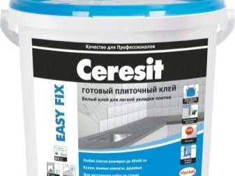
When buying tiles for a kitchen backsplash, it is advisable to immediately acquire good glue and grout. As for the trowel mixture, it is more advisable to purchase a finished color product, the tone of which you can choose with the simultaneous purchase more accurately. If you think that it is better to take a white mixture and color it yourself, varying the degree of color saturation, do not forget to choose the color scheme.
The mixture, like the glue, must be taken "fresh", and therefore it is necessary to pay attention to the release date of the products. The old grout gathers into lumps that are difficult to stir, and even more so evenly combine with the color scheme. It can spoil the look of a well-laid apron. In order to extend durability the finished apron should be sprayed with a special agent that protects the seams.
When choosing one or another option, it is worth taking into account: the smaller the kitchen area, the smaller the size of the plates and the less noticeable the grout.
Contrasting colors of the seams can add a lot of lines to the interior, which is highly undesirable for an interior composition. It is impossible in small-sized kitchens to zone the space with a mosaic, which looks better in the form of a "kaleidoscope" laying from afar.
As for the ideal color for a white kitchen, here the preference when choosing cladding can be given to different paints: wood, pistachio or metallic. You need to choose a color in such a way that it is comfortable for all household members. For example, pink and fuchsia on a subconscious level cause discomfort in the stronger sex. Blue, when there is a lot of it, causes depression, black without dosage depressing, red - excites and provokes aggression.
When laying, you can be creative by choosing the cladding option by combining boards of different sizes and shapes. For example, the main part of the apron can be laid out in the usual way, and its central part with the addition of mosaic elements in a contrasting color. You can frame the panel on the apron with a border or mosaic. Someone plays up the styling, focusing on the use of contrasting tile fragments.
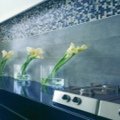
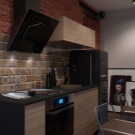
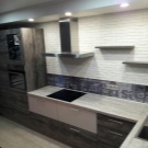
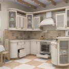
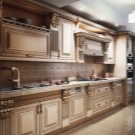
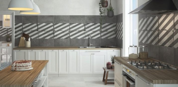
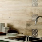
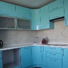
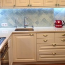
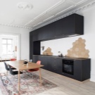
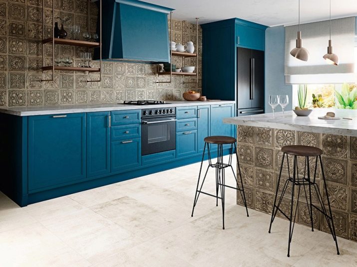
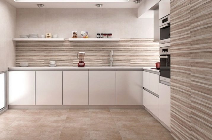
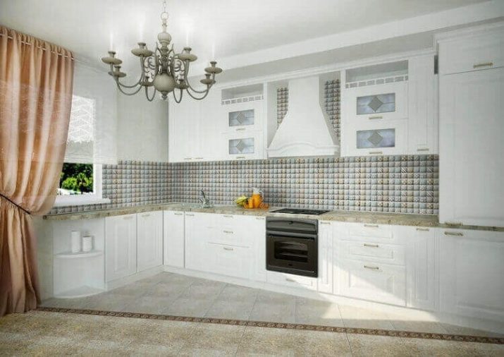
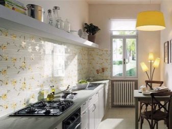
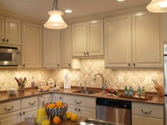
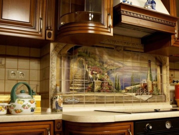
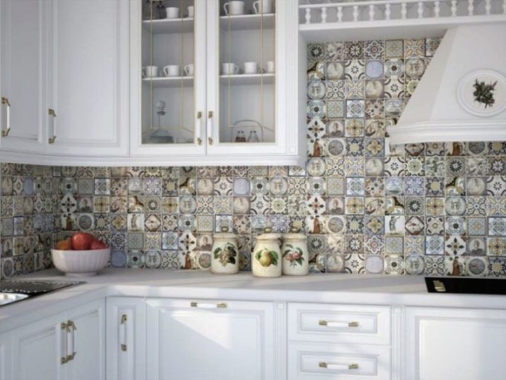
Successful examples
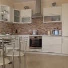
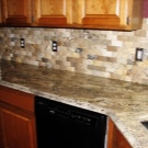
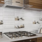
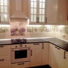
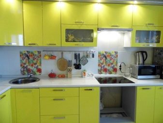
We offer 10 original ideas for decorating a kitchen with a tile backsplash.
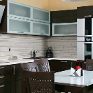
- Accentuate the workspace by decorating the wall with long white tiles.
- Laying tiles with an offset or spacing fits well into the interior of a classic kitchen.
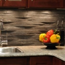
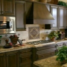
- Decorating the working area under the apron with large tiles with a relief finish, decorated with gilding.
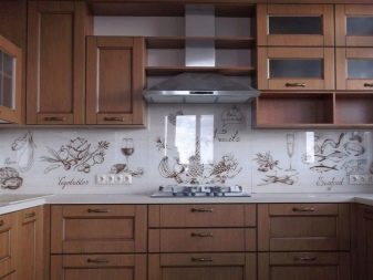
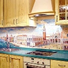
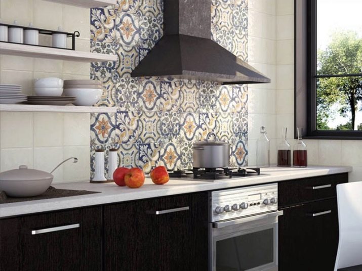
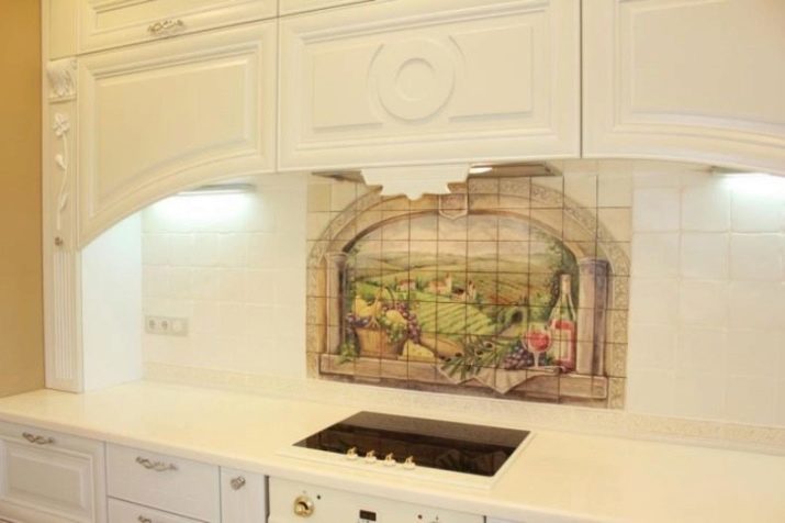
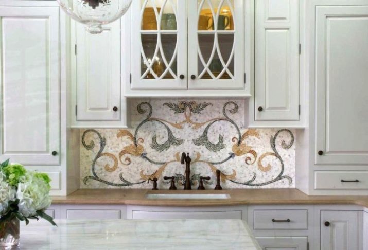
- An example of accentuating the central part of a kitchen apron by means of a tiled panel.
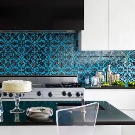
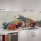
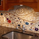
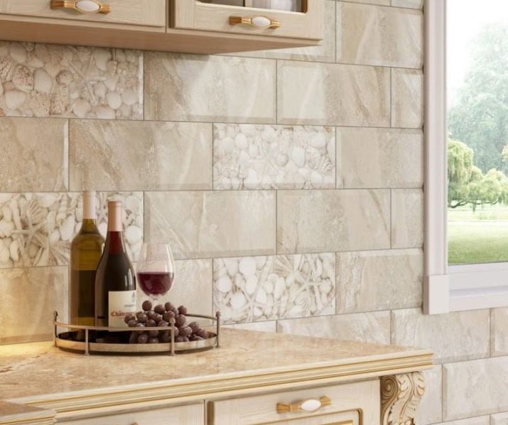
- Using mosaics to decorate the accent part of the kitchen working area.
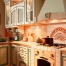
- An example of decorating a workspace above a slab using a spectacular panel with an arched finish.
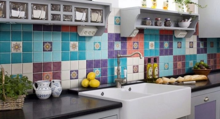
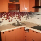
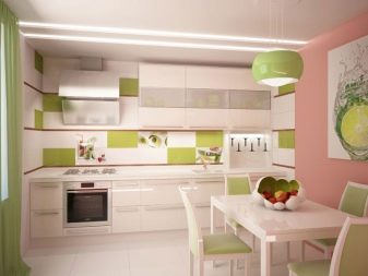
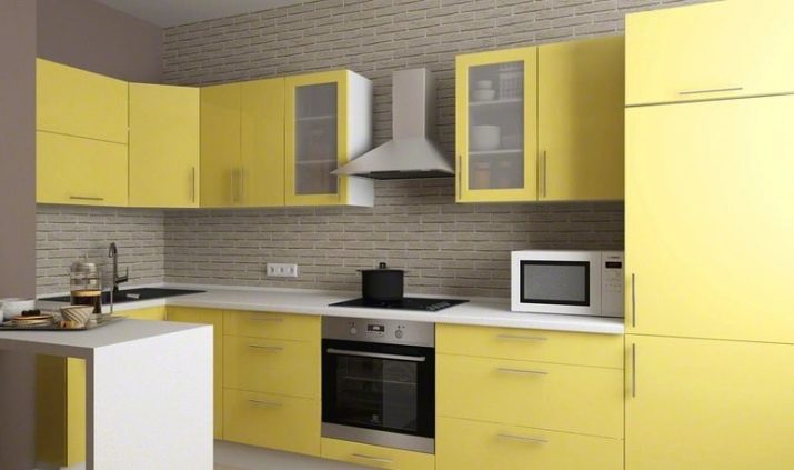
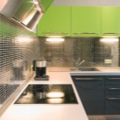
- The use of multi-colored tiles in light colors combined with the white color of the kitchen unit.
- Diagonal cladding with an openwork diamond pattern made from standard tiles.
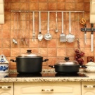
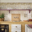
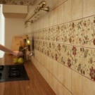
- A version of the backsplash finish in the area of the sink, made in the spirit of country traditions.
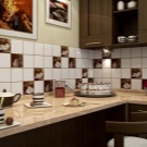
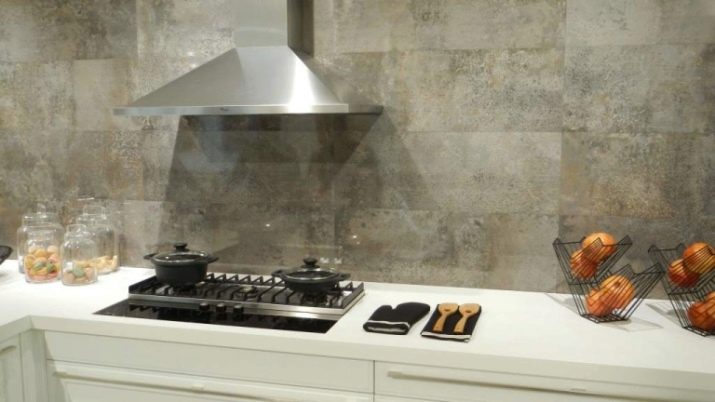
- An example of a harmonious selection of tiles in the interior of a neutral kitchen.
An overview of aprons in the kitchen is shown in the video below.


