Kitchen ceiling color: tips for choosing and interesting examples
The kitchen is a favorite place for housewives and lovers of sincere gatherings. Naturally, the room should be cozy and stylish. One of the important nuances of kitchen design is the color of the ceilings. Today, the palette of shades is striking in its variety: from classic matte white to purple glossy ceilings.
General Tips
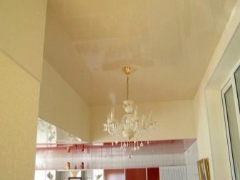
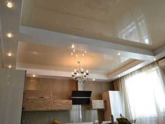
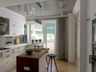
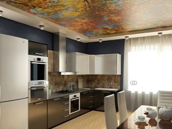
The simplest and most fashionable solution for the kitchen will be choice in favor of stretch ceilings. This coating does not require careful maintenance. In addition, they are durable and reliable. The ceiling zone is a "starting point" that can influence the overall interior and set the "mood" for the whole room.... When choosing a ceiling color, pay attention to its “final” function. The covering is able to visually expand the space or, conversely, make it more compact.
The tone can be warm or cold, as well as classic or exclusive designs.
Experts recommend taking into account the following recommendations:
- for small spaces it is necessary to choose bright hues; pastel colors allow you to visually expand the kitchen;
- ceiling shade in dark tones visually make the room more compact;

- coating color should be combined with pieces of furnitureas well as walls and floors;
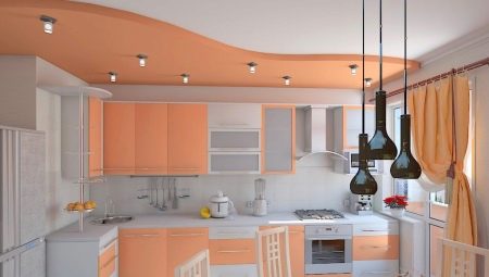
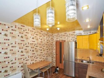
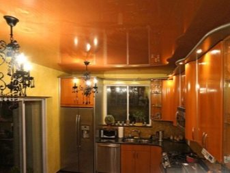
- for a kitchen where the windows are on the north side and are "closed" by trees, it is best to choose sunny tones: yellow, gold, bright orange, as they will create a cozy atmosphere and add "light";
- for a room dominated by bright daylight, are relevant cold tones (light gray, blue and steel); they will help freshen up the atmosphere and create artificial coolness in the "southern" kitchen.
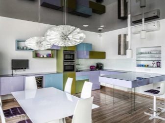
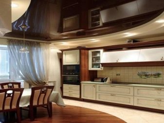
- multilevel ceilings mean combination of several colors; one of the tones must necessarily be lighter and "softer" than the others; exceptionally bright colors will make the ceiling too variegated and pretentious;
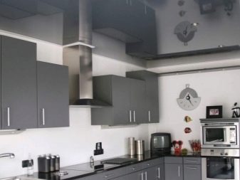
- the minimalist style of the kitchen implies a ceiling metallic, black and white-brown shades;
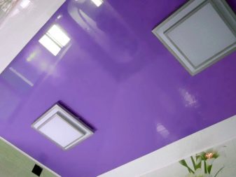
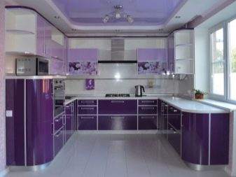
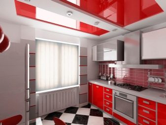
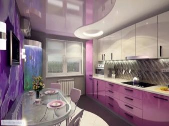
- if the owner of the house is close to Art Deco, then "delicious" glossy colors (red, chocolate, lavender and purple);
- high-tech kitchen interior will accentuate the transparent ceiling milky shade;
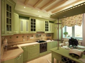
- matte textures perfectly in harmony with beams in the style of Provence and country.
Advantages and disadvantages
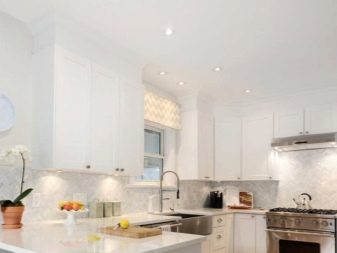
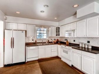
Colored ceiling coverings reflect the inner world of the owners of an apartment or house. In addition, shades can affect a person's mood and taste. The most neutral and "harmless" tone is white. It makes the room bright and cozy. However, the snow-white ceiling looks rather boring and conservative.
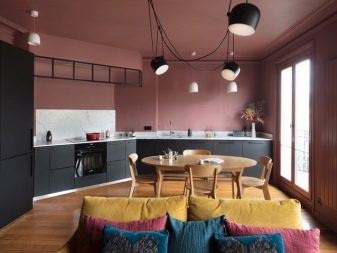
Red and orange ceilings are uplifting, but at the same time can cause feelings of anxiety and irritability. The rich green coating perfectly invigorates and charges with positiveness throughout the day. However, do not forget that a rich mint tone can cause negative associations. Thus, such shades in the interior of the kitchen should be used to a minimum. Similar associations are caused by purple.
Lavender ceiling in the kitchen - the choice of free and creative individuals. However, this color can cause fatigue and irritability. Pale pink tones are chosen by cheerful and cheerful people (mostly young families). Light tone harmonizes perfectly with light green and gray.
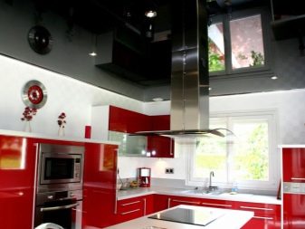
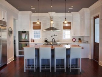
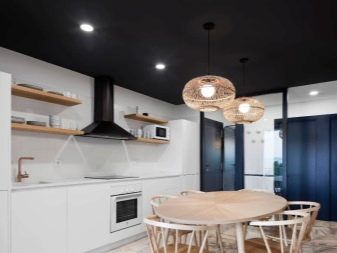
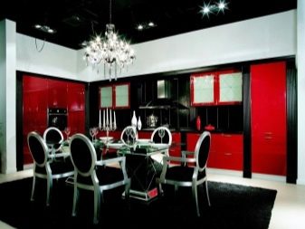
Concerning classic black, then it is suitable for a spacious kitchen with high ceilings. Such an interior looks strict and stylish. However, the constant presence in such rooms can cause depression and blues. In this case, the presence of dark tones in the kitchen should be reduced.
Important! One or another color of the ceiling depends on the lighting. For example, in daylight, blue fades, and in the evening, its shade becomes saturated and bright.
Palette
The design of the ceiling will help to realize the most daring and creative solutions, the kitchen will become the most desirable place in the house. Consider the most popular shades.
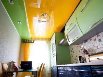
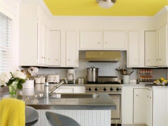
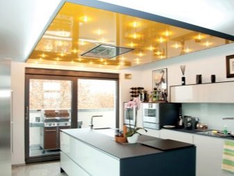
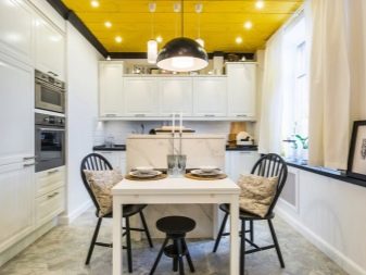
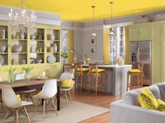
- Yellow. A sunny ceiling will help to cheer you up even on the most cloudy, rainy days. The glossy yellow finish is ideal for a miniature kitchen. Color energizes and helps unleash creativity. Cooking in a sunny kitchen will be a pleasure and a beneficial effect on the nervous system.
Dilute the sunny color using beige, gray and sandy shades.
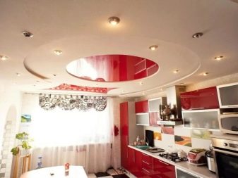
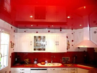
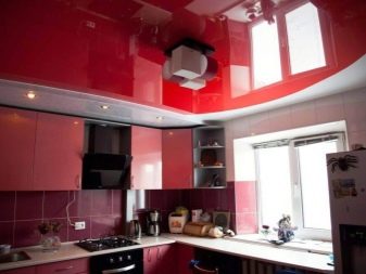
- Red... A beautiful stylish shade suitable for large and small spaces. Intense scarlet color is in harmony with white, beige and black. However, an excess of red can cause aggression. Purple ceilings in the kitchen are chosen by the bold and creative natures.
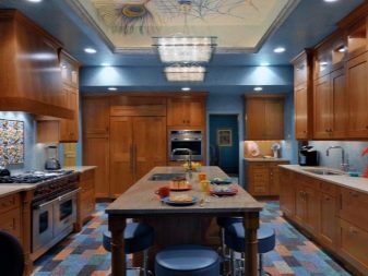
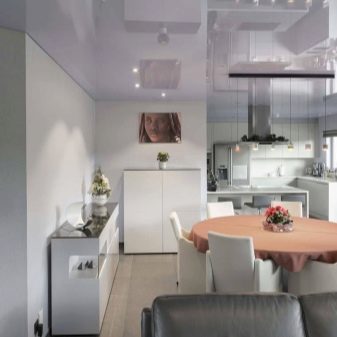
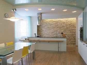
- Gray. A luxurious tone is relevant for spacious rooms. Psychologists do not advise choosing it for vulnerable and refined personalities, since such a shade can cause a feeling of melancholy and hopelessness. However, the kitchen in glossy grays looks light and cozy. The mouse is perfect for any style and gives it a unique touch.
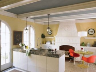
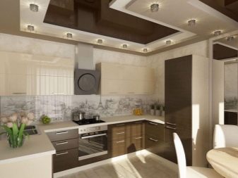
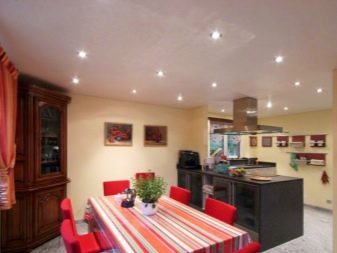
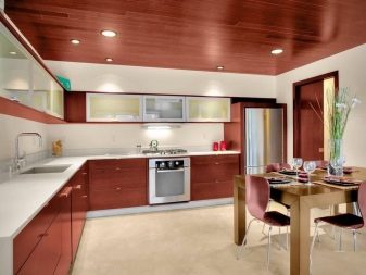
- Brown... This color can be described as elegant and luxurious. The chocolate ceiling combined with milky furniture looks truly luxurious. Light shades of brown fill the room with warmth and comfort. If the rest of the rooms in the house are decorated with bright colors, then the light brown kitchen will help to morally rest and recuperate.
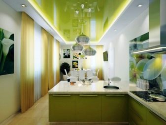
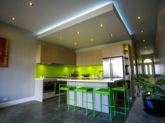
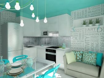
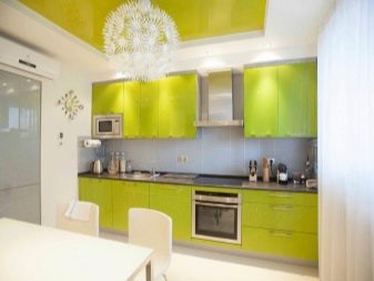
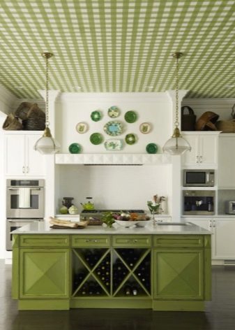
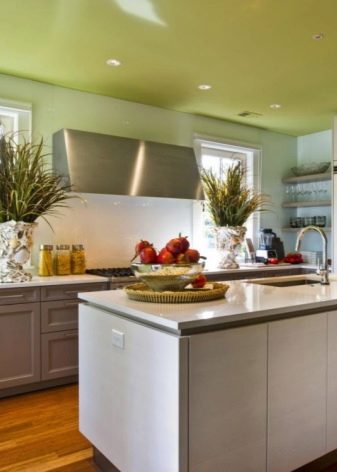
- Green. A versatile tone that suits almost any kitchen decor.The shade can be easily combined with beige, yellow and gray. The deep green color symbolizes wealth and prosperity. Juicy tones create a favorable atmosphere in the room, relax and relieve anxiety.
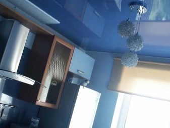
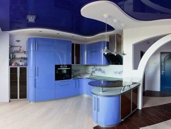
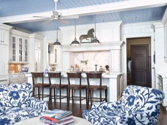
- Blue. A bright, glossy navy blue ceiling is relevant for spacious rooms. The tone visually reduces the space and makes the kitchen compact and cozy. The blue ceiling in the interior of the kitchen allows you to control weight, reducing appetite. All shades of blue are suitable for emotional people prone to overeating.
Delicate blue tone goes well with white and beige tones.
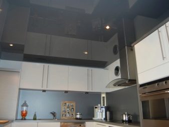
- Black. Dark gloss is chosen by risky individuals who are not afraid of sharp contrasts. Do not forget that the classic black color will never go out of style. Glossy and matte backgrounds are in perfect harmony with red, white and yellow furniture. With the correct design of the kitchen, the black ceiling will emphasize the unique interior.
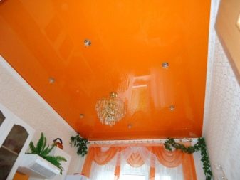
- Orange. This tone matches perfectly with the natural shades of wood, as well as copper, yellow and milky. Orange symbolizes an active life position and disposes to ease.
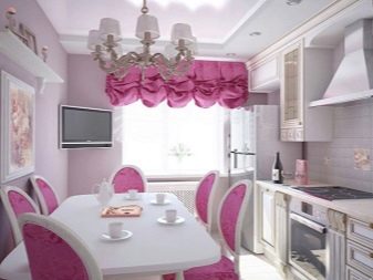
- Pink... The color has a varied palette of shades: from salmon to coral. Pink lends lightness and charm to any room. Intense crimson harmonizes with gray, black and purple.
Subtleties of choice
When deciding on the shade of the ceiling in the kitchen, pay attention to the following nuances:
- the color of the ceiling should be in harmony with the general interior of the room;
- designers do not recommend creating a kitchen completely in a single color scheme;
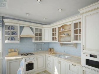
- the tone of the ceiling covering should be in harmony with the color of the walls and floor;
- the combination of three rich colors visually reduces the size of the kitchen;
- matte or satin ceilings in miniature kitchens should have light shades.
How to choose the color of the stretch ceiling, see below.


