How to choose the color of the walls in the kitchen?
The choice of color scheme for the design of the kitchen is extremely important, since the main thing is the comfortable atmosphere, which is created by the combination of several tones and the accents attached to them.
In addition, certain colors help to create the optimal style of the room, without which the interior will look ridiculous and tasteless.
The right approach to choosing colors
To correctly choose the color of the walls in the kitchen, there are 3 main parameters to consider:
- room dimensions;
- type and intensity of lighting;
- the use of tones that do not cause psychological stress, but, on the contrary, contribute to its removal.

Modern designers follow several rules to create flawless decor:
- on a large kitchen area, you should not use cold and faded shades that enhance the visual feeling of emptiness;
- if the main tone of the walls is neutral - gray or beige - bright accents should be traced in the colors of furniture and decorative accessories, creating a contrast;
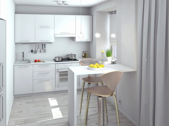
- the color of the walls of a small kitchen must be necessarily light, since dark visually narrows and reduces the space of the room;
- rich bright colors are allowed in the decor only if a small room is in shadow for most of the day, but they, in any case, should be light;
- dark shades are relevant only for kitchens located on the sunny side of an apartment or house;
- to create a cozy atmosphere, it is necessary to use warm shades and illumination with yellow lamps, the light of which is the softest and most comfortable for perception;
- it is undesirable to cover the entire surface of the walls with olive paint, which can create a boring and even dreary image - this color requires mandatory dilution;
- in a kitchen of any size, you should not use a large number of dark, saturated and cold shades that can make the room gloomy;
- visually the space is strongly narrowed by the brown color, so it must be applied in dosage.
When choosing a color palette, professionals also recommend that you be guided by some provisions from feng shui - the practice of symbolic cognition and the development of space.
For the internal and external harmony of the room, the walls of the kitchen should be painted in both cold and warm light shades, for example, milky white, coffee, salad, blue or champagne.
The influence of shades on mood and well-being
An incorrectly chosen color can have a negative psychological effect on a person, causing him to grow irritated and negative emotions. And given that people spend quite a lot of time in the kitchen, especially housewives, then gradually, due to a bad mood, various problems may arise, including loss of energy and appetite.

To prevent this from happening, it is worth figuring out what emotional message each particular color carries.
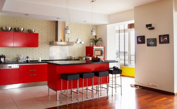
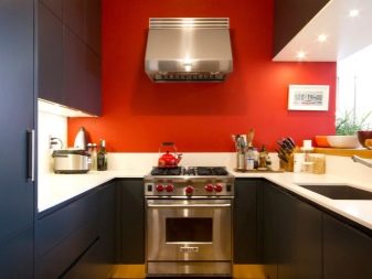
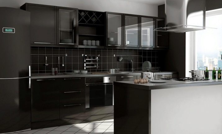
- Red, scarlet and similar shades are bright colors. It is the yang needed to nourish people with insufficient vitality. However, with constant contact with him, a person may feel depressed. Red is good when it comes to the decoration of individual details in the interior.
With its help, it is best to place accents, but as a background it is not very suitable for any living room, unless it is the reception room of the French monarch or his throne room.
In the kitchen space, this color is remarkably combined with white, gray and black tones, in a limited amount it can be combined with other shades.
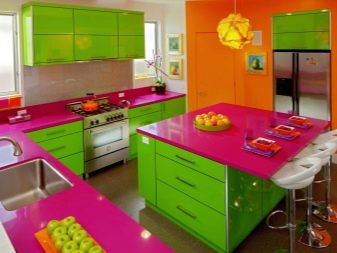
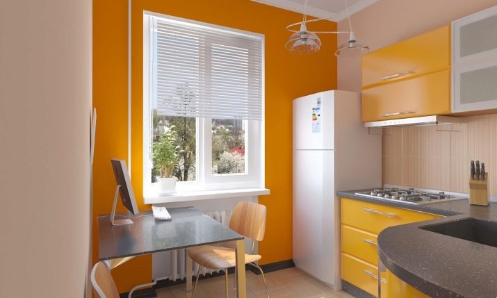
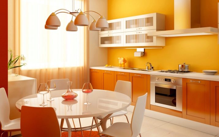
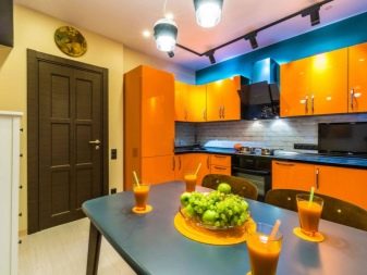
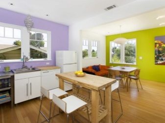
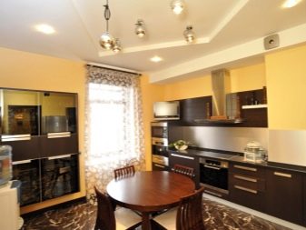
- Sunny orange - it is a combination of positive and energy, contributing to the improvement of mood and the generation of creative ideas. However, bright orange notes must be strictly balanced with other tones of the color scale: with brown, white, gray and green, a few notes in purple and blue are allowed, but not too many.
The color is more relevant for large, spacious rooms.
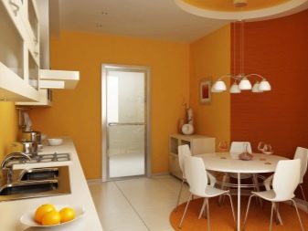
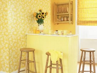
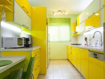
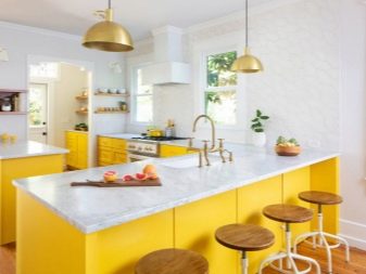
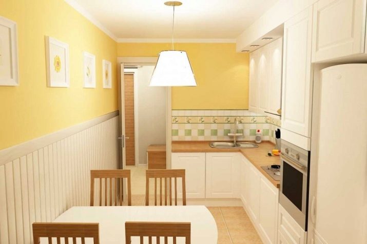
- Yellow its effect is close to orange, it enlivens the atmosphere and fills the room with warm light. Especially suitable for shady rooms where the sun cannot penetrate due to the north side or the abundance of vegetation.
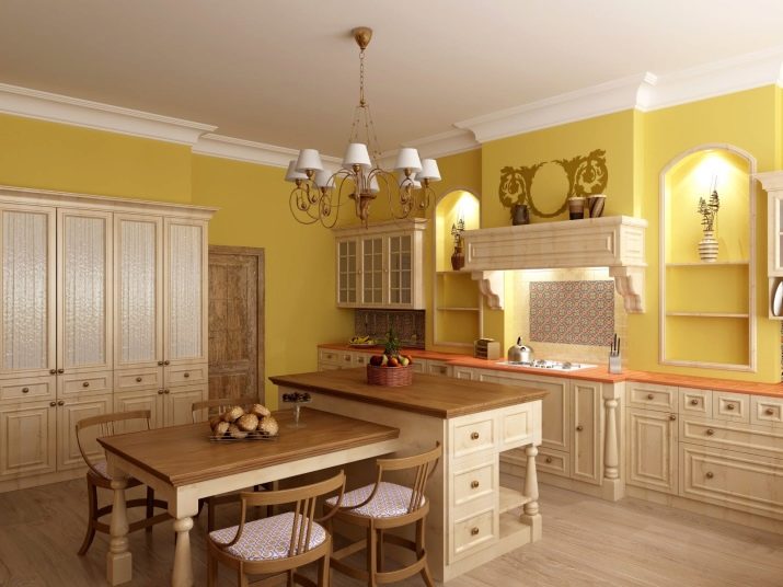
However, it is advisable to dilute the yellow facades of the headset with an ornament combining brown, white and coffee tones, or use a color with a warm creamy, light gray and chocolate tone.
Lemon or yellow pencil cases in combination with light marble countertops will look beautiful.
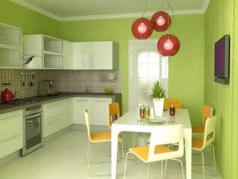
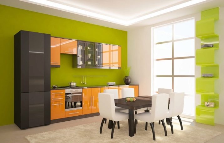
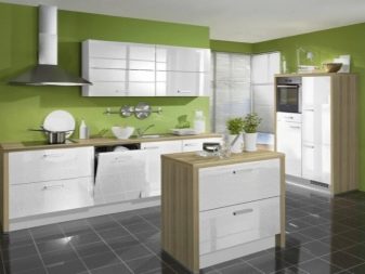
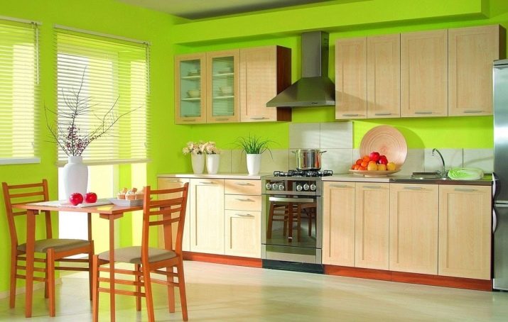
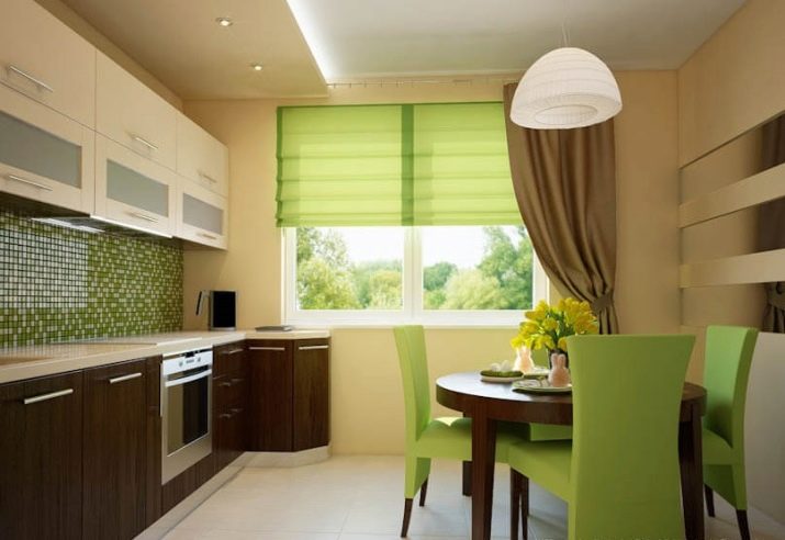
- Natural green tone, first of all, brings balance to the atmosphere, this color is able to have a calming effect. He provides the necessary relaxation in the kitchen after a hard day.
And since the color of life has many shades, it can be combined with many other colors of the palette.
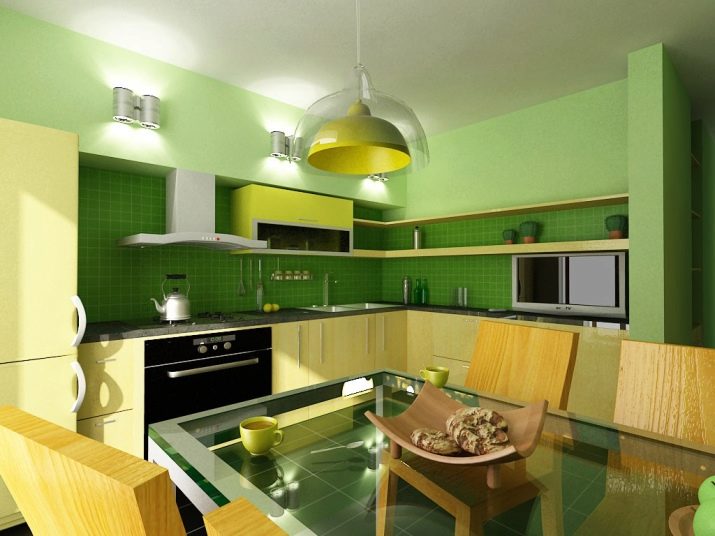
Additional tones include light purple, yellow and white. And also green is combined with beige, cream and orange accents, but in a small space it must be diluted with white furniture and accessories.
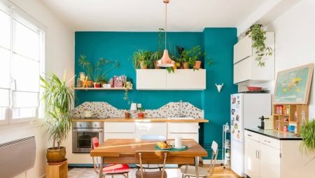
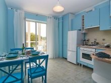
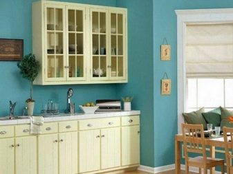
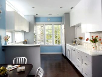
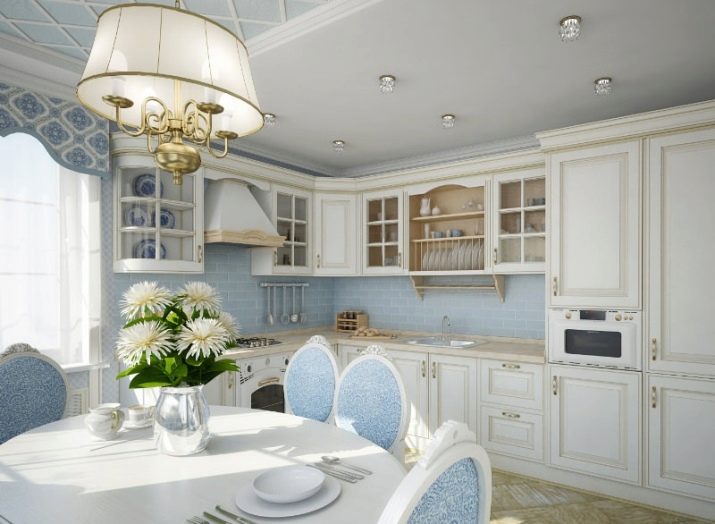
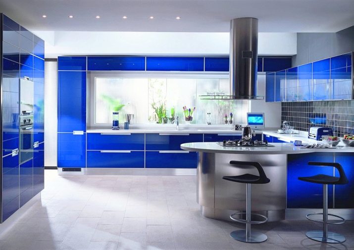
- Blue - the color of romantics and dreamers, and they can safely choose it to decorate their kitchen. Associations that are evoked by blue are the surface of the sea, the mysterious underwater world, the immensity of the firmament.
Such an image is easy to create if you paste over the walls with blue wallpaper or use plaster or paint.
If there is no fear of this luxurious cold shade, then it will help in expanding the small space and give a feeling of lightness.
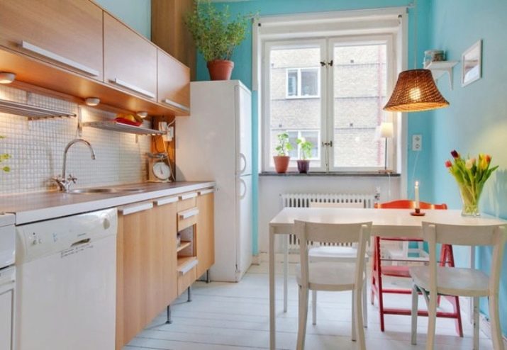
You can use the tone, combining it with matte and glossy surfaces of the headset in beige, cream and light yellow, softening its characteristic coolness. Blue walls and bright blue curtains are also suitable for gray furniture.
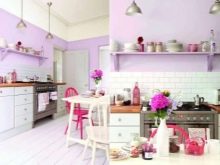
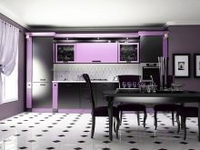
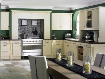
- Pink and purple tones different saturations can be applied to walls. They also look beautiful as the color of work panels and facades, if the kitchen ceiling is white, the apron is made in the form of a gray background with light mosaic, and the light gray floor and elements of the dining area are complemented by black details. It is allowed that there is one wall of a different color, but from the same 3 basic shades.
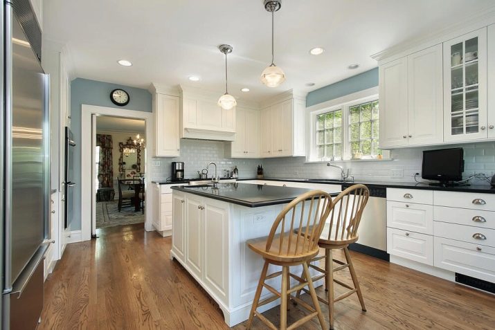
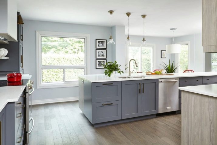
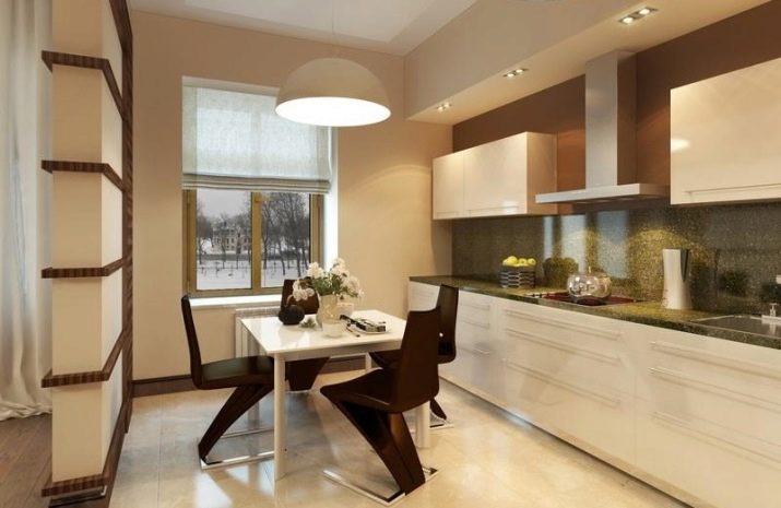
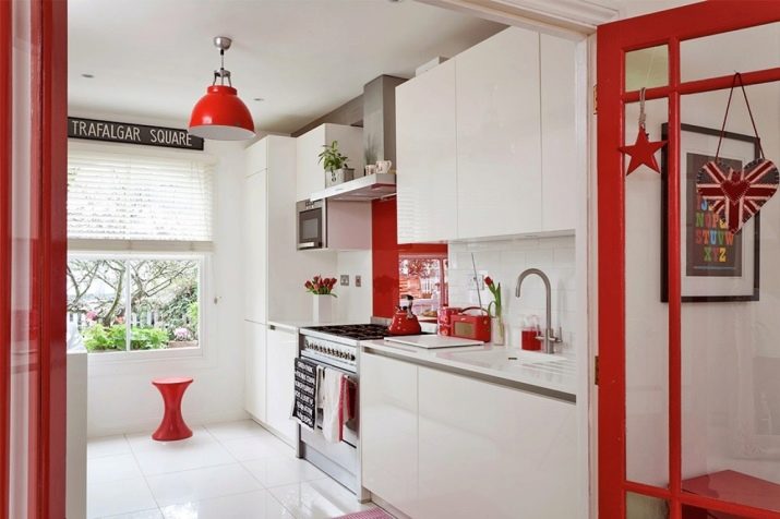
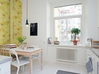
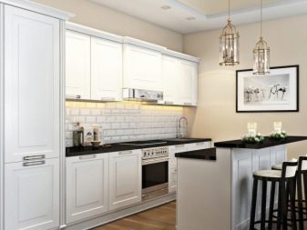
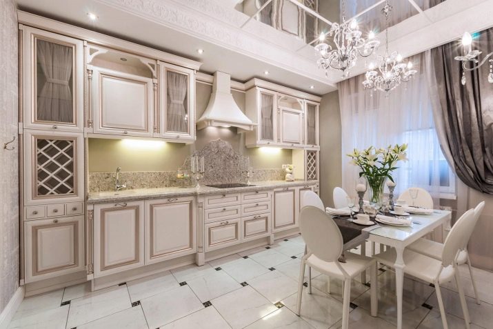
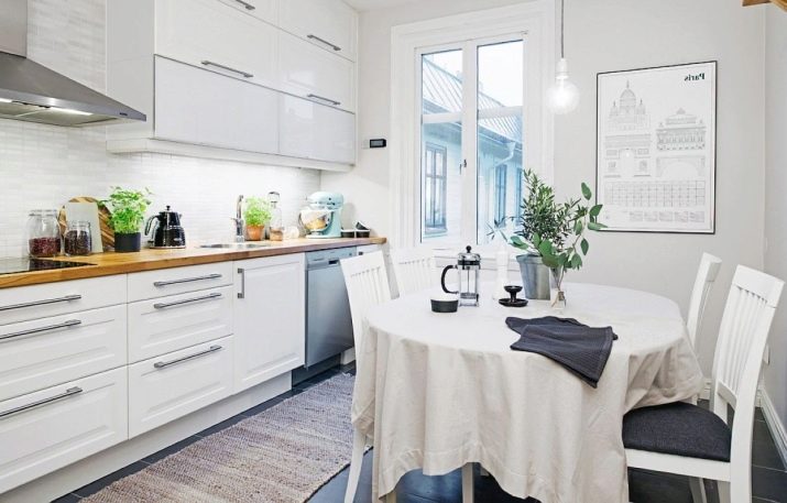
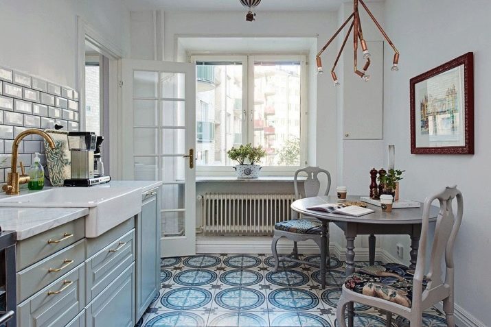
- Any neutral shades look great on the kitchen area: ranging from white to beige. These warm pastel colors make the room more spacious, cozy and calm. They can be combined with all imaginable colors, both cool and warm, perfectly combined with white and black surfaces.
Such studies are based on scientific chromotherapy methods, proving that color can both heal and depress a person, in some situations leading to stress and other health problems.
It would be unwise to refuse such important information, especially regarding your own home.

The best options and ideal combinations
When choosing certain colors, you need to know that no more than 3 tones can be combined in one room, adding to them bright accents in the form of paintings, decorative strips, accessories for decorating the table and shelves.
Cool and warm shades should be diluted with achromatic colors: black, white or various gray colors. Faceless and overwhelming in themselves, combined with bright spots, they give the room a specific sophistication. Bright kitchen furniture set against monochrome walls is a great example. A gray, emerald, orange or dark coffee background with a white set will look great.
Another option is to create a bright apron that contrasts in color with the furniture in the work and dining area. The shades chosen for its design can also be traced in the upholstery of chairs, tablecloths, decorative attributes of the kitchen.
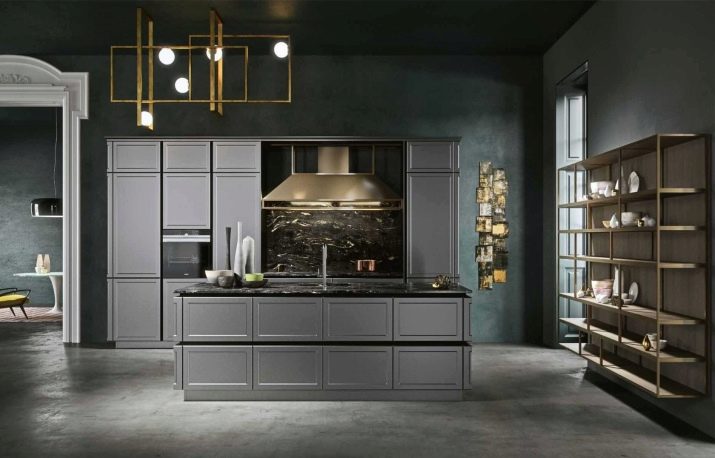
- classic, designed for a large area - as a rule, white, brown, cream tones and gilding are selected as decor;
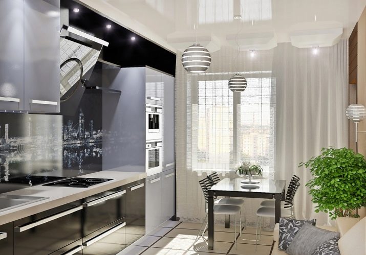
- modern - involves the use of a light palette and blotches of black, pastel and bright shades, is relevant for small and small kitchens;
- Provence - the design is carried out using neutral shades: these are light green, lilac, blue and cream tones in combination with white headset panels and curtains of light or moderately bright colors;
- minimalist Scandinavian style, relevant for a room of any size with the use of white, gray, brown, black and metallic shades.
This style, providing a variety of color options, never goes out of style. In addition to her, there are other areas that can successfully optimize the kitchen space.
Lighting
Excess, as well as lack of, natural light can be compensated for with optimally matched color combinations.
- If the room faces a southern, sunny side, it is important to use light-absorbing colors: for example, shades of brown, orange, blue and even black as separate elements.
In addition, the sleek, metallic and glossy fronts of the headset will look great and shine in the sun.
- The location on the north side is always a shading of the room, it is especially undesirable for a small footage.The shades of the light palette: yellow, orange, white, pale pink and blue will help to expand the visual space and make it more cheerful. These and other colors are reflective and will help fill the space with light energy.
- And also it is worth thinking about how to "warm" shaded rooms with warm colors, and add coolness in sunny rooms using purple, blue and green cold paints.
It remains to add that you should not decorate such a cozy room as a kitchen in dark or even more black colors.
For tips on choosing colors for the walls in the kitchen, see the following video.


