Minimalist kitchens: design options
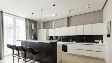
When choosing a style for decorating a kitchen, many stop at minimalism. This direction is so popular because it is well suited for both spacious and small rooms, where functionality has to be put in the first place.
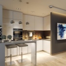
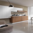
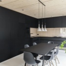
Style features
Minimalism is a modern trend that reminds many of the ascetic Scandinavian interiors, high-tech and modern designs.
However, certain characteristics are still worth identifying.
Calmness
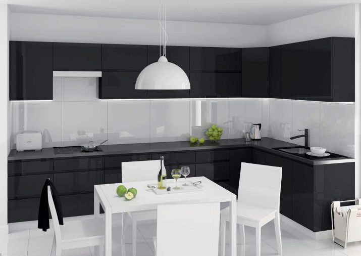
Brightness and a riot of colors are not inherent in minimalism; here you can find monochromatic calm colors, more often pastel colors.
Simplicity
Elegant carved cabinets, romantic décor, floral prints - all of this should be left to other styles.
Minimalism will require from you simple and understandable forms, clear lines, regular geometric shapes.
Minimum furniture
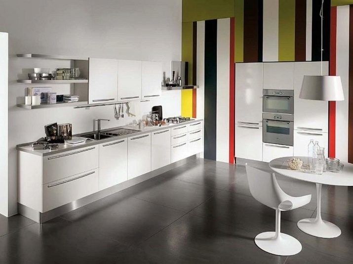
It is impossible to clutter up the space by equipping the kitchen. Only the essentials should be purchased. Wardrobes are usually built-in, the same should be the technique.
Abundance of light
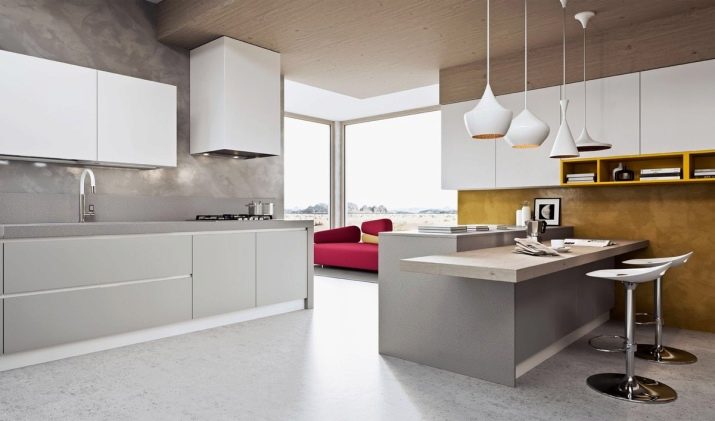
In such kitchens, light is very important, so you will need large windows and a wide variety of lamps. This will allow the room to become more spacious, lightweight, and lively.
Practicality
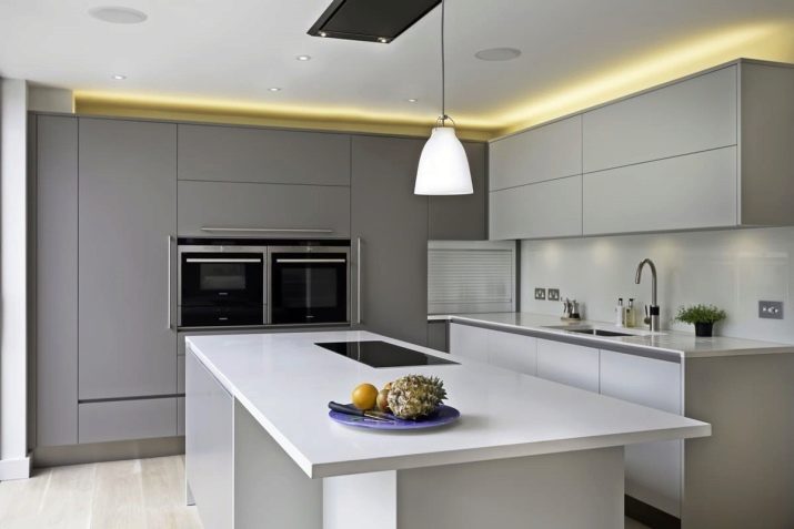
Facades and countertops in minimalist designs are devoid of pretentiousness. As a rule, they are matte, and therefore maintenance of the kitchen does not require a lot of time and effort.
How to choose a kitchen set?
As already mentioned, you need to purchase the furniture that you really need.At the same time, a set becomes an obligatory subject, without which not a single kitchen can do. The set should be simple, but functional; patterns, frames, sandblasting drawings are not welcome here. It is very important that the furniture matches the color of the walls, ideally if it merges with them, but many such a decision will seem impersonal.
If you are one of them, choose a headset a few shades darker, but so that it does not contrast too much with the main decoration of the room.
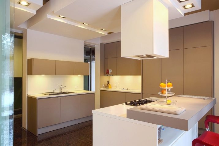
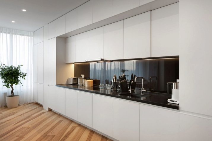
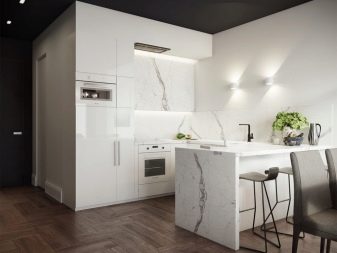
Like the shape of the kitchen, the headsets are straight and angled. If the kitchen is straight, the best option would be to install a straight set along one of the walls. In this case, cabinets should be of a closed type and without handles. All furniture opens with a light press. Glass shelves and open niches are not encouraged. All utensils and equipment should be hidden.
In corner kitchens, the set is installed at the junction of the corners, while it is important to arrange the cabinets so that one does not interfere with the opening and closing of the other. Tall cabinets that can hide a lot of utensils would be a good solution. Such items must have many functional characteristics: internal hooks and magnets, rotating shelves, pull-out hidden drawers.
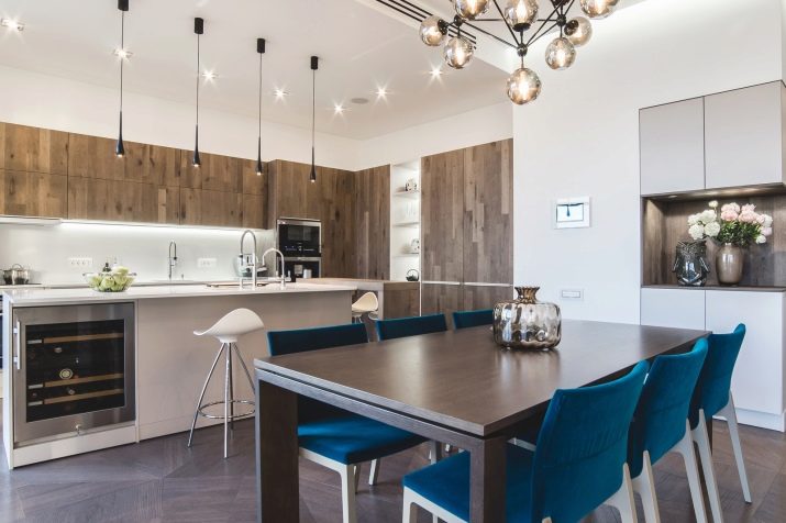
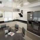
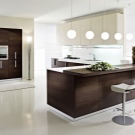
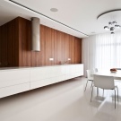
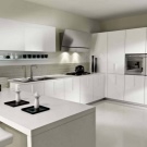
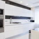
As for the material of manufacture, here the choice is quite extensive. The most popular options are chipboard and MDF. Chipboard is usually faced with plastic, as well as acrylic, MDF - with film, acrylic, veneer.
Both options are relatively budgetary, but experts still advise choosing MDF: this material is more environmentally friendly and durable. In addition, you can always order a set made of natural wood, but it is worth considering that wood also has its drawbacks - it is very expensive and is afraid of moisture.
Many people really like glass elements in the interior. Transparency is inappropriate here, so it is recommended to choose frosted glass that will hide the content from prying eyes. The surfaces you will be working on can be made of artificial or natural stone, as well as glass and metal.
Finishing options
When choosing a minimalist style, it is worth remembering that there is no place for excesses, so the decoration should be as simple as possible, but at the same time elegant.
Ceiling
The ceiling must be light. Most often it is made matte, gloss is rarely used, but it happens. Of the materials, it is better to choose plaster, light paint; stretch ceilings will also be a good option.
If you have a kitchen-dining room or a kitchen with a living room with high ceilings, then plasterboard solutions in two levels are suitable.
Of course, there can be no photographs, drawings, panels or mirrors on the ceiling.
Walls
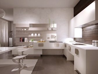
Walls in minimalism, as a rule, are made in one tone - they are mostly light, but sometimes they are also dark. It is recommended to choose cold light colors - this is how you can achieve a visual increase in space.
As a material, paint, plaster, smooth wallpaper are usually chosen, the relief is inappropriate. Both in straight kitchens and in rooms with an island, you can make an accent wall.
On such a wall, a drawing is made, a panel, a fresco or a photo print is made. You can also use contrasting wallpaper or opt for exquisite brickwork.

Floor
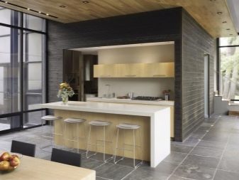
When choosing a floor for the kitchen, one should be guided not only by the aesthetic component, but also by the footage of the room. For example, in apartments with small rectangular kitchens, a light laminate will be appropriate, which will slightly expand the space. In large and spacious rooms, as well as in kitchens-living rooms, you can choose both light and dark colors.
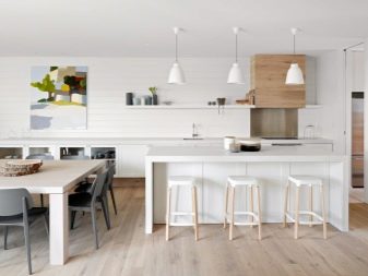
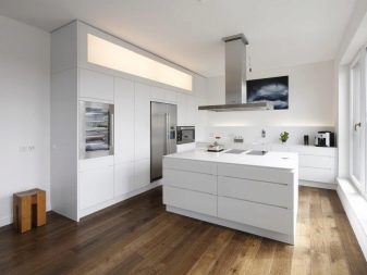
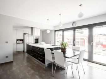
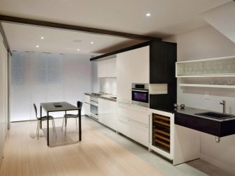
In this case, laminate in warm colors is also used, and you can also use a parquet board.
A good solution would be porcelain stoneware without relief or repeating a wood or marble pattern. By the way, designers do not advise choosing pure black or snow-white floor colors, because caring for such a coating will be many times more difficult... A more practical solution would be gray, pastel colors, beige, light brown.
Color matching rules
Minimalist designs usually follow the same rule: there are only three shades, two of them will be the main ones, one will be contrasting.
In addition, you also need to be able to pick up contrasting shades.
Let's see how to do it correctly.
White
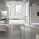
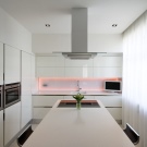
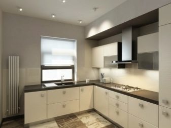
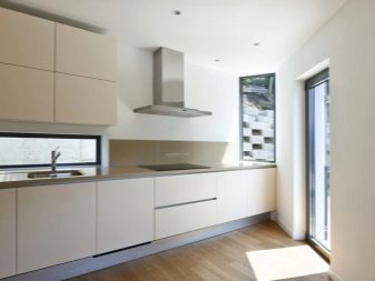
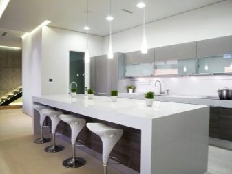
White kitchen is a classic of minimalism. Rooms of any type and format look great in this color. White is successfully combined with cream and light brown tones, you can use light gray colors. You can choose any as accent colors, but try to use not bright, but muted variations of them. In addition, there should be very few such accent spots.
Gray
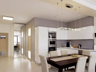
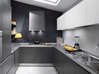
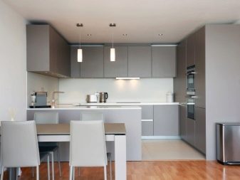
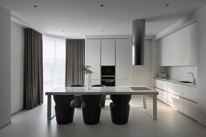
The light gray wall trim is the perfect backdrop for a white headset.
In this case, it is desirable to make the floor darker.
Accessories and textiles in pale blue, pinkish, lilac and green tones will help to add contrast, blue is welcome.

Black
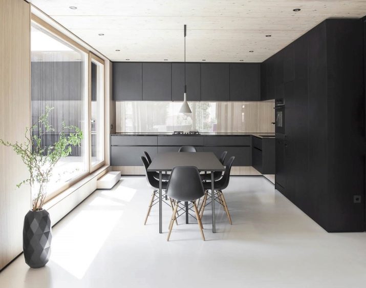
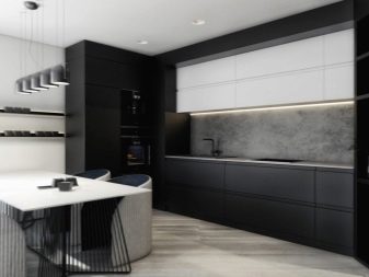
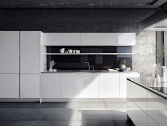
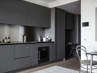
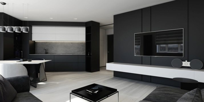
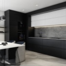
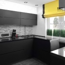
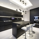
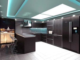
The black kitchen space looks really shocking, but it should be noted right away that such a solution is only suitable for large kitchens with excellent natural light. Black must be combined with white, for example, you can pick up a black and white or just white set, as well as a tabletop and chairs. Accents of blue, dark red, yellow and pale pink will complement this tone.
Beige
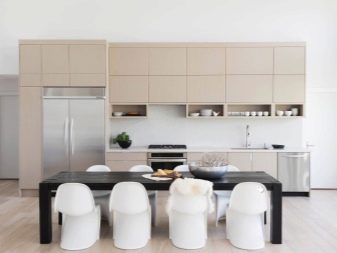
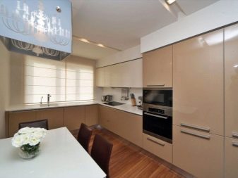
Such kitchens always look expensive, especially if natural materials are used in the decoration.
Beige goes best with black, but looks faceless with light gray.
Light orange, peach, burgundy, lilac tones can act as accents. Small silver and golden blotches will look very elegant.
Lighting options
Lighting is one of the most important aspects of minimalism. Volumetric windows are required here, but this, of course, is not enough. Therefore, you have to worry about artificial light. To play it right, designers recommend dividing the room into several zones. Several successful combinations are possible here:
- a large central chandelier or 2-3 smaller ones, located above the table, as well as additional lighting;
- lighting of the ceiling and lighting of the eating and working area;
- a chandelier in the center, complemented by a small number of spotlights.
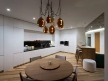
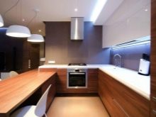
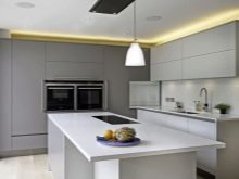
It is worth noting that more and more designers are advising to use LED backlighting. It fits perfectly into modern minimalist interiors, in addition, it has several color variations.
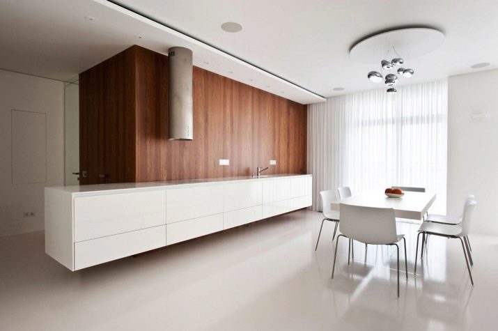
As for lamps and chandeliers, they can be from a wide variety of materials. A choice of unusual shapes is allowed, for example, lamps in the form of atoms, UFOs are popular.
Curtains and other accessories
Curtains in a minimalist design should correspond to the general style of the room, which means they should be discreet, calm in scale and practical. Long curtains and heavy curtains should be discarded right away, more appropriate options here would be blinds, as well as roller blinds. Another solution is Roman or Japanese curtains. When it comes to materials, it is best to choose synthetics such as polyester. Colors are preferable to choose neutral, but large rooms allow slight contrast.
There should be a minimum of accessories, you cannot litter the space. The best option is a clock on the wall, several original figurines or vases, a decorative tray or fruit stand.

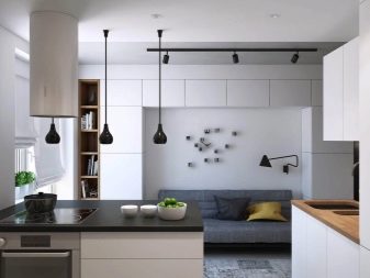
If you have lamps of unusual shapes, you can choose accessories that match them, which will add completeness to the interior. Pictures are also welcome, one or two will be enough.
Preference should be given to abstractions, images of geometric shapes, cityscapes, and macro photography. Pictures can be either bright or neutral.And also many decorate the walls with photographs, but there should not be many of them either.
Fresh flowers will be a great solution for minimalist kitchens. Bright greenery will give the room a habitable look, in addition, it will purify the air. You can use different plants, but succulents, palms, curly flowers, calla lilies will look best. Containers for flowers need to be selected as simple as possible, without decorations and decor. The quantity does not matter, it is the only "accessory" in minimalism that can be used indefinitely.
Beautiful examples
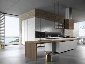
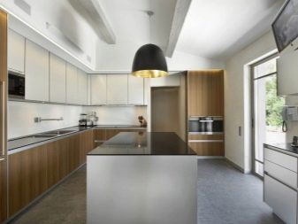
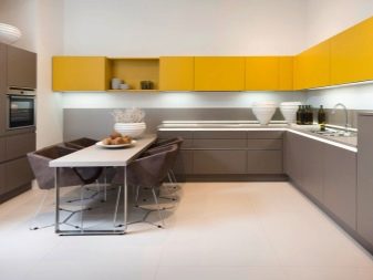
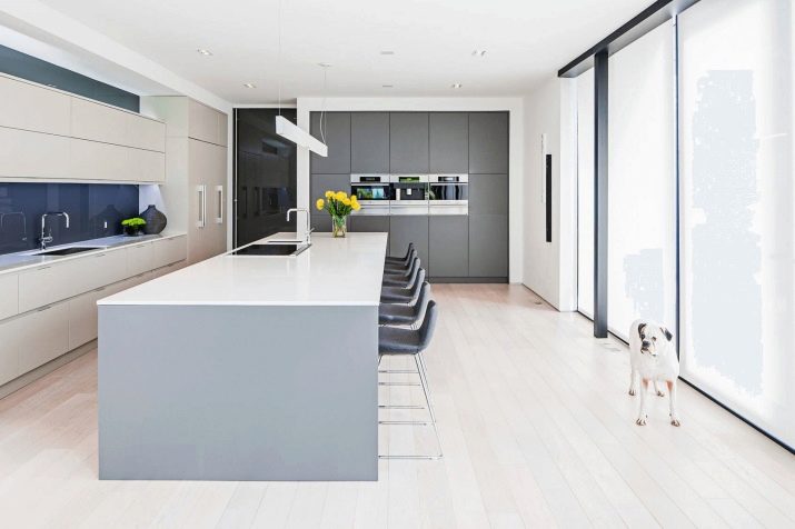
Minimalist kitchens are a combination of simplicity, rigor and elegance. You can verify the correctness and practicality of this direction by considering several interesting design options.
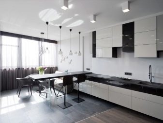
Black and white solutions can rightfully be called classic, but they look especially original in minimalist designs. Such kitchens necessarily have large windows, and there are only a few accessories here.
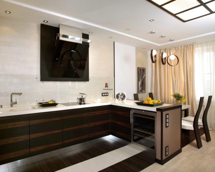
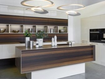
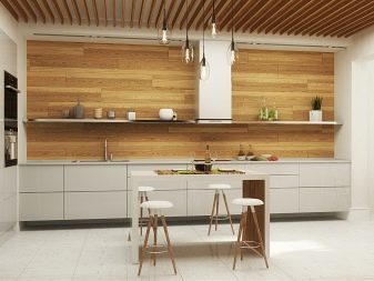
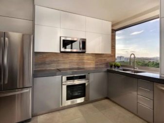
If black and white combinations seem a bit too strict, look at wood grain finishes. Wood-trimmed kitchens look warm and cozy, especially with bright colored spots. In addition, this finish also successfully accentuates the shiny metallic surfaces.
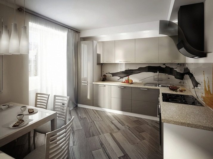
An interesting solution would be to allocate a work area. The original drawing in this area will definitely not go unnoticed, and caring for it is unlikely to cause a lot of trouble.
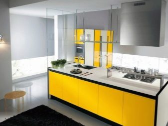
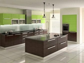
One should not think that minimalism is an extremely strict combination of shades. Not at all, brightness is also welcome here. For example, the yellow color of the facades is perfectly combined with a white work surface and a black carpet. And light green cabinets will be good "companions" for dark brown furniture and white finishes.
How a minimalist kitchen should look like, see below.


