Small white kitchen in the interior
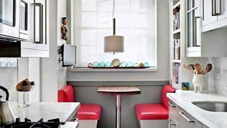
Not every apartment has a large kitchen. At the same time, I want the room to be functional and beautiful. In this case, the best solution is to use white. It fills the space with depth, gives a feeling of spaciousness, purity and freshness. We will talk about the nuances of the design of a small snow-white kitchen in the article.
Pros and cons of a kitchen set
Some people find it impractical to buy white furniture, but they are not entirely right. On light matt surfaces, dust and limescale from water droplets are less noticeable. Gloss is more whimsical, but these are texture features that are not related to color.
If you take care of the headset and take good care of it, it will delight you with its beauty for many years.
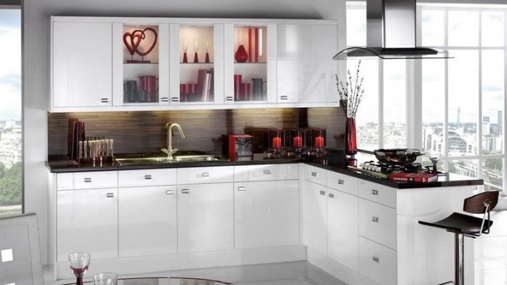
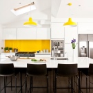
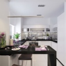
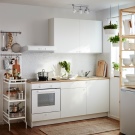
Consider the merits of choosing white for a small kitchen.
- Versatility... White is appropriate for any interior style. Regardless of whether you prefer elegant classics, romantic Provence or strict minimalism, you can create a harmonious space.
- Variety of options. White has many faces. You can choose from a cool whiteness, an iridescent pearl tone, or a warm milky hue. Shining gloss on curved modern facades, austere matte surfaces with vintage bronze handles or openwork patinated cabinets will all look different.
- Ease of combinations. Whiteness goes well with pastel tones, and with contrasting dark shades, and with bright colors. At the same time, you can easily change the mood of the interior by adding other tones to it.New textiles, accessories, chairs can make the kitchen brighter or more restrained, bring warmth or, conversely, cold freshness to the atmosphere.
- Visual effect. Whiteness is ideal for small spaces. It allows you to visually expand the space. In addition, these surfaces reflect light, which makes the furniture attractive in all weather conditions.
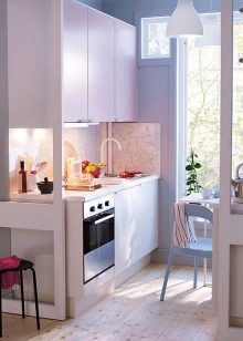
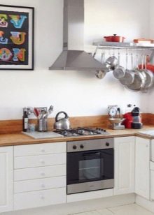
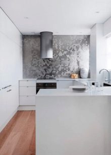
There are few disadvantages to this solution.
- The need for regular cleaning. Light-colored surfaces can absorb colorants (coffee, red wine, tomato juice, etc.). To keep the kitchen flawless, it is important to clean up any dirt right away.
- Quality requirements. It is better to choose products from trusted manufacturers. Low-quality furniture can turn yellow over time.
- Mandatory presence of a hood. The presence of a powerful unit will save the furniture from the accumulation of smoke and burning on it.
- Color features... To many, a room decorated in white seems impersonal. However, this issue is easily solved with 1-2 additional color accents. The same goes for the "hospital" association.
The color of the walls and floor that differs from the furniture, a darker countertop, an interesting apron will make the space "lively" and cozy.
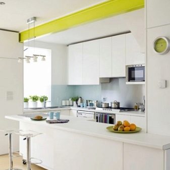
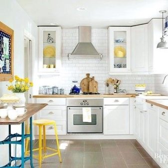
Manufacturing materials
Headset facades can be made of various materials. The most budgetary option is chipboard. Such products look good. The only caveat is the use of formaldehyde in the manufacture of furniture.
Although it is believed that the percentage of harmful fumes is very small, many are trying to get an even more expensive, but environmentally friendly option. This is, for example, MDF... Kitchens made from this material are in the middle price category. The material can take on different textures due to the decorative coating.
Natural wood is the most expensive and solid material. Although headsets are rarely produced entirely from an array today. Veneering is mainly used. The wood, covered with white paint, fits perfectly into the aesthetics of Provence and classics.

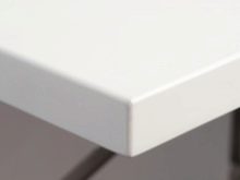
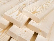
The table top can be made of natural or artificial stone, wood, chipboard, MDF... Strength indicators vary, but it is better to protect any coating from dyes, constant accumulation of water. Do not put hot pans on the countertop, cut vegetables or bread on it. Even natural stone may not stand up to this attitude. Use special coasters, cutting boards.
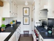
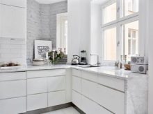
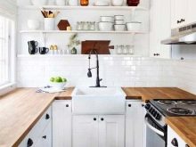
As for the shade of the countertop, the most practical are options with a stone texture (specks, natural patterns like marble, granite). On such a surface, stains and scratches are less noticeable. Monochrome gloss looks luxurious, but requires careful maintenance. The same can be said about the woody texture, which effectively emphasizes the rustic style.
Combination with other colors
To create a harmonious interior, you should adhere to the rule of three colors. It means that to decorate the room, you need to choose three shades. One of them will be the main one (in this case, it is white). The other two tones will complement it. A more varied color scheme will create a feeling of variegation and chaos, make an already small space visually even more cramped.
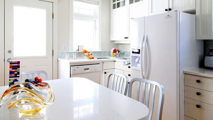
Whiteness is combined with any tones. Connoisseurs of spectacular contrasts can choose black as a companion. Rigorous space is obtained in gray-white scale. Warm beige and brown shades. Delicate interior makes inclusion in a snow-white kitchen pink and purple tones.
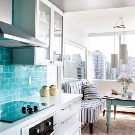
The feeling of freshness is enhanced blue, blue, green colors. Juicy shades look spectacular on a white background - turquoise, red, yellow, orange. Light colors can be used in large quantities. It is better to include dark and bright accents in the composition in the form of accessories.
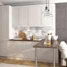
Suitable finish
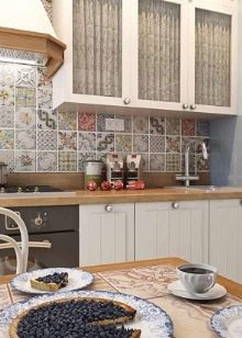
An apron for a snow-white headset should be made of durable, moisture-resistant material. These are usually ceramic tiles, plastic or glass. Any color can be used. Do not just make the apron white if the color of the countertops and cabinets is the same. Otherwise, even the most beautiful typeface will lose its sharpness and expressiveness.
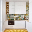
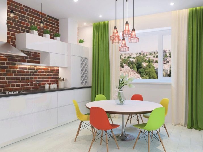
There should be few color accents in a small room. For example, you can highlight the dining area with colorful chairs. You can focus on the cooking area by choosing a colorful apron. You can decorate the window with a colored curtain, repeating the shade in other textiles.
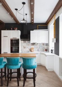
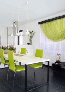
Glossy and mirror surfaces have excellent optical effect. They can be used for both the backsplash and the walls. Another technique that visually increases the free space is transparent furniture (glass table, chairs made of durable colorless plastic).
The floor can be decorated with tiles (the most practical option), parquet, laminate, linoleum. For walls, you can use plaster, paint, washable wallpaper.
When choosing a finishing option, furniture design and color partners for white, it is important to take into account the chosen interior style, because each has its own characteristic features.

What styles is it suitable for?
White miniature kitchen can be decorated in different styles.
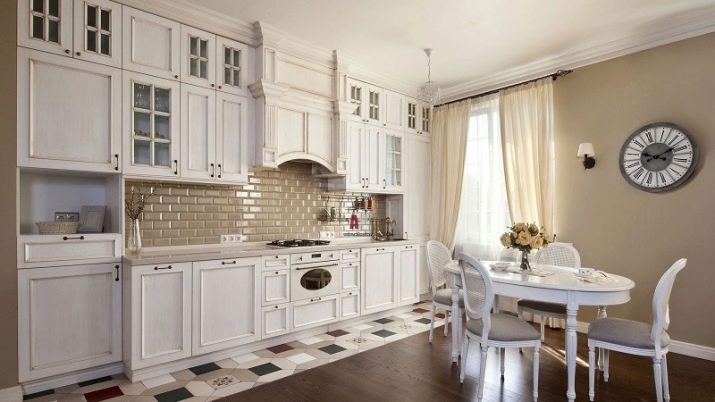
Classic
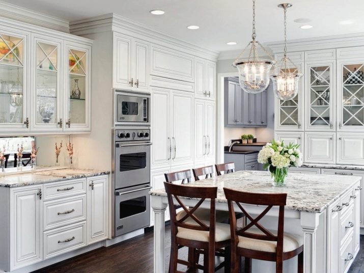
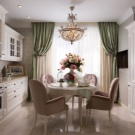
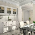
Classics and neoclassicism imply elegant furniture in a vintage style. Carving, graceful handles, cornices make the snow-white set even more solemn. If you want to create a strict, elegant interior, you can combine milky with caramel and chocolate shades. Pistachio, deep blue tones look noble in such an atmosphere. If you want to add modern features, you can combine whiteness with lavender, turquoise, blue.
The floor can be decorated with black and white tiles or parquet. Plaster in delicate colors is perfect for walls. It is better to make the apron discreet.
White panels that imitate brick look beautiful. Tiles and glass are acceptable. As for the countertop, a stone or its imitation will look luxurious here. The composition is completed by exquisite floor-length curtains, a chandelier and sconces on the wall.
Hi-tech and minimalism
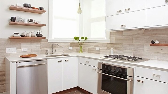
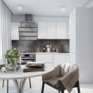
These modern styles combine whiteness with cool neutral tones: gray, black, taupe. Sometimes bright details of red, orange, yellow, blue tones are added. Clear geometric shapes, chrome-plated metal, glass, glossy surfaces, lack of fittings - these are the characteristic features of such interiors. The floor is usually decorated with tiles, the walls are painted in one calm color. For window decoration, roller blinds or blinds are used.
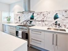
The apron is usually made in plain color. Discreet abstract patterns under glass are acceptable. A contrasting black tabletop looks spectacular in such a headset. A calmer option is gray.
Bright chairs and a couple of other accents can "revive" such a kitchen.
Provence
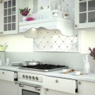
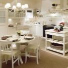
The Provence style kitchen has a rustic feel to it. White here is combined with blue, olive, mint, beige, gray, brown shades. Floral prints, a cage are appropriate. Painted wooden facades are combined with natural wood texture, ceramic sink, bright textiles.
The floor can be tiled or parquet. There are light colored curtains on the windows. The walls can be painted in a delicate tone or covered with wallpaper. For an apron, usually choose a "hog" tile or square-shaped ceramics.
Scandinavian
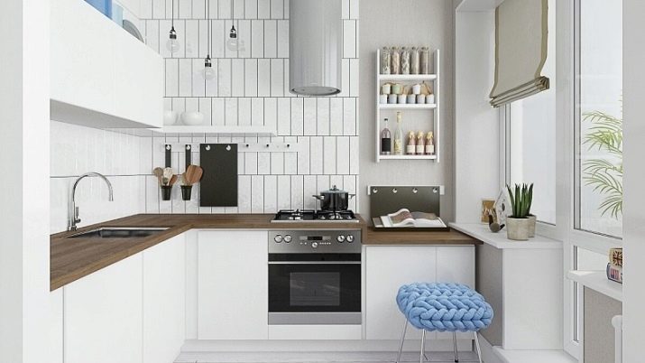
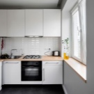
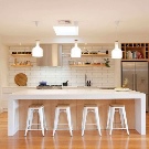
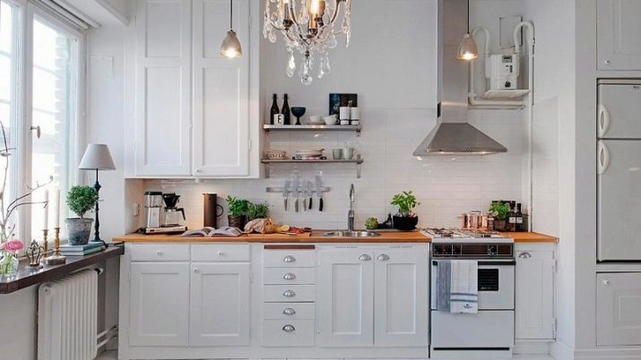
The Scandinavian interior is harmonious and stylish. Here, the abundance of white is complemented by natural woody shades, live greenery in pots. The typeface should be as simple as possible. Top cabinets are often replaced with open shelves.
The color scheme includes gray, beige, brown, sometimes elements of blue, orange, red shades. The walls are usually plain and light.Curtains are often completely absent, because the abundance of light in this style is an important aspect. Tiled or parquet floors can be decorated with a textile rug.
Loft
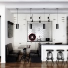
An unpretentious white set against a brick or concrete wall is a good concept for a small kitchen. Metal lamps, rough wooden shelves, chrome fittings, roof rails complete the industrial interior.
Modern
This initially classical style not only repeated the curves and smoothness of natural lines, he also took from her a wealth of floral and plant themes, natural shades. Facades can be matte or glossy. You can decorate the room with an expressive apron with photo printing or photo wallpaper, panoramic images.
Any textures, natural and expensive materials, stained-glass windows are possible here.
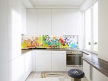
Successful examples
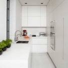
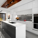
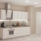
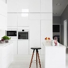
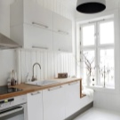
See how beautiful white kitchens are in the interior.
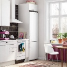
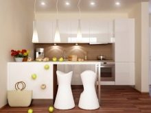
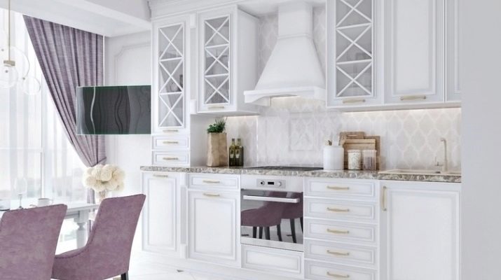
White-purple combination looks unusually gentle.
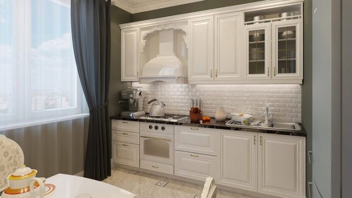
More austere interior obtained when included in the design of beige and gray tones.
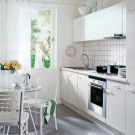
Provence charm does not require much effort to create comfort.
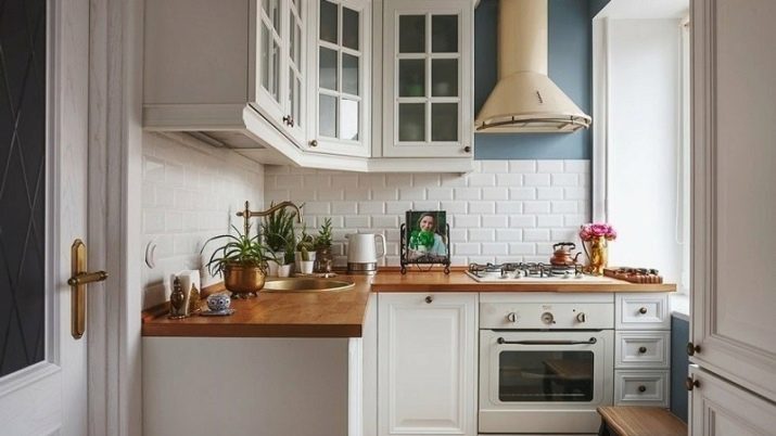
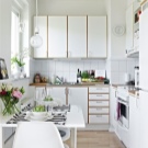
Scandinavian direction combines rustic flavor and industrial touches.
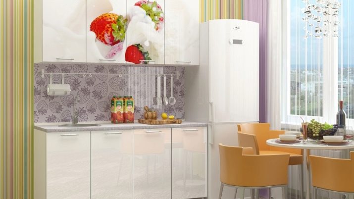
Printing on facades, colored finishes and original furniture give the kitchen a bright personality. Pay attention to how carefully the shades are chosen.
The following video will tell you about the most common mistakes when creating the interior design of a small kitchen.


