U-shaped kitchens: layout, size and design
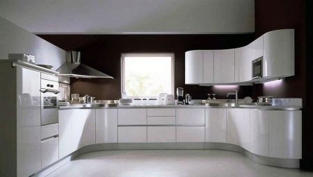
Before thinking over the arrangement of the kitchen, you need to take into account its desired configuration. The U-shaped scheme is often used. It is imperative to know all the subtleties and nuances of such a design.
Advantages and disadvantages
To begin with, it is worth figuring out whether such a decision is advisable, in general. The U-shaped design of the kitchen looks stylish and fits easily into the most modern compositions. This solution allows you to form original and functional "working triangles", to reduce the time for moving between zones. Other advantages worth noting:
- significant storage space for household appliances and kitchen utensils;
- increase in working space;
- maintaining symmetry (which is especially important in a number of styles);
- suitability for a studio type kitchen;
- blurring the clear boundary between culinary and leisure areas.
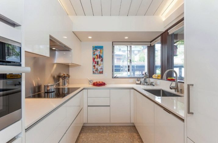
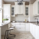
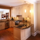
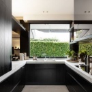
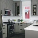
But do not forget about the negative sides of the U-shaped layout. So, it is obviously unsuitable for a narrow space. It will turn out badly in the kitchen of a small area - it is unlikely that it will be possible to find a place for the dining table. Sometimes the problem is solved by making one side of the furniture shorter. But this already deprives the U-shaped kitchen of normal symmetry.
You won't be able to use corner boxes in this room, or rather, they are too impractical. You will have to install expensive storage systems - a pull-out shelf or a carousel. It should be borne in mind that U-shaped headsets are always formed individually. Therefore, it is more expensive than standard options. It is recommended to think, weigh the pros and cons in order to make a rational choice.
Materials and colors
The kitchen set in the U-shaped kitchen, as in other options, is most often made of natural wood. Such designs are especially good in a large room. The wood is graceful, allowing it to highlight the status of the owner and create an elegant setting. The tree is environmentally friendly and does not pose health hazards; however, it is very difficult to care for him. Besides, disadvantages of wooden surfaces are:
- danger of contact with water;
- the likelihood of damage from sunlight;
- high cost.
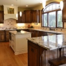
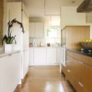
The color of wooden furniture, like its texture, is determined primarily by the type of material. Even different slices may not look the same.
Along with wood, laminated chipboard can be used. The advantages of using the material are:
- increased strength;
- low wear;
- a significant variety of colors (much more than that of a tree).
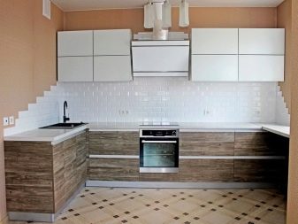
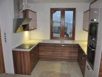
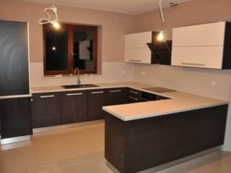
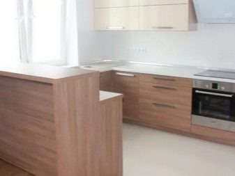
But it must be borne in mind that laminated chipboard can have a very different quality. It depends on the characteristics of the chips being pressed and the nuances of the technology. If the particle board is damaged, it can release harmful vapors. And one more nuance - only professional designers can sensibly choose a U-shaped kitchen from chipboard. Relying on your own taste is undesirable. The third possible option is plastic furniture. Synthetic materials are very easy to care for. Plastic is lighter than wood. Rearranging furniture, if necessary, will not be difficult. And thanks to the achievements of modern design, it can look brilliant and extraordinary.
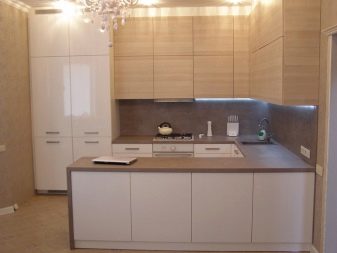
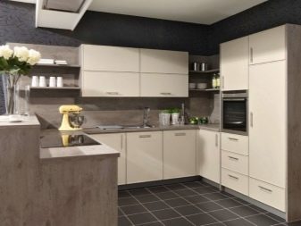
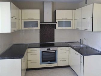
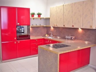
Technologies have been developed to reproduce the most intricate textures. Plastic lasts quite a long time. Its cost is much more affordable than that of the cheapest varieties of wood. But there is also a negative point - the likelihood of the release of toxic substances. You will have to choose from the very beginning headsets without foreign smells; you should not count on their gradual weathering. It should also be borne in mind that plastic furniture can be easily damaged. You will have to handle it carefully. In addition, the plastic will fade in the sun. In order for the U-shaped kitchen to serve for a long time, it is required to furnish it with furniture made of rather expensive plastics. The cheapest options are simply impractical and sometimes dangerous.
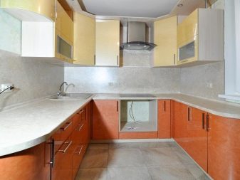
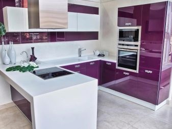
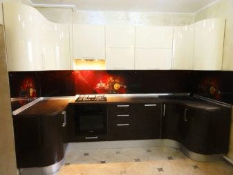
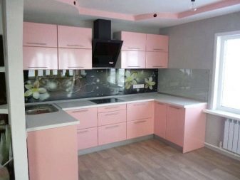
White can be used in U-shaped kitchens without the slightest hesitation. It looks harmonious and elegant in any room. The dining area is most often decorated with red, orange and yellow accents. If maintaining a diet is critical, an appetite-lowering gray and pink shade should be preferred. Beige headsets are neutral and look noble. They can be used in U-shaped kitchens of any size. The attractiveness of this color is due to the fact that it creates a calm mood. It is especially well embodied in a classic setting. Purple tones look extravagant and interesting.
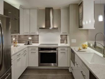
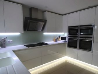
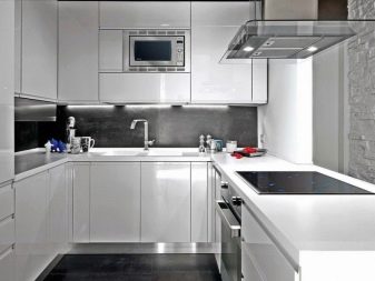
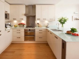
But it must be borne in mind that purple paint is suitable only for spacious rooms. If there is not enough space, you will have to limit yourself to light shades. However, since the U-shaped layout itself is used primarily over a large area, this problem rarely occurs. Green headsets that look fun and fresh are a good alternative.
Layout options
In the kitchen-living room (combined studio), the U-shaped layout most often implies the replacement of one side of the furniture with a bar counter. It has two key functions: visual separation and dining area. A formal departure from the rule requiring the headset to be installed directly against the wall does not interfere with the implementation of the general configuration. But projects with a bar counter can be implemented not only in studios. True, in a private house or in a typical apartment building, you will need to demolish the wall.
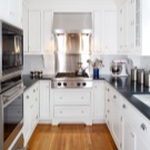
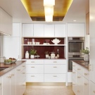
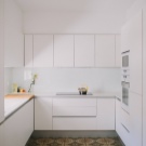
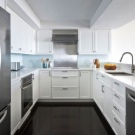
Therefore, it is very important to calculate all the parameters with an error of no more than 0.01 m.The attractiveness and youthful appearance of U-shaped kitchens with bar counters do not allow us to forget about the low practicality of this option. Even a large bar structure is inconvenient for 3 or more people. Moreover, it is not suitable for a party with invited guests. When forming a drawing of a U-shaped kitchen, you need to take into account what will be delivered at the window.
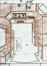
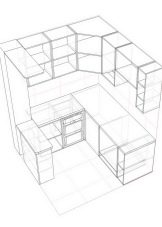
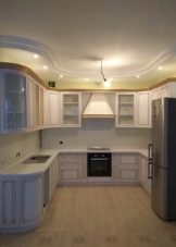
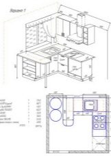
Most often, there is a heating battery, and therefore it is impossible to put a kitchen set. The normal circulation of heated air will be disrupted, and the furniture itself will deteriorate. Sometimes there is a sink by the window. But in this case, you need to think about how easy it will be to lengthen the water supply system. Having to wipe away splash from the window after every dishwashing and the difficulty of opening the sash makes life very difficult.
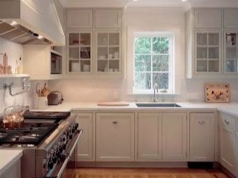
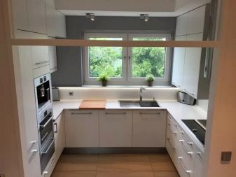
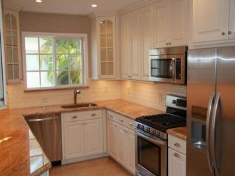
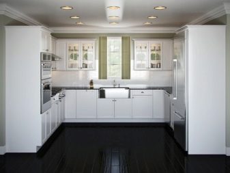
Therefore, in most cases, the space near the window will be completely free. Sometimes they take a more radical step - they make a kitchen without a window. This option allows you to think less, how to arrange furniture, how to redistribute zones. The headset and other objects are placed against adjacent walls, and the side with the opening is not used. The doors are either completely removed, or a transparent design is chosen. Carefully selected lamps also help to compensate for the lack of light. As for the sketches of a U-shaped kitchen with an island, then this option is definitely not suitable for a small area. It is advisable to use it if the kitchen is from 20 sq. m. Most often, the island is assigned the role of filling the empty middle.
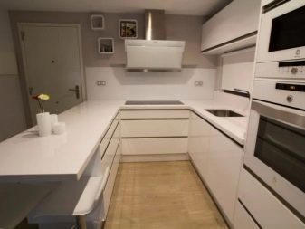
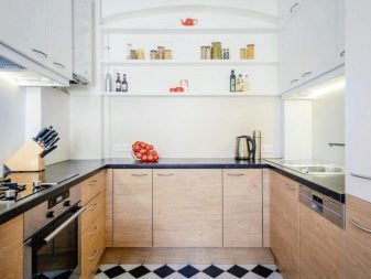

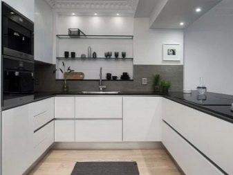
Important: the organic look of the island element is obtained only when there is at least 1.5 m of free space around it.
But on a small area, it is more expedient to form the kitchen-living room already described above in the form of the letter P. Then both zones are performed in the same style, or at least they are connected stylistically with the help of some common points. When the size of the kitchen is 12 m2 or more, the following arrangement is usually used:
- one of the walls with a refrigerator, washing machine and microwave;
- the second - with a sink, work area, electric or gas stove;
- the third - with a heterogeneous technique of choice.
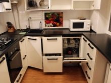
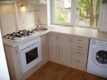
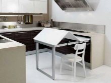
For a very narrow room, solutions with a transforming table are suitable. Such models are compact, they are easy to fold as needed. This step helps to realize the shape of the letter P, even in the most limited space. Sometimes one of the walls is decorated with a wall-slide, which rises almost to the very ceiling. In this case, medium-sized furniture modules are used, the deaf facades of which are painted in the same way as the verkhotura. The described solution is suitable even in a large kitchen.
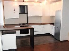
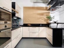
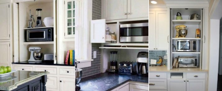
Some people prefer to use large frame cabinets in which they put:
- shelves;
- lockers;
- ovens;
- Microwave ovens;
- coffee machines.
When the kitchen is equipped with a window, one of the sidewalls of the U-shaped composition can be placed next to it. One side is taken under the working area, the second is turned into a bar counter. Important: it is not necessary to push the furniture close to the wall. When the headset is installed 2 m from the window (if there is free space), several working zones appear at once. Several chairs are placed against one of the tabletops.
Style solutions
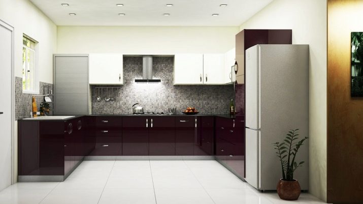
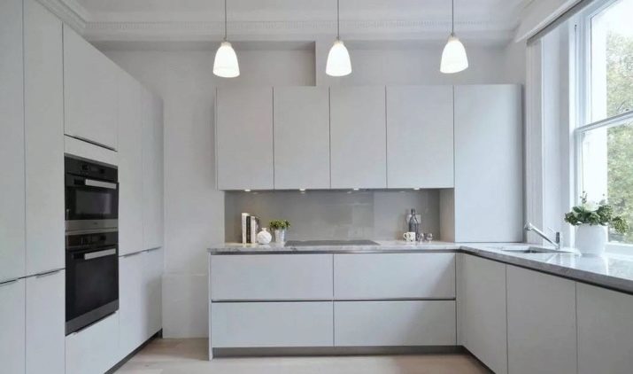
The U-shaped space in a modern style is suitable for those who value order and a practical look. This solution is equally acceptable for any size kitchen. Avoiding decor or keeping it to a minimum greatly simplifies the task. Designers note that modern style is ideally combined with light colors and glossy surfaces. Furniture is most often built in. Sometimes the U-shaped design of a kitchen in a modern style involves the use of high (reaching to the ceiling) headsets. They can accommodate all the necessary utensils and products, as well as built-in appliances. But in the interior in the shape of the letter P, the classics of design can also be used, even with a luxurious patina.In this case, the main emphasis is on playing around with symmetry. Therefore, you cannot use a bar that violates this principle.
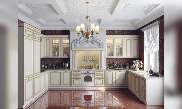
Classic style furniture should be elegant in appearance. It is painted in deeper colors than in a modern interior, but it is recommended to choose restrained, discreet colors. Important: the classic requires the use of solid, visually expensive materials. If there is not enough space, it is better to arrange a U-shaped kitchen in the spirit of minimalism. This option implies the most convenient arrangement of elements.
In a minimalistic kitchen, they usually try to use an area near the window. If the kitchen sink is not transferred there, then a stove and a refrigerator are put on the sides. Minimalism implies a preference for sleek designs and not overly vibrant colors. Experts note that multifunctional furniture will ideally fit into this style. A minimalistic interior means leaving only large objects in sight; removing small things helps to externally enlarge the room.
But the loft style, like the classic one, can only be used in large U-shaped kitchens. This solution is suitable for a studio apartment and most often involves the use of a peninsula. Important: if models with a peninsula seem boring and unsuccessful, you should think about a metal bar counter. Additionally, it is recommended to apply:
- wood;
- brick;
- plaster.
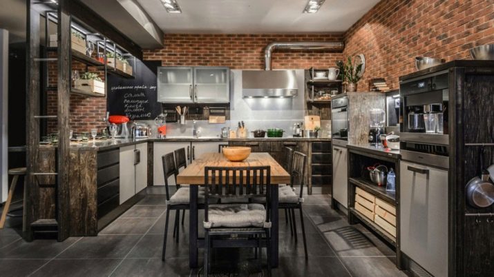
A loft-style interior will look nicer if the lighting is organized correctly. There should be more light, while choosing the simplest lamps possible. The Scandinavian approach is the opposite of a loft, and in such a U-shaped kitchen it is necessary to express unity with nature. For this purpose, natural materials are used. Sometimes they even put medium-sized sofas with fabric upholstery.
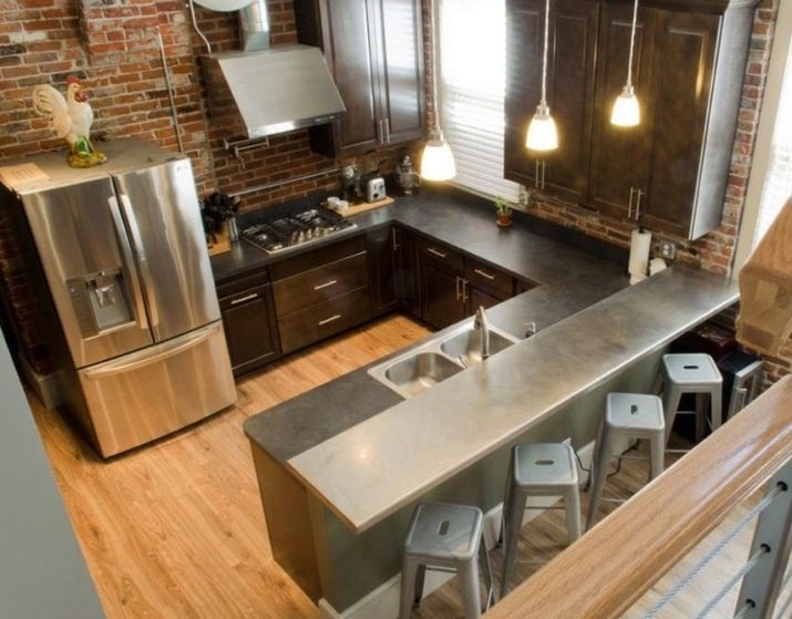
But bar counters are used only occasionally. A full-fledged table will definitely be better, where it will be more pleasant to gather. The principles of the Scandinavian interior are:
- the practicality of all things;
- the obligatory presence of indoor flowers and wall clocks;
- wall decoration with paintings or attractive photographs.
How to choose?
As already mentioned, in a house with a U-shaped kitchen, ready-made furnishing options are not suitable, and everything is done to order. But that is why the basic selection requirements are no less relevant. It is recommended to give preference to products from local factories. All companies have been using more or less the same equipment and materials for a long time. Kitchens purchased from foreign suppliers are more expensive only due to higher raw material prices and shipping costs.
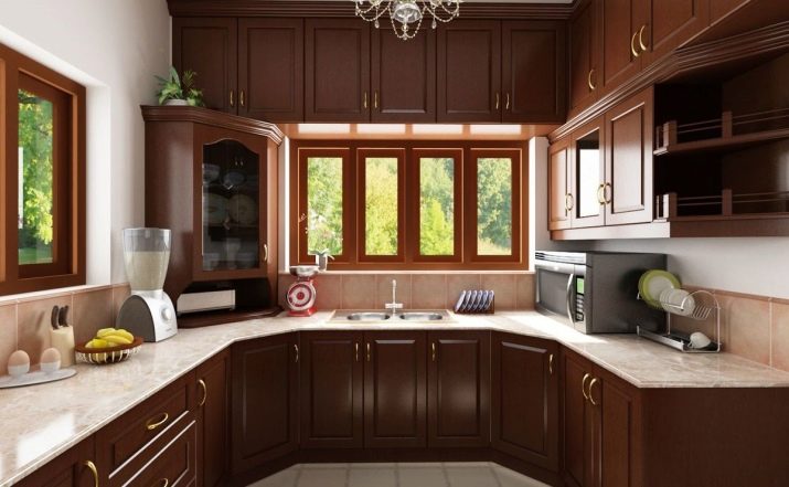
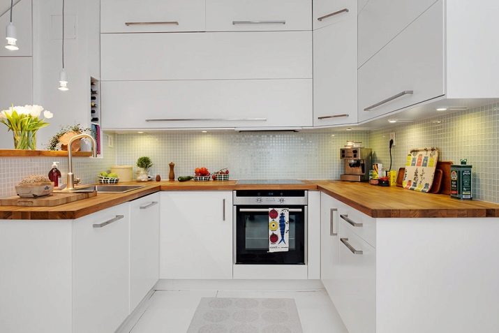
The most convenient options for aprons are glass or made of tiles. For facades, gloss white is the ideal choice. This is a very practical performance. Top-tier drawers should ideally be hinged. Lifting structures are expensive and have no real advantages. It is necessary to consider how the refrigerator will open. If you ignore this moment, it can be inconvenient to use it. You can choose a U-shaped kitchen correctly only after a careful study of the range in three stores or websites. If the furniture is made of chipboard, it must be fully laminated so that no toxic substances appear. A special coating must be applied to all surfaces invisible from the outside.
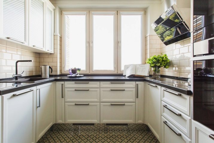
It is imperative to take into account the quality of the fittings. Its cost is determined not so much by the brand as by the layout. It is advised to compare prices of different companies in order to eliminate errors. Swing hinges are cheaper than other options. Furniture handles are selected according to their own taste, any recommendations (except stylistic ones) are inappropriate.
Beautiful design examples
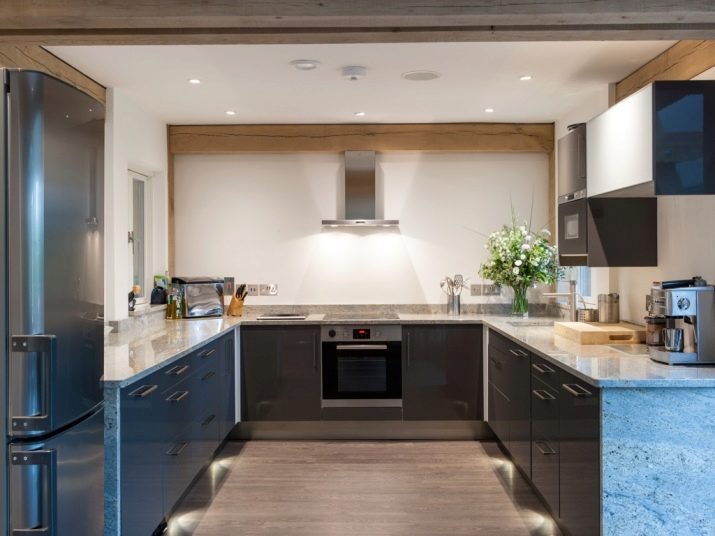
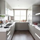
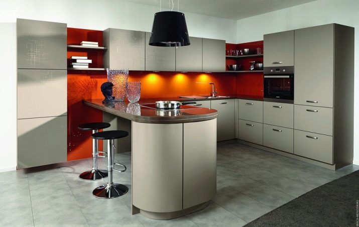
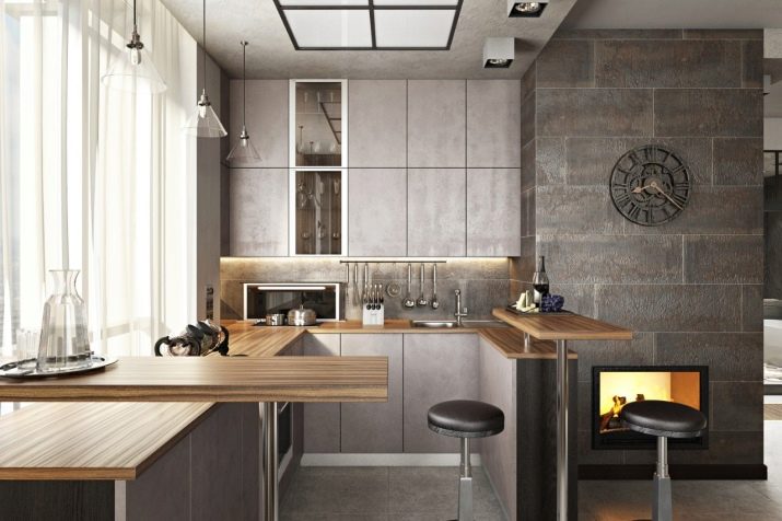
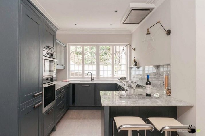
The photo below shows a stylish U-shaped kitchen, which uses the contrast of light and dark gray tones.Spotlights, glass elements and glossy surfaces add a touch of modernity to the room.
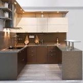
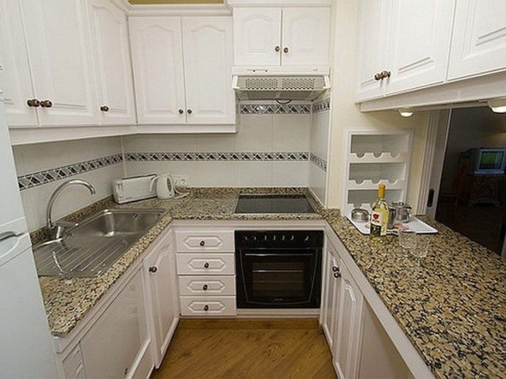
And here is shown a completely different composition - with a combination of a white top and a multi-colored bottom. The variegated countertop and richly colored flooring add to the romantic mood.
For information on how to choose the right U-shaped kitchen, see the next video.


