Corner kitchens with a window: how to correctly design and decorate?
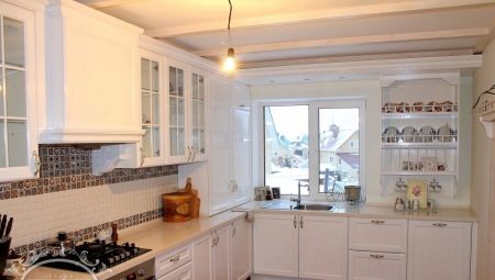
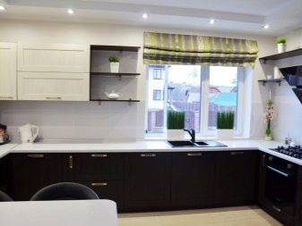
Designers agree that the corner layouts in the kitchen with a window are quite functional and at the same time ergonomic, which is why this option is most often used when planning and decorating kitchen facilities. Such solutions are especially relevant for small spaces. Depending on the location of the windows, there are several options for rational planning - they will be discussed in our article.
Advantages and disadvantages
Corner kitchens with a window will be the best option in two cases:
- if the kitchen area is less than 10 sq. m;
- if you are decorating a kitchenette in a studio or in a common room that combines a kitchen and a living room.
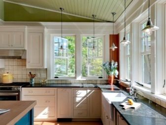
However, if you wish, you can use a similar design in other conditions, since this layout has several tangible advantages.
- Compactness - with corner placement, furniture sets and household appliances take up much less space.
- In the corner, you can always arrange not only the main work area, but also the dining area. In this case, a corner sofa is placed there - as a rule, it is small in size, and the drawers located under the seats allow significant savings in shelf space.
- The corner design of the kitchen effectively zones the space.
- With corner picking, you can always arrange furniture in accordance with the triangle principle, when the stove, refrigerator and sink are located at an equidistant distance from each other, and within walking distance. This saves users time by minimizing unnecessary movements.
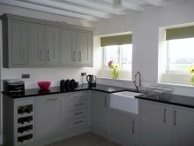
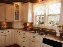
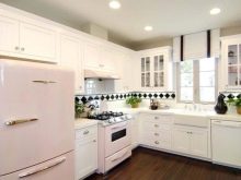
Corner kitchens are not without some disadvantages.
- If the kitchen has a non-standard layout, has ledges or niches, then it will be quite problematic to correctly design a corner set - any irregularities in the walls often not only add worries, but also significantly increase the budget for work.
- If the kitchen is small, then most often the sink is placed in the corner, thus, there is a significant saving in space. But at the same time, such a sink is very inconvenient to use, since there is very little space left in front of it, and this inconvenience turns into a real problem for housewives of a large physique.
- The project of a corner kitchen is not suitable for elongated rooms, since the space is used irrationally and there is a high risk of overloading an already small area. And also, you should not use such furniture in square spacious rooms, since in this case you will have to make a lot of unnecessary movements moving from one corner to another.
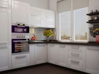
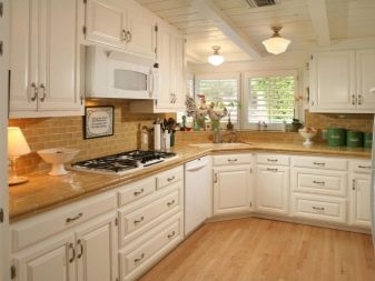
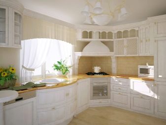
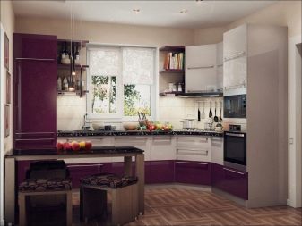
Layout options
Some designers suggest decorating corner kitchens with a window in such a way that they can fit everything you need to prepare meals. That is why when planning, pay attention to some recommendations:
- if you have a small room, it is better to install a two-burner stove instead of a four-burner one;
- choose a small sink;
- be sure to leave some space between the sink and the sink - this will make it easier to work in the kitchen;
- when buying household appliances, give preference to built-in modules;
- pay attention to furniture with hinged doors that open upwards;
- it is better to use a small, but powerful hood;
- it is better to install a folding transforming model as a table.
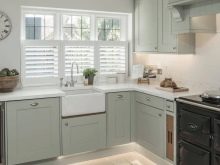
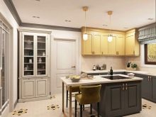
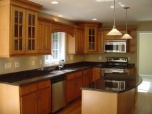
It should be noted that for a competent arrangement of the space, it is necessary to approach as rationally as possible the location of the countertop, sink, refrigerator, and also the stove... When designing corner interiors, they should be located as close as possible to each other, so that the distance between any two objects does not exceed two meters.
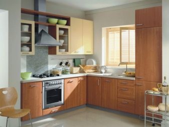
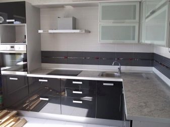
The most common layout option is L-shapedwhen furniture is placed along two perpendicular walls. In this case, all furniture modules are located on both sides of the corner zone - this option is optimal for both small and spacious rooms.
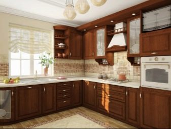
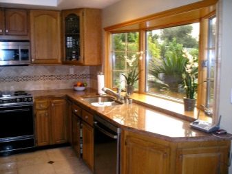
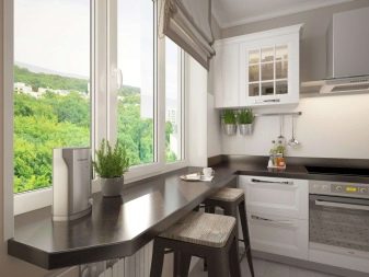
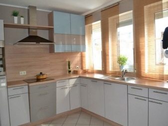
For a large kitchen, you can consider peninsula option: one part of the headset is located near the wall, and the other is mounted across the kitchen perpendicular to the first.
Thus, a plot is obtained that is fenced on three sides - a similar solution is harmonious in rectangular kitchens, while the perpendicular fragment serves as a separator of the dining and working functional areas.
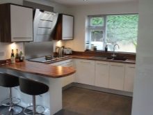
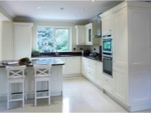
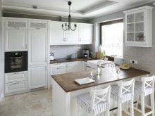
The universal solution is considered U-shaped layout - it can be used in any type of premises, with the exception of narrow rooms less than 2.5 m wide. This version of the corner zone design looks especially impressive in studio rooms, where the setting allows you to separate the kitchen part from the rest of the apartment space.
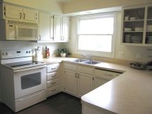
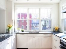
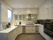
How to decorate a window?
You can arrange a room in which the window is located in the middle of the wall in different ways. If the window opening is in the center, then the niche under it can be used as a block for storing food or items necessary for everyday life - these can be both little things that are necessary daily, and things that the owners use a couple of times a year.
Wide window sills often play the role of countertops, this is especially true for small kitchens - such a countertop is used instead of a work surface, and it is also converted into a sink by dismantling the battery, integrating the sink and carrying out all the necessary communications.
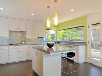
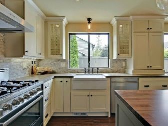
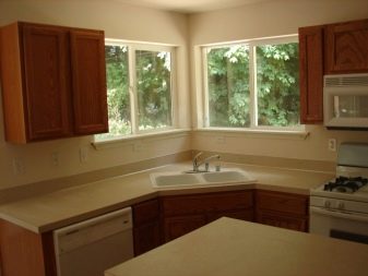
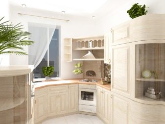
However, the windows in the room are not always located in the middle of the wall, there are often corner options for the location of window openings - usually such a layout is found in non-standard rooms, for example, in elongated narrow kitchens.
As with the central location of the window, here you can use a niche under the window - usually a sink is equipped in it or a stove is installed.
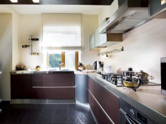
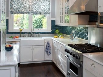
If there are two windows in the room, which are located on perpendicular walls or are at a short distance from each other, then a compact corner cabinet with open shelves can be installed between them.
A spacious kitchen and two corner windows located in it are an excellent solution for decorating a dining area: natural light and a view from the window will surely create a truly cozy and warm atmosphere. Here you can put a small sofa and complement it with a round table - such a composition fits perfectly into the space between a pair of windows.
Another option for decorating the area between the windows is to hang plasma there. Remember that well-placed elements of the kitchen layout will not only make the space cozy, but also visually add a few extra meters to the space.
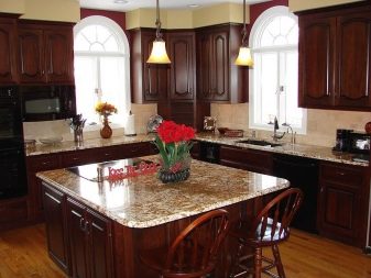

Narrow kitchens with a pencil case with a window at the end are most often found in private houses; this option is unusual for standard new buildings. This narrowing of the kitchen space is due to the need to allocate more space for the living area.
If at the same time the window is located on the end wall opposite the door, then blank walls are usually forced with furniture and household appliances. In this case, it is extremely important to leave a free passage so that you can move around the kitchen and carry out all the necessary work.
Style solutions
You can make the interior more airy and light if you follow the recommendations of the designers.
Corner facades in provence style with transparent glass or glossy inserts, as well as completely made of glass will visually expand the space, the same role is taken by open shelves.
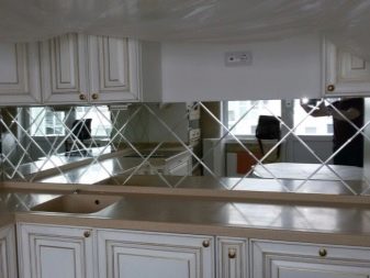
In a modern kitchen mirrors are used quite rarely, at the same time - this is one of the most effective ways to expand the boundaries of the kitchen space. It is advisable to make a mirror apron in such a kitchen, especially if you are decorating it in a loft or high-tech style, or hang a large mirror on the walls that are not occupied by the headset - this option is more appropriate for classic interiors.
If you do not want to constantly see your reflection, then you can use glossy facades or stretch the gloss on the ceiling - it depends on the footage of the room and your personal preferences.
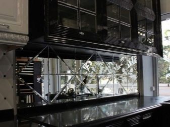
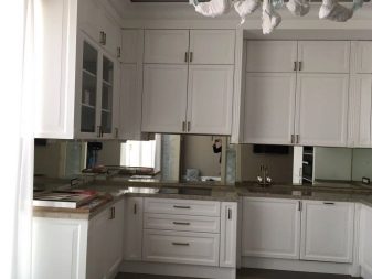
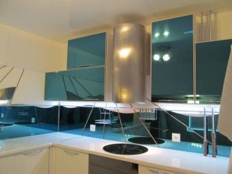
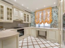
In classic and neoclassical interiors it is better to use light wood corner sets, and hang spectacular draperies on the window. In modern decor options, a combination of metal with glass is more often used, the corner zone can be supplemented with a glass apron, and it is better to hang a plasma TV panel in the space between the headset and the window.
Beautiful design examples
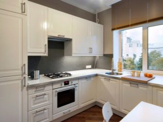
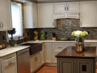
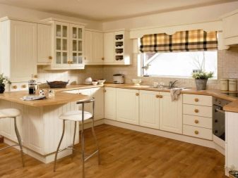
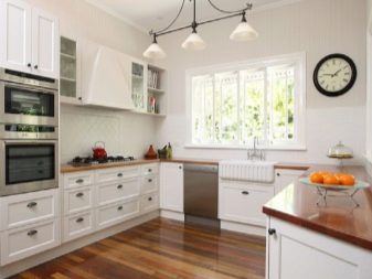
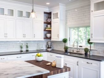
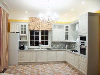
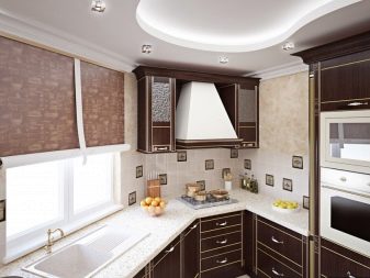
This photo selection of interesting options for corner placement of furniture in a kitchen with a window will help you choose the option that you like.
See how to use a window in your kitchen interior:
- to install a sink;
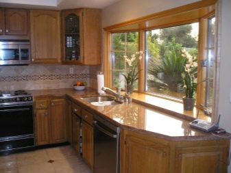
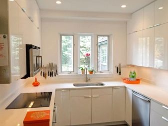
- for a cozy narrow table;
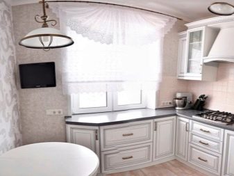
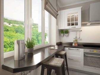
- for panoramic corner glazing in a private house;
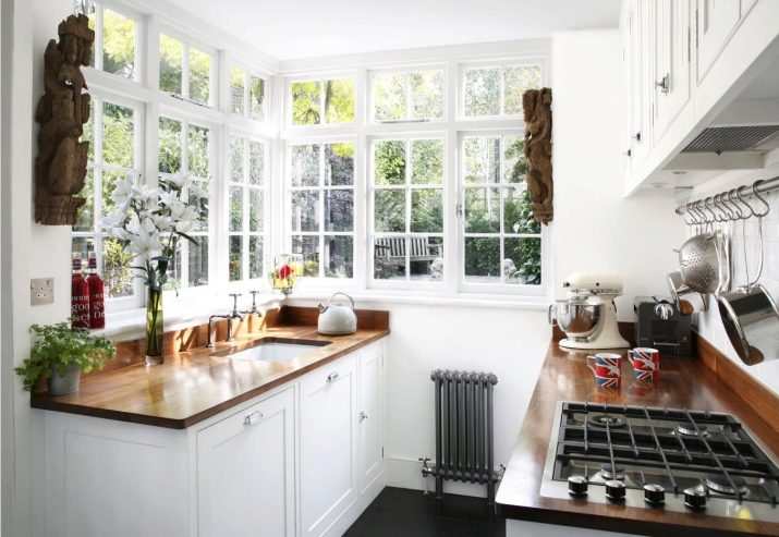
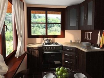
- if there are two windows, one can have a stove, and the other has a dining area;
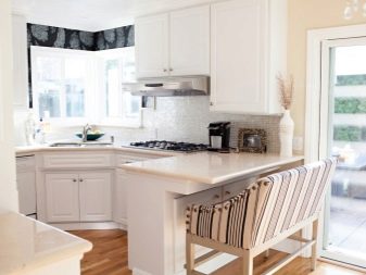
- draw a unifying work surface under two windows located on different walls.

For an overview of the layout of a corner kitchen with a window, see below.


