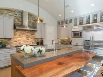
Kitchens with gray countertops
For a long time, the gray color was undeservedly considered boring, office, too official. Today, the perception of color has changed, a lot of chic design projects are based on gray and its possibilities. In any room, in any space, he can become expressive, beautifully emphasize the features of the environment. This also works in the interior of the kitchen.
Psychology of color in the interior
If you have a high speed of life, gray is for you. It inhibits the nervous system at the moments of its "overheating", balances it. It is believed that if you think about solving a problem in such an interior, the thoughts that come to mind will be as rational as possible.
And in space, gray is able to recreate elegant severity, not boring, pleasing to the eye. It is finally the best backdrop for bright accents. And only one significant danger lurks in this color: if you overdo it with it, the room becomes gloomy, not conducive to activity.
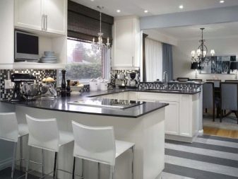
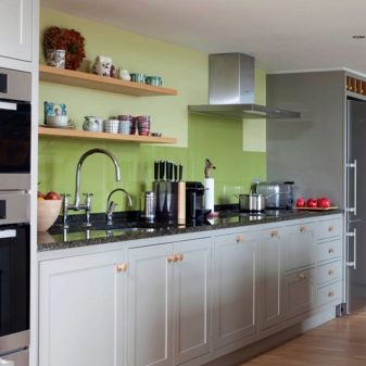
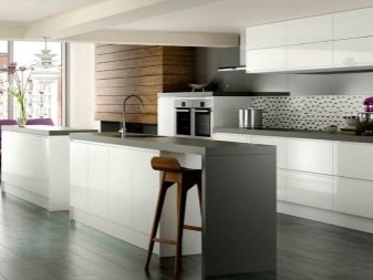
In order not to "feel sad" in such an interior, skillfully use gray. If we are talking about a kitchen, then active color inclusions will be very interesting - for example, a white kitchen with a gray countertop.
Features of white and gray space
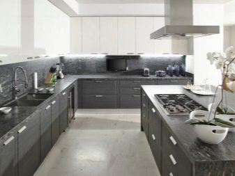
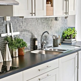
Pure white is a color of exceptional character. Deep, expressive, compromise, ordering. The gray tone is not so straightforward. It has ashy shades, and even dusty notes; it contains graphite, silver, pearls, and stone. Glossy gray and matte create completely different impressions.
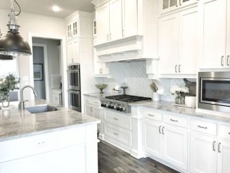
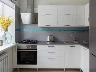
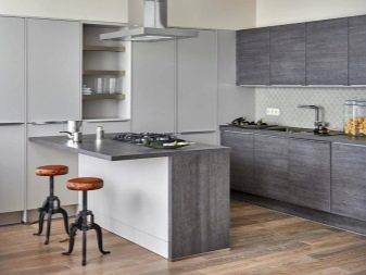
Gray and white combination, chosen for the design of the kitchen, is a decision in favor of neutrality, conciseness, dynamism.Note that a kitchen set in this range can be both warm and cold. But so that the color combination is definitely not boring and very restraining, it needs to be diluted with a third color. It will be secondary, but decisive.

An example of such a trio is white, gray and brown shades. Perhaps a beige kitchen will not harmoniously fit into such a combination, but a kitchen with the inclusion of a sand one will be good.
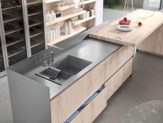
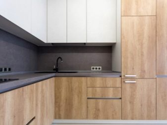
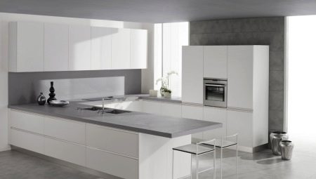
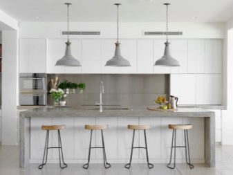
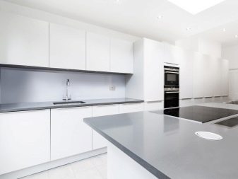
A gray countertop should look organic with an apron. White color is reconciling in this sense. If the apron is also made graphite, then it should have a print (white or wood), otherwise the two planes will visually merge, and this is not very beautiful. Unless you can combine tones of gray: make the tabletop a little warmer in tone than an apron.
If the countertop dark gray, this may be the very third decisive color that white and medium gray will make friends. A concrete-colored countertop will look good in a space where there is much more white than gray. A here are fragments of chairs or even handles on furniture can be decorated in a light wood color. This will liven up the room, relieve it of cold graphics.
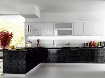
White top, dark bottom
Another, quite popular kitchen decoration solution. The facades of the hanging cabinets (and maybe the entire body as a whole) are made in an exclusively white color. No print, no special texture, no dusting. Glossy classic kitchen with clear geometry, in a minimalistic style.
The lower cabinets and the table top are made in graphite color. The floor can be done in a conciliatory color, which is a blend of perfect top white and bottom dark gray.

If you let a different color into such a kitchen, then it is very point and delicate. For example, white orchids can decorate it, their green stems and leaves will bring the slightest bit of dynamism to the interior, which is intended to be austere and calm. Do not be afraid to play with natural green - its role is small, but significant. It is the plants that make the kitchen lively and tender in strict shades. Wherein they do not let vanity and chaos into the space, that is, they maintain its mood.
Harmonious combinations
In a kitchen space with a gray countertop, other interior colors are possible. Let's consider the most successful combinations.
Let's make friends with red
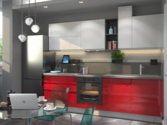
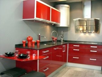
Gray, white, red are colors that do not need fashion and rethinking. The kitchen space in which they get along can turn out to be very cute. And it's possible: white top cabinets, red bottom cabinets, and a gray countertop. Quite bright, but at the same time strict, sustained, stylish. There is no imbalance, no other accents are needed.
But since the set in such a red kitchen will be very bright and expressive, certain requirements are put forward for the rest of the furnishings. Namely: you need to make the space weightless.
More glass, more transparent objects, unobtrusive finishes, a minimum of furniture and decor.
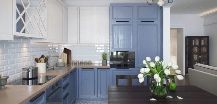
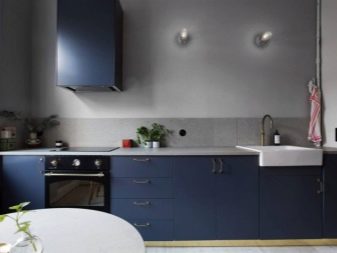
Blue and warm shade of gray
A fashionable and very cute option is a kitchen with active blue, with the addition of warm gray. Imagine adding some cocoa and milk to the gray. You will get such a delicate gray-brown, warm and pleasant color. If used in dosage in a room where other colors reign, it will be an excellent color aid.
Active, noble blue (a little with a touch of retro), refreshing white space (cabinets and an apron) and a gray countertop - a very beautiful and elegant set. Support for gray in this interior can be found in the flooring.
Gray and white tiles reconcile the upper parts of the set, balancing the image of the kitchen as a whole so that it can let in another calm and noble color - for example, dark chocolate. A dining table in this color will merge into the space of blue and white, and somewhere it will even be in tune with the brown-gray countertop.
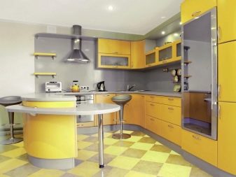
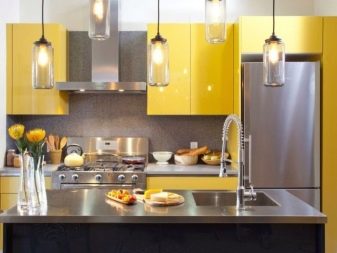
Add yellow
For those who are afraid of the sleepy mood that can set the color, it is worth diluting it with uncompromisingly bright. For example, yellow. This, by the way, a very good solution for a small kitchen. EIf you want to distract attention from the modest footage of the kitchen, make it calm, but add some cheerful color as an appropriate seasoning.
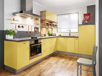

Gray lower cabinets and a gray countertop are beautiful, seasoned, calm... But the top yellow cabinets are dynamic, sunny and fun. Together, we get an excellent formula for a cozy and warm room, which will become a point of attraction for all household members.
It's good if you know how to play up the basic colors of the kitchen in the little things. For example, the graphite color of the countertops and cabinets can be conveyed in identical napkins, and the yellow color of the top of the headset can be conveyed in the same teapot. These cute design rolls will sew all parts of the kitchen (both large and small) into one beautiful, harmonious canvas.
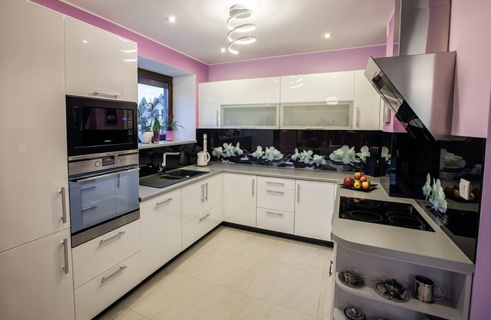
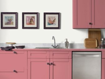
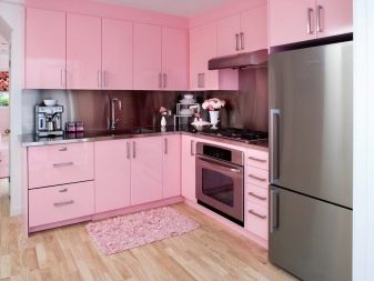
In the pink kitchen
Pink color - there are dozens of variations from flashy to aristocratic. Muted pink, pink with milk - these options are very relevant, they are liked equally by men and women. Metallic will be a good assistant to pink in such an interior. It's great if the countertop is in tune with the refrigerator (although this is not a prerequisite).
Pink, although muted in this case, is still an active color, it needs to be diluted. But you can do it with a neutral light wall decoration, as well as a beautiful strict tableware (made in gray shades, for example).
But it is not worth choosing other color options for the noble pink, this deprives the space of clarity, brevity, and style.
Who is not suitable for?
Not everyone will suit the gray that is present in the interior of the living space. And it would be good to understand this even before starting the repair.
It will not suit your kitchen if:
- the room is on the north side, it is outwardly cold, and you are a real frost;
- you love bright, warm, dynamic, and only in such conditions are you ready for culinary experiences;
- in the office you have gray walls, but you want to change the picture before your eyes when you come home;
- you love floral prints and natural, vibrant colors.
If you decide to compromise, you can play with the color temperature. Cool gray is achieved by adding blues, blues, and purple tones. Warm shades can be obtained in combination with green, yellow, red. Cold colors are preferred by very calm and even reserved people, often carried away by something that limits contact with people. They feel comfortable in such a space.
Warm shades are inherent in more sociable and friendly natures. Choose your option and transform the space. If, at the time of cooking, you see the countertop of the ideal, favorite shade of gray in front of your eyes, the dishes will definitely be tastier. Make no mistake!
For information on which material to choose a countertop for the kitchen, see the next video.


