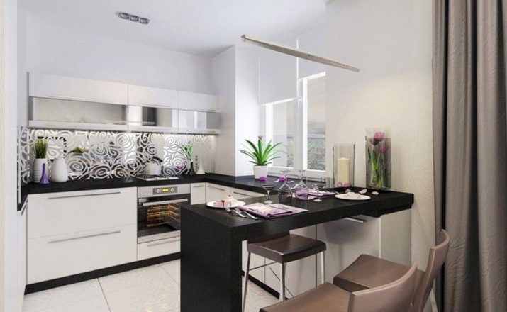
Kitchen-living room design 12 sq. m
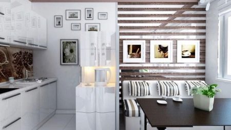
In typical buildings, kitchens are small. To save space, two locations are often combined into one. To place all the necessary items in the room, you need to competently think over the interior and layout. In the article, we will consider the ideas for the design of a kitchen-living room with an area of 12 square meters.
Fundamental rules
In order for the kitchen, combined with the living room, to look stylish and comfortable, it is necessary to adhere to the recommendations of experts. First of all, the working kitchen area and free space in the living room should be decorated in a single style.
The border between the living room and the kitchen can be an independent piece of furniture: table, flower stand and other options.
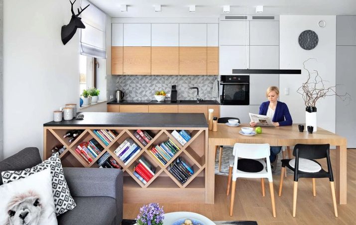
Some designers prefer to leave part of the wall and place shelves or decorative elements on it.
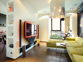
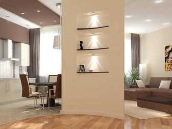
Textiles, dishes and other items (figurines, paintings) are important decorative elements. All of them must be made in the same style (color, texture and other characteristics) and correspond to the decorative design of the room.
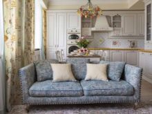
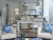
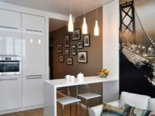
So that the design does not turn out to be boring and monotonous, select several colors and shades for decoration. It is desirable to arrange the walls, floor and ceiling in the same range, while the colors may differ from each other by several tones.
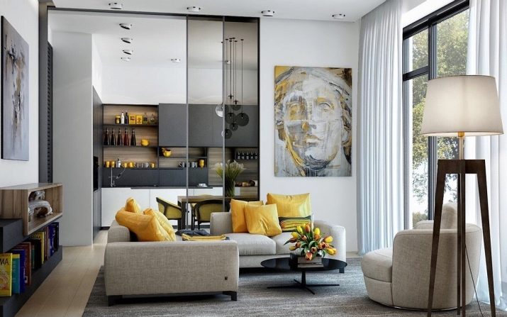
Wall decoration
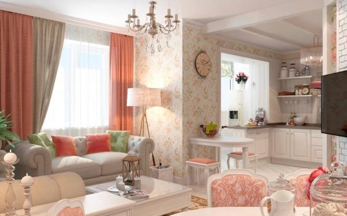
To make a kitchen-living room of 12 sq. m as spacious as possible, when decorating the walls, choose light colors.
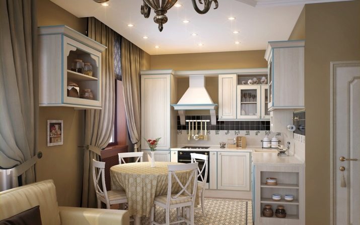
Thick and dark colors absorb the free space, visually reducing the size of the room. This technique is often used for miniature rooms, for example, 3 by 4 meters.
Cold shades are not recommended for this part of the house. A large number of gray, blue, turquoise and other similar tones will create an uncomfortable atmosphere in the kitchen. It will be unpleasant to stay indoors for a long time. Small and neat patterns will help expand the boundaries of square rooms, but it is undesirable to use such a design for kitchens with an elongated layout.
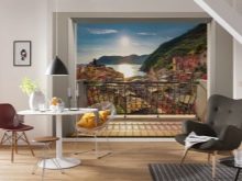
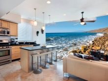
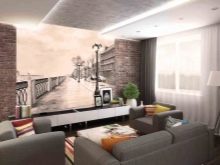
To diversify the interior, wall murals with a perspective image are great. The following options will look ideal: roads stretching into the distance, water channels, panoramas.
If you want the room to look taller, choose a wallpaper with vertical stripes.
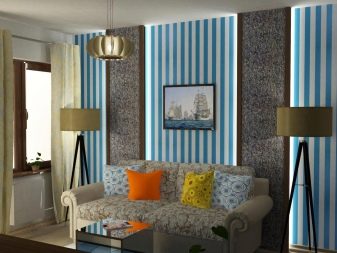
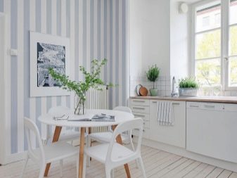
However, such a pattern will cut the horizontal space.
Depending on the layout, the task may be the opposite, for example, to shorten an overly elongated room. In this case, one of the walls is decorated with a dark color.
Floor cladding
To "move" the walls apart, it is recommended to use a board or tile. The finishing material is laid out diagonally.
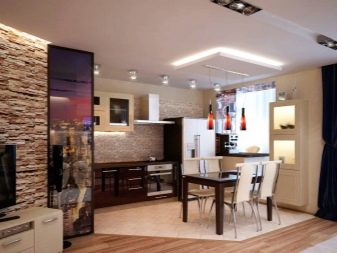
This method is ideal for rooms with irregular shapes.
If the room is long and narrow, it is better to choose the transverse method of installing the flooring. This will help balance the shape.
Another popular design trick for expanding a room is to arrange light floors with wide horizontal lines. And also to increase the space, choose a glossy floor covering with a slight sheen.
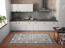
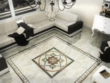
A large and expressive image in the center of the floor can be a decorative accent. Most often, the drawing is laid out with tiles or small mosaics. You can also use decorative parquet.
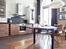
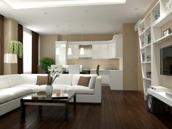
In a small room, dark colors are also possible for floor decoration., however, the walls should be decorated with light shades.
Ceiling decoration
A classic trick for expanding a room is to decorate a white ceiling. This decor is ideal for modern and classic stylistic trends. The light palette creates an atmosphere of lightness and fills the room with light.
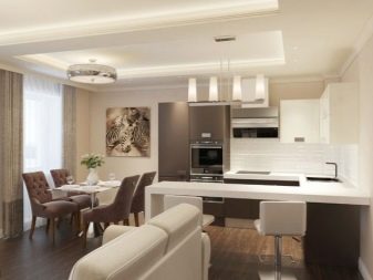
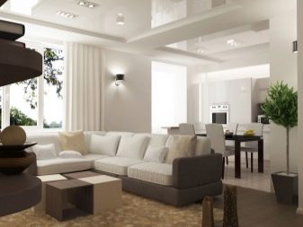
To raise the ceiling, designers use edging that matches the color of the walls. The maximum edging width is 20 centimeters. The pattern is placed around the perimeter of the entire room.
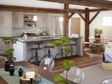
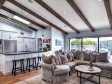
The use of ceiling beams can also expand the size of the room. Their color should be several shades lighter than the ceiling.
When decoding rectangular kitchen-living rooms, dark beams are recommended. They are placed across the narrow part.
Illumination
Window openings are best done in white.
If there is a lack of sunlight in the room, remove objects from the window that block the path of the rays (large plants, figurines and other decorative elements).
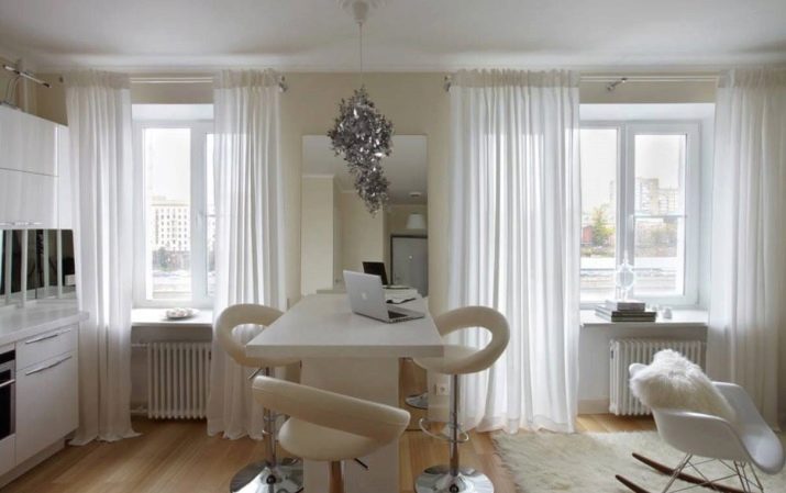
When choosing curtains, choose options from light and translucent fabrics. Long curtains will visually raise the ceiling. It is recommended to use natural materials.
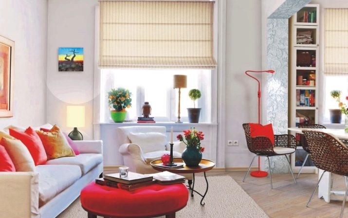
If you need to protect the room from excess sunlight, compact and practical Roman shades, the color of which matches the tone of the walls, is great.
In the kitchen, you cannot do without additional light sources. Their power should be sufficient for cooking, cleaning, comfortable pastime and other activities in the dark. Small lamps must be installed in the dining and working areas.
Furniture selection
When decorating a kitchen-living room on 12 squares, it is preferable to choose furniture with flat surfaces. Modern glossy models will fit perfectly.
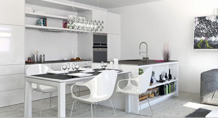
It is advisable to use a set with a minimum of handles and decorative elements.
To make the decor expressive and stylish, designers choose furniture in rich colors. It looks great against the background of delicate pastel walls.
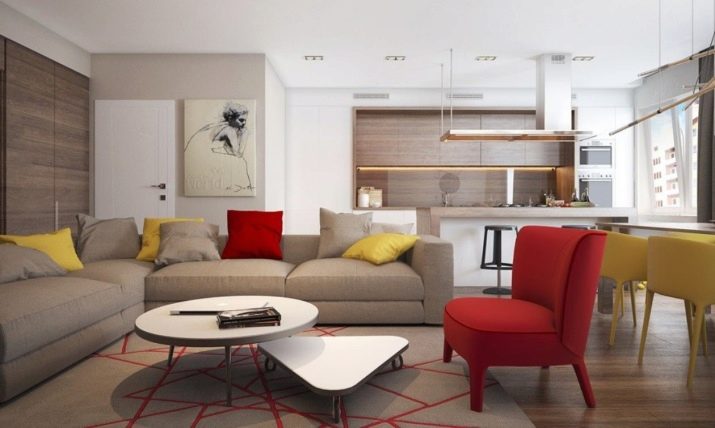
If the style of the room allows, place furniture with glass inserts in the room.Transparent elements look weightless without cluttering the space. Hanging cabinets located in the upper part of the wall will fit perfectly (the color of the cabinets should be lighter compared to the lower pedestals).
A sofa placed across the room will make an overly elongated room more balanced. You can also use a dark-colored countertop as an accent. This piece of furniture will stand out noticeably against the background of light walls.
Layout ideas
A kitchen combined with a living room should combine the functions of two rooms on the basis of one room. A well-thought-out layout will create comfortable conditions for all family members and guests of the house.
In the shape of the letter "P"
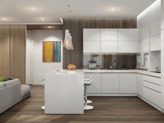
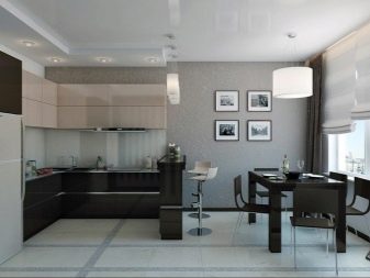
Choosing this planning method, it is convenient to arrange a separate location, consisting of a refrigerator, stove and sink. A place for eating is placed in the center of the room. The working section is located parallel to the table. Chairs are placed on different sides. A relaxation area can be arranged against a free wall.
This layout option also has a different interpretation. A practical portable island is placed in the center, which can be removed if necessary. The sofa and dining area are installed in the back of the room.
Parallel
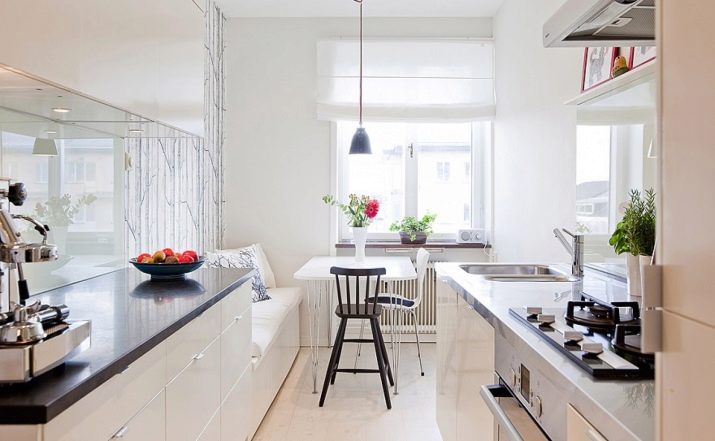
When choosing this project, technical equipment and furniture sets are installed along the walls that are parallel to each other.
This design method is ideal if the room has a large panoramic window.
For elongated and long rooms, narrow modules are great, instead of standard ones. They can be bought in almost any store, or you can place an individual order. Given the peculiarities of the layout, it is difficult to organize a full-fledged living room. Instead, it is recommended to place a bar with comfortable and high chairs.
Organization of the peninsula
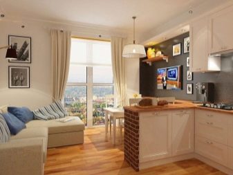
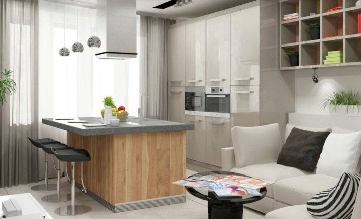
An island layout is not the best choice for rooms of 12 square meters. In this case, it is better to choose the peninsular type, in which the headset is placed in the corner. Free space is used to decorate the living area.
Common mistakes
Design specialists he warns of some mistakes.
- If you place all the things in the room at right angles, the atmosphere becomes too strict. For comfort, it is necessary to introduce asymmetry into the interior. Include a round table, a diagonal strip on the floor, various decor items in the kitchen interior - this will diversify the decor.
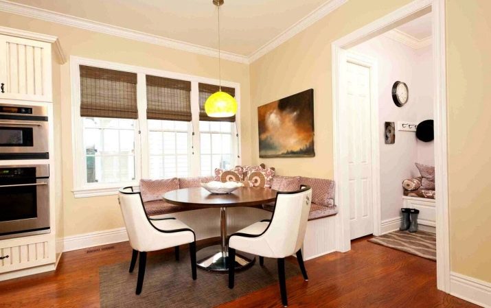
- Pictures and other hanging decorative elements are best placed on a plain wall. If the accessories are placed against a colorful background, visual noise will result, which will harm the integrity of the composition.
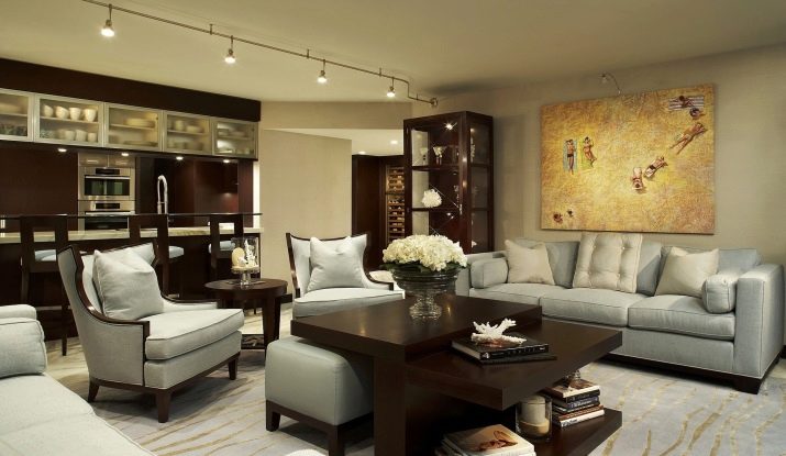
- When dividing a room into locations, use only one of the zoning methods: color, light, subject. When using several techniques, the decor will be visually overloaded.
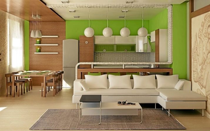
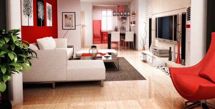
- One of the most "dangerous" colors in the interior is red. In large quantities, it creates an aggressive mood, destroying home comfort and coziness. It should be dosed into the decor, as it attracts a lot of attention and can overshadow other interior items.
Beautiful examples
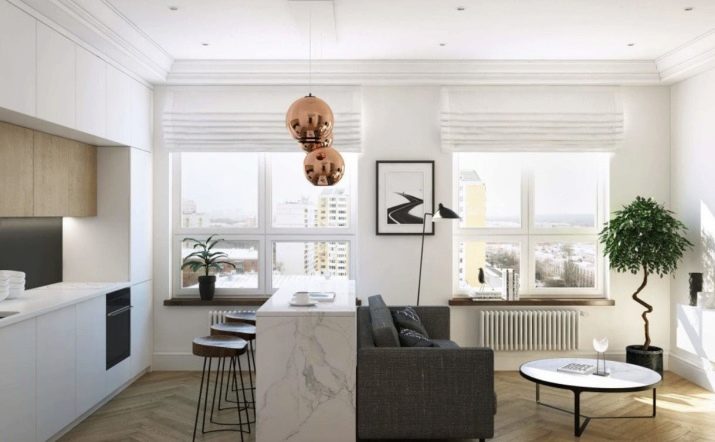
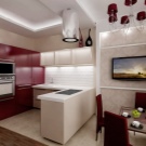
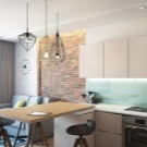
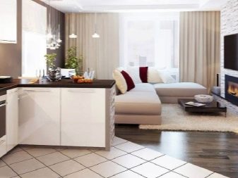
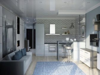
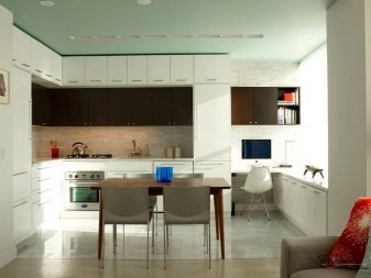
In one room, dining and work areas are harmoniously combined. Furniture serves as a partition, dividing locations. A delicate color scheme has been chosen for the decoration.
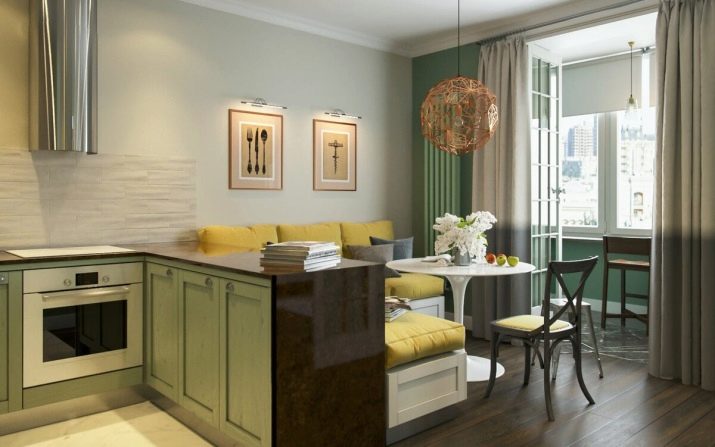
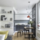
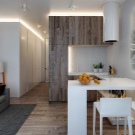
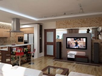
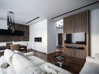
Stylish parallel kitchen. The furniture stands out against the light background, drawing attention.
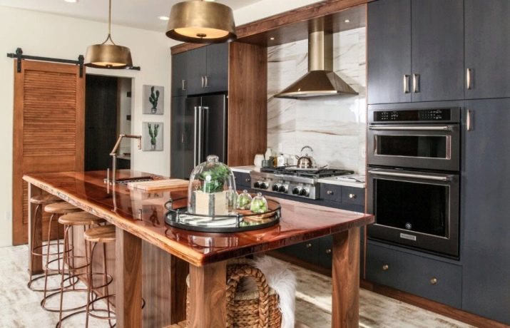
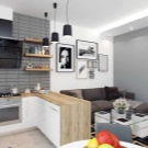
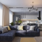
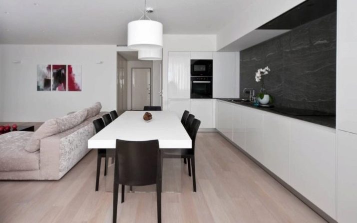
Bright and spacious room. The U-shaped layout made it possible to successfully place everything you need. The designers chose a contrasting duo of black and white.
