Interior design options for the kitchen-living room
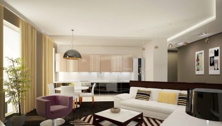
From the point of view of Soviet architects of multi-storey buildings, the kitchen and the living room are certainly different and necessarily separate premises. Nevertheless, many modern designers (as well as apartment owners) do not think so - it's not for nothing that studios are very popular, where there are no partitions between these two rooms at all, or at least it does not represent a full-fledged wall.
If you have at your disposal a classic apartment without such fashionable delights, this does not mean that nothing can be changed - with the due striving for success, redevelopment is quite real, but at the same time it is worth considering all aspects of such a decision in advance so that the result does not turn out to be unsuccessful.
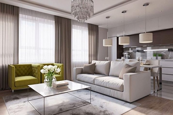

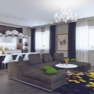
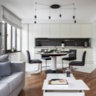
Pros and cons of combining rooms
Until now, both full-fledged studios and apartments with separate kitchens and living rooms are being built in our country, which means that both layout options have both advantages and disadvantages. Intending to make major changes to the concept of your own home and spend decent money on it, you simply have to soberly assess all the risks and understand why you need it.
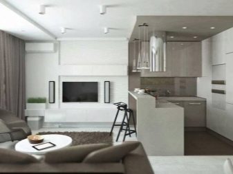
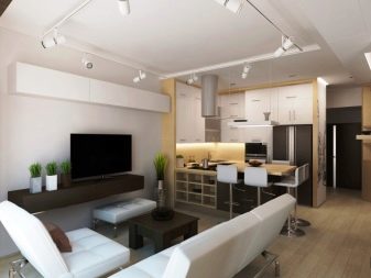
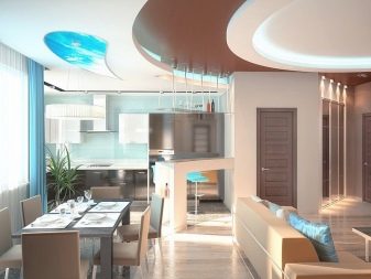
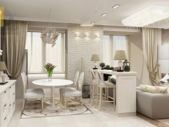
Supporters of studio apartments consider the decision to demolish the partition very reasonable. And there are certain arguments for this.
- Convenience. Many apartments, especially old ones, do not differ in an abundance of free space, and if more than one person still lives in a one-room apartment, there is a catastrophic lack of space.Taking into account the furnishings and the modern abundance of useful technology in such a room, it is simply impossible to go from end to end without touching anything. In such a situation, the kitchens, combined with the hall, significantly solve the problem, because the space freed up as a result of the demolition of the wall can be filled with something useful.
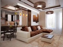
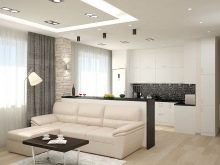
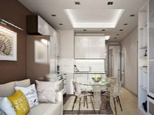
- Full control. This argument is usually pushed by parents who are worried about their overly naughty children. In a studio apartment, it is quite problematic to retire or hide, therefore mom and dad will immediately know if the baby is doing something potentially dangerous or bad.
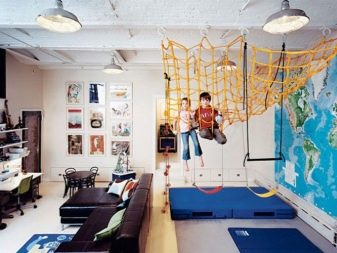
- Ease of communication. Sometimes you want to do several things at once, but your own walls interfere with this. Let's say guests have come to you and you want to treat them with something tasty. You yourself are in the kitchen for culinary needs, but you can't place them here - there is too little space. You cannot leave the kitchen at all, and moving back and forth is also risky - you do not follow the preparation of food, and you do not really participate in the conversation.
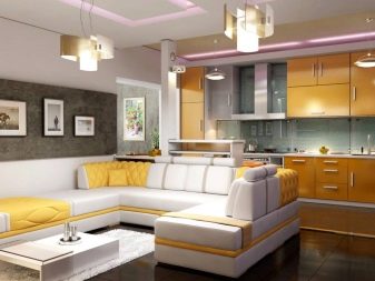
- Possibility of organizing a party. The real ability of an apartment to receive guests lies not in the number of rooms or sleeping places, but in how many people can stay in its largest room at the same time. This is understandable - any event that requires the collection of a company does not imply division into separate groups that do not have a convenient opportunity to communicate with each other. The kitchen and living room, combined together, will receive five, seven, and sometimes even more people.

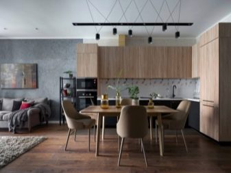
- Natural lighting. In most cases, sunlight in an apartment is considered a definite plus - it raises the mood and raises the temperature, and contributes to the production of vitamin D in the body. In summer, of course, it can contribute to stuffiness, but in general, the climate of our country is such that for most regions natural lighting of housing is more a plus than a minus. When one of the central walls is removed inside your apartment, there are no obstacles for the penetration of rays, which means that the house will be light and comfortable.
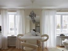
- Possibility of highlighting the dining area. You will not find a full-fledged dining area in most old high-rise buildings - the square of housing is such that there is simply nowhere to place it. As a result, the same table is often used for eating and, if necessary, for preparing it, which is not always convenient for households. Combining two rooms increases the amount of free space, and it is in the area of the former wall between them that a table can be placed, which is located as conveniently as possible for dispensing food from the kitchen, but still quite remote from the working area.
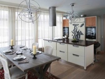
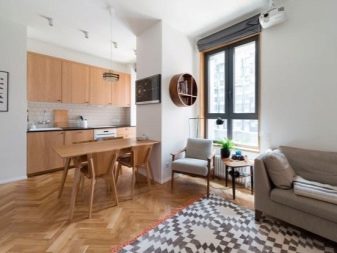
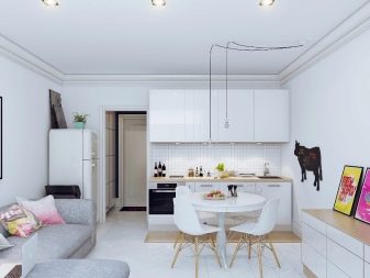
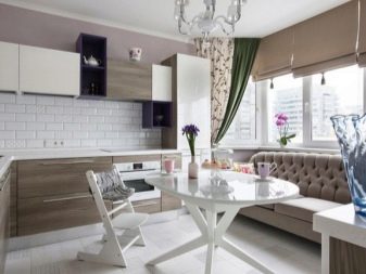
- Easy access to entertainment. Everyday cooking gets bored sooner or later, and the home cook wants to keep himself busy with something else besides culinary exercises. For these purposes, watching TV or listening to music would be good, but all the relevant equipment is usually located in the living room - where most often guests are received and relaxed. Despite the development of modern technologies, the smartphone is still not able to fully solve even such problems - its screen is too small and the speakers are rather weak.
If you are tired of having to choose between your favorite TV show and daily cooking, and the opportunity to buy more equipment is not foreseen due to the lack of money or space in the kitchen, just remove the wall and use those gadgets that are in the living room.
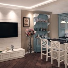
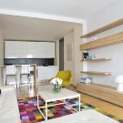
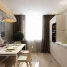
If you just realized that the wall between the kitchen and the living room has always been superfluous in your apartment, do not jump to conclusions. There are fewer disadvantages of redevelopment, but they are.
- Smells and noises throughout the apartment. The kitchen is a specific room. It is not for nothing that it is usually fenced off from other rooms - while there is someone there, the ringing of dishes, splashing water and specific smells can interfere with others.While you live alone, and there are no other people in your apartment, this may be the norm, but if there are at least two of you, you will have to somehow combine the schedules, because it is not very convenient to do culinary exercises in the room where someone is sleeping or trying to focus.
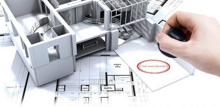
- Bureaucratic difficulties. It's good if you started a makeover in your own cottage, which you yourself built and planned so as to potentially re-plan it in the future. But even in this case, the regulatory authorities may require that you obtain documentary permission from a specialist to demolish a particular wall. In an apartment building, such a procedure will be mandatory, because a partition that interferes with you can easily turn out to be load-bearing, and its demolition can bring down the whole building.
In addition, almost any operation with communications requires special permits, so the transfer of a sink or stove may require efforts from you in the regulatory authorities, and it is not yet a fact that permission will be obtained.
- The need for special finishing for the living room. The kitchen is known as one of the most extreme places in the apartment - there is always dirt, grease, water and steam, complex cleaning chemicals and temperature changes, the same eating smells. All this forces you to choose finishing materials from a limited range of the most reliable. By combining the kitchen with the living room, you automatically create general conditions for them, which will require sustainable finishes for the former living room as well. This not only limits you in the flight of design imagination, but also confronts the fact that each renovation of the living room can now cost more than before.
- The need to diligently monitor cleanliness. There can be no longer any question of leaving unwashed dishes or crumbs on the kitchen table in the sink - they will inevitably spoil the image of the living room.
Subtleties of planning
Demolishing a major partition for the sake of creating a single kitchen-living room is not an easy task to ignore the preliminary creation of the project. The cost of all the work is quite high, so you will not have an infinite number of attempts to achieve an acceptable result.
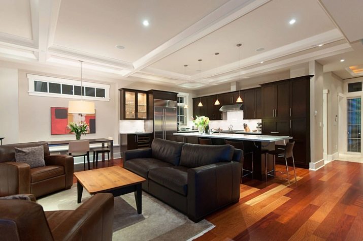
If your apartment as a whole is small, and it is possible to accommodate there only with considerable difficulty, you should not expect that a simple demolition of the partition in one fell swoop will solve all the problems. In this case, it is worth focusing on creating a hotel-type space, when both the kitchen and the living room have all the furniture and appliances necessary for everyday life, but all the "surplus" that is not used day after day should be eliminated from the project. Only then will the difference be noticeable.
Adding new numerous elements of furniture is allowed only in large apartments, in cramped ones you risk driving yourself into even greater crampedness than before.
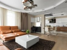
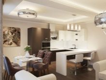
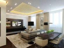
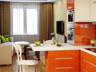
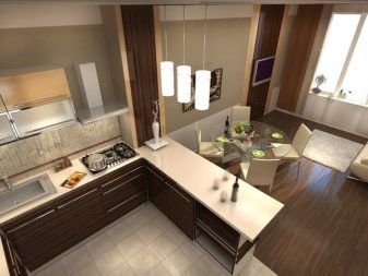
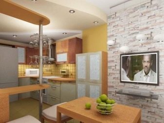
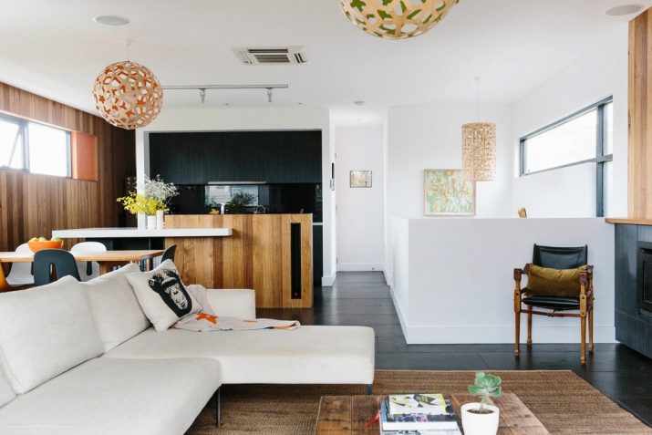
remember, that the best divider for areas where space is limited is a table or bar. The inhabitants and guests of the apartment will be able to sit down to it both from the side of the kitchen and from the side of the living room, due to which the problem of a separate dining area will be completely solved, and there will never be too many people in the kitchen. A separate dining area in a full-fledged version is usually allocated only if the resulting room seems too large and uncomfortable without it.
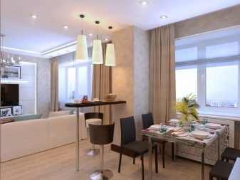
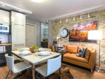
Space zoning
The unification of the hall and kitchen into a single space implies the removal of the wall, but does not mean the complete merging of the two rooms. Agree, a comfortable rest after work or a night's sleep does not go well with a sink and a gas stove - you want to cook directly in the kitchen, and relax and receive guests in the living room.
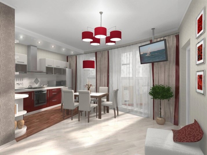
For this reason, the kitchen, passing into the living room, is usually divided by decoration into functional areas. Of these, three are most often distinguished: the actual kitchen area for cooking, the living area for relaxation and reception of visitors and the dining room - some intermediate section where it is customary to dine.
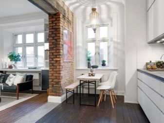
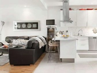
If, even after removing the partition, the kitchen, connected to the living room, did not become spacious enough, theoretically you can sacrifice the dining area... This is done in different ways: someone who lives alone and is not used to eating at home can refuse it altogether, another owner will replace a full-fledged dining area with a bar counter that is modest in its space, the third organizes a food area as part of the living room, without highlighting in a separate area.
Regardless of whether there are two zones in your combined room or three, you need to clearly show where one room ends and another begins. For this, several methods are usually used at once.
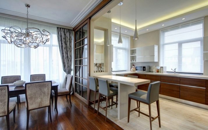

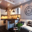
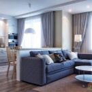
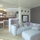
- Divider furniture. The same table or bar counter perfectly separates one from the other, and at the same time solves the problem of organizing the dining area. In addition, a sofa or armchairs can be placed against an imaginary former wall, as well as a wardrobe - this increases the comfort in the living room and reduces the view of the kitchen for those who are sitting, but if you wish, you can communicate “through the wall”. For interesting divider options, consider an aquarium or tall, potted green spaces.
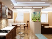
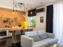
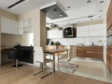
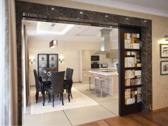
- False walls, racks, arches. Suitable as a divider, for example, a rack from floor to ceiling - there can be books, utensils, the same aquarium, while some of the through shelves can be left empty on purpose. A perforated partition with an intricate pattern simultaneously hides the details of cooking from those in the living room, but does not completely, without interfering with contact. Some people imitate an arch with the help of false walls, but here you need to be careful - this solution is not for all styles, but only for varieties of the classics.
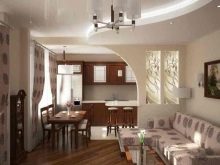
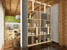
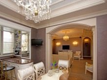
- The difference is in the flooring. In the kitchen, the main requirement for flooring is maximum practicality, which makes it possible to make repairs as rare as possible in harsh operating conditions. In the living room, the conditions are softer, and therefore you can focus on the aesthetic appeal of the finish. Although the wall between the two rooms is no longer there, the rule of choosing the floor finish still works if you draw the line between the zones far from the center of the working area. In addition, sometimes the kitchen floor is also raised relative to the living room, because it is easier to connect communications this way.
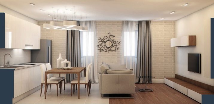
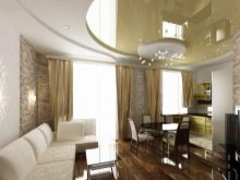
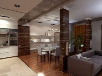
- The difference is in the ceiling finish. This point is generally similar to the previous one, with the only difference that the material here is more often the same, and the main difference lies in the level. For a combined space, multi-level suspended or tension structures are often used, additionally highlighting the border of two zones. Lighting can also be an additional element of differentiation - in the kitchen, especially in the work area, it should be bright enough to perform culinary tasks, but in the living room, you can focus on the softness of the light and the general relaxation of the atmosphere.
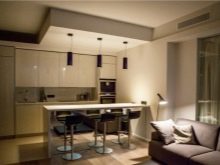
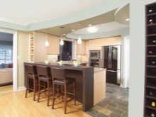
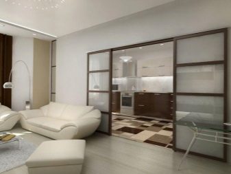
- Wide doors. Do not take doors as a product of a purely standard size - in the sliding version, they can be so wide as to replace a full-fledged wall, but at the same time they do not take up extra space when open. With this design move, you can decide when to merge and when to divide. If the door leaf is completely made of transparent glass, your apartment will become unique.
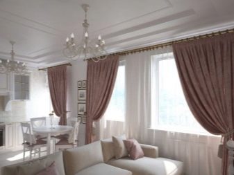
- Curtains. Instead of a dense and solid partition in the form of a door leaf, you can give preference to lighter textiles, which can also unite or divide the space at the request of the owner. Only you yourself choose what the material will be - the most dense curtain, weightless transparent tulle or something in between.
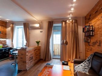
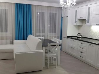
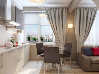
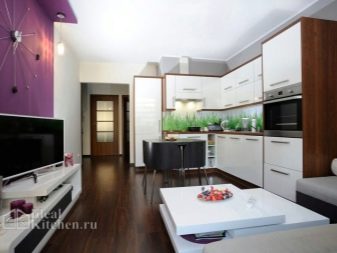
- The difference is in the decoration of the walls. An example of how wall decoration can be combined in different colors and textures is the classic kitchen apron - it always stands out from the rest of the walls, is more practical and durable, but still fits into the overall picture of the interior. It is the same with the zoning of a single space - the kitchen area is finished with more resistant materials, while in the living room you can emphasize aesthetics and beauty. Differences can be further emphasized with the color or texture of the coating.
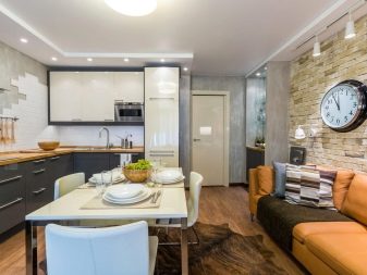
Color spectrum
Redevelopment of an apartment with the demolition of the wall usually means that the owner is cramped in the conditions of the current size of the rooms. If the apartment is too small, even combining the rooms by itself will not give an ideal result, and you will have to further enhance the effect due to the correct selection of colors.
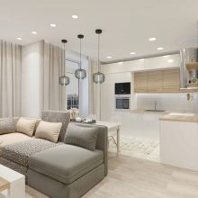
In most cases, in such a situation, light colors are chosen, since they tend to visually expand the room. Thanks to them, you will no longer feel cramped in your own home - on a bright sunny day, they will add a few extra square meters to the combined room, especially if you and the furniture choose the same colors.
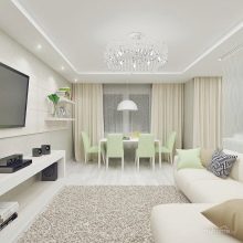
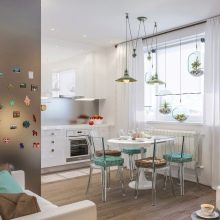
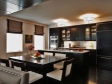
In some cases, the opposite is also assumed - the owner generally likes the concept of the studio as a space without unnecessary partitions, but the resulting "gym" seems too uncomfortable to live in due to its too large size. Such a visual defect disappears with the help of the opposite move, when the decoration is done in dark colors.
At the same time, it is worth paying attention to the recommendation of psychologists who do not advise to get carried away with too dark tones when decorating the kitchen - this has a depressing effect on the body, and therefore you will subconsciously suffer from a lack of appetite.
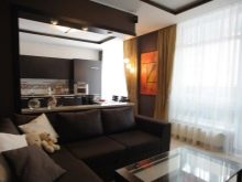
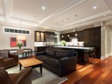
Almost certainly, the kitchen and living areas will be made at least in different shades - this is required by the same zoning of the room. In this case, it is logical to make the kitchen a little brighter and brighter, since this expands the traditionally cramped room and increases your activity, facilitating the digestion of food.
The living room, on the other hand, implies relaxation, and if you are not an avid activist, it can be made pastel or decorated in soft colors. This combination of colors will allow you to switch from one activity to another in a timely manner.
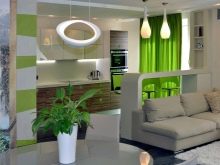
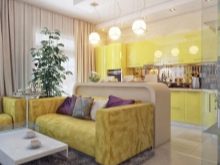
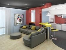
When considering combination options, please note that warm and cold tone groups are usually combined only with each other, without crossing the groups. Most designers generally advise avoiding excessive contrast in bright colors. However, it is not always worth focusing on other people's advice if you know your tastes well and are able to clearly imagine what will happen in the end. Practice shows that in some cases even the incompatible is combined, but so well that one can only envy.
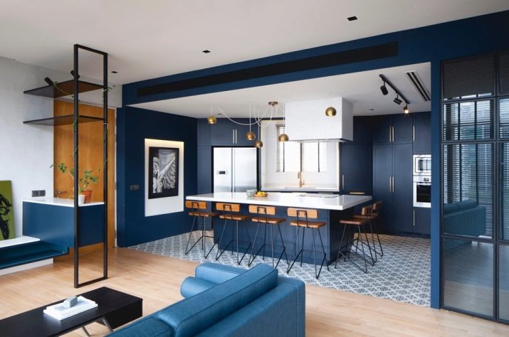
Style solutions
Deciding on the future design style of the connected room, you need to take into account some of the nuances.
- At first, if your apartment is far from limited to the kitchen and living room, and in general a certain direction is already inherent in it, then it should be adhered to when finishing the combined space, or at least not contradict what is already there.
- Secondly, some design features of a building or room can give a direct clue for choosing a style - for example, ceiling support beams can be hidden under a low suspended ceiling, but it would often be wiser to simply overtly beat them in a loft style.
- Thirdly, your design fantasies should be consistent with the planned budget, because a project abandoned halfway will look pathetic.
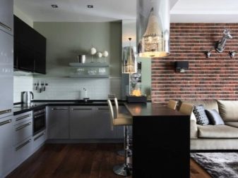
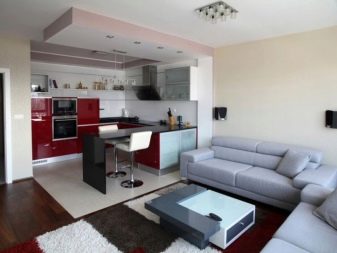
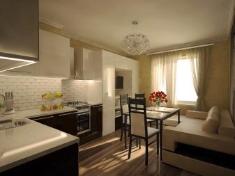
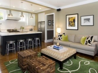
Recently, modern styles have enjoyed great success. They are sometimes very convenient.
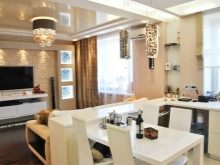
You don't need to invent anything with household appliances - hide or look for models in the old style, because modern equipment fits perfectly... Lovers of brightness, strange color combinations and asymmetry will be able to release their innermost desires to freedom - all this is allowed by modern styles. This direction does not require a scrupulous selection of decor, since the emphasis is largely on practicality.
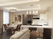
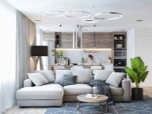
Such areas are especially often used.
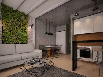
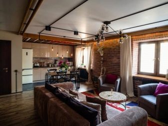
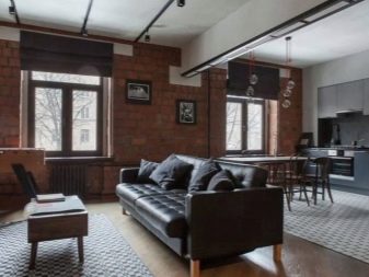
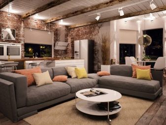
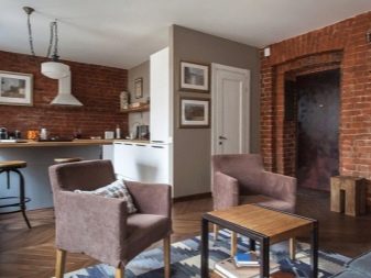
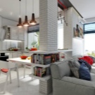
- Loft imitates the former industrial workshops, he does not need sophistication. Especially for him, they imitate brickwork, concrete blocks and other types of poorly processed walls, inadequately high ceilings and large windows are welcome. Here the emphasis is only on convenience, which will please the practical people.
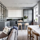
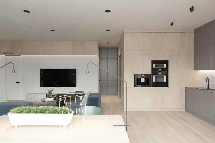
- Scandinavian style clearly shows what the northerners lacked the most - light. The lighter the finished room turns out, the more believable it will look in terms of stylistic correspondence. There are no unnecessary decorations here - everything is in the best traditions of minimalism and practicality. When choosing materials, focus on natural raw materials, wood will be especially appropriate.
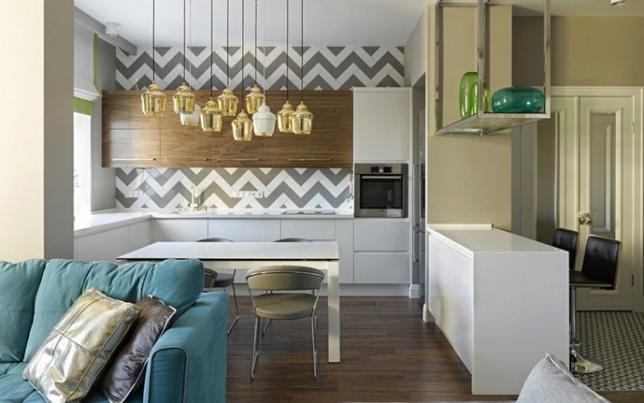
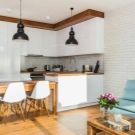
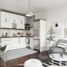
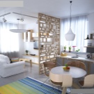
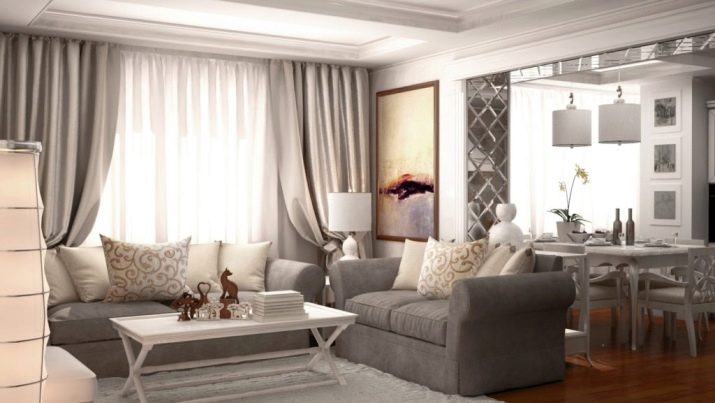
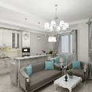
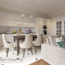
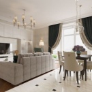
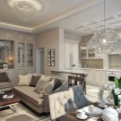
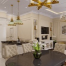
- Neoclassic - this is a kind of attempt to replace the classic individualism of things with elements of factory production. Stucco moldings and monograms, as well as mirrors are almost obligatory things, but they can also be mass-produced. The emphasis is on strict observance of symmetry and accuracy, but modern materials, in contrast to the "usual" classics, are not prohibited.
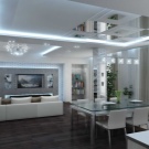
- Minimalism extremely simple - the fewer extraneous and impractical things, the better. It does not accept any bright spots, or bizarre bends, or even protruding handles near furniture - there is nothing to catch the eye, but this is the comfort.
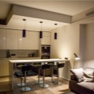
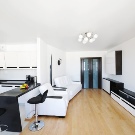
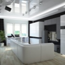
- High tech - this is the exact opposite of the classics. The outlines of the entire furnishings should be straight, literally chopped, but at the same time no one should doubt the useful functionality of each individual item. Natural materials are not welcome here, including textiles, but chrome-plated surfaces will be successful, preferably monochromatic with discreet accents. The texture of the style does not imply roughness at all - the walls must have perfect smoothness.
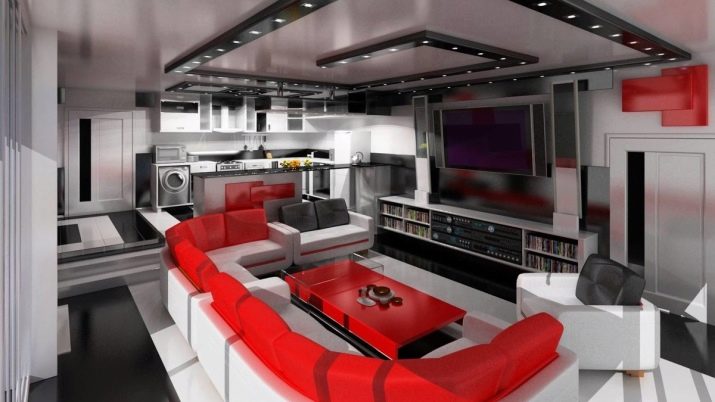

Classical trends in recent decades have noticeably surrendered, but modern opportunities allow a gourmet from aesthetics to recreate the atmosphere of any historical era. You can experiment with the following directions.
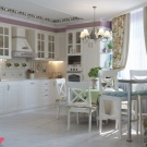
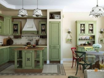
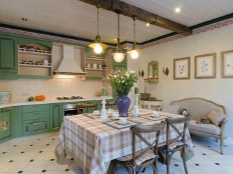
- Provence literally created for those who love French romance and tenderness. This style is a kind of rustic, only with a touch of France, so it should not be surprising that the decoration pays great attention to natural materials and natural light. In terms of shades, preference is given to soft light tones, an abundance of floral motifs and textiles is considered a mandatory norm.
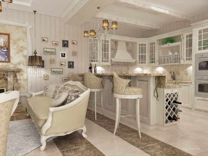
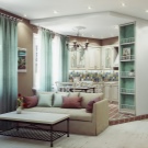
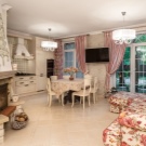
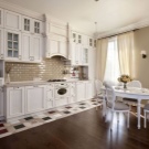
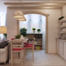
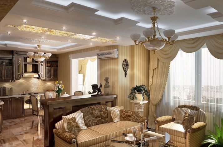
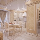
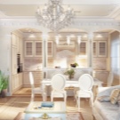
- Classic - this is solidity and high cost, this stylistic direction does not at all imply an imitation of poor dwellings of antiquity, but your apartment will look as if a very wealthy nobleman lives here. The key element of the style is the use of expensive materials and handmade jewelry. Do not be afraid that the classic kitchen-living room will seem anachronistic - it looks equally good no matter what century it is.
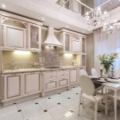
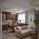
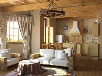
- Country or country style - this is a whole set of directions that imitate the rural situation of the past for a particular country. Provence is usually distinguished as something completely separate, but a more original owner can imitate Russian or Indian, Italian or American, Egyptian or Japanese design and decoration features.
In all cases, the emphasis is placed on traditional natural materials, and the necessary notes are made by antiques and stylized textiles authentic for the selected country.
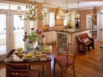
- Modern is another newfangled interpretation of the good old classics. In principle, this is still the same classic interior, with elegant things that cause delight, but with a gross violation of the principle of symmetry and correctness of forms. Experiment with the arrangement of furniture, replace glass with expensive stained-glass windows, do not avoid optical illusions, and also follow the combination of white and blue, and you will get the much-desired result. At the same time, modernism does not force you to abandon modern technologies or roughly disguise them - write them in so that they are not too conspicuous.
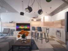
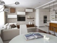
Selection of furniture and appliances
Furniture and appliances should be selected in such a way that so that they do not interfere with the complete arrangement of your joint premises. Experts advise not to start decorating the kitchen-living room without a complete and holistic idea of how the space ready for use should look like at the end. Even at the stage of selection of finishes, you should already know which furniture and equipment will perfectly fit into the interior design.
Naturally, it is worth checking in advance for the availability of the corresponding models in stores or the possibility of ordering their individual production. The second option, of course, is more expensive - that is why it is so important to calculate everything in advance.
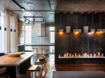
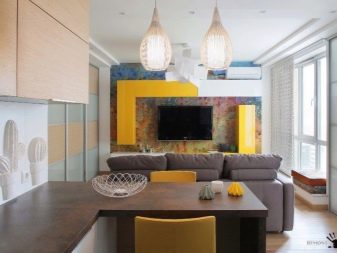
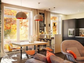
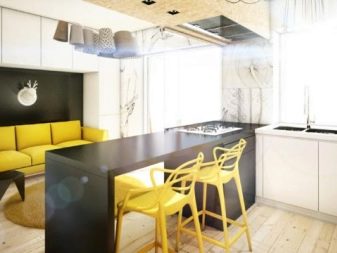
There are not so many requirements for furnishings - they must correspond to the general style requirements in terms of colors and shapes. If you strive in everything to achieve compliance with the Provence style with its soft lines and tones, then the chrome grayness of the refrigerator will completely stand out from the overall picture and simply ruin the room.
In most cases, independent study of the future interior does not make sense - the average owner usually does not have the patience or experience to draw up a full-fledged project, and as a result, some detail is knocked out of an interesting overall idea. Usually, the ideal solution would be to contact a professional designer to draw up a competent project or copy what he saw in the photo with minimal deviations due to the peculiarities of the situation or the wishes of the customer.
Successful examples
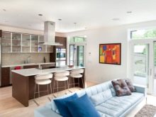
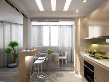
Interior design is not a topic that can be discussed without illustrative examples, therefore, let's select a few striking samples.
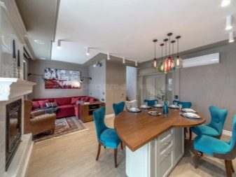
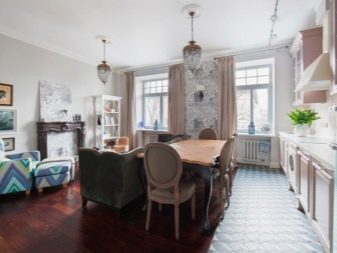
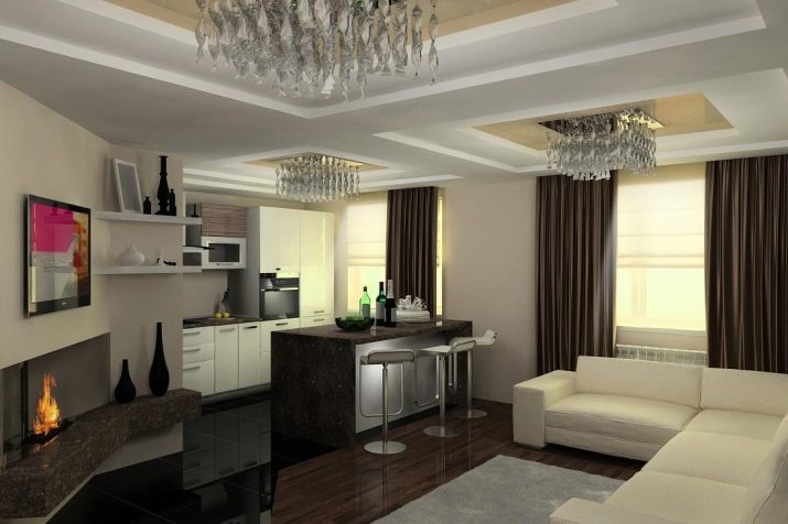
- The first photo shows a stylish neoclassicism. Here we see many elements hinting at the owner's wealth - here are interesting chandeliers, a real fireplace, and the use of expensive natural materials. At the same time, there is not too much pretentiousness - it is just right so that it does not interfere with comfort and is combined with modern technology.
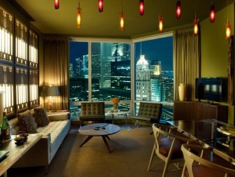
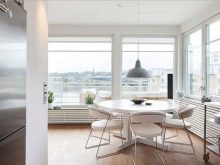
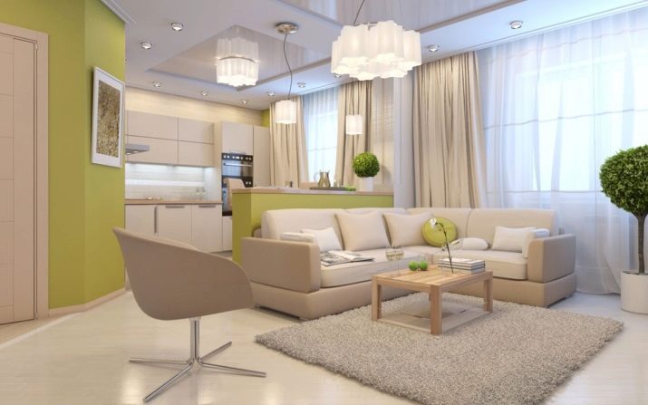
- The second example can be a great example of Scandinavian style, if we assume that it allows shades of green. There is absolutely nothing superfluous in the interior, all things are purely practical, including with a tree in the corner, which provides the apartment with fresh air. Combined with an abundance of natural light, this minimalism not only does not seem dry, but also evokes the subtle feeling that you are in a zone of absolute comfort.
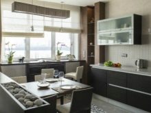
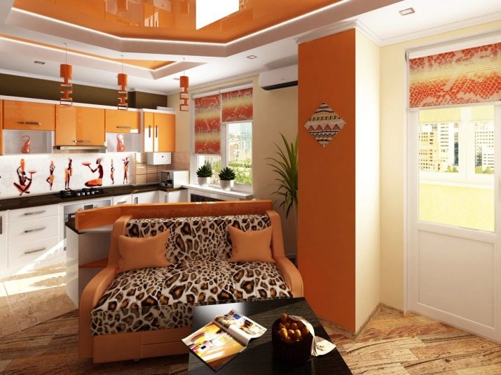
- And for those who appreciate original ideas, we have a stunningly authentic and beautiful example of African-style kitchen-living room decoration. The hot, sunny color palette, imitation leopard skin and elaborate patterns on the walls will become a reason for the owner to be proud, because his kitchen cannot be forgotten.
An overview of the interior of the kitchen-living room in the video below.


