Straight kitchen 3 meters long with a refrigerator: design ideas
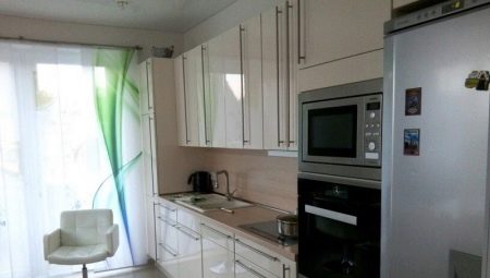
Many rooms use straight layouts. But in such a limited space as a kitchen, it is not always possible to implement it easily. How exactly this can be done in combination with a refrigerator, we will tell in this article.
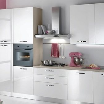
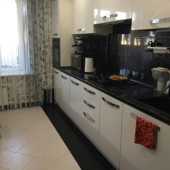
Peculiarities
In order for the kitchen to be pleasant, you need to ensure 3 main points:
- convenience;
- style;
- spaciousness.
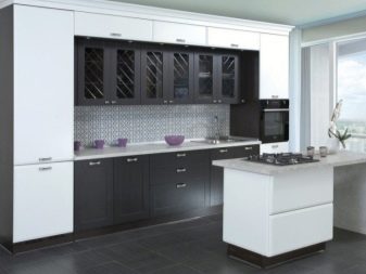
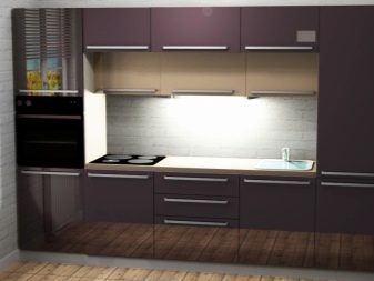
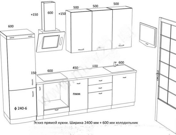
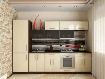
In a straight kitchen 3 meters long with a refrigerator, you need to use (in the most minimal version):
- 3 elements, 0.8 m each;
- bedside table 0.6 m;
- cargo 0.15 m;
- refrigerator 0.6 m;
- slab 0.6 m.
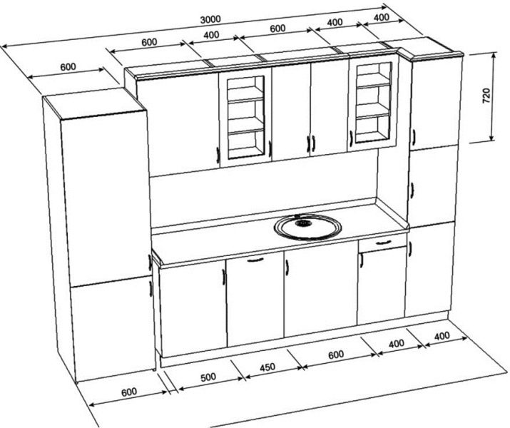
Usually they put 3 cabinets of 0.6 m each. There is also an alternative option: one block is taken at 0.8 m, and the other 2 - at 0.6 and 0.4 m, respectively. In many kitchens, additional washing machines or dishwashers are installed. Then 1.2 m is left on the lower cabinets. In this space, a pair of pedestals of the same size rises.
Making the most of the bottom tier can be a good idea. But because of this, it is difficult to find enough space for groceries and kitchen utensils.
The next important tier is the countertop. It is distributed as follows:
- 0.6 m for the refrigerator;
- 0.8 m for a tall pencil case;
- 0.4 m for a sink;
- 0.6 m under the slab;
- 0.6 m for the cutting area.
Attention should be paid to the upper tier. Open shelves are suitable only when a little dust is flying out of the windows in the house. If the street is very dirty or there are a lot of dishes, you need to choose solutions with closed facades. Therefore, in dusty steppe regions and in industrial areas, the choice is quite obvious. Any kind of closed facade, even just glass, will be more practical and more convenient than the space accessible to all winds.
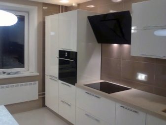
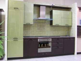
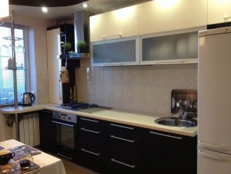
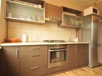
Glass is also good because it allows you to freely consider all the little things and nuances of a particular dish set. If there is something in the closet that cannot be laid beautifully, the preference for a blank facade is quite justified. Hanging shelves of various sizes and dividers are often hidden behind it. The doors can be used to attach various holders. The height of the cabinets in the upper tier (for example, above the refrigerator) is at least 0.3 m, but usually it is higher.
What is unacceptable?
No matter what design steps are taken, no matter what views on design, on linear and built-in furniture people do not adhere to, there are several absolute prohibitions in the matter of arranging a kitchen. Among them, for example, the impossibility of installing a headset where there is less than a meter to the opposite wall. A compromise is (and not always) a decrease in the depth of the cabinets and the use of sliding, rather than swinging, facades. Since the kitchen area is small, stretching of the work space is also prohibited.
It is important to remember this always when a particular design project is being worked out.
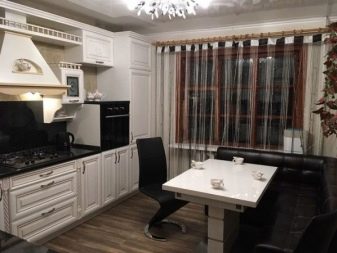
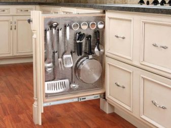
It is also a common mistake to think over such designs that are convenient, first of all, for manufacturers or installers. Normally, kitchens should be comfortable for the owners themselves - this is an absolute priority. Sometimes it makes sense to order furniture with height adjustment or non-standard height. Due to the limited space, you will have to abandon all attempts to saturate the kitchen with furniture and appliances. Leave only that which cannot be done without in principle.
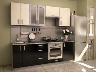
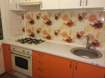
Possible options
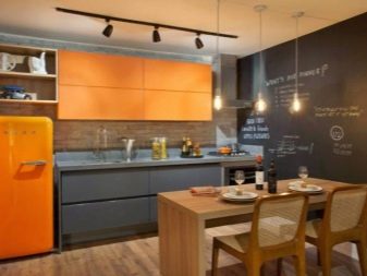
Experts call a one-sided installation of furniture and a refrigerator in one line as a time-tested classic. In this version, the dining table is opposed to the sink and the work table. A two-sided layout helps to get away from the template, in which the dining space is often taken out into the dining room. But it is important to take into account the nuances of individual styles.
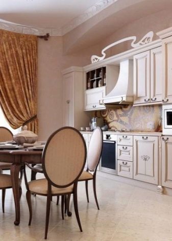
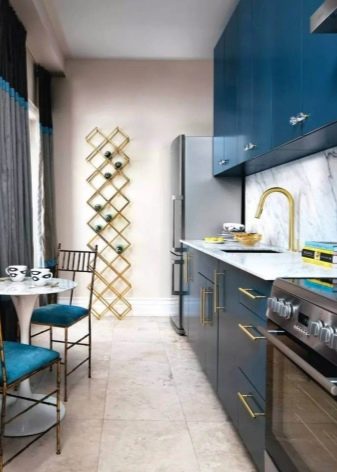
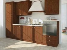
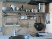
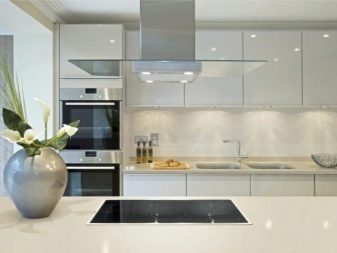
So, in a classic interior all furniture is made primarily of wood. A good alternative could be minimalism. It is in this style that the absence of any unnecessary components is justified. If the funds allow you to furnish the kitchen with ultra-modern technology, it is worth considering the option with a design in the spirit of hi-tech. This approach allows you to get rid of the clutter of furniture. To place kitchen utensils in plain sight, rails with chrome plating or with a matte outer layer are often used.
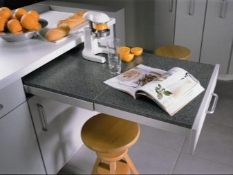
Designers and decorators have long found out that first of all it is necessary to decide on the location of the sink, since it is heavier than other items to move. Hence the conclusion: this element of space should be such that it looks pleasant regardless of changes in the situation... The retractable drawer-shaped worktop will save space and at the same time turn out to be a stylish solution. For youth interiors, bar counters and "islands" are recommended.
To make the room more "masculine", they resort to dark plastic or natural stone.
For information on how to make the perfect layout of a direct kitchen, see the next video.


