Wallpaper in the hall: types, choices and options in the interior
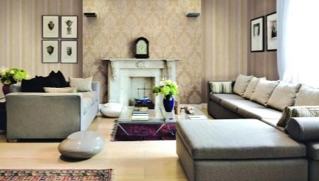
The arrangement of a hall in an apartment or house cannot be limited to furniture, consumer electronics, floor and ceiling finishing. Be sure to pay attention to the wall covering. One of the best options is wallpapering, but with all the simplicity of this solution, you need to take into account its subtleties and work very carefully.
Peculiarities
When choosing wallpapers for the hall, it is imperative to take into account the basic requirements for them, which are derived from the study of everyday practice.
Of course, preference should be given to products with maximum environmental and sanitary characteristics.
The safer the finish, the calmer the people themselves. But we must understand that the assurances of the sellers and even the inscriptions on the labels do not always correspond to reality. Wallpaper on the wall in the hall in a house where pets live, where there are children, cannot have a light color.
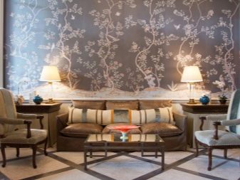
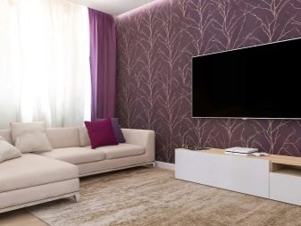
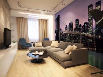
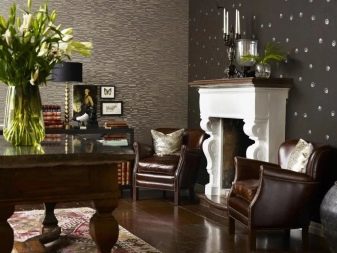
It is not necessary to choose paper canvases for a room for the whole family. You can focus on other, more exotic options. However, the final decision can only be made after a deep study of the entire range and possibilities. Mistakes in the selection of wallpaper for the hall are even more serious than when buying them in other premises.
Fashion trends
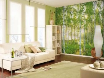
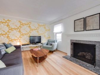
In 2019, there are many wallpaper collections that are in line with the latest trends. Paper rolls, once the most popular in popularity, are gradually going out of fashion. Consumers give preference to other, more perfect and elegant design solutions.
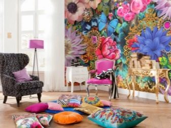
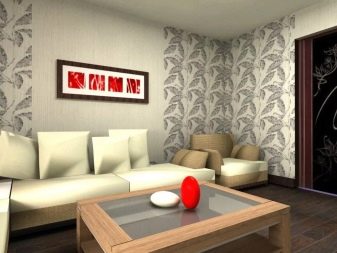
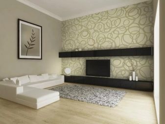
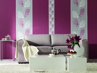
Wallpaper images should match the intentions and tastes of homeowners - this is an axiom regardless of the style chosen.
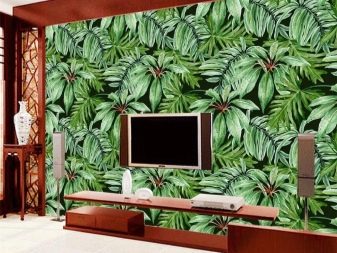
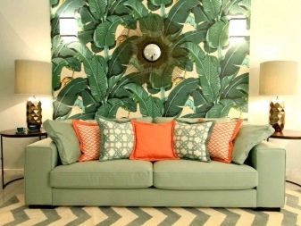
All wallpaper designs with plant motifs remain attractive options. The expression of these motives can be very different and therefore it is always easy to get away from boredom in the interior. Popular are:
pictures from the wild jungle;
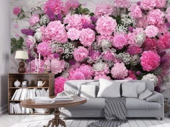
- images of flower bouquets (in pure form and in vases, pots);
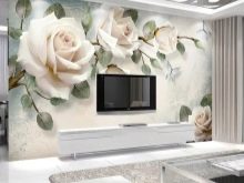
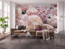
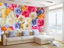
unusual plants from exotic countries.
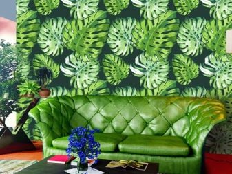
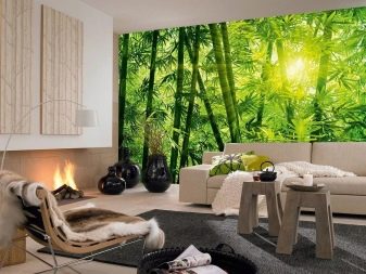
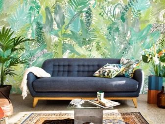
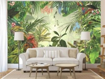
With the help of such a decor, it is easy to saturate the room with rich tones.
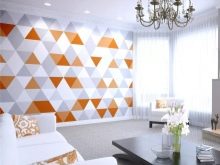
But plant motifs are not to everyone's taste; they are also in demand. geometric design options... In the late 2010s, these are most often not lines and squares, as before, but hexagons or honeycombs. They are prized for visually balancing the space and giving it integrity.
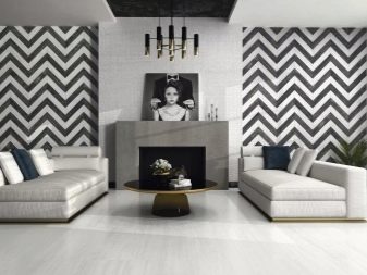
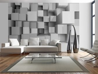
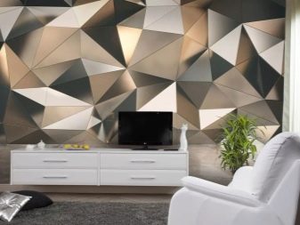
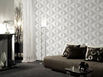
A mandatory feature is the reproduction of geometric patterns on wallpaper, upholstered furniture or textiles.
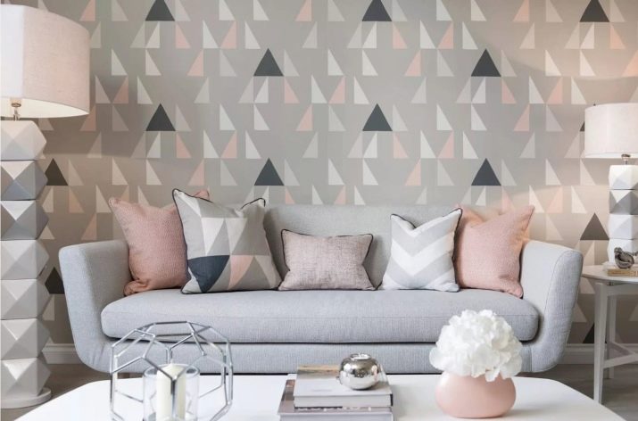
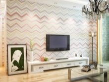
Modern manufacturers can offer stylish wallpaper with rhombuses, triangular and zigzag decoration. Typically, such finishing materials are used to create eye-catching accents.
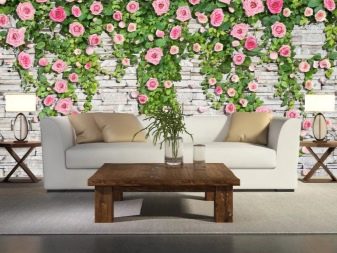
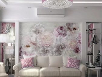
But when describing beautiful options for wallpaper for the hall, fashionable this year, you still need to return to floral images. Along with bouquets in any form, they can also be represented by natural bushes. Both the most ordinary roses and tropical plants "settle" in these bushes - in any case, fashion compliance is guaranteed.
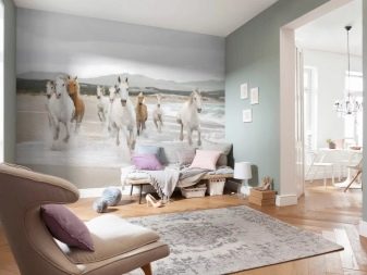
But you can express your craving for nature at the expense of animalistic motives. Prints with tigers and other beautiful, elegant animals add chic and zest to your home design. You can combine animal motifs and retro-style trends that will make the room even more sophisticated.
The bottom line is that the images of animals are distributed evenly throughout the volume.
There should not be any pretentious, overly ornate or very small details.
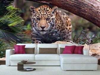
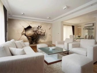
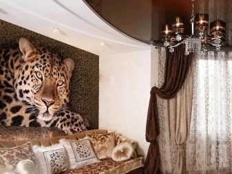
Prints depicting:
- butterflies;
- fish;
- birds with bright plumage.
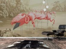

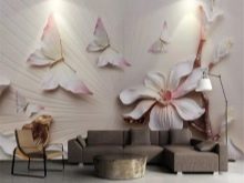
These images are used primarily to draw attention to certain walls or areas in the room.
Large animalistic images are used for emphasis. From previous years, the design approach of recent times has inherited such an option as imitation brickwork.
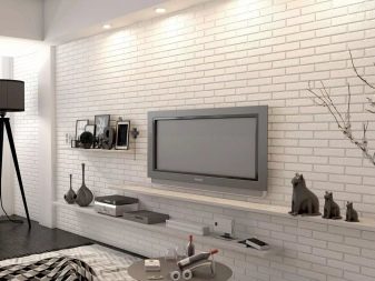
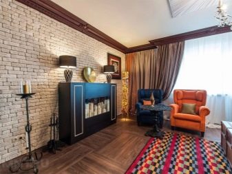
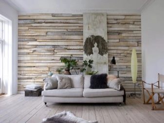
However, anything can be imitated:
- concrete and marble surfaces;
- natural stone;
- wood;
- Snake skin.
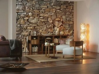
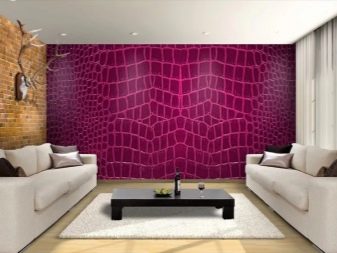
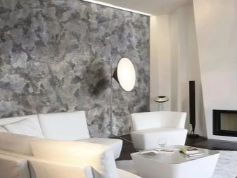
From the latest trends, one can point out the use of a complex color scheme. It includes:
- olive and green (in all the variety of their shades);
- eggplant color;
- color of the sea wave.
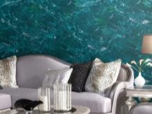
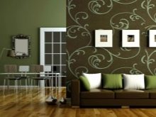
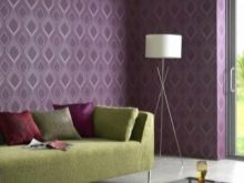
Collections with bright colors can be used to create a favorable mood.
The main choice in the current season is made between chocolate, yellow, pink and turquoise colors.
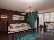
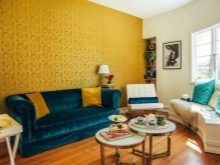
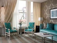
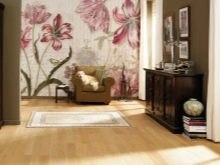
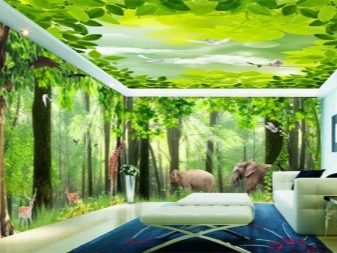
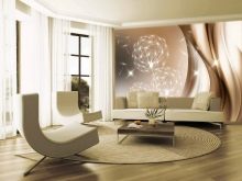
The popularity of photowall-paper is constantly growing. They can imitate not only plants or animals, but also "deep" rooms with fireplaces, bookshelves made of noble wood.
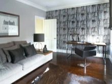
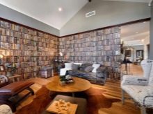
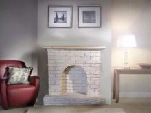
Of the other options that definitely remain in fashion or are just entering it, it is worth mentioning:
- abstract images (of any color);
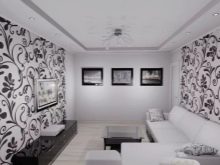
- wallpaper with black and white contrast;
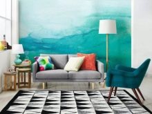
- gradient wallpaper.
Varieties
But figuring out the details of the current fashion, one should not ignore another point - the preference for certain types of wallpaper.
Identical or nearly identical design solutions can be realized using different types of canvas. Therefore, their practical characteristics are of particular importance.
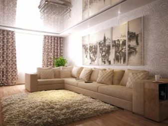
The stores have a huge amount of paper wallpaper for the hall. They are relatively inexpensive and will definitely be environmentally friendly and safe. However, such wall decoration cannot be called durable. Even the best paper degrades quickly under ideal conditions.
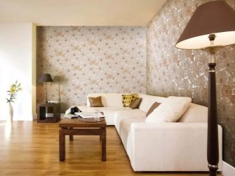
Acrylic canvas stronger and better moisture tolerance.It can be recommended as an answer to the question "what to buy, so that it is not too expensive and reliable."
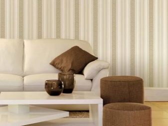
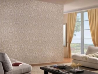
Concerning vinyl wallpaper, then they are quite beautiful and are not inferior in strength to acrylic counterparts.
However, the lack of micro-ventilation of the walls can adversely affect the microclimate in the house.
It is therefore impractical to use only vinyl cloth for pasting the living room. But it should be combined with other types of finishes.
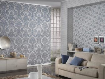
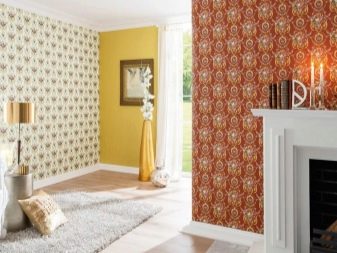
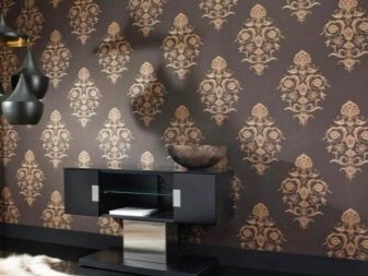
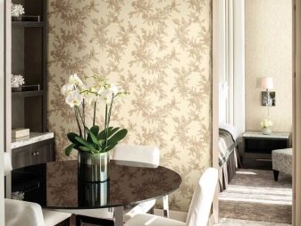
If the goal is to acquire the most durable and long-lasting wallpaper, masking the unevenness of the wall, then the choice should definitely fall on rolls non-woven... They can be applied both independently and as a basis for applying varnishes and paints.
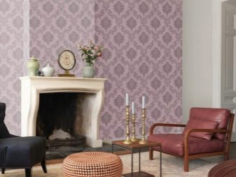
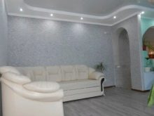
Concerning liquid wallpaper, then this name hides a composition of textile fibers or cellulose, pigments and glue.
Since all the necessary components are already in the composition, there is no need to additionally apply the same glue.
When applying a "liquid" mixture to the wall, the appearance of seams can be excluded. Another important advantage is the speed of work. The environmental characteristics of modern liquid wallpaper are high, and at the same time they are perfect for decorating rooms with complex shapes or uneven surfaces.
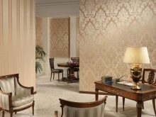
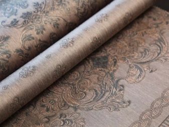
The classics that rival paper are deservedly considered textile wallpaper. They have the widest range of textures and visual options. Linen, silk or cotton is applied to the non-woven base. Where the textile is glued, the sophisticated taste of the owners is immediately recognized.
Other options worth considering:
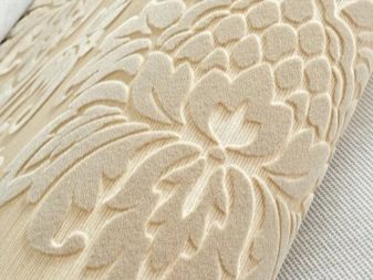
- velor wallpaper (nylon fiber covering the paper layer);
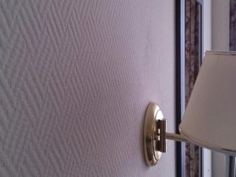
- glass wallpaper (which does not accumulate dust and does not burn under normal conditions);
- bamboo, cork wallpaper (they make the room more interesting and do not impede the movement of air, however, they are not sufficiently resistant to moisture).
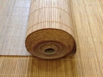
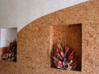
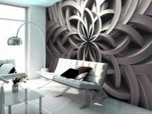
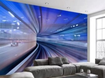
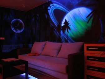
If the decoration of the living room is in the first place, and not its practical characteristics, you can safely use 3D wallpaper. Such an image can be created on almost any existing material. Most often it is non-woven, paper or vinyl.
Along with the traditionally popular options, decorated with abstract patterns, single 3D wallpapers that take up a small space are increasingly used.
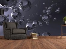
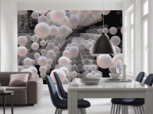
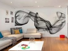
If funds are available, use fluorescent three-dimensional canvases, that look charming in any setting.
Colors and patterns
Having dealt with the type of wallpaper, you need to familiarize yourself with another important aspect - the color of the canvases. The selection of colors is determined primarily by the level of illumination.
When the windows face north, it is possible to correct the situation with the help of light and warm colors. But in this case, the use of combinations of dark, light tones is also allowed. You just have to take care of the enhanced lighting.
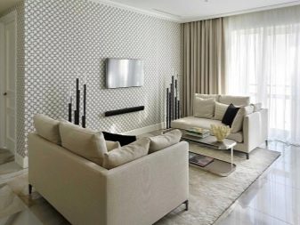
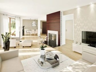
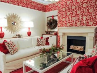
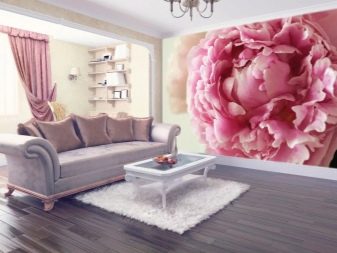
Together with red, you can use gray, green or bluish shades. Purple, gold, and brick tones are acceptable companions, but use should be limited. If the walls are painted in pink, gray and burgundy furniture can be combined with it. In small quantities, the use of brown paint is allowed.
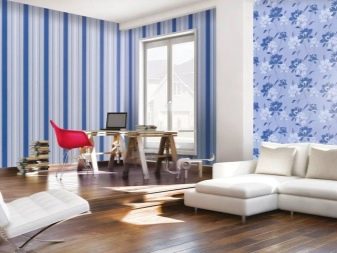
As for the blue wallpaper, it will appeal to connoisseurs of marine style. This color scheme will also harmoniously fit into rooms with bright accents. Thanks to the blue color, you can provide calmness and release the tension that has accumulated over the course of the day. Will succeed:
- visually expand the space;
- add light to the room;
- freshen up the interior of the south-facing hall.
But one must understand that an excess of blue can provoke aesthetic tension.
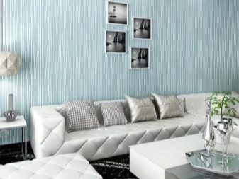
Continuing the review of plain wallpaper in the hall, you need to pay attention to the white canvases.
It should be borne in mind that it is extremely difficult to correctly combine white walls with other interior elements. We'll have to think carefully about all the nuances and subtleties.
White wallpaper can act both as an inconspicuous background and as a bright decoration of the room. Both rich colors and pastel colors can act as an addition - you just need to carefully consider their interweaving.
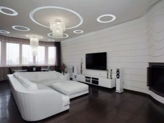
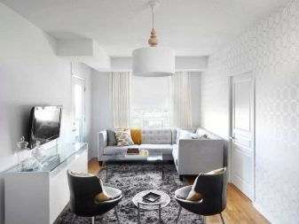
White color avoids negative emotions or excessive nervous excitement. By using color accents, excessive boredom is also avoided. White wallpaper can be combined with almost any color in the interior.... Thanks to the neutrality of the colors, it becomes possible to easily change the environment with a minimum of effort. It can be inscribed in any style, you just need to beat it correctly.
But it must be borne in mind that white walls get dirty easily, they must be created primarily with vinyl wallpaper. Only vinyl can be easily washed.
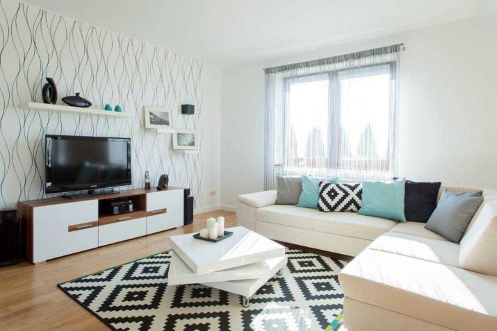
By beauty, they stand out favorably turquoise wallpaper... This color occupies intermediate positions between blue and green shades. By According to the designers, it brings notes to the atmosphere:
- lightness;
- happiness and serenity;
- tranquility;
- concentration of thoughts.
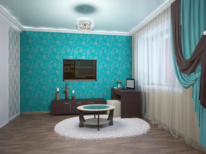
The brightness and ambiguity of the turquoise color turn off quite a few people. But with the proper preparation of the interior, the negative effects characteristic of it can be avoided. An intense turquoise color should be balanced with whites or other soothing tones. This move will delight supporters of bold avant-garde moves. Much more often, however, they use pale turquoise wallpaper, which fits perfectly into a variety of design concepts.
Turquoise wallpaper with monograms and other options in the oriental spirit are perfect for emphasizing the Asian style in the interior. To emphasize the avant-garde side of turquoise and to achieve greater severity of the interior, you can use coatings with geometric patterns. An indisputable classic, relevant almost everywhere, is combination of white and turquoise colors.
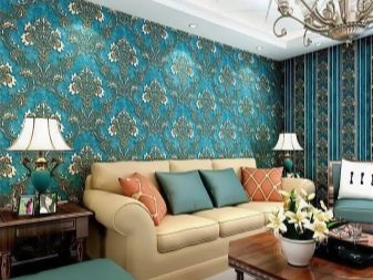
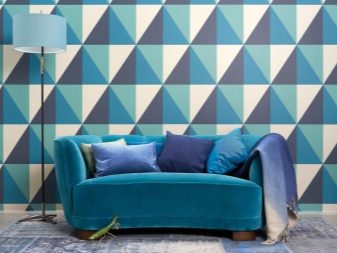
No less attractive than turquoise, there may be lilac tones. Now this color is experiencing a "rebirth" after undeserved oblivion during the XX century.
A lilac wall will add a touch of luxury and charm. It will look very deep and rich, sometimes they even say that this is some other reality.
Lilac color gives the interior harmony and tranquility, it is equally useful in city apartments and private houses.
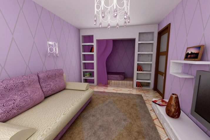
Psychologists note that the shade helps to cope with fears and stressful, anxious conditions.
Most often, lilac tones are used in styles such as classic and neoclassical. But they also find application in interiors:
- provence;
- Art Deco;
- shabby chic;
- modern.
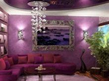
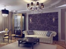
Lilac wallpaper can be decorated not only with floral patterns, but also with abstract subjects, geometric patterns. In some cases, surrealistic motives are also used. Under the influence of complex lilac patterns, emotional relaxation occurs and a favorable visual effect is achieved. To complete this topic, it is pertinent to point out 3 varieties of lilac color:
- pale (needed as a background covering and to visually enlarge the premises);
- deep (needed to highlight specific areas);
- especially bright (helps to highlight accents).
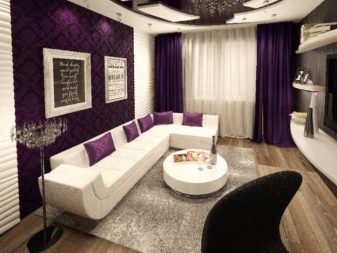
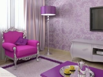
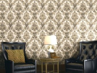
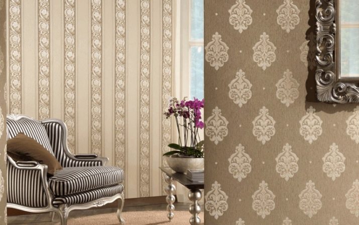
Wallpaper in the hall with monograms deserves special attention. These decorations will allow:
- transform space;
- achieve sophistication of the environment;
- are practical;
- help cover small surface irregularities.
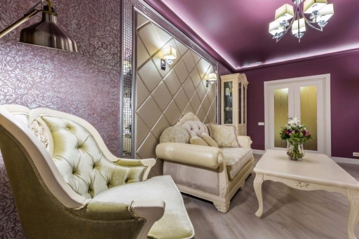
However, large and bright monograms should not be used in small living rooms.
In low light, the focus should be on light and warm colors. To ensure the optimal geometric structure of the space, you can use large monograms centered on one of the walls. You can add coziness by combining monograms with floral designs.
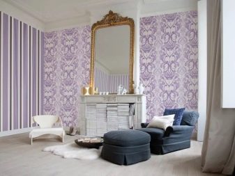
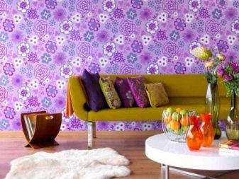
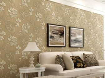
The next common option is beige wallpaper... The advantages of this color are unique warmth, softness and comfort. In any environment, as long as the color is used skillfully, it will add style and create a pleasant sensation.
Since the shade itself is soft, it is very easy to choose bright and rich contrasts, enlivening the atmosphere as much as possible.
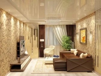
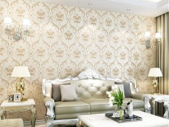
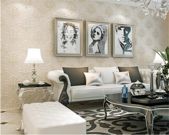
So that the interior design is not boring, you can introduce several juicy and expressive accents. Beige-black and beige-gold wallpapers are popular among designers.
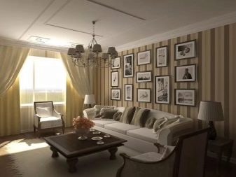
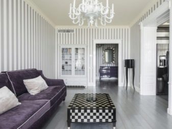
It is appropriate to complete the overview of color options at striped wallpaper for the hall. Such a finishing material has a long history (it has been used since the 1970s). Striped compositions are primarily aimed at using the game of proportions and manipulating geometry. Even more modern design techniques do not deprive this approach of stable popularity.
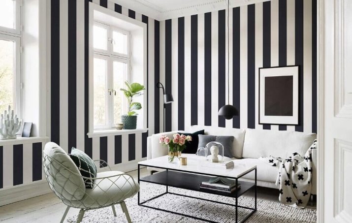
The stripes allow you to make the hall more interesting and lively.
When using striped wallpaper on only one wall, stripes should be wide enough... The presence of contrasting colors is unacceptable. This solution will ensure the external solidity of the interior. In Art Deco and Baroque styles, the use of stripes is unacceptable, because such styles prohibit the use of straight, straight lines.
How to choose the right one?
A very important point is to understand which wallpaper is suitable for a room with south-facing windows. In this case all materials that quickly fade in the sun should be avoided.
It is advisable to use non-woven fabrics marked with a special marking “resistant to the sun”.
Warm, especially "fiery" colors are categorically unacceptable.
The opposite approach is practiced if the room is facing north. In this case, the further the room is from the window, the more light shades should be. But at the same time, you should not use white tones, because they are not practical enough. In a darkened room, the slightest dirt will be very clearly visible on a white surface. If the goal is to highlight a certain part of the space, fragments of dark tones are better suited.
In this case, the main rules will be:
- exclusion of very bright and "flashy" colors;
- inadmissibility of dark accents in rooms with insufficient illumination;
- limited use of zoning techniques in a small area (in a small living room, plain solutions are better suited).
Taking into account the design of the furniture
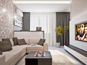
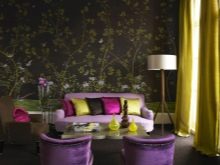
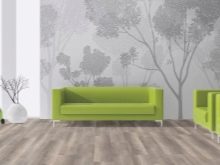
For light furniture, you can choose wallpaper of any color and texture. It is recommended to use contrasting elements as accents.... Canvases with large drawings are welcomed as much as possible. They act differently if the furniture is painted in dark colors: in this case, use lighter wallpaper, but always without saturated colors.
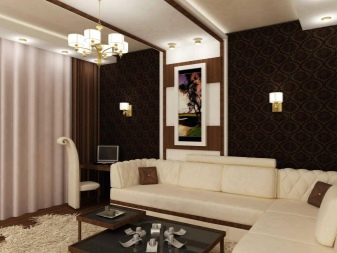
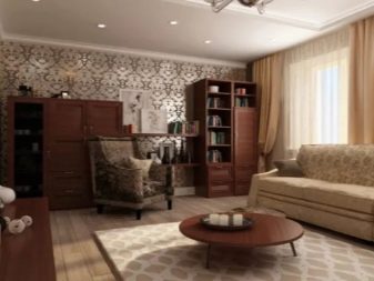
Large drawings on the walls are extremely poorly combined with dark-colored headsets.
Occasionally, accent elements are used that visually refer to the colors of the furniture itself. But when furniture products are painted in very bright and rich colors, the wallpaper should drown out and weaken this interior pressure so that the room does not turn out to be too "aggressive". Neutral colors are suitable for two-tone furniture, which correspond to the color of the facades or are 1-2 tones lighter than them.
For living rooms of different sizes and shapes
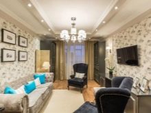
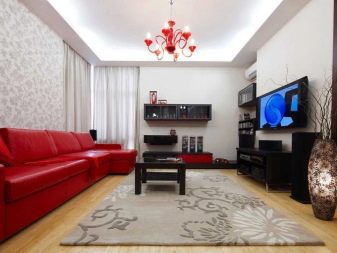
For "Khrushchev" from a small living room, it is allowed to use wallpaper of various colors. Various options for their use do not contradict the current fashion. But it is still better to use the solutions that are optimal, according to experienced designers. For a small room, it is recommended to use the lightest wallpaper possible. They are combined with bright and relatively dark inclusions. It is important for the interior to look livelier, and the style is emphasized more precisely.
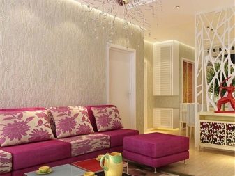
In a tight space it is unacceptable to use dark wallpaper coverings as a background. Bright backgrounds aren't good either. Large patterns on the walls are definitely unacceptable, because they will "absorb" free space.
You can correct the imperfections of the geometry or size of the room by using wallpaper with stripes of different sizes. Vertical elements will raise the ceiling, but you must always remember that they can unnecessarily reduce the area of the room.
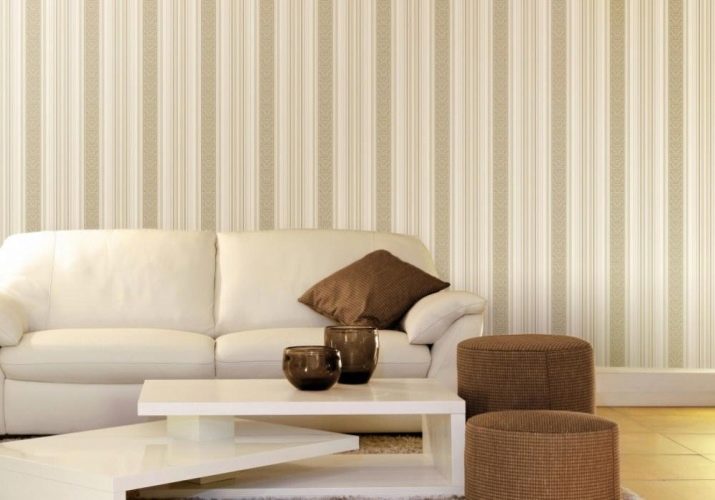
You can smooth out the feeling of a small width by applying a wallpaper with a horizontal pattern. In halls with an asymmetric shape, when selecting and applying wallpaper, you need:
- take into account the location of technical communications and their main nodes;
- think over all other possibilities for correcting errors;
- try to emphasize the stylistic unity of adjacent rooms;
- to use optical illusions, extinguishing design flaws.
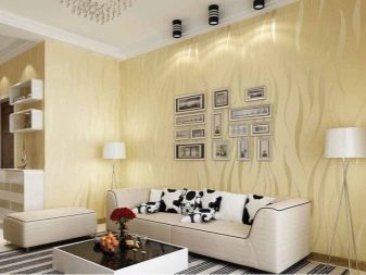
Style solutions
Let the living room have the right or wrong shape - in any case a certain approach, style should be used in its interior. HIt is necessary to deal with this point in order to avoid mistakes. In the assortment of any major wallpaper manufacturer, there are collections that refer to the theme of a particular country. The images themselves applied to rolls will express the basic spirit of the chosen style. As for the nuances of choice, now the classic and even emphasized old stylistic directions.
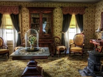
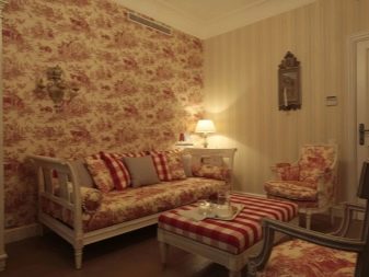
Their main feature, designed to express alienation from the utilitarian spirit of the 21st century, is the presence of bright inclusions. It can be accessories with gilding, and slats made of noble wood. Another typical decoration of classic wallpapers is large symmetrical patterns and overflows. The use of bright and rich details is widespread. Stucco moldings and moldings are considered an interesting addition.
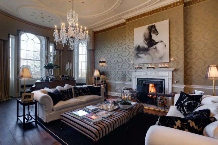
If the style is chosen for the decoration of the hall baroque, then it is imperative to strive to reproduce the palace theme. Every detail is sure to express the mood for a luxurious sophisticated environment. Wallpaper should have large, intertwining patterns and soft ornaments with floral or geometric themes. It is recommended to create a baroque interior dominated by burgundy, beige or golden tones. In the rococo variant, it is worth considering the use of:
- white;
- pink;
- beige colors.
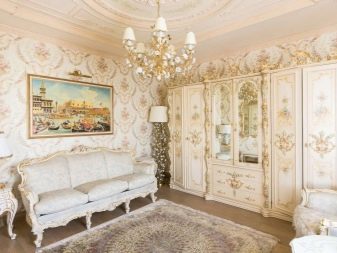
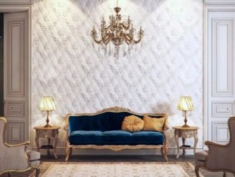
When a room is decorated in the spirit Art Deco, wallpaper should have a light, calm color. Patterns are acceptable, but not required. Most often, canvas with prints is used for one of the walls - and this is an important zoning technique. The use of wallpaper in the spirit of retro is also popular, which expresses:
- the simplest flower arrangements;
- a combination of cells and stripes;
- a combination of geometric and abstract motifs.
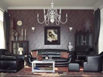
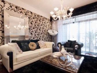
To style retro rather close is the decoration of the hall in the spirit of Provence. This format implies the creation of the most comfortable space, taking into account the developments of the Mediterranean part of France. They traditionally use a floral theme. It can be expressed both in floral patterns of various sizes and in photo wallpapers with realistic subjects. The presence of strict lines will also be a mandatory feature.
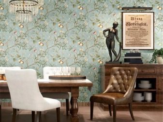
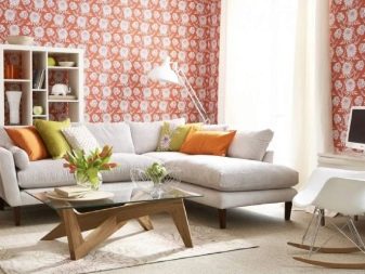
Other branches country, unlike Provencal, are appropriate mainly in a country house. A common feature will be the active use of decorative effects, among which there are wallpapers with imitation of other materials. As for modern styles, they are less clear. You will not have to strictly follow any rules; rather, it is appropriate to talk about the reproduction of specific features.
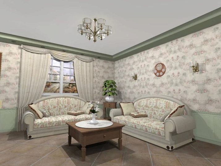
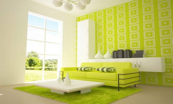
V modernist types of wallpaper are actively used contrasting color combinations and patterns in bright colors.
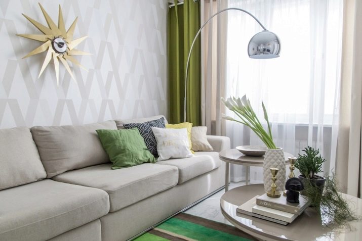
Scandinavian style dictates its requirements for wallpaper. For the most part, monochrome solutions are used. Of course, white and gray colors prevail.It is sometimes practiced to combine unfinished brick or stucco walls with wallpapered walls.
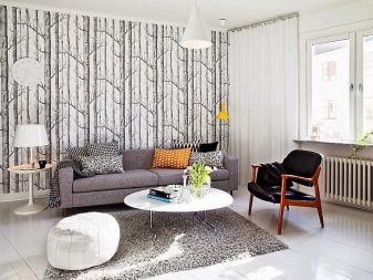
The canvases themselves usually express the spring mood.
The geometry of Scandinavian wallpaper is reduced to the use of simple and concise solutions. The use of abstract motives helps to avoid associations with old-fashioned interiors.
As for wallpaper in style loft, then they mainly reproduce concrete, natural stone or brick. The use of monotonous canvases is allowed. You need to combine the colors of the wallpaper in the spirit of a loft as carefully and carefully as possible.
How can you combine?
It is very simple and easy to paste over the entire hall with monotonous canvases, but this is a manifestation of an extremely meager imagination. It makes sense to glue at least one wall that differs from the rest of the canvases.
It is a mistake to combine the first wallpapers found in the store or in the catalog.
The right combination is chosen first of all after choosing warm and cold tones. They must be balanced in the room, otherwise it will look uncomfortable and even strange.
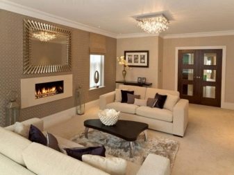
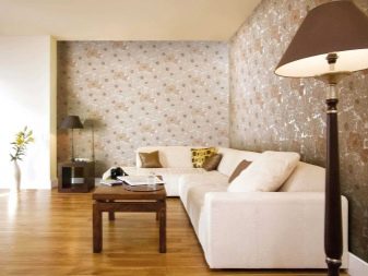
The combination can be built from close colors (shades of the same color), adjacent segments of the color wheel, contrasting colors. The first 2 options are optimal for those people who do not have perfect design principles or do not have an impeccable artistic taste. The most common combinations are:
- drawing and monochromatic color;
- a couple of drawings;
- geometric image and solid color;
- geometric image and ornament.
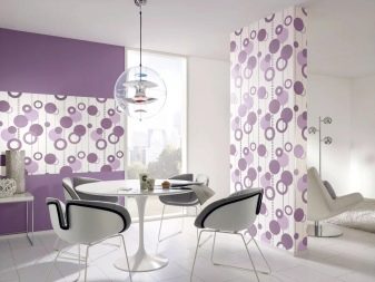
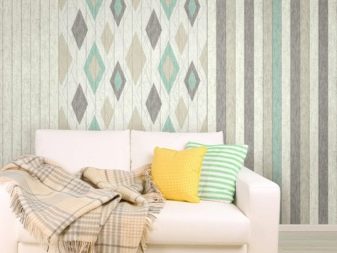
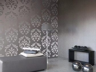
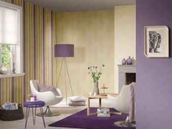
If you make a bright and at the same time contrasting picture on the wall, you can create the impression that a picture of enormous size is hanging there. An expressive floral print is not a bad choice. In this case, furniture, carpets and textiles should be painted in one of the tones used for the main pattern. The choice of small or large, abstract or subject patterns is largely a matter of personal taste. Another thing is important: a wall where a bright drawing is used should not be filled with decorative elements.
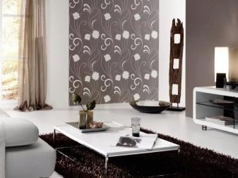
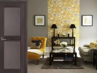
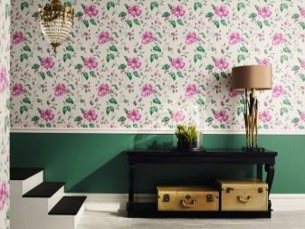
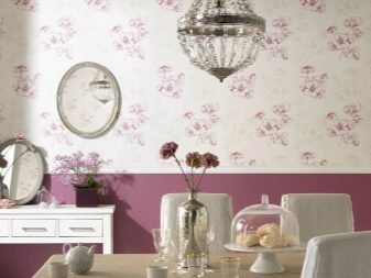
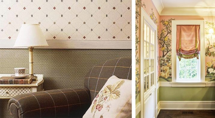
A classic of the genre is the color difference between the “top” and “bottom”, separated by a border. However, it must be borne in mind that such a combination technique looks too bureaucratic. And for apartments with low ceilings, it is hardly suitable. When the joint line goes from above, it is selected along the horizon of the door or cabinet opening. With the lower layout, the border is drawn through the windowsill or through the upper parts of the furniture adjacent to the windowsill.
Due to the alternation of vertical stripes, a low ceiling is visually raised or an excessively long wall is shortened. This solution is perfect for cases when there are 2 of these problems at once. To crush and visually shorten the length of the wall, you need to combine 3 textures:
- the main wallpaper canvas;
- decorative fragment;
- molding or curb tape.
Highlighting a particular wall in one tone is considered a risky decision.
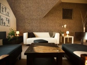
In a square living room, where furniture is minimal, a color spot can cope with a negative feeling. Light furniture will cease to be lost if you prepare a dark background for it. Correct selection is achieved thanks to wallpapers with a similar pattern, but a different background. A more modest design implies use of moldings.
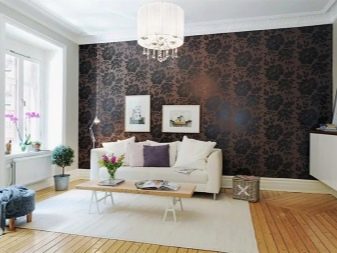
Successful examples
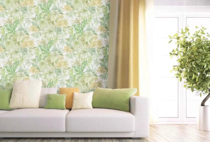
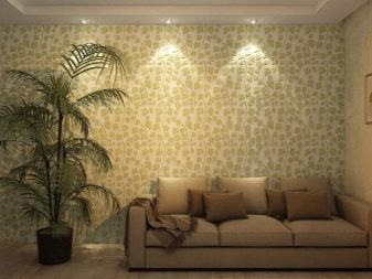
The photo shows how charming a light green floral ornament can look. Such wallpapers are not striking, but still justify all investments.
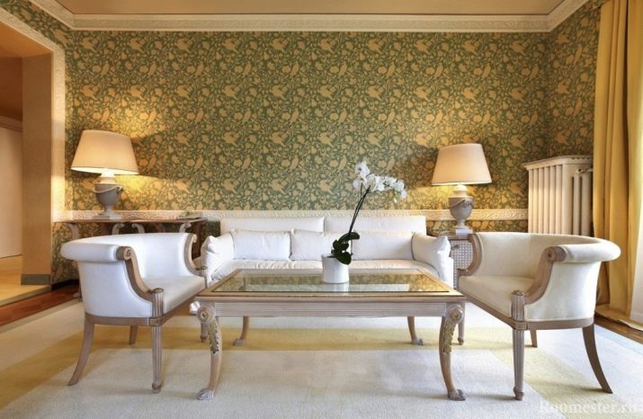
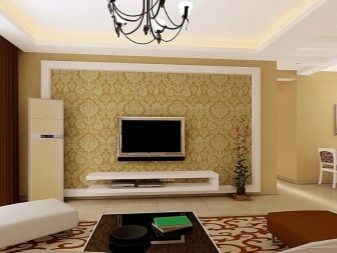
And here they did a little differently: they use stylized rather than pure plant subjects. And the colors are clearly darker. This wallpaper design fits perfectly into the classic composition of the room.
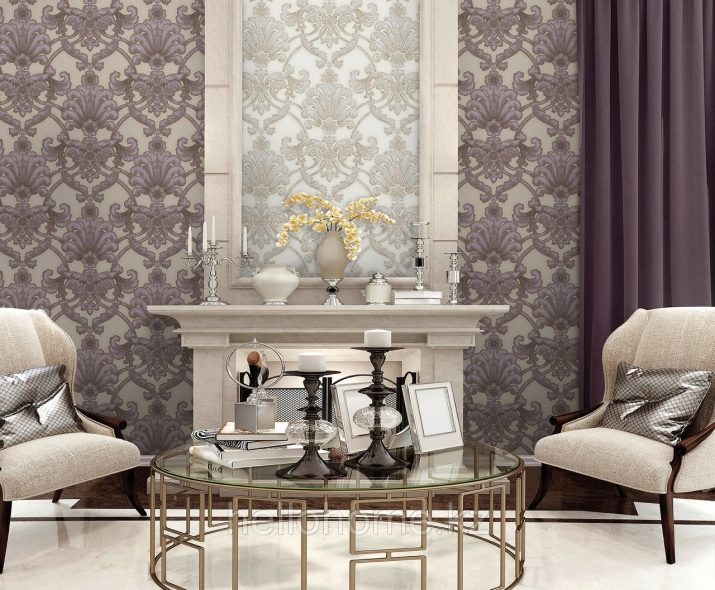
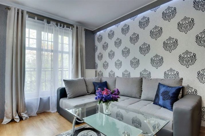
This photo shows how beautiful dark gray flowers can be against a light background. Although this solution is even considered outdated, in fact it is an immortal classic.
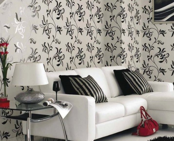
An ideal choice for a light and calm interior.An alternative solution is a light colored wallpaper with darker vertical stripes.
How to choose the right wallpaper, see below.


