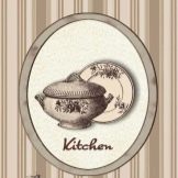
Posters in the interior of the kitchen
Kitchen posters can be very varied. But in order to properly take advantage of their opportunities, you need to take into account the rules for choosing posters on the wall of Provence and loft-style kitchens, familiarize yourself with New Year's posters in the interior and black and white options. Other beautiful options for kitchen posters deserve attention, which must be disassembled separately.
Peculiarities
Posters in the kitchen have long ceased to be some expressive unique exoticism. On the contrary, it was they who became an excellent design option for this room. It is quite affordable to use such decor even with the most limited budget. The choice of specific plots on the wall is huge - just like the plots, both classical and modern works of painting. But at the same time, with an inept decision, you can encounter unpleasant aesthetic effects.
Species overview
New Year's decoration products can be widely used in the kitchen. They will become an excellent decor for the winter time, and not just directly for the holidays. Good original options would be plots:
-
with winter firs;
-
a forest covered with fog;
-
leopard on the background of a winter landscape.


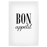
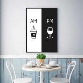
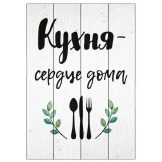
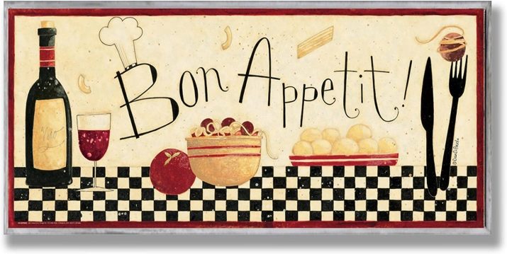
But no one will celebrate the New Year continuously. Therefore, black and white and other vintage posters that are perceived as well deserve attention. Even the simplest versions of such products are often decorated with various thematic inscriptions. It looks good, for example, a wish for bon appetite on top of several "dishes" on a chessboard. Other possible options:
-
the image of the dishes on the dish;
-
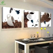
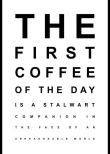
symbolic cup of coffee;
-
black and white composition with two different drinks;
-
simple inscription "bon appetit";
-
the picture on the boards "the kitchen is the heart of the house."
In some cases, it is more appropriate to use posters about cleanliness. So, in kitchens that are used by a large number of people at once, a reminder of the duties of the shift attendants looks very nice. But there may be other options, some of which are more appropriate in private houses and apartments. Even the simplest inscription, without any additional drawings and symbolic images, can become an excellent filling of the kitchen space.
However, its appearance is easy to vary, creating, for example, a plate with slightly "spoiled" corners.
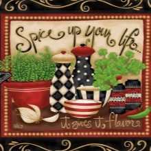
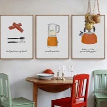
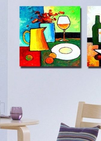
Modern original kitchen posters deserve special mention. A modular composition depicting various dining greens would be a good example. Also good:
-
plots with scattered coffee and coffee cups;
-
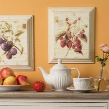
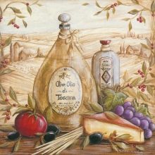
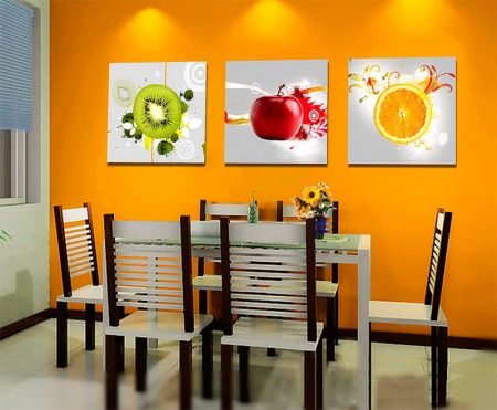
fruit still lifes;
-
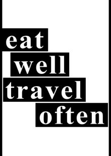
inscription in English;
-
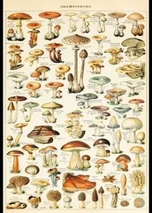
paintings with various mushrooms;
-
styling under an eye test table.
Selection rules
A poster on a canvas can be a very good solution in an interior of any kind. In addition to the low likelihood of fading under the influence of ultraviolet radiation, it is attractive for its ease of cleaning. When choosing a specific option, one must also pay attention to the frame in which the image is placed. Even the same picture in different frames can easily "sparkle" with new colors. Some baguettes even have decorative carvings.
In any case, it is necessary to choose in advance, first of all, the point where the poster will be posted. Sometimes there are no problems with this: you just need to equip an empty area. Then the plot is chosen "for him." The specific position must be clearly visible from as many locations as possible. Its visibility should be maintained even when the doors are opened, when manipulating the curtains.
The dimensions of the painting and its individual parts must be strictly symmetrical to the dimensions of the room. Depending on the nuances of the room, horizontal or vertical patterns are chosen. It is very important to take into account the color scheme of a particular interior. Depending on personal taste, they choose either compliance with it, or an expressive contrast. Additionally, you need to study the general style and take into account your character and dominant mood.
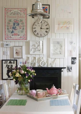
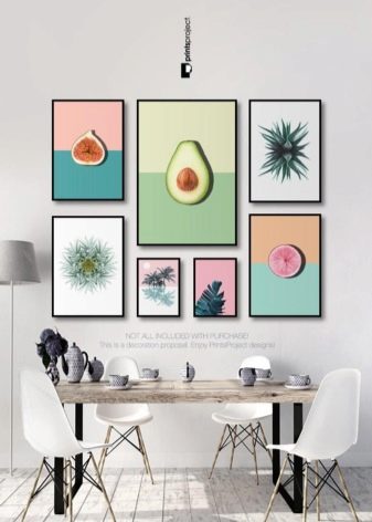
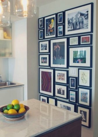
A large kitchen will look better if you use a large poster in the dining area. It can be divided into several smaller parts. Mini-art will be more profitable for rooms in the shabby-chic format, which requires a significant amount of small details. It is very good if famous advertisements and photographs of the 19th – 20th centuries are at least partially reproduced. The use of collages cannot be ignored either, which can be an excellent filling for a wide variety of spaces.
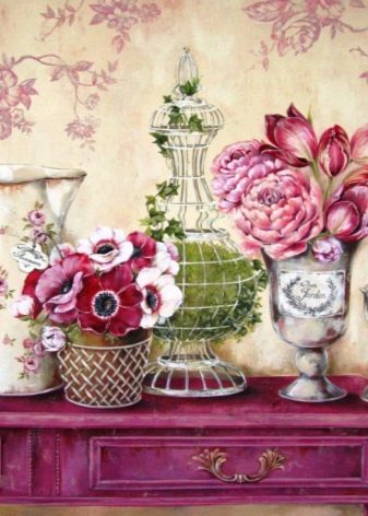
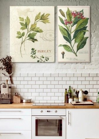
Provence-style posters will dilute the monotony of the city bustle. Simple and beautiful motives in calm pastel colors are most appropriate in it. The dominance of plant motives is very important.
Also, very often the Provencal setting involves the use of thematic illustrations. Such a solution allows you to fill the kitchen with romantic joy.
But you can also take a closer look at the loft-style posters. They are characterized by the use of hard materials and the emphasized coarseness of colors. The colors should correspond to the origins - the design of industrial buildings. Loft style implies a preference for black and white tones, unless another solution is chosen. There are a few more principles:
-
wall decoration with one painting, at least 2-3 images;
-
introduction of posters with large free space;
-
preference for uncomplicated plots;
-
active use of graphics and slogans in the old manner.
Placement Tips
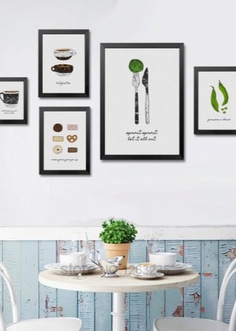
There are comparatively simple rules for decorating posters. In any kitchen there is a place for one large or a couple of smaller images.If you align 3 pictures on the top line, then you get a good solution as well. There are also such recommendations:
-
creation of asymmetric collections of 4 images;
-
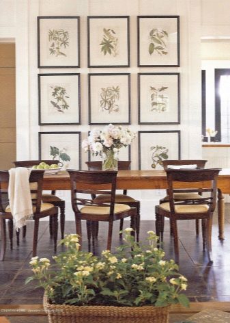
Formation of a linear symmetrical group of 6 posters;
-
decorating empty areas with horizontal rows;
-
decoration of kitchens with high ceilings with a rectangular group of 4, 6 or 8 paintings (according to the volume of space);
-
preferential placement on plain pastel or light walls;
-
clear structuring of space;
-
baguette framing of large paintings.
Beautiful examples
Look great:
-
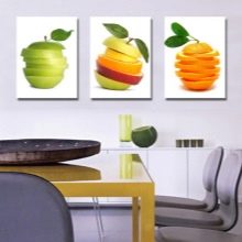
images of fruits on white sheets, using a juicy yellow background;
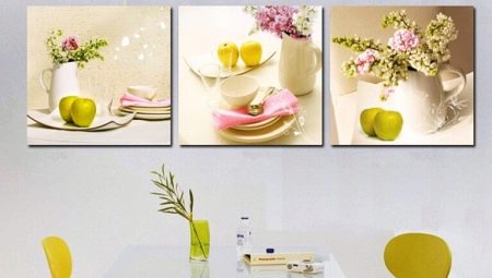
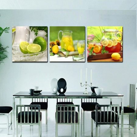
- three still lifes in green and yellow tones;
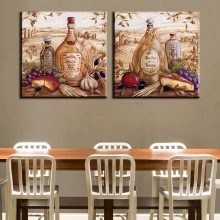
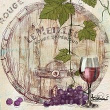
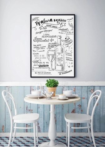
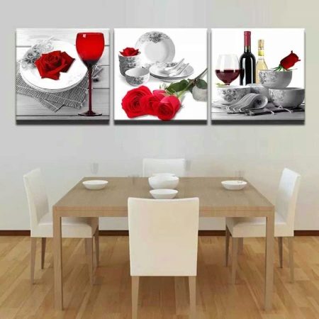
- wine and flower composition;
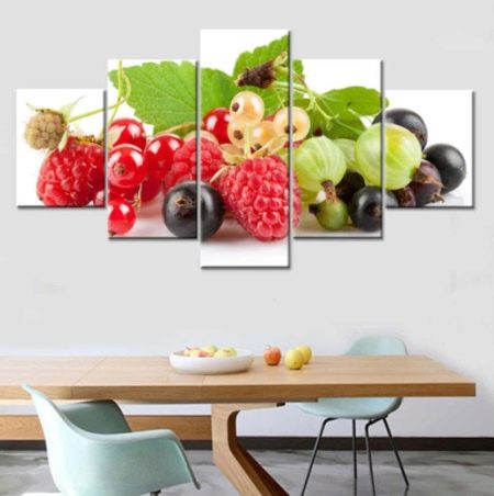
- juicy berries;
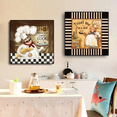
- Pictures on the cook theme.