Slides in the living room: a variety of models and recommendations for choosing
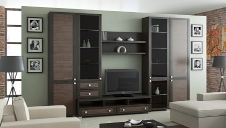
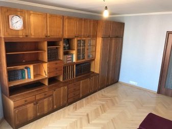
Several decades ago, a wall of wardrobes was almost an indispensable element of the living room interior, but today such a choice of furniture will seem outdated to many - this option looks too cumbersome and gives off a classic, which today is increasingly giving way to modern minimalism.
Theoretically, it would be possible to completely abandon such a piece of furniture, but then another question arises - how to place in the apartment everything that was previously stored inside, albeit a huge, but spacious and capacious wall. The modern answer is called a slide.
What?
Unlike the well-known wall, the concept of a slide has not yet been hackneyed, therefore many ordinary people simply do not understand what is at stake. In the meantime, there is not so little in common between these two creations of the furniture industry.
In terms of purpose, these are direct relatives - wall-slide in the hall is very important for hidden storage of dishes and other valuable, but not always aesthetically attractive things, at the same time, it is able to highlight and emphasize certain moments of family history, becoming a kind of exhibition of the best commemorative photographs, certificates and medals, if any.
Among other things, a TV stand can also be present here, due to which the continuity in terms of interior design is even more emphasized.
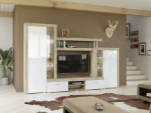
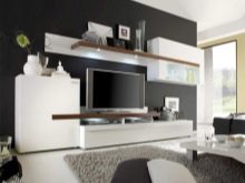
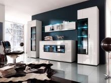
The key difference is that the classic wall is a huge, often one-piece structure, almost always devoid of a bright personality. At one time they were stamped in millions and they claim to be unique only for the reason that most of such furniture has already sunk into oblivion. In this regard, slides are designed in a fundamentally different way - they are modular furniture that can be rearranged without affecting the rest of the furniture.
The components of such a design can be initially released in the form of a set and sold in a store, but you can also go the opposite way, making a sketch yourself and ordering it from furniture makers to bring it to life. The second option is good from two sides: firstly, such a slide will meet your wishes both in terms of design and functionality, and secondly, it will certainly be a 100% unique product.
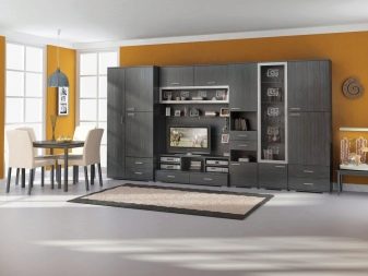
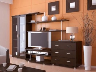
The positive qualities of the slides are briefly described as follows:
- minimalistic design allows you to place a maximum of useful things on a minimum area even in a cramped city apartment;
- the modular nature allows you to recombine the components in the way that is convenient for you right now, which also allows the convenience of transferring the slide to another room;
- minimalism has recently been in vogue, and customization allows you to choose a design that, in your understanding, will be beautiful and appropriate;
- contrary to popular belief, slides are still not the embodiment of minimalism - they suit any style, especially if you carefully select such furniture;
- the assortment of such products is wide enough - there are all the possibilities for choice in terms of material, shape, color and texture.

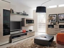
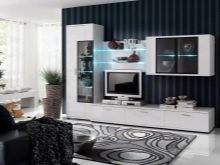
Species overview
The classification of slides is possible precisely due to the fact that they are diverse, which means that they allow you to adapt to your own needs. For ease of selection of models, several criteria are highlighted by which you can choose such an accessory.
First of all slides are not a priori modular - there are most of them, but in fact, one-piece structures are still being made... The latter are not very good, since their size is fixed and rather large, and it is simply impossible to change their configuration, add or remove something.
Whether it's a modular wall - in a store you can see it in one form, but at home arrange the components in a completely different way and even take individual shelves to another room, "breaking" the composition, which was conceived as a single one.
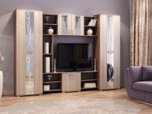
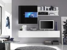
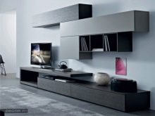
In terms of shape and size, the slides are also classified, and already into 3 types. The simplest and most logical option is linear model, located along one wall: it can occupy both its entire length and only a part, in the latter case it is usually located approximately in the middle, leaving equal gaps on the sides to the corners.
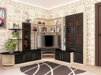
If there are too many components, and even the room is cramped, it makes sense to give preference corner structure - it occupies two adjacent walls with the center in the corner. There is also U-shaped version of such furniture, but, contrary to expectations, it is by no means used in tight spaces - it is such a majestic structure that the aesthetic meaning of its use is visible only in truly spacious rooms.
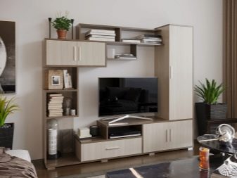
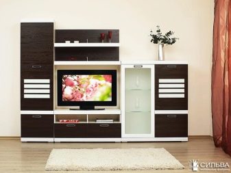
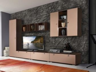
Slides without cabinets at all look like an interesting modern solution. This choice is appropriate if your apartment already has a full dressing room or at least a spacious wardrobe and there is no point in buying another one. In this case, the wall looks like a set of separate floor cabinets and wall cabinets, which are separated in the middle by a TV and simply unoccupied wall space.
In this case, the shape of each individual component is usually non-linear and the more intricate the combination of elements, the more attractive the design of the room looks.
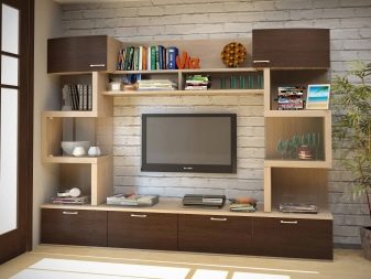
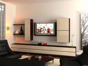
There is also such a thing as mini-slides. With this, everything is clear - there is no abundance of constituent elements, therefore the whole structure consists literally of a couple of small bedside tables and a couple of hinged shelves. This is a good solution in case your living room absolutely cannot boast of spaciousness.
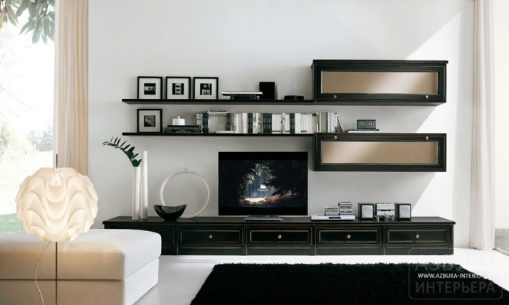
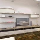
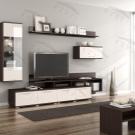
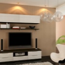
Equipment
Since the slide consists of individual modules and can be made to order, it does not include any mandatory and invariable elements - all components are discussed and can be present in doubled quantities or absent altogether. Do not be surprised if you see the following sections in different combinations for a significant number of store models:
- wardrobe or wardrobe;
- duffel case or chest of drawers with drawers;
- a cabinet or shelf for a TV, although the latter can sometimes be simply suspended in a specially left niche;
- furniture for the installation of various audio and video equipment, including still exotic sets with a full-fledged computer desk;
- a bookcase or separate open shelves for a personal library;
- dish cupboard for storing spare kitchen utensils;
- display cabinets or shelves for displaying some kind of souvenirs, memorable photographs;
- heavy frame units for high-weight contents.
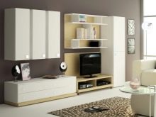
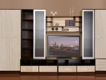
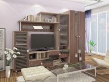
Each of these pieces of furniture has its own purpose, and a potential owner, choosing a slide, should focus not only on its overall dimensions, but also on functionality. There is no point in cluttering up even a spacious living room with extra wardrobes if they are empty and in the same way absolutely everything does not need to be crammed into a cramped room and immediately, if it was possible to move some of the furniture to other rooms.
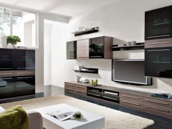
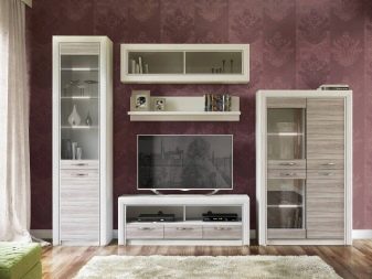
At the same time, it is quite obvious that such a large ensemble of furniture will be the main highlight of the entire interior, which you simply cannot pass by, which means that you should decide on the choice of a specific model in such a way as to carefully complement the sold frame with some external details that will more fully reveal your rich inner world ...
Perhaps you read books exclusively in electronic format, or lately do not find time for them at all, but imitation of a full-fledged library in the living room will inevitably make a favorable impression on guests - from now on you will be among the most well-read and erudite of their acquaintances.
Hiding them, like the same rare vases and figurines, is possible, but undesirable - they themselves are a worthy interior decoration and help to dilute the excessive minimalism inherent in many modern walls.
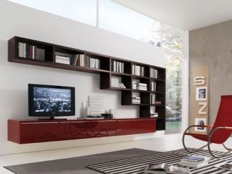
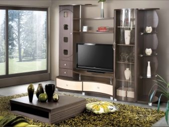
Even put in the right place a living flower in a pot or a table lamp gives the "dead" modular design an element of life and originality, due to which the interior comes to life and is no longer perceived so dry. Although such details are not an integral part of the slide, in a well-planned interior they can seem indispensable, and without them the wall will no longer be perceived as well.
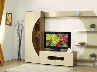
Materials (edit)
In theory, a modular slide can be made from literally anything, but there is a list of materials that are most often used for such purposes. Each of them has its own advantages and disadvantages, which it is advisable to familiarize yourself with even before purchasing the product.
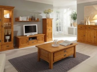
- Solid wood. Potentially one of the best options - wood is equally appropriate in most styles, except for high-tech, it looks just amazing and very solid. The strength and durability of such a material is impressive, because a good product will serve its owners for at least half a century, while the material is environmentally friendly, which is rare today.
Almost the only drawback of a wooden slide is its high cost, but such is the price for an elite quality.

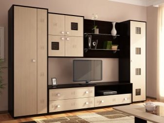
- MDF. This material is a high pressure board made of wood chips. A relatively recent invention resembles natural wood in appearance, is also environmentally friendly, but it costs a little less. True, in terms of durability and strength, the MDF wall will be inferior to a real wooden one, but the expected service life will still stretch for thirty years.
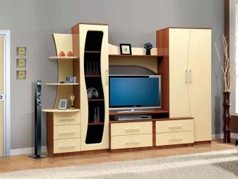
- Chipboard. Let's be objective: this material has few advantages and almost half of consumers choose slides from chipboard simply because they are very cheap. Another relative advantage is the ability to choose the color and texture of the exterior finish, but this furniture still does not pull on natural wood.
Of the minuses, one can single out comparatively low strength and questionable durability, as well as the risk of potential toxic poisoning. The fact is that chipboard is made from shavings, which are glued together under pressure with toxic adhesives, and they can produce fumes that adversely affect health.
Some manufacturers convince that they have complete order with quality and safety, but then it is worth checking the certificates more carefully and still you should not rely on the level of at least MDF.
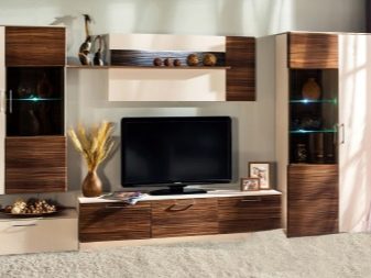
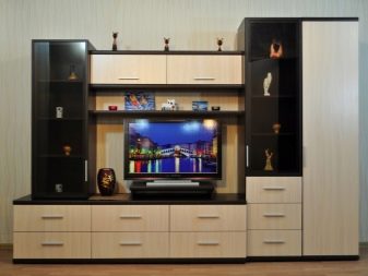
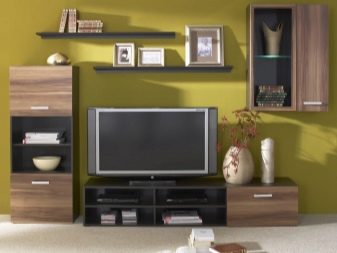
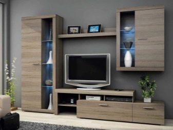
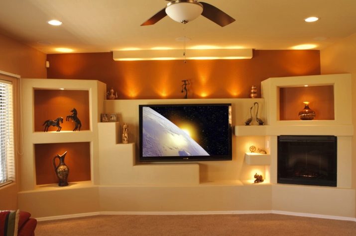
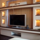
- Drywall. Originally appearing as a building material, these boards are nowadays used for the most unexpected needs. A plasterboard wall can still be considered a rarity, but at least its plausible design for almost any other material speaks in its favor, which adds originality to the interior. In addition, walls are often sheathed with the same material, so in your house the wall may well become part of a real wall.
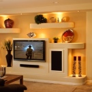
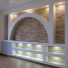
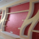
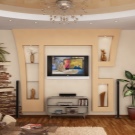
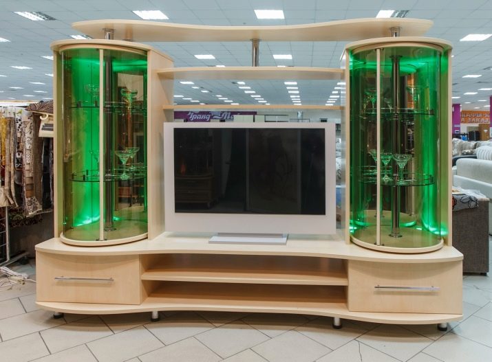
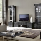
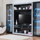
- Glass. Full-fledged glass walls are already possible in our time, but they are still very rare - such a solution cannot always be fitted into the interior, and you have to choose between dubious durability and exorbitant prices. Glass is much more common as a facade material in the production of such furniture, but if the facade is completely sheathed with it, then the entire slide is perceived as glass, although its body is almost certainly made of something else.
Such a solution fits very interestingly into the high-tech style interior, while anything else, especially an overly classic wood, would seem inappropriate here.

Forms
Modern walls are straight (linear) and angular. Each of these options may have its own advantages and disadvantages, depending on the features of the living room layout, therefore, when choosing, you should not focus solely on an unprofessional opinion, not supported by any rational arguments.
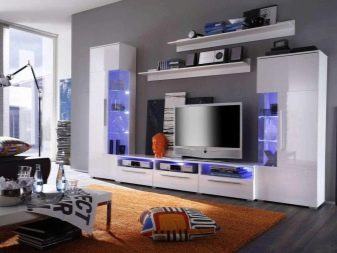
So, straight slides located along one of the walls are usually installed in square and rectangular living rooms. If you have chosen a model of such a kit from among the ready-made ones, it may turn out that it will no longer be possible to put the components at an angle. - the structure will lose its integrity and will not look dignified.
The linear model usually assumes the presence of a large number of different components, while the highest of them can be located both in the middle, with a gradual decrease in height closer to the edges, and on the sides, while in the middle, the TV is framed above and below by floor stands and hanging shelves. In both cases, the furniture creates the illusion that the ceilings are slightly higher than they really are.
At the same time, it is important to find a certain balance between too narrow, but leaving a wide aisle, and roomy components of the headset.
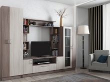
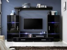
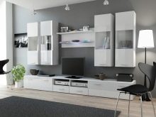
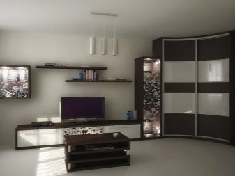
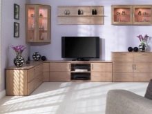
Corner walls are most often used in small living rooms, since it is difficult to fully place a large amount of furniture along short walls, and as a result, the corner is completely empty and wasted in vain. Moreover, often such headsets are installed in order to correct the shape of the room, since in an elongated narrow living room, they are sometimes able to turn the proportions of the room into more correct ones.
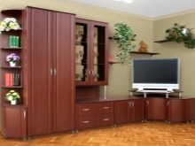
With a relatively small space occupied, the corner wall usually turns out to be quite spacious, since it is almost always deeper than it seems at first glance.Its central element can be literally anything, but most often designers put a TV in the very corner, framed by other sections, although an alternative may be the option with a cabinet in the corner.
At the same time, it is not always correct to consider the corner itself as the center - the main part of the structure can be located along one wall and only slightly touch the neighboring one, which is often observed in rooms with a window located near the corner.

Styles and colors
In the modern design of the walls, it is worth highlighting 5 directions that are recognized as stylish and interesting. Now it is important to be completely original, not imitating absolutely anything, but it is unlikely that the average layman already has brilliant ideas on how to offer a stunning novelty in the form of his own style. Against this background, we will consider the already existing directions.
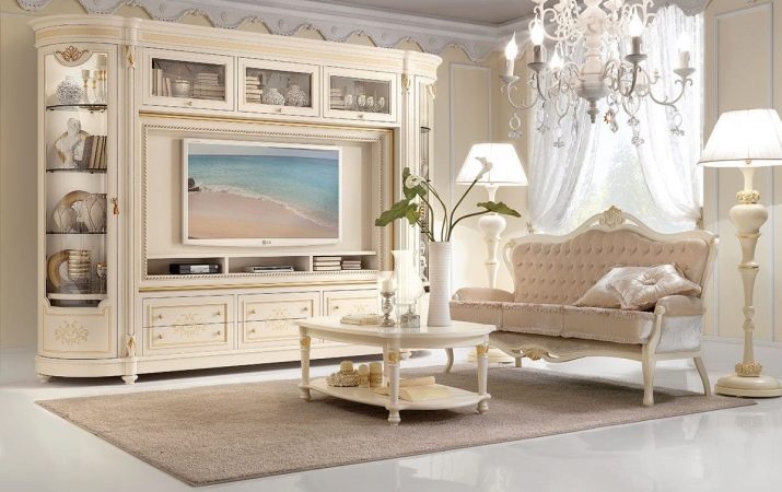
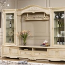
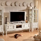
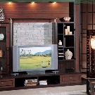
- Classic demands beauty in the form of curly ornaments, carvings and other similar "excesses". A classic wall simply has to look “rich”, because it involves the use of expensive natural wood or, if it is neoclassic, MDF in wenge colors with a slightly reduced number of decorations. Classicism is different, therefore, with a general similarity, you need to choose between Baroque, Rococo and so on, but in all cases, all lines will be straight, without complex shapes.
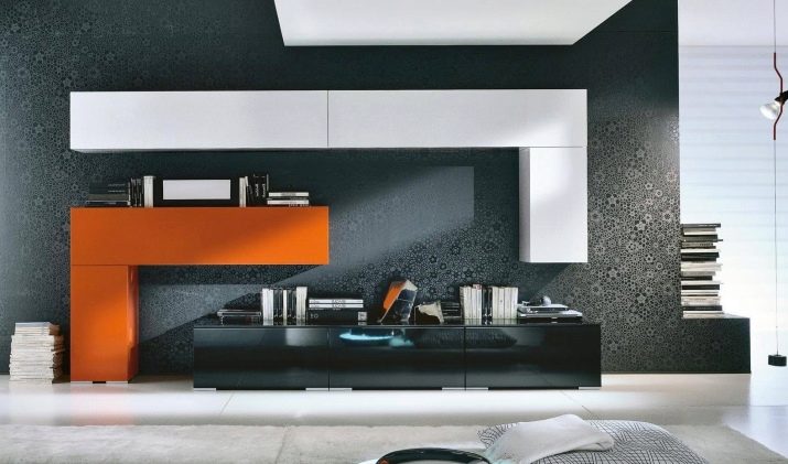
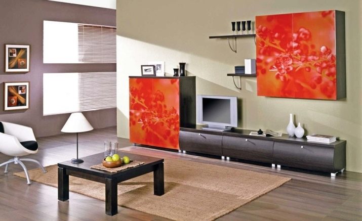
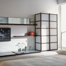
- High tech - the complete opposite of the classics. Beautiful high-tech furniture is one that is completely devoid of non-functional decorations, its beauty is in its utmost simplicity. The most modern materials are welcomed - metal, plastic, glass. A large size is inappropriate for such a headset - in the future it will be possible to store a lot of things with a minimum of occupied space.
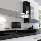
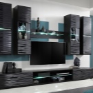
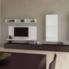
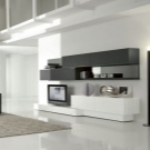
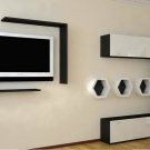
- Modern in many ways similar to the classics, but in a slightly more modern interpretation. This is all the same ostentatious beauty and high cost, therefore the requirements for wood or at least MDF remain appropriate. The relaxation concerns the rejection of strict chopped lines - modernism allows rounding corners and allows for smooth outlines.
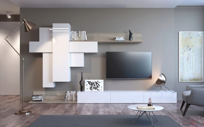
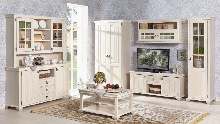
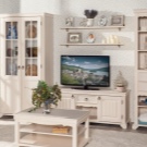
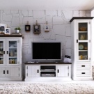
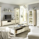
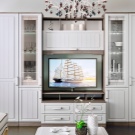
- Provence - a top-end style from among the village, which is designed to convey the coziness of a beautiful dacha somewhere in the south. The set should give the impression of antiquity, because the materials are used natural, and to make them more believable, they should be painted white - it is characteristic of the style and gives the impression of a skillful, but homemade product. Intricate carvings and unique fittings add to the impression that this piece is one of a kind.
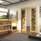
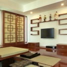
- Japanese style so far only gaining popularity. It is minimalistic, the decor is inappropriate here, although how to say - instead of glass facades, rice paper with hieroglyphs applied can be used. Of the materials, only wood is suitable, while the frames are painted in darker tones, and the facade against their background seems even lighter.
How to choose?
Having decided to buy a slide home for the hall, you must answer the most important question: why do you need such a set of furniture and what do you plan to store in it. Having decided on the requirements and specific requests, you can roughly estimate what components should be present in a model that, in your opinion, claims to be worthy.
Thanks to this, you will not only significantly narrow the range of your search, but you will also be able to avoid a common mistake when a wall is bought because of its appearance, and then it turns out that it has a lot of unnecessary components in the absence of really important ones.
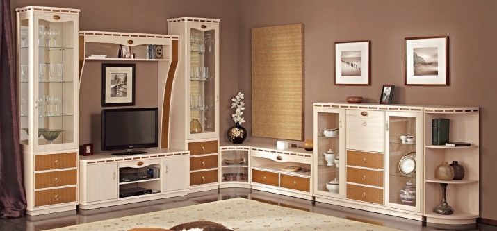
Another fundamental point is correspondence of the size of the wall to the area of the room and the height of the ceilings. It is clear that it will certainly work to shove furniture into the room, but it is important to understand that households and guests should not be uncomfortable from this.Agree, it will turn out stupid if a too potentially straight wall is unnaturally bent in the corner area or its inappropriate width leaves a too narrow passage in which two cannot miss.
A truly royal blunder will happen if you have foreseen a niche for a TV, but did not take into account that the slide is designed for high ceilings, but you have low ones, and therefore the "box" of the normal diagonal simply does not fit into the space allotted to it. To avoid such blatant misses, you must carefully measure the living room, in which the furniture is purchased, and clearly determine how many centimeters in length, width and height you are ready to allocate for a new piece of furniture.

Color and style are two more characteristics of the room and furniture that must be compatible. The slide will inevitably be striking, because it occupies at least half of the longer wall, which means that it is unacceptable for it to look like a foreign stain.
Most of the walls today are made in minimalist directions, but the same high-tech and Scandinavian style put forward completely different requirements for the choice of furnishings. If you managed to renovate a room in a certain style, then you probably know what criteria its design should meet - so stick to them.
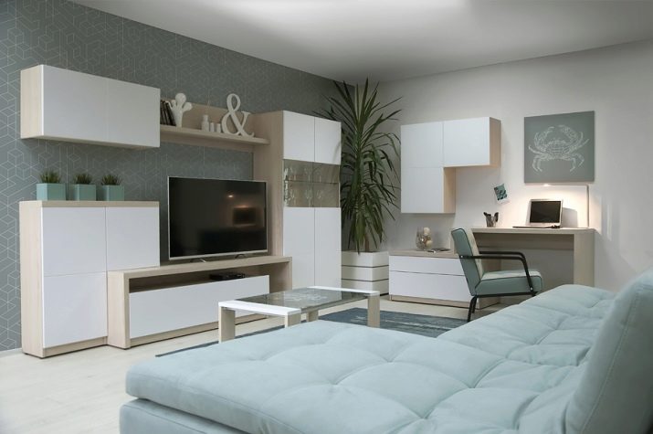
Finally, correctly calculate your budget and the feasibility of purchasing each of the models you like... A solid and multifunctional wall is quite capable of replacing many individual pieces of furniture, thanks to which you save both money and free space. At the same time, you should not chase after a fashionable or interesting model if the money spent on it does not allow achieving the full functionality and attractiveness of the living room as a whole.
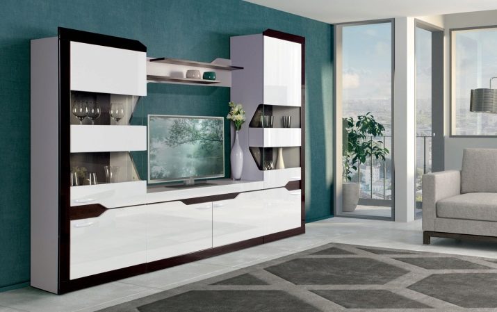
For an overview of the slide in the living room, see the video below.


