Small bathroom design options
Most Russians don't have large bathrooms. Standard apartments simply do not provide for them. The problem is especially urgent for residents of old apartment buildings, and there are an overwhelming majority of them. But even the smallest room for hygiene procedures is not a reason to deny yourself the joy of making it beautiful and functional. This article will tell you how to make a real masterpiece out of a tiny bathroom.
Features of the design project of small rooms
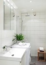
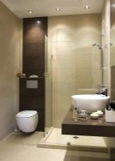
Design thought knows no boundaries and is not afraid of limitations, and therefore 130 x 150 or 2 sq. meter is not a disaster, but just an excuse to come up with an unusual design. This room is one of the most frequently visited in the apartment. There is nothing strange in the fact that you want to equip small areas in a small apartment with great love.
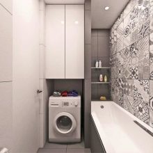
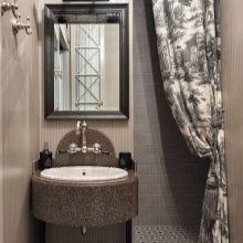
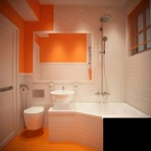
In a small bathroom, it is quite possible to create a space that will accommodate all the necessary things and fixtures. But there are also some peculiarities. You will have to choose a small bath or change it to a shower stall. You need to figure out how to place the sink, mirror and shelves. Well, where without a washing machine! She, too, will have to find a place.
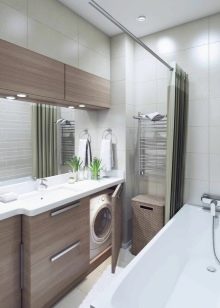
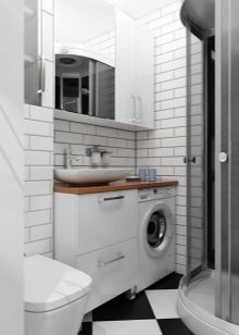
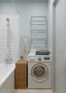
The design features of a small sanitary room imply correct color and light solutions that will help to visually "expand" the space. In order to fit everything you need, you should immediately imagine the volume of everything, draw up a drawing taking into account the dimensions of the bathtub, toilet bowl, and if the unit is combined, then the washing machine, as well as the sink.
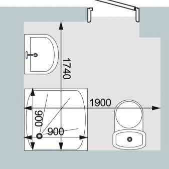
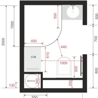
When placing furniture, you will have to come up with an original design, in which the main rule will be used - if there is a lack of horizontal space, you should use the vertical one as much as possible.
For a design project, you can use the help of professionals or do everything yourself, especially since today there are a great many programs and applications that will allow you to create a voluminous project, calculate the dimensions and accommodate everything you want.

Finishing options
Having decided what needs to be placed in a small bathroom, it's time to think about how and how you can decorate it.
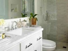
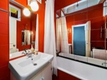
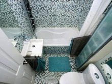
Floor
For a tiny bathroom floor, choose ceramic tiles... It is a practical and durable material that will last a long time. It is hygienic - easy to clean and environmentally friendly. Another plus is the ease of installation, many manage to cope with this task on their own. The tile conducts heat well, if desired, you can put a "warm floor" under it.
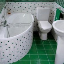
Experts in the field of interior design for small bathrooms advise you to choose small ceramic tilesbecause large models will reduce an already small space. You can consider the option of mosaic tiles, it fits perfectly and masks the curved sections of the floor. It is not necessary to make the floor a solid color. If you wish, you can buy two types of tiles and make a "mosaic" or lay out a pattern - it all depends on your own taste. Floor tiles work well with wall tiles and PVC wall cladding.
Walls
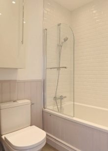
The walls of a small bathroom can be tiled with ceramic tiles - plain or combinations... Effectively "expands" the space of the photopanel on the wall, made of different ceramic tiles. For walls, experts advise choosing a tile with a horizontally elongated shape. The effect will be more pronounced if such tiles are laid horizontally on the wall opposite the entrance.
If the bathroom does not have a high ceiling, then you should think about how to visually "raise" it. It is clear that the ceiling line will not change, but its perception can be completely changed. To do this, you can use the horizontal ceramic tiles that are laid vertically. The decorative tiles with a vertical pattern expand and increase their dimensions.
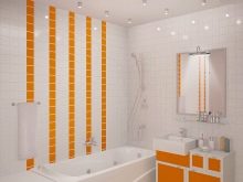
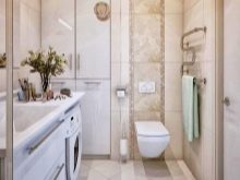
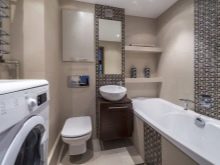
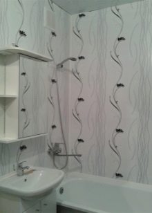
Another option for wall decoration is plastic panels. Their installation is very simple, and the special form of joining guarantees the integrity of the structure, in which the seams will be almost invisible. Their cost is low, and this finishing option is more budgetary. You can choose monochromatic modest panels, or you can choose with a pattern or even embossed.
Some manufacturers very faithfully imitate the structure of stone and wood.
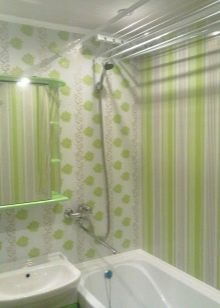
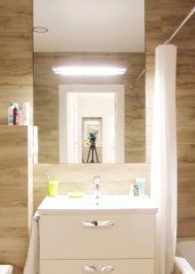
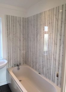
Panels in a small bathroom with low ceilings are recommended to be fixed vertically. If the ceilings are high and the area is small, then try placing the panels horizontally - this will visually expand the walls. Panels with a small pattern are considered the best option for a small room, since a large one "hides" the space.
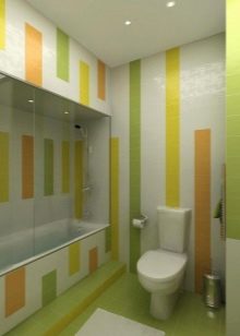
Ceiling
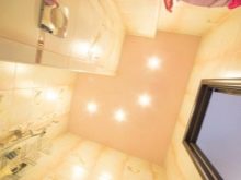
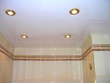
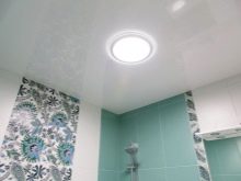
The ceiling can be finished with plastic panels. It looks equally good with tiles and panels on the walls. But it should be borne in mind that the ceiling of a small bathroom should always be light. This will help to visually "raise" the height of the room. It is advisable to choose plain light materials for the ceiling, which will make up an advantageous duet with lighting. Drawings on the ceiling are considered acceptable only if they are a logical continuation of the decorative wall decoration.
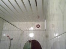
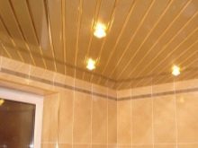
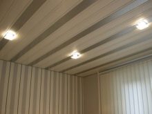
PVC on the ceiling - it is not only beautiful, but also convenient.If the neighbors from above flood you, then the material will suffer to a lesser extent. It can be simply removed, dried and returned. Lovers of original solutions for the ceiling can be offered another option - suspended rack structures. They look easy, not burdensome, they do not "steal" space.
Color solutions
A tiny bathroom needs the right color choices. If you like, this aspect is one of the most significant. And if there are choices with the choice of finishing materials, then the color solutions are subject to certain "laws", violation of which is fraught with consequences - the room will look even smaller or will produce a painful and unpleasant impression.
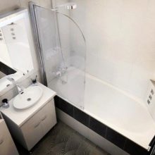
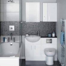
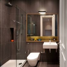
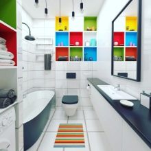
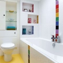
Small bathroom furniture should choose light, large and massive dark modules to make the room more cramped. Niches, which will be painted in contrasting colors from the main tone, will help to expand the space. A bathroom is a room devoid of natural light, and therefore you have to try to make it look light and spacious.
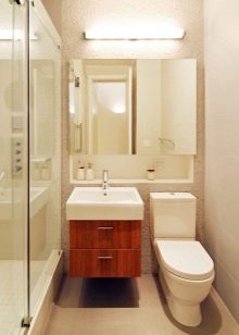
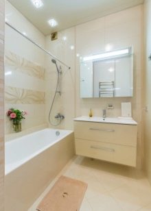
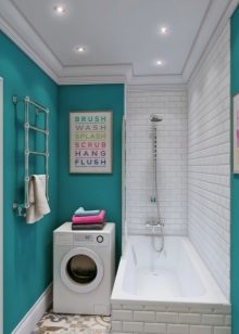
Only light shades give a feeling of lightness. If the tile is glossy, then the reflection of light in it will create an additional sense of perspective space.
But if you decorate the bathroom with plain light-colored tiles, the sanitary room will look like an operating room and will give an unpleasant and dreary impression.
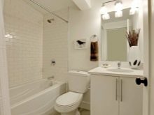
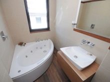
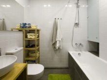
Therefore, it is worth considering about color accents-spots. These can be bright individual tiles in the cladding or bright shelves. If the goal is to make a place of relaxation and rest after work out of a tiny room, then it is worth considering the option of combining light materials and furniture with elements that imitate "wooden shades". This idea is especially good for general white, beige or gray backgrounds.
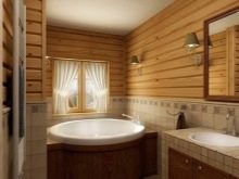
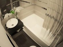
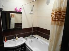
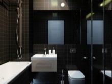
Bright and dark materials will make the room even smaller and cramped. It will be uncomfortable in it, like in a box from under the TV. Too large and bright accents will spoil the design, depriving it of additional visible volume.
Styles
Interior designers offer several trendy and modern solutions for very small bathrooms. For such rooms, the following styles are considered the most advantageous.
Classic with mirrors
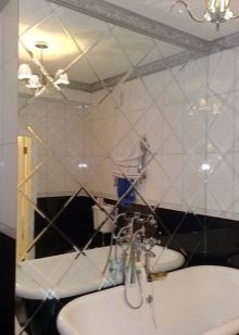
Nothing enlarges space like a mirror. Therefore, 1-2 large mirrors completely solve the problem of increasing space. You can make a mirrored wall, for example, near a bath, use a special mirror tile for it, which will imitate a real and a large window. If you place a photo panel on the opposite wall, then there will be an absolute illusion that in the “window” you see yourself against the background of the sea, forest or beautiful fish.
If the opposite wall is also mirrored, you get a visually huge room. But it will require more careful maintenance. - there is nothing sadder than dirty dirty mirrors reflecting each other.
"Provence"
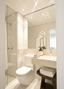
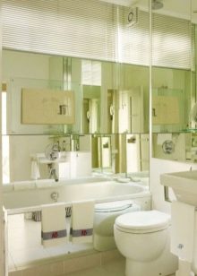
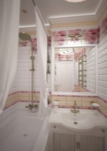
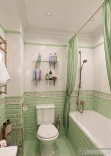
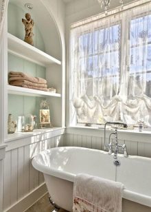
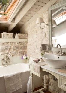
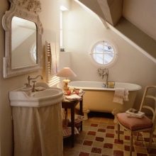
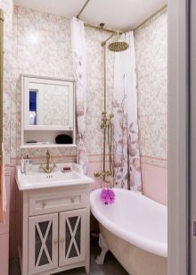
The rustic style, originally from France, is reflected in the interior. It is simple, uncomplicated, subtle and almost weightless. To create this in a small bathroom, you will need light-colored finishing materials, complemented by modest floral drawings in pastel colors. Nothing should get out of this demand, shout and demand attention. Furniture and plumbing should also be in Provence style. No "curls", gilding and mirror coldness.
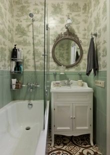
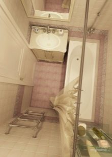
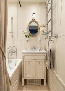
A bathroom in the style of "Provence" will help you create modest hangers and 1-2 wall cabinets. Brighten up with bolder towel and robe colors, fruit or flower rugs.
But the courage is limited - the shades need to be chosen to match the overall color scheme, only a little more saturated.
"Country"
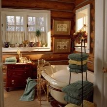
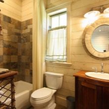
Another interesting country style, this time from America.The atmosphere of the ranch will help to reproduce the materials under the "wood" and compositions from tiles, reminiscent of the well-known patchwork quilt. Avoid overly bright colors. They will shrink the room. Try not to go beyond the beige and "woody" range.
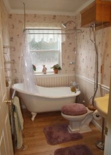
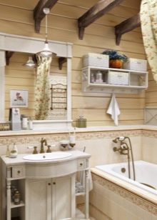
Do not overload the room with a lot of furniture, one wardrobe is enough, certainly with sliding doors. It will maintain the overall style, serve as a storage place for bathing and washing accessories, and also perfectly disguise the place where the pipes of communications pass. Bright accents are acceptable, but should be small - a bright glass for brushes, a bright hanger. You can make a brighter mirror frame. It is better to replace the curtains with sliding light doors.
"Avangard"
This style is optimal for owners of small, elongated spaces. A narrow room can be divided in two. One of them will include a shower cabin and it will be executed in a dark color - black, red, blue. The second is a light zone, in which you can place a sink. You can complement the design by placing a photopanel at the junction - by placing there, for example, Malevich's "Black Square" or a photocopy of a portrait of Harlequin.
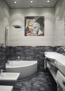
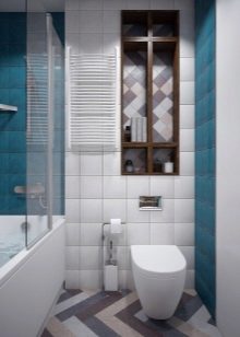
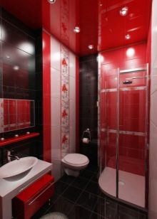
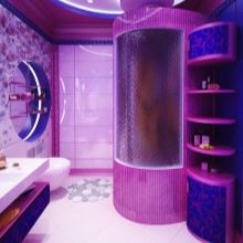
You can do the opposite. If you spend a lot of time in the bathroom, then it is better to make this part of the room light, and the second part with the sink and cabinet - darker. In any case, it is better to make the floor almost white, this will help to enhance the lighting.
English style
In such a room, everything should be British, accurate and practical. We'll have to divide the vertical surfaces into the upper and lower parts, use darker shades from above, and lighter ones from below. It is important that there are elements reminiscent of wood - panels, wood-like furniture.
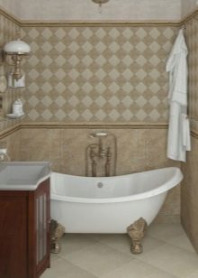
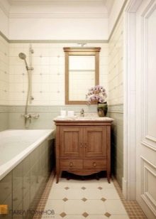
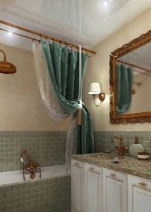
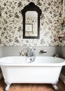
In the English style, ceramic tiles are rarely used. Walls are usually plastered or sheathed with moisture resistant plasterboard. For exterior decoration, paint or waterproof wallpaper with a pattern in the style of England is used.
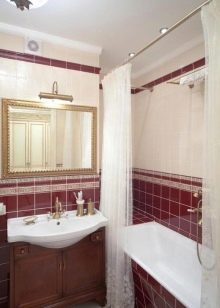
It is better to choose a sink for this style in the shape of a "tulip", and place the mirror in a frame.
Minimalism
Reasonably modern minimalism is considered one of the best for small spaces. The bottom line comes down to placing in the bathroom only the most necessary, necessary. All this should have simple shapes and small dimensions. There is no place in style for frames, vignettes or large mirrors. For showiness, you can divide the room into two halves, highlighting each with its own color of the flooring.
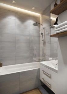
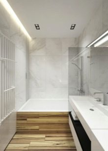
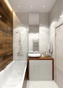
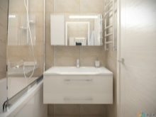
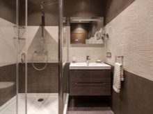
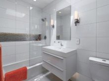
For such a solution, shower cabins are optimal - strict and modern, without lighting and bells and whistles. Next to it, you can place a compact heated towel rail, a small metal sink. Tiles "marbled" are suitable for wall decoration. The mirror does not need a frame.
Choosing a bath and shower
A standard bathtub is about 2 square meters in size. Agree that this is half or even the full area of your premises. Therefore, it will not work to mark a full-size bathroom in a tiny space. A good way out of the situation would be to install a curly or corner bath.
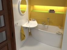
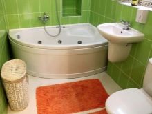
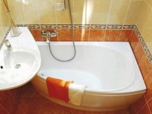
Since the bath itself is the main subject of the sanitary room, it should be chosen and included in the layout in the first place. Pay attention to the small acrylic options - they come in a wide variety of shapes. If you want to purchase a traditional and conservative cast iron bath, it will be more difficult to do, since manufacturers do not offer a large range of sizes and shapes.
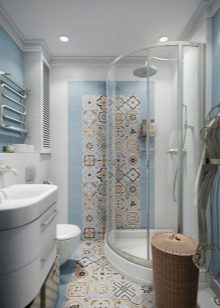
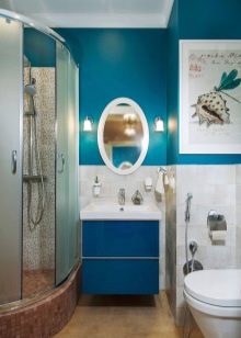
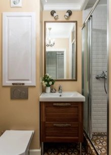
A shower cubicle is a great alternative to a bathtub, it takes up very little space... If you choose a cab as an alternative, try to provide an important detail - its pallet should be quite deep. Cabins with sliding walls made of transparent or matte material fit well in almost all styles. At the same time, the cabin always looks elegant.
Toilet bowls and sinks
For a small room, you can choose a wall-mounted, corner or monoblock toilet. Freestanding models are affordable and it is quite possible to choose a small model among them. A good solution may be to purchase a toilet with a corner cistern, this will help to save some of the vertical surface by placing the cistern in a corner.
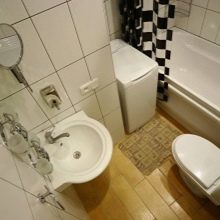
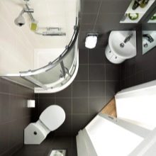
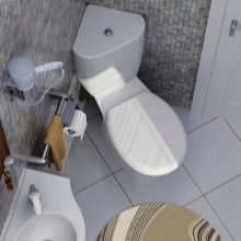
remember, that corner toilets do not save space, but they allow you to more efficiently use the rest of the space... If the goal is to save space as such, then it is better to consider installing a monoblock sanitaryware. These models are notable for their inseparable design. They look neat, compact and don't leak. If it is possible to hide the cistern behind the wall decoration, you should also think about a wall-mounted toilet.
It really saves space and frees it up, for example, for installing a washing machine.
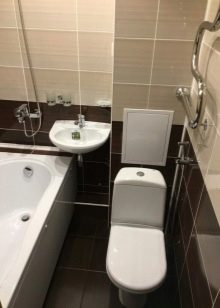
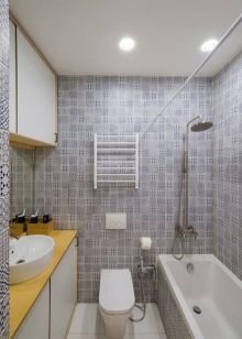
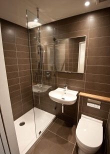
Large sinks are detrimental to a small room, even if you have planned and chosen everything else correctly. Therefore, the choice should be made between compact products that are mounted on the wall, console or in the corner of the room, and also stand on a special leg. For small spaces, interior designers generally recommend tulip sinks and cabinet-mountable options.
You should be wary of console sinks, they are not suitable for every design solution, although in general they are considered compact and ergonomic.

Layout ideas
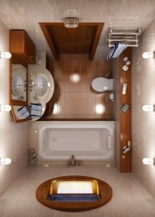
There are many planning ideas. There will be only one optimal project in any case. Try to keep some important points in mind.
- Combining bath and toilet - a logical way out, if both are separate, but miniature "obscenely". Make sure that the wall is not load-bearing and feel free to combine two small spaces into one, but larger.
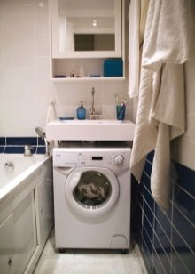
- Feel free to combine bath and shower, choose corner solutions and make the most of vertical spaces. Combine the rest with each other, for example, the washing machine can be installed in the same niche as the sink under one table.
- Do not leave unfilled corners in the project. The more items are placed in them, the more free space will remain in the center.
- The sink can be placed above the bathroom, in the corner.
- Make the most of the space under the bathtub, shelves for storing household chemicals and detergents are perfectly placed there.
Lighting
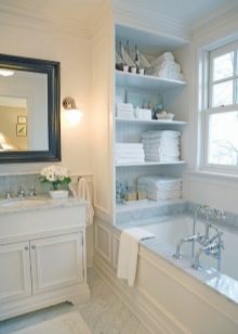
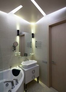
Tiny bathrooms usually do not have natural light, in which case it is better to provide spot and bright lighting in the ceiling. If your small room for frequent visits has a window, for example, when located not in an apartment building, but in a private one, then by all means use natural lighting and ventilation. So far nothing has been invented better than this. If your project includes a mirror, you can make it a separate strip illumination.
This will help when carrying out beauty treatments.
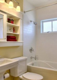
Features of storage of things
So we come to the main question - how to make a bathroom not only beautiful, but also functional. The choice of furniture requires careful attention. Once the design has provided for the location of the bath, sink and toilet, you can see how much space is left to create a practical space. Furniture - cabinets and shelves can be placed in any free space, in corners, above the sink and even above the toilet.
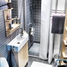
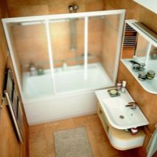
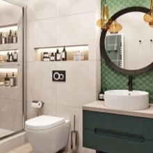
All storage items should have a small depth and width. Large furniture will negate your efforts to increase the space on a visual level, and it will take up too much usable space. Protruding corners and ribs can injure household members when dressing or undressing. note that the least common shelves and whatnots are found above the toilet. By some strange coincidence, this place in the sanitary rooms is almost always empty. Use it.

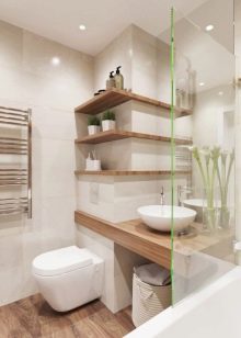
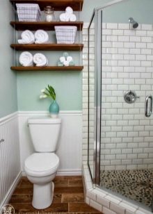
A cabinet with a door is placed above the bathroom; shampoos, washcloths and other accessories can be placed in it. Another storage area can be placed under the bathroom - there is usually enough space there. A top-load washing machine can be placed in the corner under the sink. Above the sink, you can also hang a cabinet - open type or with doors.
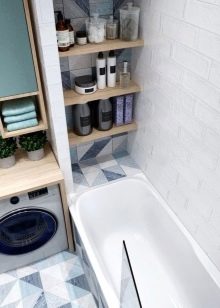
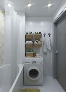
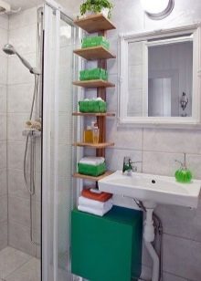
No matter how compact the furniture is, it invariably steals space. Therefore, you can almost completely abandon it and use niches. They are made of moisture resistant plasterboard at the stage of wall decoration. Their number can be any, everything here is at your discretion. Niches win you space, but keeping things in them is different. So, you will have to provide everything for full ventilation, otherwise towels, dressing gowns and other necessary things will quickly become moldy and smell unpleasant.
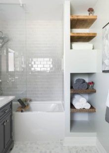
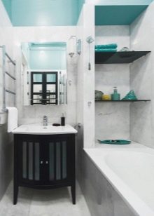
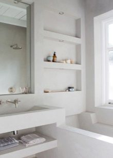
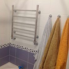
Textiles can be placed on hangers. To do this, use the vertical space in the part that you have left free, excluding the space above the toilet and bathroom. Things should not interfere with free passage. If not a single idea arises, remember how this problem was solved in the cramped "Khrushchev buildings" of the Soviet era - hooks were attached to the door from the inside. They can store both small towels and large bulky robes that take up a lot of space.
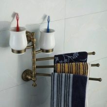
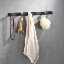
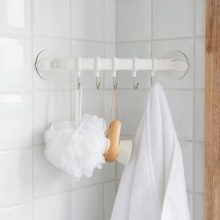
The hanger on the door can be removable or stationary. The towel warmer is best placed on the opposite wall to the bathtub.
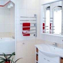
The most practical owners combine two in one - they combine a heated towel rail and a hanger.

Little tricks of arrangement
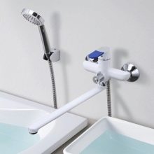
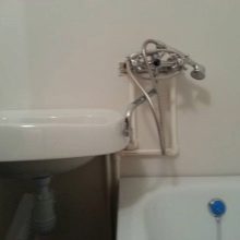
Small tricks include a single faucet for the sink and bathtub. The idea is not new, but very promising. These faucets fit perfectly into the decor and allow you to win extra space. The faucet with a long neck can be swiveled towards both the bathtub and the sink, but in this case, the sink will have to be placed as close to the corner of the bathtub as possible.

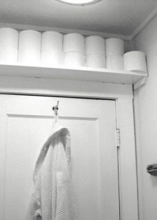
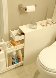
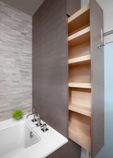
Out-of-the-box solutions are numerous. You can make a spacious shelf or a niche with shelves above the bathroom entrance. True, only adults can use it, children will not have enough height. On the other hand, it is very good if you store household chemicals, laundry detergent, bleach and cleaning products on such a shelf, which are not a toy for children. If the repair budget allows, you can make ergonomic pull-out shelves, cabinets, and a pull-out mirror.
Beautiful examples
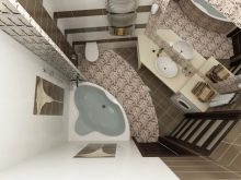
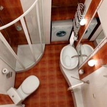
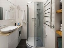
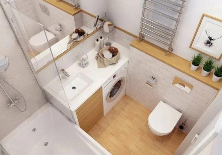
See how the issue with space in this bathroom was elegantly solved, the area of which is only 3.5 square meters. Everything you need fit into it and the central space remained free. Light shades of materials, the location of the heated towel rail in front of the bath, the combination of the sink and the washing machine made it possible to achieve an impressive effect. The toilet cistern is located in a niche inside the wall, and there is a place under the sink for compact but roomy shelves.
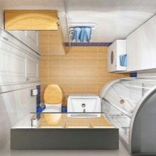
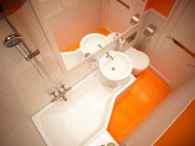
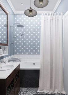
In this version, the area of the room was slightly larger, but it was possible to create space savings both visually and in fact. The design is striking due to the combination of two primary colors and a moderate and stylish floral print laid out in the middle line with tiles. The bathtub was replaced by a cabin with transparent sliding doors. Matte would break the overall floral ensemble. There was a separate place for the washing machine, but all the shelves for storing things had to be placed in the space under the sink

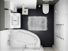
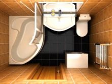
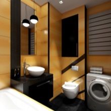
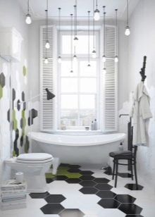
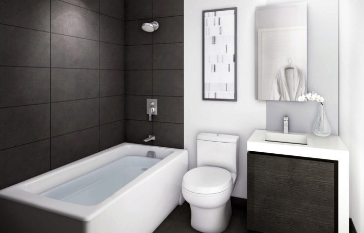
- This design uses a black-and-white contrast style "techno". Austere and laconic style is compatible with minimalism, which was done in this room. The arrangement of the bath is consistent and linear, with clothes hangers on the opposite side. But what about the washing machine? And it is under the sink, safely hidden behind the door.It is noteworthy that the shelves for things and cosmetics are hidden behind a mirror on the wall.
It opens and provides access to the storage location.
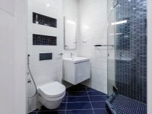
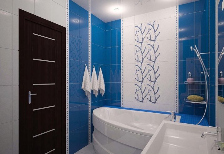
Visually, this room looks quite large. Believe me, this is an illusion, it is created by a mirrored wall, which is adjoined by a corner bath with a sliding "collar". There is enough space underneath to store the things you need. The volume is created by spotlights, a light ceiling, a white floor and contrasting blue inserts. A little unexpected, but the black door looks very impressive.
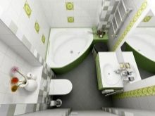
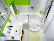
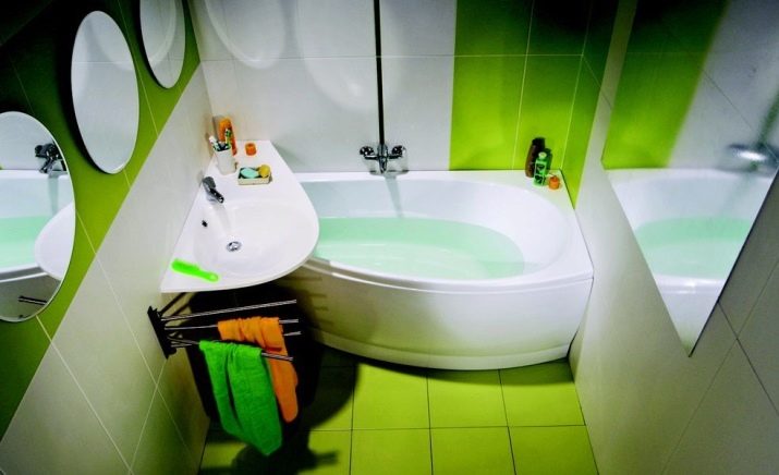
- And here is an unexpected solution called Avocado. Agree, there really is a lot in common - a delicate green color, an abundance of mirrors that create a perspective due to the location opposite. The bathtub is small, angular, acrylic. Towel racks are located under the sink. Achieved visual increase in the ceiling due to the vertical laying of tiles on one wall, as well as visual expansion of the room due to the horizontal pattern with the same tiles on the perpendicular wall.
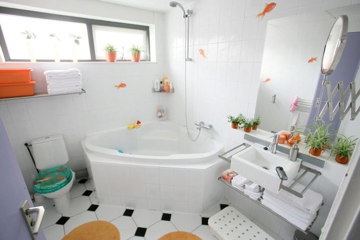
This bathroom has a place for everything, despite its small size, even for flowers in pots. The idea is functionality. Pull-out mirror, pull-out and foldable linen shelves, small corner bath. A great advantage is the presence of natural light.
